February 28, 2010

Virtual Paintout - San Francisco Bay Area

The Virtual Paintout for this month is the San Francisco Bay Area. The Virtual Paintout blog is a year old now, and Bill has decided that we will paint the Bay Area as a tribute to Google for the first anniversary.:)

Now I have never been to SFO, and the only idea of SFO that I have is from the paintings of Karin Jurick. I had painted some Victorian houses last year in one of the DSFDF challenges. Karin also had couple of SFO cityscapes for some of the challenges, but I did not participate in them. So instead of looking all over the Bay Area, I restricted my search only to San Francisco City.
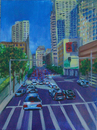
Virtual Paintout - SFO
San Francisco Cityscape - A work in progress
© Nithya Swaminathan


As is my usual practice, I spent an obscene amount of time obsessing with Google Street view and took a lot of images. I loved so many images while traveling virtually, but when I looked at them together to select which view to paint, I found all of them rather boring. So I tried various enhancements to the images and then finally decided to paint them with intensely saturated colors. With maximum color saturation, even a mundane cityscape looked quite interesting. This one is not yet complete, but I posted it anyway since today is the deadline. I will be completing this soon and would also paint a few of the other SFO images that I have saved. Only after looking at the image in the monitor, I also realized that there are some tweaks needed too. Stay tuned for the completed painting in a couple of days. Until then, I think I will go back to wishing for Spring with some more flowers.

Check out various views of the Bay Area at the blog. It is a beautiful virtual tour!

February 26, 2010

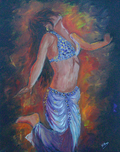
Ecstasy

These days, when I upload my paintings to flickr, it automatically gets updated on Google Buzz. This way, my family gets to follow my paintings regularly. My parents do not generally visit my blog or follow what I do. But then, since Buzz is so on-your-face, they do not miss anything.:) At a time when social media is nothing but suffocating, I was so not interested in embracing yet another place to post mindless status updates. I have however not deactivated buzz for the sole reason that it saves my folks the trouble of remembering my blog url or any such things.:) Though I do not post anything new to Buzz, the auto update from flickr is good for me.

Ecstasy
Ecstasy
Acrylics on Canvas, 16 x 20 inches
© Nithya Swaminathan


This one is completed and signed, but something about her body/anatomy doesn't seem alright to me. I thought I have made the hands too small, but looks like that isn't the case. So while I am unsure of what exactly is missing, I have kept it aside to take another look after a few days. I hope some flaw pops out at me :-) Your feedback is welcome!

February 24, 2010

Break Free

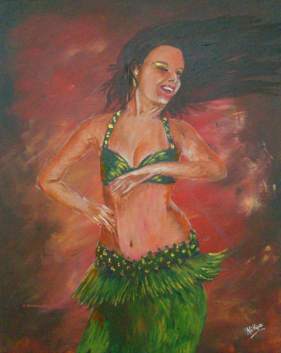
After painting some legs, I think it is time to do a whole body again. So I am getting back to my belly dancers and capturing movement. One of the ideas that I employ in this series is a haphazard background. I wanted the background with large amounts of red, as it is fire and passion that I want to portray. By making the background rather hazy and with very visible broad brushstrokes, it gives a better sense of movement than what a still background would do. And painting the background is one of the most exciting part of the series, as I just play around to my heart's content and keep applying color as wild as I can.

Break Free
Break Free
Acrylics on Canvas, 16 x 20 inches
© Nithya Swaminathan


This painting is based on a reference from Flickr photographer Adelita Chohfi. With this reference, it was love at first sight, and the flowing hair on her face is what did it for me. The idea of depicting complete freedom and happiness, without showing even a bit of the face or a smile was a fascinating idea and  I just *had* to paint this one.

The mood of the painting, and the title, all represent very precisely the kind of mood that I was in while doing this. Over the last few days, I was obsessing over a self portrait, which turned out to be a disaster. I cannot explain how depressed I was with it. I thought I gave it a decent start, but then it turned out really bad. I tweaked it to no end, spent a lot of time and energy tweaking it but it was a lost cause. I did complete the painting and post it on WetCanvas, where people did have nice things to say. But I am totally bugged and will not be posting it elsewhere. Anyway, getting back to this painting, this was the perfect way to unwind for me, after a portrait where I harped so much about the details. This one is so exactly opposite, no detail whatsoever, and is all about mood. I literally did leave myself loose and had maximum fun painting this. And I really like how it turned out.

Your feedback is welcome!

February 20, 2010

Le restaurant

As I mentioned sometime last month, I hosted the Different Strokes challenge in the Acrylics forum of WetCanvas for the month of Feb. This was one of the references I provided. This image is from the little French town of Colmar, taken when we visited this place in the Spring of 2008. It is a very charming little town in the Alsace wine growing region of France. I loved this arch and the lighting, the tables set up nicely, and the atmosphere. It has been on my to-paint list for longer than I can remember and I decided this was the best chance. I wasn't quite sure if everyone would be inspired by this subject, so I gave another street cafe scene as yet another option. Most of the people painted the arch however, to my pleasant surprise.

Le Restaurant
Le Restaurant
Acrylics on Canvas, 12 x 16 inches
© Nithya Swaminathan


I tried playing around with some structure paste for the outer walls of the building. On top of the paste, I used the palette knife to color the walls. I wanted a lot of texture to the walls, to make them stand out and to draw the viewer into the scene. The inside was painted with the brush. I could've done a better job with the overall lighting is what I think. I might tweak it a bit, adding a few highlights and some more darks. Let's see.

I also hope that this paintings motivates me to get started on Europe cityscapes. With tons of references from all over Europe, every time I think of starting a series, I get distracted with something more interesting. Meanwhile, your feedback is welcome on this one!

February 15, 2010

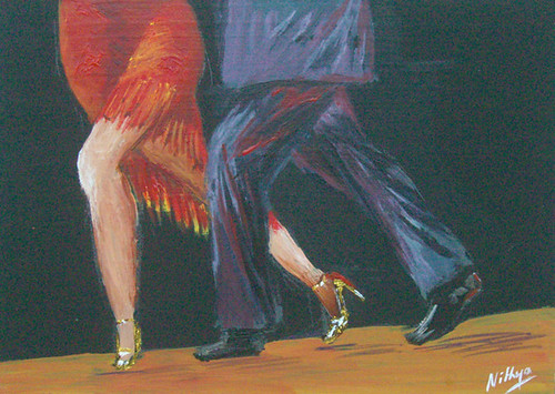
95. Tango #6

Tango #6
Tango #6
Acrylics on board, 5 x 7 inches
© Nithya Swaminathan

February 14, 2010

94. Tango #5

Tango #5
Tango #5
Acrylics on board, 5 x 7 inches
© Nithya Swaminathan

February 13, 2010

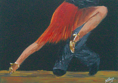
93. Tango #4

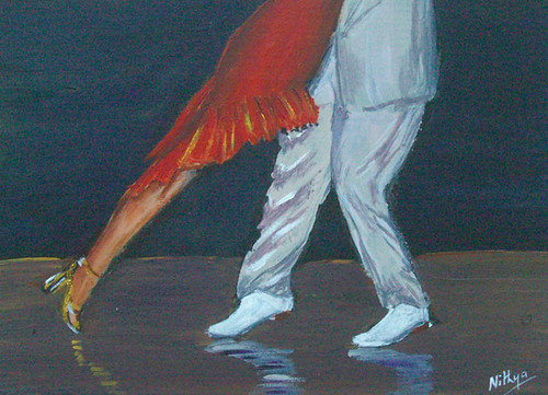
This one's my favorite from the Tango paintings, what do you think? I loved painting it and like how the lady's legs turned out. Your feedback is welcome!

Tango #4
Tango #4
Acrylics on board, 5 x 7 inches
© Nithya Swaminathan

92. Tango #3

These Tango paintings are based on the references from a dancer couple on Flickr. They are a real life couple who also perform together. And when I requested their permission to paint these photos, they were so gracious and allowed me to. In the first couple of paintings, I spent about 75% of the time doing the lady's legs and hardly spent any time on the guy's. So a friend told me that they are not as good as the woman's legs. And so I tried slowing down a bit and added a little more detail to the guy's legs as well. Your feedback is welcome!

Tango #3
Tango #3
Acrylics on board, 5 x 7 inches
© Nithya Swaminathan

February 12, 2010

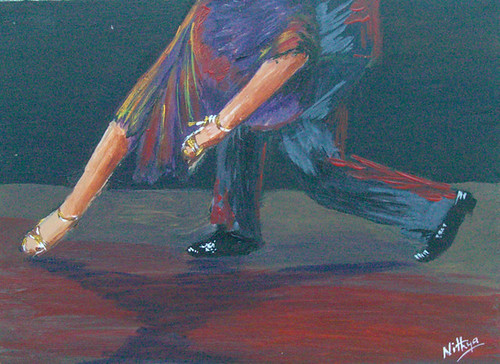
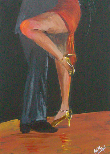
91. Tango #2

I had picked up a set of moulding/structure paste recently, just to see what was possible with it. The set also had a bottle of gold, which I thought could be used in these dancer shoes. I love the effect it gives. The shoes are done in burnt umber, yellow ochre and white and finally a touch of gold here and there. It looks as though they are fully done in gold.:) Your feedback is welcome!

Dancing feet #2
Tango #2
Acrylics on board, 5 x 7 inches
© Nithya Swaminathan

90. Tango #1

Last year, I did a series of belly dancers. The main idea of the series was to capture movement, and the passion of a dancer without focusing on the facial expression. The series relies only on capturing the body language. It was a series I thoroughly enjoyed, and it also struck me that I could extend it to some other forms of dance as well. I had some references of Tango that I had saved several months ago. If I had painted them then, I'd have done them in full, but now it occurred that I could just paint the legs and see if I could still capture the attitude.:) And so I decided to do a series of just legs in various Tango postures.

Dancing feet #1
Tango #1
Acrylics on board, 5 x 7 inches
© Nithya Swaminathan


With these paintings I am also getting back to the brush. Boy it's been quite long! I do miss my knife a great deal though. Let me know what you think of this one.

February 11, 2010

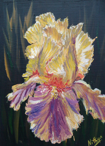
89. Gold and Pink

This is the last of the irises, for a while atleast. I have thoroughly enjoyed doing them, and I think I will do more. I definitely want to. I am a lot more confident and comfortable using the palette knife now, which is the biggest gain by doing all these flowers. And they were a great change from still lifes. Let me know what you think of this one, and the series.

I will try and post all the irises together soon.

Gold and Pink
Gold and Pink
Palette Knife on board, 5 x 7 inches
© Nithya Swaminathan

88. Cheery

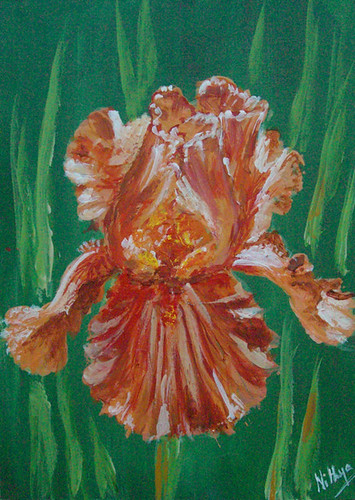
The original reference for this painting is a peach iris, but my painting turned out more orange than peach. I love orange. It always makes me think of bright days and hence the title.:) Hope you like it!

Cheery
Cheery
Palette Knife on board, 5 x 7 inches
© Nithya Swaminathan

February 10, 2010

87. Inner Glow

Inner glow
Inner Glow
Palette Knife on board, 5 x 7 inches
© Nithya Swaminathan

86. Pink and Purple

Pink and Purple
Pink and Purple
Palette Knife on board, 5 x 7 inches
© Nithya Swaminathan

February 9, 2010

85. Golden Maiden

Golden maiden
Golden Maiden
Palette Knife on board, 5 x 7 inches
© Nithya Swaminathan


I was really liking this one for the colors on the petals. I do not like the end result much though. The stem kinda merged with the background that it looks like the flower is floating. I did not tweak it further and left it however. :) Let me know your feedback.

84. Pristine

Pristine
Pristine
Palette Knife on board, 5 x 7 inches
© Nithya Swaminathan

83. Pretty in Pink

Pretty in Pink
Pretty in Pink
Palette Knife on board, 5 x 7 inches
© Nithya Swaminathan

February 8, 2010

82. Ballet Dancer

This one to me looked like the flower was dancing wearing a violet skirt, hence the title! :-) It so looked like the skirt was being blown by the breeze and all that. Do you like it?

Ballet Dancer
Ballet Dancer
Palette Knife on board, 5 x 7 inches
© Nithya Swaminathan

81. Golden Glow

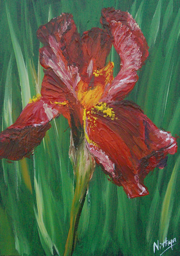
The pieces that are dominated by red are much easier to render with the knife for me. The reds kind of put me in my comfort zone and I make minimal to zero use of a brush in these pieces. Which is why I like them a little more than the others. I like this one too. Let me know what you think!

Golden glow
Golden Glow
Palette Knife on board, 5 x 7 inches
© Nithya Swaminathan

February 7, 2010

80. Lonely Lavender

Lonely Lavender
Lonely Lavender
Palette Knife on board, 5 x 7 inches
© Nithya Swaminathan

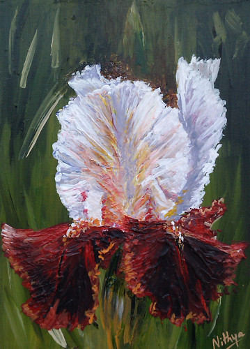
79. Red and White Iris

This one's one of my favorites of the series. I loved how the red petals turned out and their contrast with the white petals. My friends at Wetcanvas have been so supportive of the whole series and I have heard only great feedback so far! I can't elaborate enough what a revelation flowers have been for me!
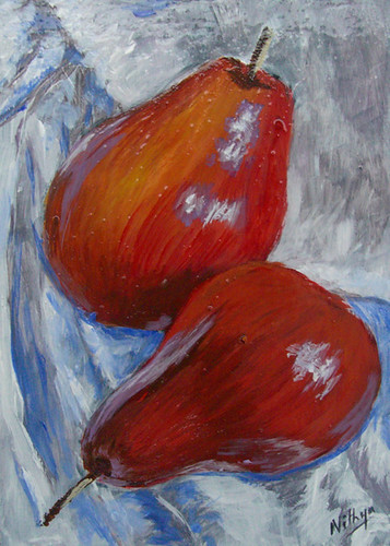
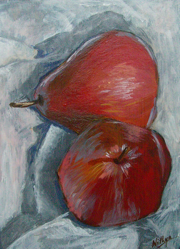
Red and white Iris
Red and White Iris
Palette Knife on board, 5 x 7 inches
© Nithya Swaminathan


Let me know what you think of this!

78. Golden frills

Golden frills
Golden frills
Palette Knife on board, 5 x 7 inches
© Nithya Swaminathan

February 6, 2010

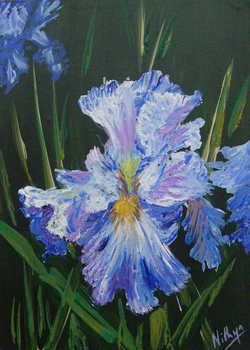
77. Ultramarine Iris

Blue is my favorite color. Though about 75% of my work screams red, blue is what I personally prefer.:) And among the blues, ultramarine is a huge favorite. So no wonder I loved doing this one. It has only ultramarine blue and white. The hint of another iris in the background was done with the brush, so that it seems more at a distance.

Ultramarine Iris


Ultramarine Iris
Palette Knife on board, 5 * 7 inches
© Nithya Swaminathan


Let me know your feedback!

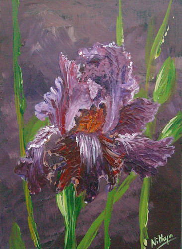
76. Purple Beauty

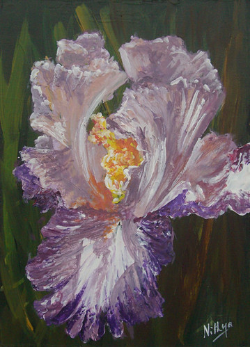
This one is my favorite among the first batch of irises. The five paintings were completed in one day over a period of six hours or so, the longest studio times that I have put so far. I like this one better than the rest for a few reasons. Firstly, I tried not to make the background too contrasting with the flower, and I like the effect it gives. But more importantly, I am happy that I could achieve the desired effect with minimal use of the brush. Other than the frills of the flower that were done in the fag end, almost everything else was done only with the knife. By this piece I had kind of got the hang of the palette knife better, and could blend colors with relative ease. And so this was much more fun than the other pieces :-)

Purple beauty


Purple Beauty
Palette Knife on board, 5 * 7 inches
© Nithya Swaminathan


Let me know what you think!

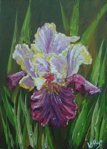
75. White and Violet

Violet


White and Violet
Palette Knife on board, 5 * 7 inches
© Nithya Swaminathan

74. Swaying along

White and violet iris


Swaying Along
Palette Knife on Board, 5 * 7 inches
© Nithya Swaminathan

73. Covered

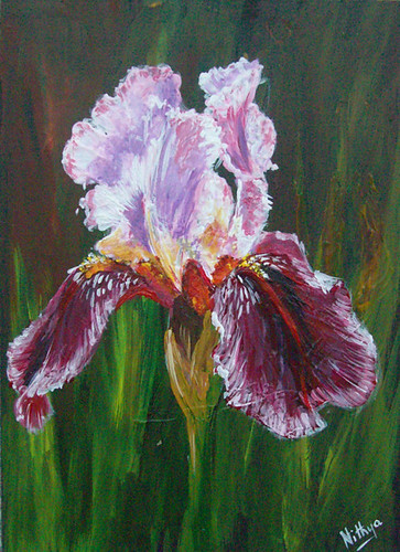
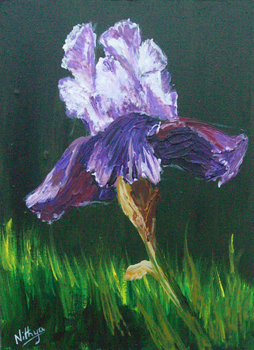
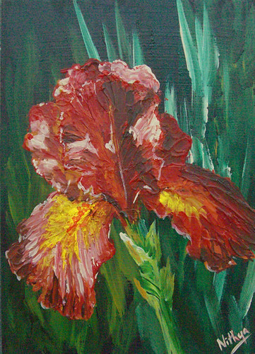
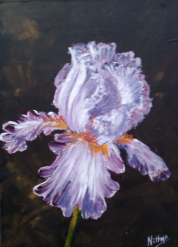
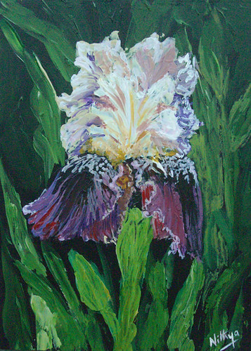
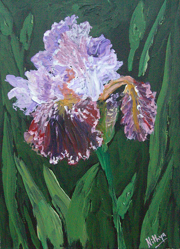
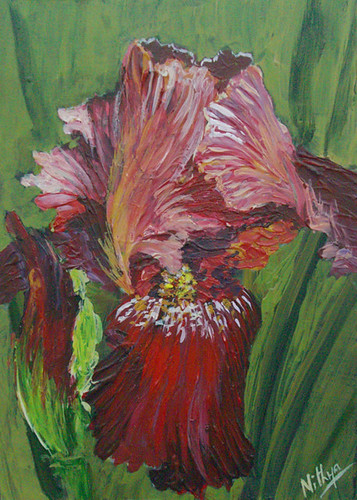
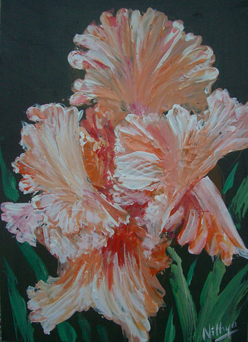
I follow the same technique in all the iris paintings. All these pieces are done on a black surface. These days, I paint exclusively on black, excepting the snowscapes that were done on a blue underpainting. With my largest brush, I do a very rough, loosely detailed background. In most of the cases, the background is quite dark, and is a mix of sap green, olive green, burnt sienna and some yellow ochre.

After the background dries, I sketch with a small brush directly on the board. I am not aiming for a realistic look at all, so I don't bother about the accuracy of my sketch. This series is all about color and texture, so I just go with the flow. I do a loose sketch, with flaws and all.

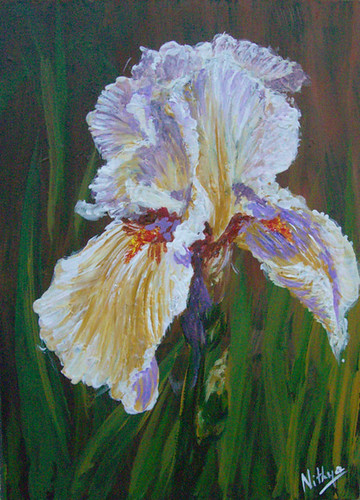
Copper Iris


Covered
Palette Knife on Board, 5 * 7 inches
© Nithya Swaminathan


It is now that we start the actual painting. I first do a heavily textured layer of the entire flower with the palette knife. This is done in the direction of the petals. The most amazing thing that I discovered was that when I use the knife in the direction of the petals, the end result is almost like veins on the flower. This thing works wonderfully for an iris, because almost any iris has its veins clearly visible. If I were working with a brush I'd probably be marking some veins with a thin brush, but here there is no such fuss. The knife does it better than any brush. And then some tweaks are done with a brush, which results in a loose enough but not so abstract painting!

February 5, 2010

72. Iris love

I love irises. They are absolutely gorgeous flowers and look breathtaking in every color they exist! First of all it was a huge surprise to me that they come in about a million hues! I also love how the petals are like frills, so delicate and beautiful. Well I probably suck in expressing in words how much I love them so lets stop it at that.

I was very very apprehensive about painting an Iris, the reason being the same that kept me from painting any kind of flower. Knowing that I suck at anything remotely "delicate", I wondered how I could make those petals seem real and not like made of paper. There are some outstanding botanical artists who do complete justice to the flower. For instance, I drool at the absolutely stunning irises that Jacqeline Gnott does, they just blow me away. And not in my whole life will I be able to render something as good as that. That was my primary fear in even attempting these flowers.

Blush


Blush
Palette Knife on board, 5 * 7 inches
© Nithya Swaminathan


But then, after doing those tulips and other flowers with the palette knife, I had this knife obsession and just had to continue in its flow. So I just plunged in, and I am glad I did. I will be posting a lot of irises over the coming posts, in a multitude of hues. All of these are done with the palette knife. I shall also write a bit about the process later. Stay tuned.

Let me know what you think of this one.

February 4, 2010

71. Dollops

These days when I paint, I close the browser and paint only with my reference image. That way I am not tempted to keep refreshing Twitter/Facebook, check mail a dozen times etc. It keeps me more focused obviously, and the work gets done. And I upload my work (for critiques) only to WetCanvas, and no other place that's meant for hobbyists.

Dollops


Dollops
Acrylics on board, 5 * 7 inches
© Nithya Swaminathan


This, is in direct contrast to what I was a couple of years ago. The number of places that I had a "portfolio" was more than the number of paintings I had to display. How jobless is that?! I used to create an id in every other art website, and have bits and pieces of images uploaded across so many places. Now I realize I was out of my mind, and I am in the process of deleting these accounts. And while some of them are easy, many aren't.

I hate it when websites do not allow account deletion as a simple direct process. I had a lousy experience recently with Sulekha, in getting my account removed. It is such a huge and popular website, but does not allow account deletion. Forcing users to retain their accounts is cheap tactics, if you do not want the users to leave, you better provide services that will retain them. Idiots. I had to write to the admin so many times and finally they got it removed. Huh!

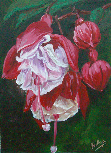
Ok, let me stop the ranting. This is a painting of Fuchsia, done with a brush. Again no idea if I could do this with a knife, but I am tempted to try one more with the knife. Soon I guess. This one was challenging in the sense I did not want to make it too detailed, but wanted just enough detail. I also think the white part isn't white enough and looks dull. All that will be set right the next time I tackle these flowers. Meanwhile let me know what you think of this one!

70. White Tulips

A mix of palette knife and brush for this one. The foliage in the foreground is done with a knife, and the flowers are with a brush. White is never my cup of tea, I get jitters painting the various colors in white. And if I did this with a knife, I wonder if it would've looked like a white flower. So stuck to the basics and did them with a brush.:)

White Tulips


White Tulips
Palette Knife on Board, 5 * 7 inches
© Nithya Swaminathan


All these tulips leave me wishing I could visit the Keukenof gardens. We were there a couple of years ago and loved it. What a paradise! We plan to visit again this year, I hope that materializes. I have so many tulip references from my last visit itself, and now I am finally feeling confident enough to get to them. So more tulips are on the way for sure :)

Let me know your feedback on this one!

69. Fiery

The Calla lily is one flower that has big time appeal to me. I love its unique structure, and just fell in love with this photo. This one was done with a brush, absolutely no idea if I could pull it off with a knife, and also bring in the glowing effect. So played it safe this time.

Fiery


Fiery
Acrylics on board, 5 * 7 inches
© Nithya Swaminathan


I never knew Calla lilies come in red too, I have seen only white ones. When I upload the paintings of the day, I tell my hub and he has a look at them from his workplace. He works in another city and so is away for most of the week. So there, that's the big secret to how I am painting a lot more these days :-) Anyway, he called me back saying he likes the bird of paradise the best. And then, sends me a mail saying he liked this one the best, and then the killer, is this also a bird of paradise?!!! Well I know he is artistically challenged, but then visually too?! Trust him to come up with such stunners. :-)

I really like this one too, I like how it stands out against the black backdrop. Let me know what you think of this.

68. A bunch of orange

While I love painting with gay abandon and getting to complete so many pieces in a day, I hate the part that follows. I have to upload my images in a million places, starting with flickr, facebook, my online shops, etc etc. Facebook is brilliant in the  sense it does not allow importing photos from flickr directly. I HATE that. Added to it, if I have to upload the same image on my personal profile and my fan page, Facebook expects me to do it twice. How crazy! When I am an admin of a fan page, I expect it would be nice if I can share an album between both my profiles. I wish I could outsource all these tasks and just get to paint. Sigh!

Bunch of orange


A bunch of orange
Palette Knife on board, 5 * 7 inches
© Nithya Swaminathan


Anyway, that's enough ranting for a day. This painting too done entirely with the palette knife, and I just added some bright highlights with a brush in the end. This was only on the flowers. The leaves were fully with the knife. Let me know what you think!

67. Bird of Paradise

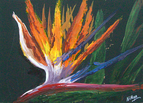
The bird of paradise is designed to be done with the palette knife. The very simple no fuss structure of the flower makes it so easy to render that this was done in less than half an hour. Takes huge amounts of paint, slap them on and continue. And it was super fun! Not much work in terms of mixing either as I was looking for a real intense look.

Bird of Paradise


Bird of Paradise
Palette-Knife on board, 5 * 7 inches
© Nithya Swaminathan


Let me know your feedback on this one.

February 3, 2010

66. Purple coneflowers

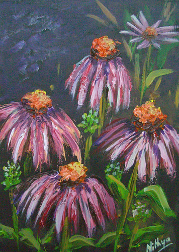
This was done from a lovely reference in WetCanvas. I tried to bring in some taper in the petals this time around, so ended up spending a little more time on each flower. Also touched them up a little bit with a brush, to make the shapes a little more defined.

Purple Coneflowers


Purple coneflowers
Palette-Knife on board, 5 * 7 inches
© Nithya Swaminathan


Among other things, I was listing all these paintings in my online store at Artfire, and the site did not allow me to use the word 'knife' in the description of my painting. I tried making it a hyphenated word as 'palette-knife' and still no luck. Crazy ain't it?! Does google think I am a terrorist or what?!

Let me know what you think of the painting!

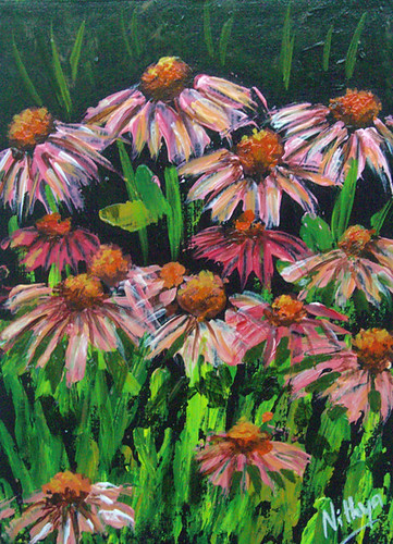
65. Coneflower field

I find these flowers immensely cute and attractive, I LOVE that magenta. Until recently, I did not even know the name of these flowers. While I was hunting for flowers which I thought could be easily done with the knife, I stumbled upon this reference and loved it. I have attempted to optically mix color in this one. There are multiple overlapping strokes of different colors and values, which will give a complete picture when see together. I did not spend time mixing color on the palette. I like how it came together, but I did not manage the darks well. It needs some more shadows.

Coneflower field


Coneflower field
Palette Knife on board, 5 * 7 inches
© Nithya Swaminathan


One thing that I could not pull off was the taper in the petals. When painted with the knife, the petals were rendered with uniform width. I wasn't adept enough to bring about the taper, so the petals look a bit strange.:-)

Quickly learning from the previous tulips painting though, this time I avoided a strong background. Just hinted some greens mildly with the brush, so that the focus is on the flowers.

Let me know what you think!

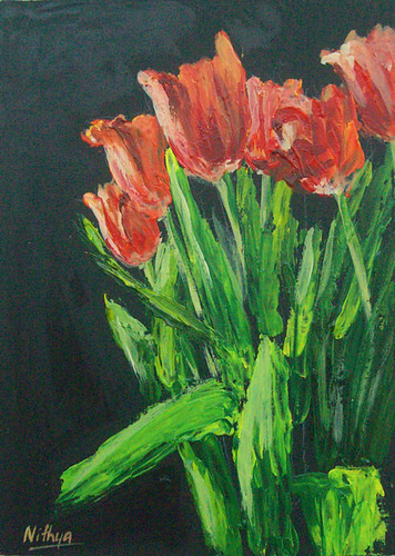
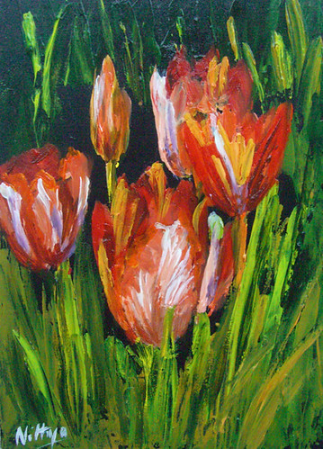
64. Red tulips

Here are another set of red tulips, done with my palette knife. These tulips aren't entirely red, they have patches of white, and it was fun getting all the colors without picking up the brush again. How I love the textures! Hope you like it too :) One thing I could've done, looking at the painting now is to have painted the foliage behind the flowers with the brush. That way they would've automatically receded to the background and not pop up with heavy texture. I have done them with the knife though, and the distance doesn't come across. It probably competes for attention with the flowers.

Tulips


Red Tulips
Palette Knife on board, 5 * 7 inches
© Nithya Swaminathan


What's the fun anyway without a little trial and error. This is the biggest advantage of working small, it gives room for a lot of experimentation. Let me know your feedback!

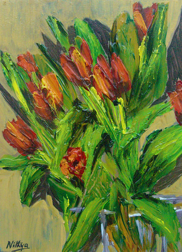
63. Awaiting Spring..

Today was a fantastic day, I completed 4 paintings from scratch and am about half way through on 3 more pieces. These will be completed tomorrow. There was a challenge in one of the Wetcanvas forums, with a few floral references, it really gave me a spark and I just went on to paint couple of more pieces outside of those images as well.

Tulip bunch


Bunch of Tulips
Palette Knife on board, 5 * 7 inches
© Nithya Swaminathan


I have been meaning to pick up my palette knife for quite sometime now, and had bought a set of knives a while ago. Got to use them finally, and loved it. I have been way out of touch with my knife and it was quite rusty in the beginning. But slowly I gained control and thoroughly enjoyed myself :)

This one was completed entirely with the knife, I was too tempted to pick up a brush and add some detail on the petals etc. But then chose not to. The shadows on the wall are done with the brush though.

So taking a break from all the gloomy snowscapes, here is a burst of color with the hope that Spring is around the corner. Let me know what you think of these pieces, the new style, color and just about anything!

February 2, 2010

62. Pears #9

The Haitian Relief Art Auction by 140hours was a grand success. In about 50 hours, 30 works were sold, and nearly $4000 was raised towards the cause of the earthquake victims. None of my paintings were sold, but I am very happy for the platform that it was. In the process of getting our artworks together and encouraging one another, I got to meet a lot of new artists on Facebook and Twitter!:)

Pears #9


Pears #9
Acrylics on board, 5 * 7 inches
© Nithya Swaminathan


A big kudos to the Technical team of 140hours, for they put together everything so quickly on the website. All the artists' submissions  were put up on the website and linked to individual pages all in no time. A big thank you to the entire team! You guys rocked.

Let me know what you think of this painting :)

61. Pears #8

I worked on this one a little differently. Normally I paint a mid tone for all the large shapes, and then go on to add darker as well as lighter values. Finally the highlights. I was watching a painting demo video yesterday where the artist was painting from dark to light. I have seen a lot of artists mention that they work like that, never tried it myself though. After I saw it in the demo, decided to give it a shot.

Pears #8


Pears #8
Acrylics on board, 5 * 7 inches
© Nithya Swaminathan


So this painting was done from darkest values to lightest values. Since the surface is already black gesso, the darkest were very easy to paint. Adding lighter values gradually was a rather interesting way to see the painting come alive. I will probably be doing more of these kind of studies to come. It was also much faster than my method of painting. This image was done in 45 minutes flat, from scratch.:)

Let me know what you think!

February 1, 2010

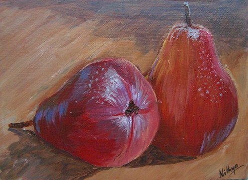
60. Pears #7

Pears #7


Pears #7
Acrylics on board, 5 * 7 inches
© Nithya Swaminathan

If you like it, share it!