 |
| Looking ahead Oil on Canvas, 5 by 7 inches SOLD |

December 31, 2011
Looking ahead - Textured figurative painting in Oils, 5 by 7 inches - SOLD
December 29, 2011
Perched with a Popsicle - Painting of children, 9 by 12 inches
 |
| Perched with a Popsicle Oil on Panel, 9 by 12 inches Click here to bid |
December 28, 2011
Eiscafe - Textured Cityscape in Oils, 10 by 10 inches
 |
| Eiscafe Oil on Canvas, 10 by 10 inches $200, Buy on Etsy |
December 27, 2011
Color coordinated - Textured Oil painting, 9 by 12 inches
 |
| Color Coordinated Oil on Panel, 9 by 12 inches $200, Buy on Etsy |
December 26, 2011
A German Summer - Textured Oil Painting on Canvas, 10 by 12 inches
A summer evening with some coffee and conversation, a scene so typical in Germany!
 |
| German Summer Oil on Canvas, 10 by 12 inches $200, Buy on Etsy |
June 28, 2011
Tech Tuesdays - Integrating Disqus comments on your blog
Today, I would like to show you how to go about integrating the Disqus commenting system on your blog.
Why Disqus?
Step 2 - Choose the platform on which you have to install. Blogger, for instance.
Step 3 - Import existing comments
Why Disqus?
- Rich features - threaded comments, reply by email, track all your comments etc.
- Sign in with ANY id - you can sign in with Facebook, Twitter, Google and so on. Anything.
- Well integrated with social media - You can share your comments and replies on twitter and facebook too.
- Other add on widgets like Recent comments, popular commenters etc.
Until recently, it was not so easy to integrate disqus with blogger, it had to be done manually. But now it takes less than a minute. I would strongly recommend every serious blogger to do it. Here's how we go about it.
Step 1 - Sign up for Disqus and add your sites.
After you sign up for an account with Disqus, be sure to add your blog to the list of sites that you manage. Then go to your Admin panel and click on the "Install" tab.
 |
| Admin -> Install |
- When your site is already added to your disqus profile, all you need to do now is to click on the button as it is shown below, to add the widget to your blog.
- You will then be required to login to blogger and authorize the widget.
- When the page element is added in blogger, you can drag and drop it to where you want. Typically, in the end of the post body.
 |
| Install to blogger |
- Since disqus is the default commenting system on your blog now, you have to also import the older comments in your blog so that they don't disappear now.
- Click on the tab "Tools" in your admin panel.
- Now select "Import and export" and select the platform from which you have to import comments. Here, it is blogger again.
- This will take a while, depending on how many comments you have in your blog.
- Once it is completed, you would be able to see your old comments in the new system.
 |
| Import comments from Blogger |
Wasn't that super easy?! Try it out and let me know if you face any issues. I'd be glad to help. If you have any suggestions for posts in my "Tech Tuesdays" series, drop me a line.
June 22, 2011
Song of dusk - Textured Oil painting, a brand new subject!
I have never been drawn to painting animals. I think it boils down to the fact that I am not too much of an animal lover. Birds interest me though, I have sketched quite a few and done a couple of bird paintings way back even when I used to dabble with colored pencils. And I was drawn to these bird images recently, just to give a shot at a new subject. It was also a challenge to myself, just to see how much detail I could bring in only with the knife. And on that count I must say I am really pleased with the result!
When I paint with the knife, I tend to work really quick, quicker than with the brush. I took it rather slow with this piece, because I did not want to less it up. I wanted to bring in as much detail as possible to the feathers and the form of the bird. What a beauty she/he is! Everything including the eye and the white little dot was done only with the knife and I gave myself a pat on the back. :)
 |
| Song of dusk Oil on Board, 6 by 6 inches (palette knife) © Nithya Swaminathan $100 and ships free worldwide Click here to Buy |
This painting was actually done before my vacation, and I just realized that I had not blogged it at all. And I listed it today on Etsy. I logged in to Etsy after more than a month and was pleasantly surprised to see the changes in the listing process. Listing was Etsy's only pain point and the change is brilliant. Absolutely brilliant!
It is a recent favorite of mine, and I would be pleased to hear what you think of this piece.
It is a recent favorite of mine, and I would be pleased to hear what you think of this piece.
June 21, 2011
Tech Tuesdays - How to set up a custom welcome tab for your Facebook page
So here comes the first installment of my new series - How to set up a custom welcome tab for your Facebook page. If you are a blogging artist, I assume you have a business page on Facebook already. If not, get yourself one right now and come back to reading this. :)
Here is my page on facebook - Fine Art by Nithya Swaminathan, and what you see when you click on the link is my "custom" welcome page. You will be shown this page if you are not a fan of my page already. If you are a fan of my business page, then you will be seeing the "Wall" by default and you can click on "Welcome" to your left to see the welcome page.
Why do you need a welcome tab?
When someone visits your facebook page for the first time, this tab will give them "intro" to your work. You could list all your important links, like your blog, website, online store and so on so that a visitor is not left searching for them.
You could include a call for action, like I have, requesting them to like the page.
Now shall we go about building such a page in less than 30 minutes? Here you go!
Step 1 - Choose your app
- Search for an app that builds custom tabs and add them to your fan page by giving it the necessary permissions (clicking "Allow" to authorize the app).
- A simple search for "custom" in the facebook search bar will list many apps that provide this functionality. Examples are Pagemodo, Custom Welcome Tab, Static FBML etc.
- My page uses "Custom Welcome Tab" and it is very easy to use.
- When you "add" the app to your page, you could also specify the text that is to be displayed in the left side of your page. I have just chosen "Welcome".
 |
| Add the app to your page |
After adding the app to your page, when you go back to the app you will be able to see your page listed in the dashboard. Click on the "Configure Tab" button to customize it's contents.
 |
| Configure Tab |
- The app provides a rich text editor to add text, images, links and format them as you would like your page to be.
- In my page, I have added an image just like I have done in the home page of my website. I have actually added the same image as on my website. You could even add a video introducing yourself and your art. The possibilities are endless.
- I wanted to keep it simple, so my welcome tab shows an image of my work and my links.
- The editor also provides an option to preview your changes so that you could make changes after previewing them. Save your changes and come back to your page admin panel.
 |
| Rich Text Editor with image added |
 |
| Add links to website |
- Once you have designed your custom welcome tab, it has to be configured as the "default landing tab" in your page, only after which it will be displayed when visitors land on your page.
- Go to your fan page and click on Edit in the left side.
- In the admin view, click on "Manage Permissions".
- In the option "Default landing tab", select the tab that we have just designed from the dropdown box.
- Save your changes.
 |
| Set as landing tab |
Voila and you are done! That's it and when a new visitor, who is not a fan of your page lands there, they will be shown the welcome page first. Cool isn't it. This is how my page looks.
 |
| Custom Landing Page Fine Art by Nithya Swaminathan |
How did you like this step by step guide? Was it useful? Was it confusing? This is the first time I am trying something like this so I welcome all your feedback. Do let me know what was fine and what was not. And do come back for the next installment on the 28th of June 2011.
I look forward to hearing from you.
Introducing Tech Tuesdays - a brand new series on A Splash of Color
When I interact with other artists on various venues, one thing that I come across is that a lot of them find technology a tad confusing and even overwhelming at times. If you are one such artist, read on.
I am starting a new series on my blog that is aimed at artists who wish to overcome the challenge of technology. A step by step approach to demystifying things. This new series is titled "Tech Tuesdays", and yes, it will be published once a week every Tuesday.
As of now, my plan is to deal with one very specific topic every week, mostly related to maintaining an art blog, a Facebook page for your art, a website and so on. I will try to be as detailed as possible with screenshots and step by step guidelines.
Who would benefit from this -
- Artists and art bloggers who have very less or no knowledge of HTML, customizing your facebook page, integrating your various online presences, etc.
- This series is NOT for people who are in front of the system all the time. It is much more basic than that.
How you can participate?
- Leave a comment suggesting any topic that might be of specific interest to you.
- I am an engineer and having worked enough in software development, there are things that I might not necessarily find "challenging" and I could ignore them. But if you have a suggestion, I am more than willing to help.
- Share the articles with your friends or anyone else whom you think would benefit from them.:)
June 20, 2011
Now a member of Daily Paintworks
Ever since I heard Carol Marine and her husband David on the Artists Helping Artists show a couple of months ago, I have been waiting for the Daily Paintworks site to be opened up for membership for all artists. David has been doing such a phenomenal job with the site that it is a pleasure to exhibit there. The search features are totally awesome, it is unbelievable how many improvements are being brought about in the website every other day.
Do check out my gallery at Daily Paintworks. Today, I inaugurate my DPW auction with my recent piece "Mirror mirror on the wall". This is the first time I am trying out the auction format, so I have kept the starting bid very low at just $20. Do check it out.
 |
| Mirror mirror on the wall Acrylics on Canvas, 5 by 7 inches Click here to Bid |
June 19, 2011
Back from vacation!
Oh well, I was technically back on the 2nd of June itself, but was too immersed in the real world to even get to my blog. We were away for a good part of May spending awesome time with family at NYC. My sister lives there and it was getting together with family after a long time and every minute was well worth it.
I cannot even begin to describe how fascinated I am with New York. What a city full of life, it was love at first sight for me. There are some places that have caught your imagination for longer than you can remember, and very few of them will actually live up to all that and more without underwhelming you. NYC certainly falls in that category. I so couldn't get enough of it that I will be painting a series of cityscapes/impressions of the city. First impressions of a tourist :) That is soon to come on the blog, stay tuned.
My favorite part of the vacation, more than all the museum visits, was watching a play at Broadway. It is always fascinating for an artist to see other art forms, and for someone who has no knowledge of theater, this was just the best I could ask for. The set designs and the performances, everything was so impeccable. It should ideally be one of the first things to do in the city, and I would rank the experience much higher than getting to the top of the Empire State and such. Truly one of it's kind.
The Metropolitan Museum of Art was such a heaven, the best museum that I have seen after the Louvre. We spent one full day at the museum, and I was wise enough to leave my little one at home so that I could spend time undisturbed. Right from the intricate tile paintings and stained glass paintings to the sculptures, every piece was so stunning. My favorite at the museum this time were the timeless ballet dancers of Edgar Degas. Those pastel sketches simple blew my mind! This was also my first time coming face to face with a Sargent. Enough said!
Ever since we got back, we were badly jet lagged for a few days and then I have been too busy with work. Being three weeks away is a luxury in a consulting job and so the post vacation period has been a little more work than usual. This past week kept me occupied for most of the time with preparations for my little one's birthday. Our little bundle of joy just turned 5, when did my baby grow up into such a big girl!!! We had a nice party with her friends yesterday and it was a lot of fun.
One reason why I hate vacations or any breaks is that the break invariably gets extended longer than I would like it to. This time too, it's been more than a month since I have painted and I am feeling so rusty! I started working on a piece last week and hope to post it in the next couple of days. I promise!
May 2, 2011
Video of paintings in March and April 2011
Here'd the video of my paintings in March and April 2011. Both these months I was tied up with a huge workload in my day job and painting did take a backseat. And whatever time I had for painting was taken up in doing my website and so on. However, I did manage quite a few pieces and surprise surprise, I was happy with most.
Now I could churn out 50 paintings in a month and think they all suck. Or I could paint 20 above average ones. I think I now prefer the latter. And yes, as always I have a dozen works in progress in the studio.
It is remarkable that I have painted quite a few landscapes these past two months. Thanks to all my plein air adventures, all about which you can read here and here. Hope you enjoy the paintings, do share the video with your friends if you like it! :)
April 30, 2011
Make an offer - May 2011 - Original Landscape in Acrylics
Did you check out the latest changes in Blogger? I can't get over the new dashboard and the features. It seriously blew me away. So sleek and completely awesome. I am sure this itself is an incentive to the lazy blogger like me :)
 |
| Farmhouse Acrylics on Canvas, 8 by 8 inches. Bidding starts at $60 Mail me to place a bid. |
This painting is from my plein session last weekend. A rather lonely house in my neighborhood. The bidding for this painting starts at $60, which is more than a 50% discount from the normal price. Plus, it ships free worldwide. So what are you waiting for? You can place a bid by shooting me a mail with your offer price.
Hope you like the painting, why not write to me with some feedback?
April 28, 2011
Springtime Sunshine - Bring on the yellow!
I found time for some more plein air over the long weekend and it was fabulous! Yet again I set up my easel amidst the stretches of yellow and the hills behind provided a great backdrop. This one was terrific fun to paint. This again is painted just with the primaries - crimson, ultramarine and cadmium yellow pale.
 |
| Springtime Sunshine Acrylics on Canvas, 12 by 6 inches $150 and ships FREE worldwide. |
The entire painting was completed with the brush and I finally added some intense yellow with the palette knife, to make the fields really "pop". And I quite liked it! It's actually been a while since I painted with the knife. Having some fun with brushes right now and hope to get back to the knife soon.
Over the 4 day long weekend, I planned to paint outside at least on two days, but ended up going out only one day. Most of the time was spent with family, which was very welcome given our hectic schedules during the week. My daughter loved it too. I do hope to paint out this weekend again, to catch a bit more of the yellow fields before they disappear just like that!
Let me know what you think of this one. I will be sending out my monthly digest, my first ever newsletter this weekend. Do consider subscribing if you haven't already. :) It includes a draw for an original painting from me, exclusive only to my email subscribers.
Sign up to my newsletter.
Let me know what you think of this one. I will be sending out my monthly digest, my first ever newsletter this weekend. Do consider subscribing if you haven't already. :) It includes a draw for an original painting from me, exclusive only to my email subscribers.
Sign up to my newsletter.
April 21, 2011
Springtime Indulgence - And there's some more berries coming your way!
This is the last of my strawberry paintings in this set. As of now. Who knows, before the season ends, I might give them a go again. This one is only very slightly different in arrangement from Toppled. There is in fact no change in the arrangement, only in the angle in which it has been painted. This one has a bit more stronger light, which of course I love.
 |
| Springtime Indulgence Oil on Board, 6 by 6 inches $100 including shipping Click here to Buy |
 |
| Springtime Indulgence Framing Suggestion |
April 19, 2011
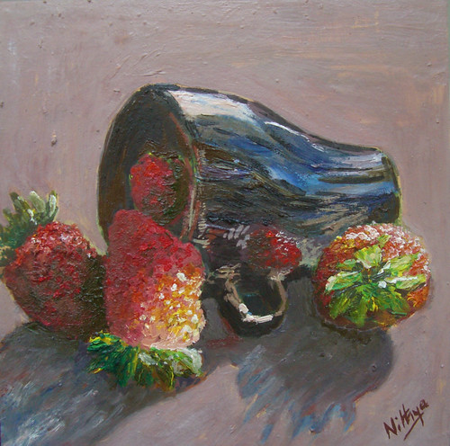
Very Berry - Some more strawberries in Oils
Those who know my still lifes, don't you also know that the top view is my favorite? Hell yeah, I am a complete sucker for the top view, of objects I mean. :-) So soon after I finished painting Toppled, from life, I captured a few images of the set up from different viewpoints, one of which is the quintessential top angle.
 |
| Very Berry Oil on Hardboard, 6 by 6 inches $100 and ships free worldwide Click here to Buy |
There is one more strawberry still life coming, but this one is my favorite among the three. I especially like how the coffee mug turned out in this one, more than the fruit itself. Do you like it? Why not write to me with some comments? I love to hear from you!
 |
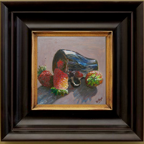
| Very Berry Oil on Hardboard, 6 by 6 inches Framing suggestion |
Let me leave you with a framing suggestion. I love chunky frames as this one and love to see my art in them, even if it is only a collage :) Frames are not included in the price of the painting, this is only a suggestion. I would be very happy to guide you in choosing a frame though, just write in and let me know!
April 18, 2011
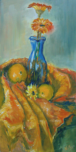
Made for each other! - A Complementary Colored arrangement!
This painting was done yesterday for this week's challenge at the Daily Paintworks is the Color Challenge. Carol Marine had asked the participants to choose a color scheme - triadic, complementary or split complementary and then come up with a painting with that color scheme. I opted in for a complementary scheme of Blue and Orange, which is one of my favorite schemes.
I set up this still life at home and painted it from life. Last time I used the same vase and some oranges for my paintings Blue and Orange and Blue and Orange #2. Both of those were done with the limitation of using one color per stroke, completely out of my comfort zone. So I went it for a set up as simple as possible. This time however, I wanted to have orange as a dominant color, so brought in some orange fabric as well. Been a long time since I painted fabric and boy do I love it!
 |
| Made for Each Other Oil on Deep Cradled Panel - 8 by 16 inches $250 and ships FREE Worldwide Click here to Buy |
Instead of making it completely blue and orange, I thought I would bring in a wee bit of yellow-orange and red-orange, the split complements of Blue in the regular color wheel. Hence that little yellow flower in the middle and some reddish touches in the cloth.
This painting is my first attempt with a deep cradled panel and I must say it is fantastic! There is no worry of warping of the wood and stuff, all I did was one coat of gesso and it could be painted! Awesome! And what more, it can be hung as it is with natural wood colored sides and without a frame. Easy peasy! I even managed a photo hanging it on my wall, though in this photo the colors are not so accurate I must warn you!
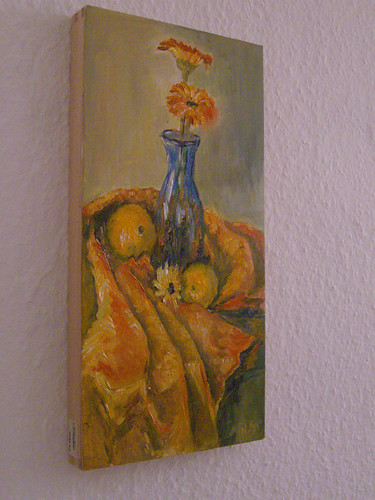 |
| Made for Each Other Oil on Deep cradled panel, 8 by 16 inches |
Would you like to see my set up from which this was painted? I have had many people ask me to write more about the process, my tools and stuff. Well I would have never thought an artist's work behind the scenes would interest others, but now I know that it does interest people and indeed makes them curious. So here it is, a juxtaposed image of the set up and my painting in the same frame. :) Enjoy! I took a similar picture after my plein air last week, and then it struck me today, why not when the life session is at home!? So here!
 |
| Made for Each Other The painting and the set up :) |
How do you like this one? Write to me with all your feedback and anything else! I love to hear from you.
April 13, 2011
Featured on the front page of Artfire!
I am THRILLED to let you know that I am featured on the front page of Artfire! I am their featured artist for today and tomorrow and my profile is right there on the front page with a link to my studio and a short interview. This interview was good fun I must tell you! Do check it out.
Here is a link to the interview - Featured Artist on Artfire - Nithya Swaminathan.
My shop - Fine Art by Nithya Swaminathan on Artfire.
For those who do not know, you can buy art from Artfire even without signing up as a member. That to me is a huge plus and one that makes this site really stand out.
April 11, 2011
Toppled - Luscious, yummy strawberries!
Spring in Germany is synonymous with Strawberries and Asparagus. And as luck would have it, I eat neither. I do not like the strawberry flavor at all and do not consume it in any form. My little one on the other hand loves this fruit. With or without cream she gobbles them up. So we bought a bunch of them and both of us were happy. I set them up first, paint them and then she gets to eat them. The husband sure knows how to keep both women in good spirits. :D
I wanted a simple set up, as usual, and picked up my black coffee mug to contrast the luscious red pieces of fruit. The little reflection on the mug awas a bonus due to good sunlight. This one was painted alla prima from life.
 |
| Toppled Oil on Board, 6 by 6 inches $100 and ships FREE. Click here to Buy. |
And by the way, this spring I have ventured into some gardening and we have a little strawberry plant growing at home. So the next time I feel like painting some berries, I hopefully just have to pluck them and not have to go to buy them. Long time for that, but let's hope anyway.
April 9, 2011
Mirror mirror on the Wall - Some fun with figures!
Every once in a while, I make random searches for images in stock websites and in the reference image library in WetCanvas. Not that I am done painting with all my own images and am running out of stuff to paint, but just to get my creative juices flowing I look at different images, and then work up possible compositions in the mind and so on.
That's how I landed on this image at sxc.hu. And loved it so much that I just dropped everything else that I was doing and got to this. Loved the idea of painting this guy and his very many mirror reflections without showing a glimpse of the face. This one too is painted only with the primaries. No burnt sienna on my palette, though it forms a large part of the painting.
 |
| Mirror mirror on the wall Acrylics on Canvas, 5 by 7 inches $100 and ships FREE. Click here to Buy |
Coming up with a title for this one was great fun. I first named it "Glass Palace", which was of course oh-so-boring and pretty lame. And then I wanted to name it "Infinite Loop". That's the first thought that comes to my mind thinking of these endless mirror reflections. My husband felt that non techies would not get it though and that would be a bummer too. Just then my friend Arvind suggested this title to me on Facebook. He originally said "Mirror mirror on the wall, tell me who can count them all". Since it was too long a title, I just cropped it :)
April 7, 2011
Spring on the Highway - Original Landscape from my backyard
Whenever I thought about doing plein air, I always wondered how I would find the "perfect" spot to paint. How I would identify a great landscape and then capture it on my canvas. This was a mental block of unimaginable proportions let me tell you. And then as mentioned before, I started reading Kevin Macpherson's "Fill your oil paintings with Light and Color" that mentions working from the same spot repetitively so that the same location can be captured in different moods.
 |
| Spring on the Highway Acrylics on Canvas, 8 by 8 inches $120 + $20 shipping worldwide. Click here to Buy. |
And then, I ditched this idea of "finding" a spot. I just went to a place amidst some fields, less than 5 minutes drive from my home and set up my easel there. As I stood there and looked on all sides, I could see at least half a dozen views that I could paint. Phew! So much for hoping that some day one mysterious landscape would suddenly pop in front of me.
The first view I painted was "Ocean of Yellow", a view of the rape seed fields that glow here in Springtime. And when I turned to the other side, I loved this view of the highway with entirely earthen tones except for those little spots of pink. What screams Spring more than flowering trees anyway?! I'd have even painted some more, but it was nearing noon and it became too bright to see the colors properly on the canvas. So the next time around, I hope to start earlier and work plein air. Let's see. Hope you like this one, let me know what you think.
April 5, 2011
An Ocean of Yellow - Finally some plein air!
I have a weird relationship with Plein air painting. I have always wanted to do it, but never got the hang of it really. I tried it once exactly a year ago, but I would think of it as a disaster. I did about a third of a painting and wanted to complete it in the studio and never got to it.
This time, my approach was new and more effective thanks so some knowledge from books. I am reading this book "Fill your Oil Paintings with Light and Color" by Kevin Macpherson, and that helped me get a better understanding of the thought process behind plein air. The last time I tried it, I just set up my easel, made a mental note of what would be my boundary and started sketching right away. I mean directly on the canvas. And oh, the book is lovely! It is not an art instruction book that gives you how-tos, but it makes you think with the help of a lot of images provided. I love it.
 |
| Ocean of Yellow Acrylics on Gallery wrapped Canvas, 8 by 8 inches $120 + $20 shipping worldwide. Click here to Buy. |
So this time around, things were different. I went with a view finder proportionate to my canvas size, decided on my view, sketched it entirely first on my sketch book and then started painting. And I deliberately made an attempt to squint a lot and see the values. It was great fun. This time since my approach was better, the whole process was indeed a lot more enjoyable.
Also, I painted this entirely with the primaries. No green anywhere on my palette. I went in for a palette of Alizarin Crimson, Ultramarine Blue, Cadmium Yellow Pale and Titanium White, also as suggested in Kevin's book. While this makes the painting great fun and makes me think better in terms of colors and color temperature, I love the fact that it makes traveling so easy with paints. Just 4 tubes and I am ready to go! Is that fun or what?! I hope to write in more detail about my learnings from the plein air session, so stay tuned.
April 3, 2011
Splashing Around - Sun, sands and some kids!
While I can sit for hours together all alone at a beach, the other thing that I greatly enjoy is children playing in the sand and water. It makes me very nostalgic and I get transported back to my childhood when playing with cousins and friends at the beach was such a regular affair. I loved this boy running around in the water.
 |
| Splashing Around Oil on Board, 6 by 6 inches $100 and ships FREE. Click here to Buy. |
I added the bigger male figure in the front to bring in more distance into the frame. I was quite in a double mind whether or not to add the bigger figure, then went for it. What do you think of it? Do you like the painting? Do let me know.
April 2, 2011
Crossing Paths - More fun on the beach
As soon as I finished Sand Castles and Looking at the Horizons, I was in that zone and had this urge to paint a couple of more pictures of children. And this was the outcome! Let me know what you think.
 |
| Crossing Paths Oil on Board, 6 by 6 inches $100 and ships FREE. Click here to Buy. |
April 1, 2011
Bleeding Blue! - Stuff of a billion dreams!
As I mentioned in my post on Daffodils, the cricket World cup is going on and guess what, India are playing in the final tomorrow! Whoooo! This painting was completed after their semi final win over Pakistan on Wednesday. It was a great exciting match and this is my way of celebrating my team's victory.
It is a palette knife painting of a blue tulip! I was looking for some blue flower to paint, and while I was looking for references with mainly bluebonnets in mind, I was rather pleasantly surprised to find a blue tulip! So started it right away.:) Let me know if you like it!
 |
| Bleeding Blue Oil on board, 6 by 6 inches $100 and ships FREE, click here to Buy |
It is probably the most cherished dream of any Indian, that our cricket team must win the coveted cup. And tomorrow is a great chance for us, I really really hope we pull it off. The last time we were in the final, in 2003, we were beaten black and blue by Australia. It was so disappointing as my whole class was watching the match with so much of enthusiasm in college. The last edition in 2007 was a very forgettable outing for us. So this is definitely our best chance. Sri Lanka, the team we are playing against, are as tough as opponents can get, but then let's see. I think the momentum is with us.
March 31, 2011
A FANTASTIC Blogger improvisation for Art blogs - Try it NOW!
Blogger has launched "Dynamic Views" today, where you can choose how you want to view a blog. It is essentially how a viewer who lands up in your blog can easily view the most important stuff your blog has to offer.
 |
| Palette Knife Painters "Mosaic View" |
Why it is a love at first sight?
No brainer really, isn't it?! For an Art blog, instead of having to scroll down and view post by post, if you can see all the images at once, doesn't it capture the attention of an audience immediately? It gives you a portfolio view of your work, right here on your blog. Awesome isn't it!
Biggest advantages?
Biggest advantages?
I'd jump in and say art bloggers stand to gain the most. I'd also add food blogs and of course photography blogs. Essentially any image intensive blog will benefit immensely from this. I know so many awesome food blogs with such mouthwatering pictures, which I am sure if seen in a portfolio view, the readers would be all the more tempted to check out the recipes.
With the normal blogger view, there is a limit on the number of posts that one can see. And on an average if we have one image per post, it limits the number of images on the front page as well. However, with these views, the images are loaded on the homepage. This, however, doesn't slow down your website. The images are rolled as you scroll and not during launch, so you cannot believe how super fast the page loads.
With the normal blogger view, there is a limit on the number of posts that one can see. And on an average if we have one image per post, it limits the number of images on the front page as well. However, with these views, the images are loaded on the homepage. This, however, doesn't slow down your website. The images are rolled as you scroll and not during launch, so you cannot believe how super fast the page loads.
Views allow Sorting
In the flipcard view, there is this great feature where you can sort the images by date, author and so on. Imagine how awesome this would be in a group blog like Palette Knife Painters that I am a part of, to easily see the posts by various authors. You know what, personally it will be very useful for me for Palette Knife Painters, as I often forget which are the paintings I have blogged there. Now I have a ready reckoner!
Which is my favorite view?
I love the "snapshot" view, because it gives all the images and the post titles too. The other views do not give the post titles. I somehow like images with titles and find this view best. Check out A Splash of Color in the Snapshot view. The numbers next to some of the posts show the number of comments in those.
How to view your blog in dynamic views?
 |
| A Splash of Color Snapshot View |
To view your blog in these different styles, type append /view to your blog address, like http://nithyaswaminathan.blogspot.com/view, and have fun with it! Oh boy! the "normal" blogger looks oh-so-boring now!
What if you don't like these views?
Dynamic views are enabled by default, and you can disable them however. If you want to disable this feature and do not want your blog to be viewed dynamically, you can do so by Logging into your blogger dashboard ->Settings->Formatting->Enable Dynamic Views. Select "No" there and save it. But trust me, if you are an art blogger, you will love it. Try it out right now!
So, which is your favorite dynamic view?
March 24, 2011
Daffodils #2 - Celebrating Spring and an Indian win!
I was not really planning to paint today, as I had so much work and there was a crucial cricket match going on between India and Australia. I was so occupied the whole day and the match was more important than anything else. For those who do not know, I love watching sports. Cricket, Tennis and Formula 1, in that order.
 |
| Daffodils #2 Oil on Board, 6 by 6 inches $100 and ships FREE, click here to Buy |
 |
| Daffodils #2 Framing suggestion. |
It is common knowledge that when you want something really bad, the whole universe conspires to make it happen. I did not really want to paint today, but the universe conspired nevertheless. We were having some issues with our work systems, and India were looking to snatch defeat from the jaws of victory in the match. To keep myself sane and not keep swearing at the cricket players on the TV, I went into my studio for refuge. :)
It so turned out that just after I switched off the TV and went in to paint, the match swung in India's favour and we pulled off an awesome win. Hurray! We have now sent the three times World Champions packing home! So being the superstitious self that I am (only when it comes to matches), I'll probably follow this pattern for the next couple of matches too. But then, I may not. Why give up on some excitement. Anyway, I am thrilled today and quite happy with the painting too. Let me know what you think!
March 23, 2011
Update on the Help Japan auction
I had submitted two paintings for the Help Japan challenge at DPW. I am very happy to note that both paintings have been bid upon for $50. I'd like to thank whoever has bid on my painting, I do not know who it is yet.:) The auction will run till this weekend and you can still bid at a higher price.
I also donated one more painting today, an old one of my red tulips. Yet another palette knife painting with acrylics.
 |
| Looking at the Horizons SOLD |
My painting will be shipped unframed, but doesn't it look cool with a frame? Let me know what you think.
You can bid on my paintings here -
Over $12000 has been raised so far, the auction is going on really good. There are nearly 300 pieces of original art available for bidding, do consider bidding in the auction on your favorite piece. It is being donated for a great cause, please spread the word.
Welcome Spring! - Textured Oil painting of a daffodil
Is it any secret that I love the German spring? I simply can't get enough of it, and it is definitely my most favorite season of the year. The daffodils have been in bloom for more than a week now and I was waiting for some good sunshine to take pictures. Got some nice references of the flowers today and got to painting them.:) I missed painting the daffodils last year, so did not want to miss them this time around.
 |
| Daffodils #1 Oil on Board, 6 by 6 inches $100 and ships FREE, Click here to Buy |
During spring, more than the flowers, I love the spring green of the leaves. It is so heartwarming to see leaves after the long barren winter. This year, touchwood, the winter in Germany has been rather short and extremely mild. We hardly had any snow after Christmas and the temperatures have been pretty mild.
 |
| Daffodils #1 (framing suggestion) |
I have also provided some framing suggestions, and will be glad to assist you in selecting a frame that will suit your decor. Let me know what you think of the painting.
March 20, 2011
Looking at the Horizons - Art auction for Japan
One more painting that I am donating to the cause of Japan. This Acrylic Painting is done with the palette knife and is textured. Click on the link to zoom in to the painting and see the details. Bidding starts at $50 and runs for a week.
 |
| Looking at the Horizons Acrylics on Board, 6 by 6 inches SOLD |
Sand Castles - Art auction for Japan
This week's challenge at Daily Paintworks is a fund raiser for the cause of Japan, with the theme being "Home". Home is where the heart is, and to me, it is always in Madras, South India. That's the city that I grew up in and the one that is closest to my heart. It being a coastal city, the first image that comes to my mind when I hear "home" is undoubtedly the beach.
The beach has been an integral part of our lives and no trip to Madras is complete without a visit to the beach. Since we are a tropical city, the water is always warm and soothing and I simply LOVE standing at the shores with the waves lapping up my feet. I can sit there for hours together and just keep watching the waves, which I mentioned in my painting "Wave watching" too.
 |
Sand Castles Acrylics on Board, 6 by 6 inches SOLD |
This painting is a precious memory from my childhood. This painting is done with the palette knife and is textured. I have uploaded a hi-res image at the DPW site and you can zoom in to see the details. This feature is really cool! You can see the texture generated by the palette knife.
I hope you like the piece. Bidding starts at $50 and I ship worldwide. Please spread the word.
March 12, 2011
Art for Japan - A fundraiser for the Tsunami Relief
An update:
Artists at Etsy, I am sure most of you would have seen this already, but sharing it once again here -
Artists at Etsy have also been brainstorming ideas to set up a collective shop for charity purposes, but the Admin's stance is not yet clear on this. I will continue to update this post as and when some concrete information is available.
Meanwhile, I am making this fundraiser active on my Etsy and Artfire stores. For every painting that is purchased.
This is an attempt to help the earthquake and tsunami victims of Japan in a small way, and I will be donating a THIRD of my sales to the Red Cross. By purchasing an original painting from me, you could donate an amount starting from $10 to the Red Cross towards the relief efforts.
Artists at Etsy, I am sure most of you would have seen this already, but sharing it once again here -
- Japan disaster relief - how to help.
- Artist Aid team at Etsy
- Joy for Japan team at Etsy - follow the discussion
Artists at Etsy have also been brainstorming ideas to set up a collective shop for charity purposes, but the Admin's stance is not yet clear on this. I will continue to update this post as and when some concrete information is available.
Meanwhile, I am making this fundraiser active on my Etsy and Artfire stores. For every painting that is purchased.
This is an attempt to help the earthquake and tsunami victims of Japan in a small way, and I will be donating a THIRD of my sales to the Red Cross. By purchasing an original painting from me, you could donate an amount starting from $10 to the Red Cross towards the relief efforts.
This is not an auction. The prices of my paintings can be seen in my stores roughly a third of the sales will go towards the relief efforts in Japan. For EVERY painting that is sold, I will donate 1/3 of the price to the Red Cross. This will mean $10 for the small paintings priced at $35, $20 for my $60 paintings and so on.
About the paintings -
- My paintings are all done with high quality Acrylic and/or Oil paints.
- Most of the pieces are done with the palette knife and hence textured.
- I will ship them varnished (unless you specifically tell me not to) so that you can frame them with a standard store bought frame. I use a UV protecting varnish with a gloss finish.
- The paintings can be framed without a glass and I will be more than happy to offer framing suggestions.
- Since I paint in a series, you could frame a set of 3 or 4 similar themed paintings together and they would make an awesome collection.
- Most importantly, each piece is an original, one of its kind, signed and dated by me. I do not sell reproductions.
Please spread the word. Thank you.
P.S: There is no need to "sign up" in order to purchase a painting from Artfire. Guests can make purchases directly and it takes less than a minute.
Seduction - Palette Knife Tango painting in Oils
By now I am sure it would be very evident that I love painting the Tango and it is such an oft repeated motif in my work. I just thought how it would be to do without the legs for once. Most of my Tango paintings, if not all of them, primarily have red and black in the palette. I also went in for a different palette doing away with red and going in for a lot of browns.
And this painting is much larger than my other Tango pieces. Let me know what you think. I did not like it that much initially, but now I like it. After setting it aside for a while I did not want to change anything about it, which is a good thing.
And this painting is much larger than my other Tango pieces. Let me know what you think. I did not like it that much initially, but now I like it. After setting it aside for a while I did not want to change anything about it, which is a good thing.
 |
Seduction Oil on Canvas, 16 by 16 inches |
This painting is done from a lovely photograph on flickr by Sungnicholas, used with the permission of the photographer.
March 9, 2011
Blue and Orange #2 - Original Still Life
Have I told you how I paint? Mostly sitting on the floor. Not even mostly, make that close to 95%. Unless I am extremely motivated to stand in front of the easel or sit at the table, I perch myself in a cozy corner on the floor and I can stay put for as long as I want.
So I was sitting with this still life from Blue and Orange in front of me. And in between the session, I just got up to fetch myself some coffee and was taking a critical look at my work in progress. It so happened that I also glanced at the set up itself, from above and liked it even better. Thank God I did not stop my previous painting half way and start with this one.
 |
Blue and Orange #2 Oil on Canvas, 5 by 7 inches |
As soon as I wrapped up Blue and Orange, I rearranged some of my stuff and painted this one standing at the easel for a change, for it was a top view that I was painting. An oblique top view infact. And I like this one much better. By then I was a little familiar with the whole "mix anew and lay each stroke" approach, besides the painting itself being smaller. I like this one quite a bit. Which one do you like? Do let me know!
Subscribe to:
Posts (Atom)