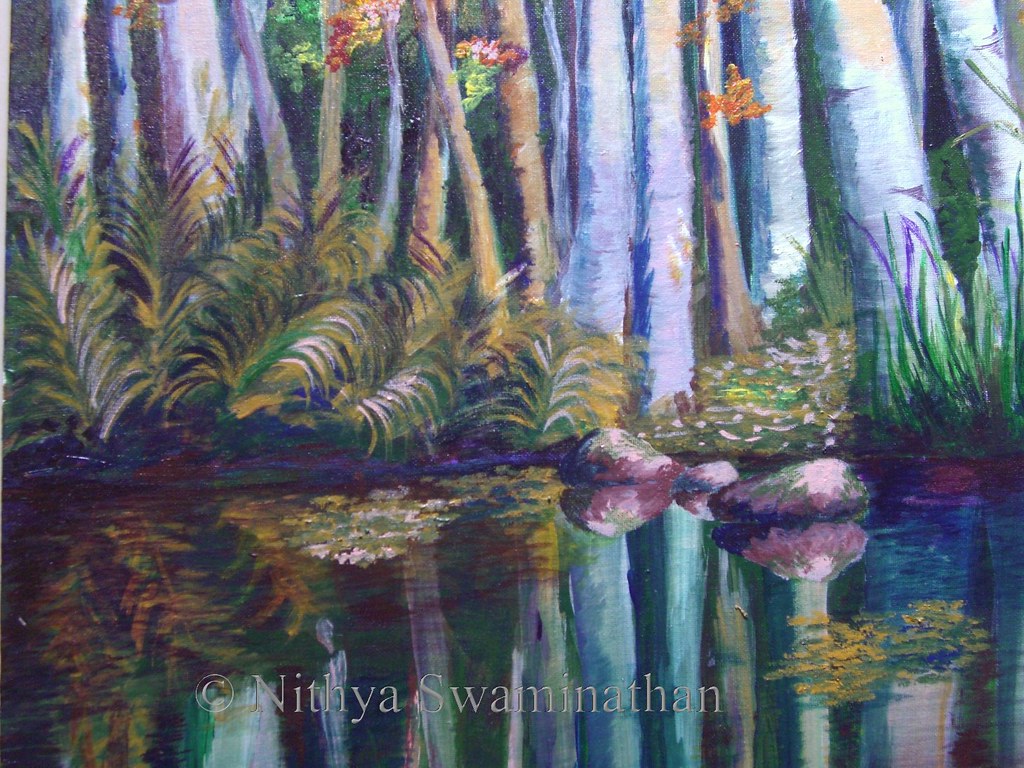
Did anyone feel that my maples were a bit too yellow last time? Well I felt so, and I had to do something about it. That’s probably not the only reason why they look like gulmohars and not maples, but I wasn’t too happy with the leaves. I added some flesh tint on them to make them brighter, and darkened the crimson on the other side.

Autumn Woods
Acrylics on Canvas, 18 * 36 inches
(c) Nithya Swaminathan
Original Available
In my
previous update, since the leaves had a lot of yellow and were surrounded by more of green and yellows last time, they were getting lost in the grayscale. The barks had a good range of values, but the leaves looked quite flat. I have changed that by adding a lot of dark blues surrounding the leaves, to push forward the maple leaves. And then I correspondingly reduced the yellows in the sunlit areas of the birch barks as well.
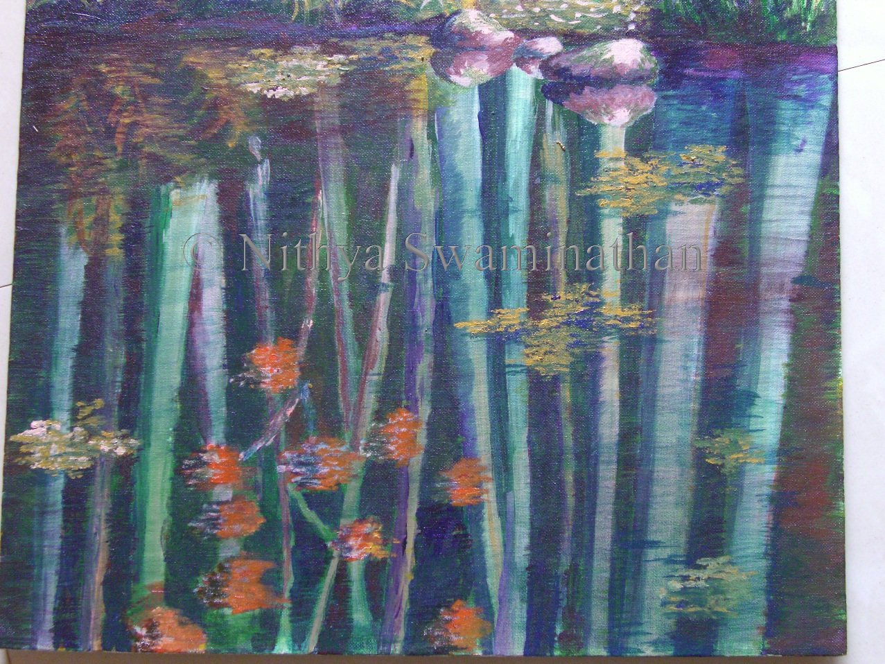
Some closeups of the painting for you guys. First is the closeup of the reflections. The reflections have been done by adding the barks first as bright as possible, and then doing several washes of blues and greens, and some browns here and there. Finally to get a better feel of water, I have added some dried leaves floating here and there. I am pretty happy with the reflections overall except for those of the maple leaves. The orange kinda sticks out. I have already got suggestions to tackle it, will probably be washing it over with some darker hues.
Autumn Woods - close up
(c) Nithya Swaminathan
This is a closer look at the middle part of the painting, the ferns and their reflections. This is also my favorite portion of the picture, the part that I am really happy about. I went about randomly doing the ferns but they turned out quite well.I also added some highlights on the ferns. And instead of having the bushes on either side look alike, I made one side have tall grasses. And the middle part is supposed to be a path of some sort, though it may not look like one.
Autumn Woods - close up
(c) Nithya Swaminathan
As I had already mentioned in the previous post, I felt like adding a couple of rocks in the middle. They look really nice, I can tell you. I like the mood that the rocks add, I feel like gingerly stepping on them and walking into those woods, ha!
Autumn Woods - Greyscale
(c) Nithya Swaminathan
Finally, a look at the grey scale, to determine the values in the painting. In this version, I am able to differentiate the background foliage from the maple leaves, which was missing in the previous version. I am fairly happy again with this as well.
While I was checking out
slide.com, I just put together the WIP images of this painting and got a slide show done, aint it cool? Shows the flow of the painting from scratch to finish, more importantly shows me my own thought process, how I went off track at several places etc etc. It provides a good learning for me.
Here is a link to this
thread at
Wetcanvas. Have a look at the amazing results produced by the other artists as well. Such different paintings produced from one image. Awesome fun!

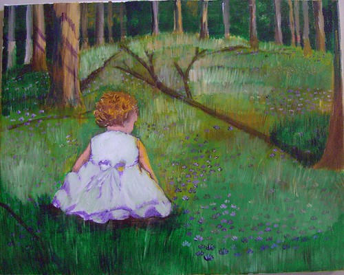
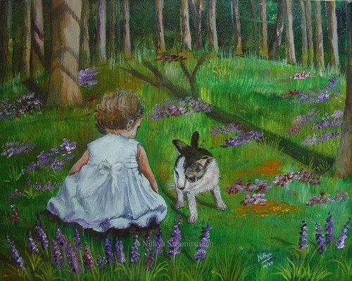
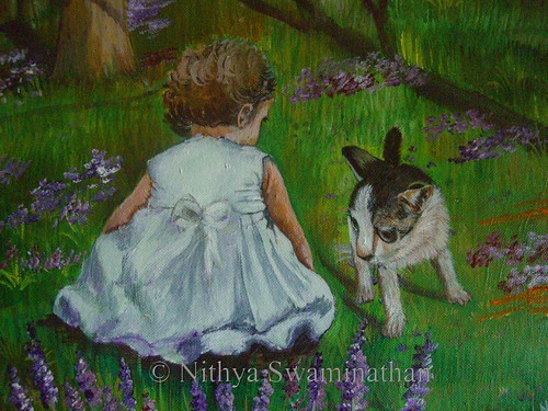
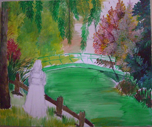 Me time - stage 1
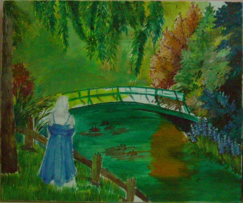 Me time - stage 2
 Me time - stage 3