When you study some masters and are greatly inspired by them, actually seeing the paintings for real is an experience quite unmatched. Such was my state of mind when I saw not one, but around 40 Rembrandts in flesh and blood, at the
Rijksmuseum, Amsterdam.
Rembrandt Van Rijn, obviously the most popular amongst the Dutch masters of the
Golden Age, is one artist whom I admire hugely for his masterful usage of darks in order to get dramatic lighting. They say if you want to paint light, paint the darks first. This is true, because only proper darks and shadows with bring out the effect of light. And this is showcased best by Rembrandt.
Blame it on my lack of knowledge, I thought that Rembrandt painted realism painstakingly. But then that wasn't the case. He painted realistically only the focus areas, giving them a lot more detail than the 'out of focus' areas. They were done effortlessly and that kind of increased the effect and completely draws the viewer to the focal point which he aims. It has to be seen to be believed!
 One more thing that strikes me is the splendid usage of black in his paintings. This is the case with not only Rembrandt, but a lot of the Dutch masters. They use black extensively, be it in the clothes or in backdrops. My art teacher used to vehemently prohibit us from using black paint as is from the tubes. She always insisted that no shadow or object is absolute black and it is formed by mixing other dark shades instead. I followed it blindly many years ago, and then saw that it was true. The more and more paintings I studied, more real life objects I closely observed, I understood the meaning behind her statement. It is amazing though how these masters have used the color to create the best possible darks and bring in an atmosphere to their paintings.
Rembrandt’s paintings show very clearly his strong brush strokes, and it is believed that he used the bristles and the back of the brushes also to create impressions like fine hair. In his first self portrait seen above, when he was aged just 22, the hair is so masterfully done. After dabbing a lot of dark colored paint, he has scratched on the wet paint using the back of his brush. This creates a great suggestion of hair and looks extremely real too.
 My favorite amongst the Rembrandts was the Jewish Bride. The audio guide mentioned that it was Vincent Van Gogh who said that he could spend 10 years of his life sitting there just looking at that painting, and surviving on stale bread. Coming face to face with the masterpiece, it isn’t surprising that he made such a statement. The focus in the painting is on the sleeves of the guy, one that shines in gold. To get the shine, the artist has done an under-painting in burnt sienna, and then followed it up with huge amount of yellow (and some ochre, I think) dabbed with a
palette knife. It gives an unbelievably realistic look to the sleeve, as if it shows every crease possible. But going closer, we would note that it isn’t detailed as a photo realistic painting. The forms are only suggested and terrific values established with the under-painting and the palette knife. Also, photographs will not really capture that 3D effect the painting has.
The genius of Rembrandt can be seen in how he has handles the shadows of the lady’s fingers, and also give glimpses of red on the man’s sleeve, which is nothing but the red reflected from the lady’s dress. One more point which I wouldn’t have noticed if not for the audio was a tiny black outline on the lady’s thumb, which goes to show that she is not resting her hand on his body, but it is away from it. Mind blowing! I just stood there in front of it for a long time, just unable to take my eyes away from it. Though every Rembrandt is a stunner, this one just blew me away, totally! I wouldn’t mind going there again just to see this one.
 Another one of my favorites from Rembrandt was the painting of Anna, the Prophetess. This is a profile of an aged woman with diminishing eye sight reading the Bible with the help of her fingers guiding her through the lines. The focus is on the “reading hand” and not the face of the woman. Rembrandt depicts every single wrinkle in that hand, he probably wanted to show in terms of folds all the experience in life she had. Apart from the hand, everything else is shown in less detail. It is not impressionism per se, but it is done in a loose style. The lighting of this painting is also brilliant, the light rays fall on her reading hand. Her face though lacks any detail, and is almost hidden in the shadow.
There is another painting of Anna and Tobit with a lamb, which conveys a great deal of emotion. The story is something like Tobit suspected Anna for stealing the lamb and later regretted it. I do not know the story too well, and it hardly matters anyway. Suffice to say that whatever emotion is conveyed in the story is captured masterfully in the painting.

One more painting that had a religious connotation was
Jeremia Mourns. The painting is of the destruction of Jerusalem, and
Jeremia, a prophet laments this sitting alone. The story mentions that he had prophesied this event, but he could not prevent it. The emotion that's conveyed in the painting is one of immense pain and grief, and its fantastic. The focus is on the prophet's face and each wrinkle in his face shows the amount of pain. Here again, in doing his bears and hair, Rembrandt employs the back-of-the-brush technique. The ornamental shawl is also exquisitely done.
The photograph here looks as if the top left of the painting is entirely dark with no detail, which is not the case. What is shown there is a lot of troops marching into Jerusalem, a fortress, people attacking each other etc. War and destruction depicted with great lighting but not very intricate detail. This photo obviously doesn't do justice to the painting.
 Though Rembrandt was a master of the portrait, his landscapes were no less spectacular. There is only one landscape by him in the museum, called the Stone Bridge. This piece uses the same dramatic lighting that he employed in his portraits. The photo again does not capture the complete detail in the painting. I loved the clouds in this one, very very dramatic. And in the foreground, there is a lot of detail not shown in this photo. There are people walking, one man carrying some load and going, one family going with a cart and so on. It is one of my favorites in the museum.
 And then, The Night Watch. This is the most famous painting in the museum, and it occupies an entire wall. It is absolutely gigantic. The painting is a group portrait with terrific light and shade. The scene is that of some militia men marching out of a gate. There is so much of movement in the scene, because the men are not static. They are marching and this effect is achieved in their various postures which are all distinctly different.
The focus is on the lieutenant in the front, and the little girl in the middle who is a mascot. It is interesting to note that both these "objects of interest" are not bang in the center. They are slightly off-center, adding interest to the viewer. So much attention is give to the fabric worn by each person, their collars and the expressions on their faces.

Though the night watch is the most popular painting in the museum, and probably the most popular group portrait, my favorite group portrait is another painting,
The Sample Officials. This painting captures more than just faces, it just captures a snapshot of a moment in time, frozen forever. And that is awesome to say the least!
There are 6 men in the picture, and each of them is so unique in posture and expression. They are officials who sample the quality of cloth produced and hence the name for the painting. It is as though the room in which these guys are is slightly raised. As in you open the door, walk up a couple of steps and then these guys would be sitting there. Now, if someone entered opening the door and they all notice this, this is how the moment would be. All of them seem to be looking in one direction, towards the visitor. The cloth is also so wonderfully done. From a distance, it will look like the red cloth is done in intricate detail, which is far from true however. In the focus area where there is light, there is some (not much) detail of golden threads etc. This gives the viewer an impression that the entire cloth is detailed. It is however just red and sienna dabbed randomly with no detail whatsoever. The focus is actually not on the cloth, it is on the faces and they are brilliant.
Some other paintings of Rembrandt that I loved are his other self portrait when he was 55, then some more portraits of other people, specifically one of a young rich woman where he is at his detailed best. Her dress, collars and ornaments everything just oozes detail. I wanted to put in my first thoughts about all the Dutch masters in the museum, but Rembrandt has awed me so much that I am running out of space. So all the other masters, some other day.
All the images in this post are copyright Rembrandt :-)
For further reading -

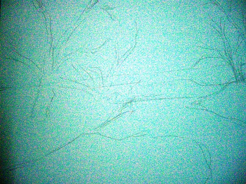
 Seen above is the initial sketch done freehand and directly on the canvas. This is also an attempt to paint as loose as possible, so I have deliberately avoided giving any details in the sketch.