November 26, 2008

Sketching from life - tomatoes and jar

Started this still life from life. We got a new pickle jar and I thought I'd use it first before any pickle gets into it :-) I like still lifes where the fabric forms a part of the background also. So set up my fabric in that matter. I did the folds meticulously like those in a sari, and set it up behind my jar, so that the folds flow unidirectionally into the foreground.

Here is my sketch from life, which would be the basis for the painting that would follow shortly. The sketch is in colored pencils as usual.

Untitled - sketch from life
Colored pencils on paper
Copyright Nithya Swaminathan

I am yet to start the painting, so if you have any suggestions/crits before I put my brush onto the canvas, they are more than welcome. Thank you!

November 22, 2008

November Virtual Sketch Date

This time around the VSD image is a landscape. I was not very excited about the image at first, since I was in a still life mode of late and was expecting one. :-) But had a blast doing it. I went in for a very loose style, no sketching whatsoever. Just painted as I felt like. It is Acrylics on Paper.

Shadow Play
Acrylics on Paper, 6 * 9 inches
Copyright Nithya Swaminathan

Be sure to check the Virtual Sketch Date blog tomorrow to see all the entries. I am really looking forward to it.

November 20, 2008

Apples and lace - completed

Apples and Lace, Acrylics on Canvas, 12 * 16 inches.
Copyright Nithya Swaminathan
Email me for purchase info
Prints available here

It isn't easy painting from life with a toddler around. She was waiting to disturb my arrangement and I had to give up after a lot of efforts! Anticipating this I had anyway taken a backup photo of my arrangement so completed the painting from the image.

I have done more work done on the fruits, and given some final highlights on the cloth and the basket. Touched up the shadows on the table as well. This is done and signed now, and I am pretty happy with the outcome. However, any last minute tweaks or suggestions are welcome. Let me know your thoughts.

Apples and lace - some more progress

This is taking longer than I expected, mainly because of the laced cloth. It is taking a lot of time to get the laced effect, yet not go photo realistic, proving o be a big challenge. I am not fully convinced yet with the cloth, it is not done yet, but about 80% done.

My progress so far -

Apples and lace - stage 5
Acrylics on Canvas, 12 * 16 inches
Copyright Nithya Swaminathan

I would like to have your comments on the fabric, does it look "lacy" enough? Is there anything that can be improved? A fresh perspective would always be useful, so let me know folks.

November 18, 2008

Apples and lace - a minor update

Apples and Lace - Stage 4
Acrylics on Canvas, 12 * 16 inches
Copyright Nithya Swaminathan

Got some work done on the fabric, have started the lace dropping down on the table. Lots more work to be done, here is the image as it is now.

November 16, 2008

Apples and lace - Painting from life

Apples and lace - Sketch
Acrylics on Canvas, 12 * 16 inches
Copyright Nithya Swaminathan

While I was cleaning up my house, I found this little basket. I found it very interesting that I was compeled to use it in a set up. There were also 5 small apples that would fit inside my palm, and some laced cloth. I was playing around with some arrangements and zeroed in on this one.

I am painting this one on black for two reasons. The first reason is that the canvas was shelved coz it had a painting that really did not take off and I am painting this over that. So I have done a coat of black and started afresh. The other reason is that I want to experiment painting on black. I have never worked on a colored surface before, so doing this just as a break.

Apples and lace - stage 2 Acrylics on Canvas, 12 * 16 inches Copyright Nithya Swaminathan

I have first done the sketch directly with white paint, a rough outline. The sketch isn't perfect but I go ahead hoping to correct it while painting. I have then done a mid-tone filling for the apples and the background. This is my usual approach that I was taught by my teacher years ago. It always works fine for me, for any painting. I first do a filling in the mid tone, and then add details with the darker values. I add the lighter values in the end and highlights in the very end. The previous still life was the first time I worked from dark to light, and with this one I am going back to my usual approach. The green seen in the picture has nothing to do with this painting, it is the remnant of what was previously on this board.

Apples and Lace - Stage 3
Acrylics on Canvas, 12 * 16 inches
Copyright Nithya Swaminathan


I have then done the table and the basket again with a mid tone. The advantage of using a black base is that the darkest values can be easily established, and that adds a punch to the painting. The shadows of the apples here for instance, I have left them as it is. Ofcourse, I will be adding some lighter values. Same holds good for the shadows in between the lace, they have been left as it is for now.

The left most apple (to the viewer's eye) is looking like it is hanging in mid air, which is not the case. I will be correcting it as I go forward. This should be done in a couple of days and I am looking forward to it. After the decent attempt with the previous still life, I gained some confidence to work a little larger (with my set up that is), so this is 12 * 16 inches on canvas. Watch this space for more updates, and I promise really soon.

Some exciting news!

I just had my first ever S-A-L-E!!! Not an original yet, I just sold a print of a painting on Imagekind. Still, what the heck, its a sale and I am rather thrilled. This is not the first time I am making money from my art. I have done private commissions, and I am also a published illustrator of a magazine. However, this rather miniscule sale is the most precious to me. That's because this is the first time I have sold something that I did for myself. Not something that a customer wanted me to do, but something that I wanted to do. The confidence this boosts up is quite unimaginable I should say. Something I did not feel even when I landed a dream job! Be rest assured I am not getting carried away, but I have this new wave of self belief instilled in me and that cannot be denied. Someone willing to pay for my art, I tell you the feeling is priceless!

This is the painting that I sold, and my gallery at Imagekind is here. I am adding more images to my gallery, keep checking it from time to time. If you find any image on my blog but not available as a print, please feel free to mail me and I will make the same available.

Moving on to other things, I have just started another still life from life. I contemplated again about the sketch and then paint approach, but decided to try another approach this time. I am painting directly from life. It is another attempt at fabric, lace this time. That is for another post altogether, and that would be tomorrow.

November 15, 2008

Thinking beyond canvas!

I love the challenge of painting on different surfaces, and it is something I keep trying from time to time. From sanded paper to light bulbs to human faces, I have tried a wide range of surfaces. Latest in this list is a leaf. A real peepal leaf that is awesome to paint on.

One still life on another!
Mixed media on leaf
Copyright Nithya Swaminathan


The leaf was dried and painted on the back side. The image is done after an old masters still life, which is the easiest way to get a pleasing arrangement :-) I haven't done many florals before and I am not too excited about them in general. However, I felt this image was perfect for the shape of the leaf. The leaf is terrific for oil paint and not so much for acrylics that are water based. It absorbs more paint and lacks the lustre that it has with oil paints. The biggest challenge is to complete the painting without tearing the leaf, more challenging with my daughter around! I will not delve deeper into the process, anyone who wants to give this a shot and is looking for guidance can just shoot me a mail.

The natural color of the leaf served a very good backdrop that I decided to do without a painted background. Since I will be mounting this piece on a black backdrop anyway, it was better to leave the leaf as it was. Now my biggest dilemma is how to frame this one. I wonder if it will take varnish on it, or can it be framed without varnish? Anyone out there who can help me sort this out?

Ofcourse, your comments and critiques are welcome.

Primary Colors - Completed

Primary Colors - Completed
Acrylics on Canvas, 8 * 10 inches.
Copyright Nithya Swaminathan.

Managed to complete the still life today. Lightened up the background, on the right side. Then touched up the apple a bit adding some lighter values. Majority of the work though was on the folds, getting them in decent shape was an ordeal!

Though I had a bad photo as a back up, I did not have to really look into it. This was done entirely from my sketch and I am very happy about it. Looking into the photo would have only hindered my progress as there was a minor change in viewpoint.I had a lot of fun working on this one. Feel free to post your comments and critiques. Here is a slideshow showing the transitioning of the painting through various stages.

November 14, 2008

Painting upside down - a challenge

Walking on the ceiling!
Watercolor pencils on paper, 10 * 10 inches
copyright Nithya Swaminathan

This week's challenge at Karin's Different Strokes blog was to paint this walker upside down. In her pep-talk accompanying the reference image, Karin makes a valid point about trying to paint what you know rather than what you see. That would not happen when painting upside dpwn.

With this approach, I followed the reference and the patterns of light in it. Blindly painting what I saw! I did not alter the image in any way, as that would probably mean flipping the image and I wanted to avoid that at all costs. It was super fun I should say. I also went ahead and signed the painting as it was painted, so if viewed in the right direction, my signature would be upside down :-)

Walking on the ceiling - viewed upside down
Watercolor pencils on watercolor paper, 10 * 10 inches
Copyright Nithya Swaminathan

When painting normally, I have the habit of viewing my canvas in the mirror every now and then. That kind of guides me if I am in the right direction or not. It works like a charm especially for portraits, as mistakes will stick out in the mirror image. This time around, I had to hold my temptation from turning the image :-) That was the most difficult part of the challenge, so to say.

Here is the link to the weekly challenge, have a look at others' interpretations.

Also, watch this space tomorrow for something totally different from me. That is besides the final image of the still life.

November 12, 2008

Primary colors - painting from my sketch

When I did my sketch from life of this still life set up, I did not really plan to paint it later. I wanted to enjoy sketching and thats it. That changed now and I decided to paint it, using only my sketch as reference.

It is fun to paint this way. I get to paint my own set up without the time/light constraints of working from life. And more importantly, I get to evaluate my sketching skills as well.

Primary Colors - reference


Since this is just a beginning in a new direction, I decided to start small. This is done on a gallery wrapped canvas of size 8 * 10 inches.


Primary Colors - preliminary sketch
Acrylics on Canvas, 8 * 10 inches
(c) Nithya Swaminathan


I have always been inspired by Celeste, one of my favorite acrylic artists. She does such gorgeous still lifes, and does them so effortlessly. One of the techniques she uses is a Burnt Sienna underpainting to block the values in the picture. She consistently gets awesome results with the underpainting and I decided to do give it a shot too. This is the first time I am trying this.

Primary Colors - stage 1
Acrylics on Canvas, 8 * 10 inches
(c) Nithya Swaminathan


The idea is to use only only color, burnt sienna and do all over the painting. The paint is kept a little watery in areas that are lighter in value. For the lightest regions, there is more water than paint in my brush. When the colors are applied over this, getting the values right is much easier and I don't have to break my head over it.

Now onto the colors, here I have done just one layer on top of the underpainting. I deliberately kept the paint a little watery so that my values are still visible beneath.

The painting is quite "flat" now, with only 3 colors - lemon yellow for the sweet lime, crimson on the apple and cobalt blue on the fabric. I have left the background as it is.

Primary Colors - stage 2
Acrylics on Canvas, 8 * 10 inches
(c) Nithya Swaminathan


Then I start adding details to the objects and I am almost done now with the background, and both the fruits. The sweet lime now looks like a pear, to my horror! I will fix that in the end. The apple is done I guess. The right side of the background will also be made a little lighter. Have just started on the folds, and they are driving me crazy already.

Primary Colors - stage 3
Acrylics on Canvas, 8 * 10 inches
(c) Nithya Swaminathan


I realized while painting that I have actually done a decent job of sketching. I am able to make out most of the folds. I only wish I had taken a better photo of the set up, as a back up. But who knows, if I had such a back up, I might have never got to this!

So this is my progress so far. There is still a long way to go, and I hope to complete this today. Feel free to give in your critiques. Let me know if the fabric is all crap! Or anything else for that matter.

Testing the waters

Testing the Waters
Mixed Media on Canvas, 6 * 9 inches.
copyright Nithya Swaminathan

Karin Jurick, one of my favorite blogging artists runs a blog "Different Strokes from Different Folks" that hosts a challenge every week. She uploads an image and any artist is welcome to submit their interpretation of the image. Any medium is fine.

I love this blog and enjoy seeing the close to hundred different versions of an image every week. While I have wanted to participate in this, I have not quite found the time. Infact I have 2-3 of the previous challenges in a half done state! This time I loved this image and simply could not let it go. I have significantly modified the reference, but the essence is not changed.

The focus is on the shadows and the various colors in them. This one is done with mixed media, a little bit of watercolors, some acrylics and some CPs. It was fun. I did a rough sketch and then closed the reference. I wanted to give it a shot without seeing the colors in the photo. I followed a very loose approach, wanted to try something very different from what I usually do. I will get back to this image after a while and try to evaluate myself, though now I can say it looks decent.

Since the image is a late night image under lights, it does not reflect the true colors as they are in person. I will upload a better image in the morning. And do not forget to check out all the entries, they look awesome!

November 2, 2008

Why I strongly recommend Art Trades

In an art portal like WetCanvas, at any point in time, there would be about half a dozen "Trades" happening. These are nothing but forum projects where artists exchange original art. The media could be anything from photos to bead art.

MidNight Glow
Colored Pencil on Paper
2.5 * 3.5 inches
(c) Nithya Swaminathan

Since the ATCs or Artist Trading Cards have become very popular these days, more and more artists take part in such trades. An art trade is one where a group of N artists take part, and each one prepares N-1 original pieces of art and sends it to the other participants. Whenever I get a chance, I take part in these trades. I love them and I plan to write about my experiences with Art Trades over the next couple of posts.


Striped
Colored Pencil on Paper
2.5 * 3.5 inches
(c) Nithya Swaminathan


The Kiss
Colored Pencil on Paper
2.5 * 3.5 inches
(c) Nithya Swaminathan

In this post, I will write about all that I have gained by taking part in Art Trades, and I wish to reiterate that this is entirely subjective. And then I also plan to write about what it takes to participate in an Art Trade, as it requires a lot of committment from one's side. That will be in a later post.

Experimenting with techniques/media
This is by far my biggest gain by doing such projects - that I am able to stretch my boundaries and try out things I normally wouldn't. And since a trade generally involves doing about 20 cards, by the end of the project it becomes "normal" too!

Golden Twins
Colored Pencil on Paper
2.5 * 3.5 inches
(c) Nithya Swaminathan

Early 2007, when I joined in for my first Art Trade, I picked up a lot of autumn references, fall colors aplenty. I wanted to work in colored pencils and did all my cards using CPs. However, I felt my CP work lacked some punch, and touched up one painting with a little bit of acrylic paints. The result was so good that I did a dozen cards in the same technique – doing it entirely in colored pencils and then with a dry brush, just indicating some leaves etc using acrylics. It became a signature style and was well appreciated.

Turquoise
Colored Pencil on Paper
2.5 * 3.5 inches
(c) Nithya Swaminathan

This year, for another trade, I did a lot of birds. This time I wanted to try an under painting with watercolor pencils. After a wash with watercolor pencils, I painted them over with normal colored pencils, and the results were really good. The colors were more intense. When I normally paint in a larger format, I do not experiment this much with technique. When working large, I prefer to do what suits me best. That would generally be working with Oils/Acrylics.

Underwater Exploration
Colored Pencil on Paper
2.5 * 3.5 inches
(c) Nithya Swaminathan

Talking about trying out different media, all my Art Cards so far have been in colored pencil. My readers would be aware that I love the medium and try to do as much work as possible in CPs, in between my paintings. Since the ATCs are small in size, I always do them in CPs. It helps me to build my confidence to do larger colored pencil pieces. I also plan to do some more cards in Pastels and Watercolors. These are two media that I find really fascinating but have never tried myself. An Art Trade would be the right place to make a start in a new medium for me.

Experimenting with Subjects

Angel Fish
Colored Pencil on Paper
2.5 * 3.5 inches
(c) Nithya Swaminathan

Just as I try to experiment as much as I can with techniques and media, I also try to do a lot of subjects that I normally would not while working large. My body of work majorly consists of landscapes and water scapes.

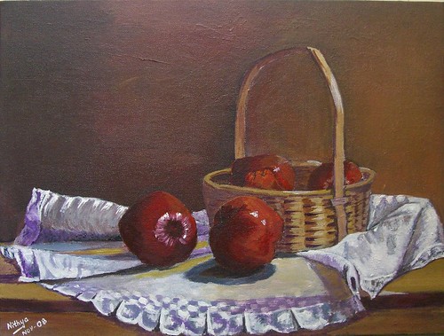
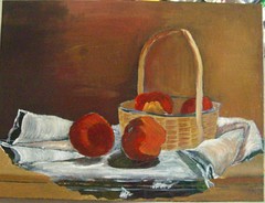
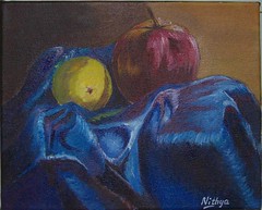
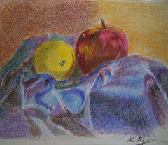
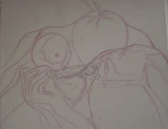
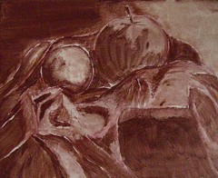
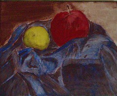
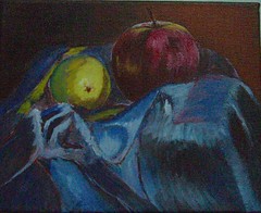
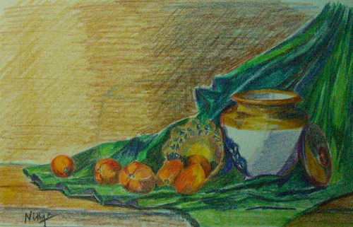
I have never done a large still life as yet, but I have done couple of dozens of still life Art Cards. Same holds good with birds. My fall landscapes on the other hand were more like studies. I would definitely love to do them large, and wanted to see how they would turn out.

Peeping Tom
Colored Pencil on Paper
2.5 * 3.5 inches
(c) Nithya Swaminathan

My most recent Art Trade was a theme based one – I took part in an exchange titled “Under the Sea” on Drawspace. I have never done any fish before; I never really found them inspiring till date. So took part in the project as a chance to try out a new theme and I had a great time. I still cannot say I would do them on a larger format, but they were ideal for the ATC size. Super fun since I can go wild with the colors!

Fiery Orange
Colored Pencil on Paper
2.5 * 3.5 inches
(c) Nithya Swaminathan

Working in a Series
This is something that I have successfully tried in all the trades I have been part of. Though there is no rule that the cards should be on the same subject, I always make it a point to do all my cards around a single subject. That really helps me explore a subject more, and I enjoy it. I have done exchanges with still life, birds, fall colors, and most recently underwater seascapes/species.

Tiger Fish
Colored Pencil on Paper
2.5 * 3.5 inches
(c) Nithya Swaminathan

I am a person who finds it very difficult to sustain my levels of interest to do a series in a large format. But in the smaller format, I am completely at ease and have always made it a point to work in a series with Trades. This kind of gives an idea to my recipients as to what they could be getting in the mail, though there is always an element of surprise.

Enhancing my knowledge
Until I took part in my first Art Trade, I never knew what was "Encaustic Art". I was fortunate to trade with an artist who did such brilliant encaustics and am now a proud owner of 3 encaustics. It is not something I would myself give a shot at, but it was fascinating to read about a new form of Art and also receive something extraordinary.

Golden Fish
Colored Pencil on Paper
2.5 * 3.5 inches
(c) Nithya Swaminathan


Look at Me!
Colored Pencil on Paper
2.5 * 3.5 inches
(c) Nithya Swaminathan

In my next post, I would continue with some more things that I have gained, most important of which is a trading network of sorts, with all my Art Trade buddies.


All the images in this post have been done for the "Under the Sea" exchange on Drawspace. The trade ended in October and I have all my cards sent out. Waiting with bated breath for the comments from the recipients.
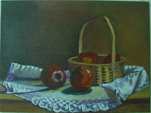
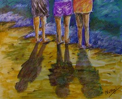
If you like it, share it!