About 3 weeks ago, we have moved from the cozy comforts of Madras to Germany. And bulk of my time thereafter has gone in setting up the new house and making it more livable. It is easier to set up a house from scratch, than to set right one maintained by a guy :-D Well, my husband was here for a couple of months before me and things were lying around all over.
And then of course, a good deal of time has gone in getting used to the cold! Whats with all the -15!! I have never seen even a +15, the least I have seen prior to coming here is warmer than that. Phew! I come from a city that has only hot, hotter and hottest months in a year, with a good part falling under hottest. So this is entirely new to me and I cannot really say that I am having fun. I hate so much of preparation in terms of clothes layers, to even step out of the house. I miss the times when I could just decide at the drop of my hat and start on my bike.
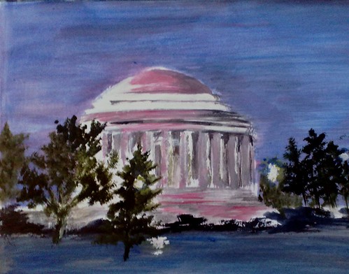
One thing I like though is the winter landscape, though it is painfully cold. I like the muted palette, the barren trees, everything that's in complete contrast to my Madras. The whole region seems like its been painted, a visual treat to an artist. It snowed here a week ago, and while my daughter wanted to go out and play in the ice, I thought it was a good excuse to click snaps. I have never painted snow, mainly because I have never experienced snow. Now that I have seen a snowfall for the first time ever, I thought I just HAD to paint it. I have accumulated a lot of snowy references, and I am just sorting them out in terms of crops etc.
I have packed as many canvas panels as I could from home, and a good supply of materials to last me for a few months. Since I wasn't sure when I would locate a good stationery store, I did not want to take a risk. However, I am mighty glad that I have already found a good store, very nearby to where I live. Yay! So look forward to some genuine wintery scenes in this space.
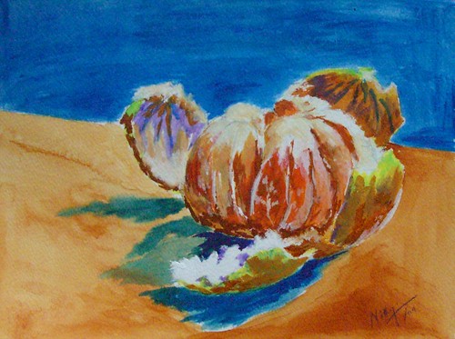
 Rose - completed
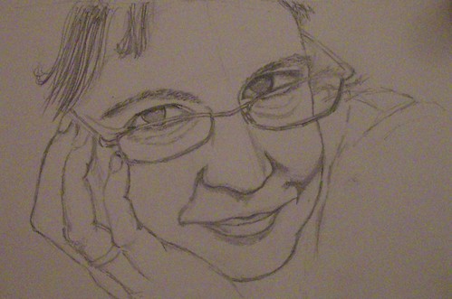
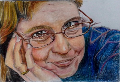
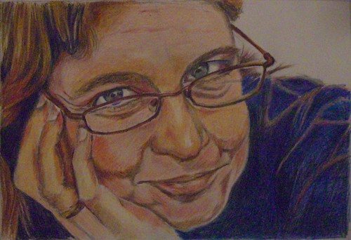 I knew it had some issues to be fixed but was unable to point out exactly. That's what happens when you look at an image for a long time continuously. My husband had a look and told me that the mouth was not okay, and needed some tweaking. I realized that I had made the lip line flat, and not a little angled. I changed that and I think it looks decent now.
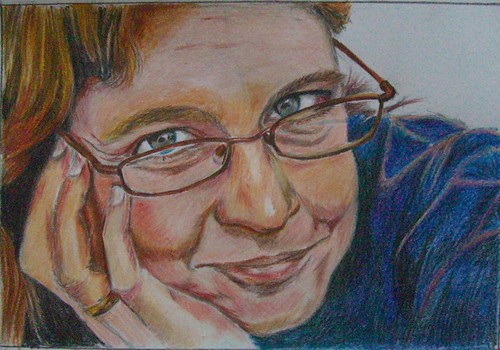 Portrait study - Rose
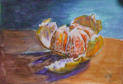
 What are you waiting for?
 What are you waiting for?
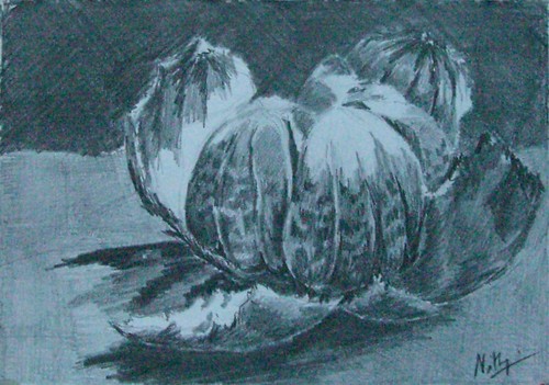 What are you waiting for?