December 23, 2009
Moving my blog
November 18, 2009
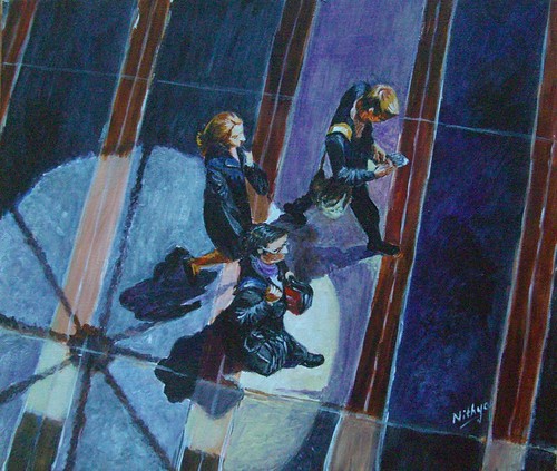
Different Strokes - Under the spotlight
Have a look at other wonderful entries here.
September 19, 2009
Zibbet - a review
I joined Zibbet a few months back after it was reviewed on EmptyEasel. And the site has come a long way since then, improving in a lot of respects. For those who do not know Zibbet, they are a young selling venue for Art and handmade, based in Australia.
This review is based on my experience with the site and with interacting with the team there. For sellers who are thinking about starting an online shop, or are looking to expand along with their other shops, Zibbet is a great place to check out and here's why. One of the most appealing things about the site is its clutter free layout. Everything is real simple, the look and feel of the shops, the listing process, etc. The listing process is very simple and straightforward, and is done in only 2 steps.
They offer two types of accounts - a free and a premium account. Their free or BASIC account is just what it says – entirely free. You can list upto 25 items, and keep all the money from the sales. There is no listing fees, no commission on final sales, just nothing at all. If your items keep selling, the shop can be replenished within the limit of 25 and so on. So you could potentially have a new selling venue with no costs whatsoever. And the best part is, the free listings page is ad-free, so it does not look cheap. This is an important plus in my opinion, because, I have seen sites which offer some stuff for free, but spoil the whole look by flooding it with ads. The site looks anything but professional in such a case, whereas Zibbet differs in that aspect. The basic account looks as neat as the premium, just without some features.
They also have a premium account, which obviously is more feature rich. This is currently being offered at just $7 a month, and I assume it will go up to $15 later. For this amount, they have a lot of very nice features –
- A big banner for your shop, where you have the option of reusing your etsy banner too.
- Color coordinated shops – customizing the layout and colors.
- Adding widgets to your shop – this is a great feature that allows you to add your twitter feed, facebook page and just about anything that can be added as HTML code. I even have my blog feeds into my zibbet page. For established sellers at Etsy, you can add your Etsy mini itself as a widget so the shops get promoted together.
- Copying listings. Knowing firsthand how similar my listings are, I can vouch this is a great time saver. In my case, all my listings are Acrylics on Canvas. Even the main colors of a lot of my paintings are similar, as I work in series. In such cases, it makes a lot of sense to copy the listing and then change only the title and bit of the description.
- Adding videos to your page.
- Many more features to come, as these guys are constantly on an improvement mode. I have probably missed out some of the features, and I strongly recommend you check out the complete list of features here at the Zibbet blog.
Apart from the features per se, my most important reasons for considering zibbet are:
- A great admin team. Jonathan and his team are super responsive to feedback and make their best efforts to resolve any issues faced by sellers. They are available everywhere, on twitter, on their own blog or just an email away. When they had initially put together a sneak peek of the changes to come, they had planned to offer only 15 listings for the basic account. However, since a lot of sellers suggested it was too less, they made it 25. So this is an admin team that really listens to its customers and tries its best to implement any good feedback.
- Small size of the site, yet. The site is still quite small, I guess not even thousand sellers and only a few hundred premium sellers. So there is a chance of being found easier than say in an ocean like Etsy. I think they have the potential to grow well, and it is only wise to take advantage by jumping in early.
For painters who are not too prolific, the basic account is a great way to get started. I’d strongly recommend you check it out. And if you find it worth it, an upgrade to a premium account can be done later too.
Just to give an idea about the comparative costs involved - Taking myself as an example, I intend to complete 300 paintings in the next one year and say I have 100 of them at a point to list. At Etsy, I would be spending $20 listing them all, for 4 months and then spend the same money again relisting and so on. And when an item sells I will also have to shell out 3.5% of the sales fees. Whereas in Zibbet, I spend $28 over a course of 4 months, and even if all the items sell, I do not spend ANYTHING MORE on a sales commission. I think it is fantastic for artists like daily painters who plan to have a big number of items in their stores. Having a lot of items for sale makes it easier for a buyer to really spend some time on your shop, look at your style of art etc. And I think cost should not be a restricting factor to having more number of listings than you would like.
And well, if you intend to sign up at Zibbet, I request you to use my referral link and sign yourself up. They have a very nice referral program going on, where you get $1 off from your monthly fees if you refer a premium seller. For life. And which means if 7 people sign up because of you, you get to enjoy the premium account, completely free. Forever! So go ahead, sign up and refer your friends too.
If you sign up using my referral link, as a premium seller, I will send you a small painting. So the chance to own an original piece of art is yet another reason why I think you should definitely consider Zibbet :-) You do not have to sign up as a premium seller right away, you can upgrade later. I will get the benefit even if you upgrade later, and I will definitely send across your little painting to you. Hurry up, there are only some premium accounts left at the reduced price!
Zibbet is also offering a FREE TRIAL of the premium account now, for a period of 7 days. And then based on the trial, if you like what the site has to offer, you can go ahead and sign up after your trial. I think it is just worth trying out and I am sure you will not regret it. Go ahead and sign up right away!
Links
September 16, 2009
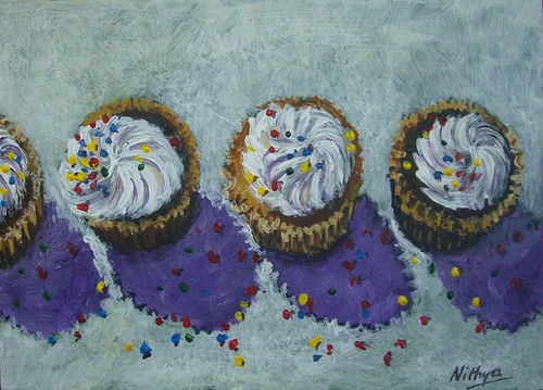
Different Strokes - Return of the muse!
Acrylics on Board, 5 * 7 inches
Copyright Nithya Swaminathan
August 6, 2009
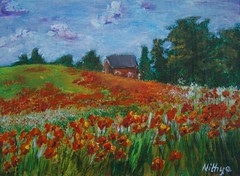
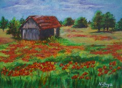
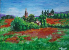
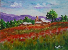
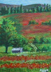
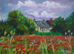
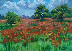
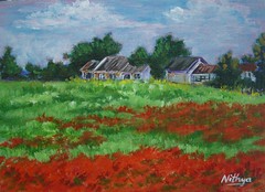
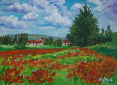
Poppy fields gallery
I have some big canvasses lined up next, they were almost forgotten in all the time I have been working small. I am thinking of restarting the dancers. And on the small painting front I think it is going to be more landscapes coming your way.
 |  |  |
 |  |  |
 |  |  |
 |  |  |
July 27, 2009
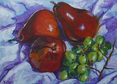
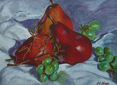
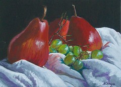
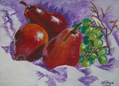
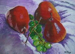
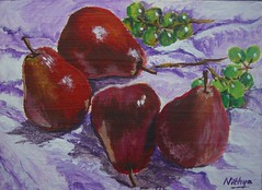
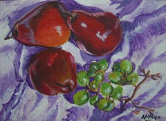
Pears series gallery
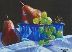
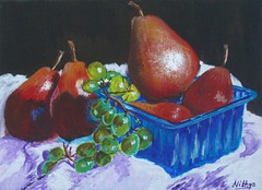
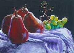
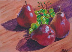
I have stopped duplicating posts between both the blogs as I do not want to spam people who follow my blogs on Facebook or through feed readers. So in Facebook, while in my profile I import this blog, posts in my other blog will be seen only by people who follow my fan page. Now that I have done a dozen paintings of pears, I thought I can just put them together in a gallery format. Clicking on individual pictures will take you to the relevant blog posts.
 |  |  |
 |  |  |
 |  |  |
 |  |  |
July 19, 2009
Who's hiding behind?
The pears have a lot of color, in order to capture the lighting, reflections of the cloth on the surface of the fruit etc. However, I find the grapes are much more challenging and it is fun to paint them. The grapes need to have the translucent effect and I am not there yet. This is the first time I am doing grapes and I am having fun, learning a lot, observing more color. Of course, I have more paintings coming up in this series, and I finally hope to nail the translucence. I hope!
The pears that I have used in these set ups are of the Red Bartlett variety. They are largely red with a mix of ochre in between. My set ups are such that the red side gets prominence. And my renditions seems to be more bright red in color, which is something I have generally done, exaggerating colors a bit from real life. I like it that way, tends to have a more dramatic effect.
July 18, 2009
More pears and grapes
July 17, 2009
A new series, a new blog
On my birthday, I launched a new blog. It is a new project that I have undertaken, where I plan to complete 300 paintings before my next birthday, when I will turn 30. Check out my new blog 300 to 30.
July 14, 2009
I am on Facebook now!
 I am an active user of Facebook, where I have reconnected with long lost friends from school and college. Something that I had not thought about however, was using Facebook to market my Art. I was not really keen on having a business page there, as I felt it was too redundant, since I already have a blog and a website anyway. But Linda Blondheim, in one of her marketing posts, gave it a whole new perspective. Facebook might help to connect with non-artists who are interested in Art, whereas the blog with all nitty gritties about the process is perhaps too technical for a non-artist. I thought that made a lot of sense and decided to give it a try. Click on the image to see my page.
I was very reluctant to get into Twitter too, in fact I do not use it to its fullest even now. But in a very short span of time, Twitter has helped me connect with more Artists than this blog did in 2 years. There are a lot of interesting links being shared, and I find it awesome. I have also discovered a lot of Artists whom I did not know, via Facebook too. A lot many artists have fan pages on FB and its nice to stumble upon them. And I hope having a page of my own helps me connect with a community that's interested in art, artists as well as collectors.
One thing that I find tedious about setting up the page is that the image gallery has to be maintained by uploading images there. Flickr is my preferred service for hosting my images, and I cannot simply import my images from Flickr to the facebook page. So I have uploaded all the images all over again. The good thing though is that we can have many different galleries so that the images are all well categorized. Since the pages for us artists are all about images, it would be great if we could just import images from Flickr.
I have launched this page only yesterday, so it is too early for me to say if it has had any effect. A few months down the line, I shall probably be better positioned to do a post about it. So if you are on Facebook, please check out Nithya Swaminathan on Facebook, where you can see a big chunk of my completed works. I have also included a fan box widget similar to the followers widget in the sidebar here, please have a look. You feedback is welcome, and thank you for all the support.
Links:
July 3, 2009
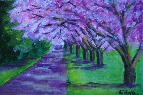
Lane of Pink Blossoms
July 2, 2009
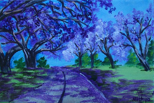
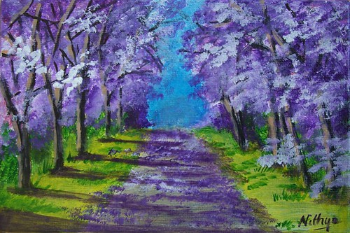
Jacaranda lane
It is funny and often frustrating how colors get distorted under a camera or a scanner. The colors in this one for instance, though there is a significant amount of blues, it is not as blue as it appears in the image. It looks much better in real life, and it is unfortunate the photo is the way it is! Sigh!
July 1, 2009
June 30, 2009
Richeson75 - Online Exhibit
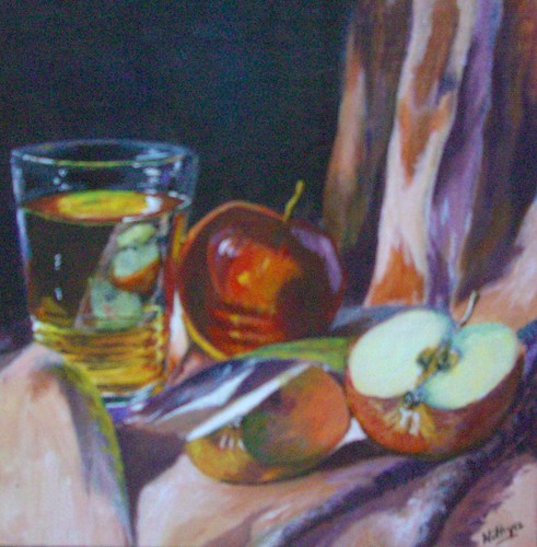
 Recently, I had blogged that one of my apple paintings was accepted into the Richeson 75 still life and floral exhibition. The exhibition is now available online.
My painting Apples and Glass seen here was juried in. However, I did not send the original across as it was turning out to be too expensive and not quite feasible. Check out the various entries, a lot of which are out of the world :)
After my quarterly review of this years goals, I had planned to do it every quarter. And yes, another quarter has just gone by in a blink! I currently have a lot of unfinished stuff going on, that I wish to complete them before the mid year review. I will be posting the mid year review this weekend, on the 5th July. I hope things will be in a state of logical conclusion so that a review makes more sense.
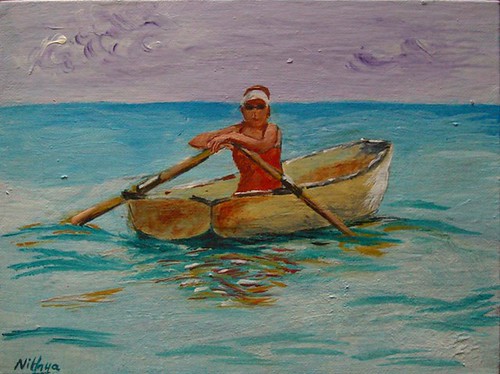
Different Strokes - Row, row, row your boat
All the entries together can be seen here. Your feedback is welcome.
June 29, 2009
Getting back to some more apples
I am grown so much in love with painting apples, that I like to think it is the best thing to do when in an extreme phase of self doubt :) It clears all doubts about myself and keeps me going. I did not take any progress shots this time so all I have is the completed image. There are more to come.
June 21, 2009
Twin Pinks
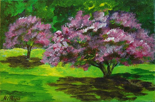 Twin Pinks
 Acrylics on Canvas, 4 * 6 inches
Copyright Nithya Swaminathan
June 20, 2009
The Road less traveled
June 19, 2009
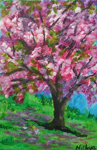
Flowering Trees - a postcard exchange
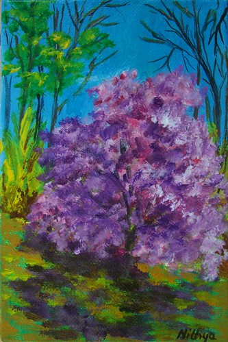 I am addicted to Art exchanges, you know that already don't you? I have mentioned that a million times here and elsewhere. I just love the excitement of receiving such varied Art from all over the world. And it also helps me work better as exchanges generally work within a deadline and I get more stuff done.
For several months now, we have been having virtual classes in WetCanvas covering a wide range of subjects. Few months ago, we had a terrific class on painting trees, by Elizabeth. As a spin off from the awesome class, some of us got together to go a postcard exchange of Flowering trees. So here goes, my attempt at recreating Spring :)
Pink Shadows
Acrylics on Canvas, 4 * 6 inches
Copyright Nithya Swaminathan
Instead of posting them together, I will be making separate posts because it is easier for me that way to keep a count of all paintings done this year. We are working towards 100 this year, just in case you forgot :)
June 17, 2009
Different Strokes - Summer Vegetables
June 2, 2009
Different Strokes - Pennsylvania Poppies
Acrylics on paper, 5 * 8 inches
Copyright Nithya Swaminathan
May 20, 2009
Different Strokes - Red Signal
Since I was too busy with my daughter's portrait, I almost missed the deadline for this one. Thankfully I remembered it just on time and got to it. I started working on this only this morning, and due to the lack of time, I was forced to keep it really simple and loose. So instead of nitpicking over too many details, I tried to bring in a feel of the scene and painted as quick as I could to finish it on time. :)
Have a look at all the entries here, they make an awesome collection.
May 19, 2009
Chasing my rainbow - updated
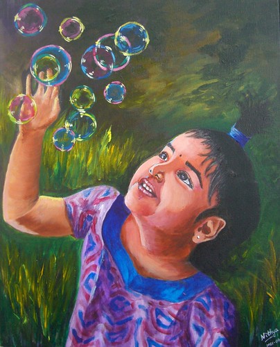
And then, I turned to my ever dependable dad for pointing out the issues in the portrait. Not that I could not do it on my own, but I firmly believe a fresh look helps, more so if its from him. As expected, after I mailed my daughter's portrait version 1.0 to my dad, I got some fabulous suggestions. I got some great suggestions also from my brother, who is a very gifted artist unfortunately with no online presence! My dad pointed out n number of places where I could improve, and finally said that I have to satisfy myself first. I think he nailed it with that one sentence. I wasn't even close to being satisfied with the previous version. A mother's obsession is too strong and I just could not settle with the earlier version. Not that I am greatly satisfied now, I am certainly not. But I feel I am almost there. Here is how the portrait looks now.
Some of the things that I have done -
- I have added more darks around the corner of her lips to bring in more depth to the smile.
- I have softened the area where the neck meets the chest, earlier it was too hard edged and I think it looks better now. So instead of looking like an attachment on the chest, the neck looks like a continuation.
- Softened the background a bit. One thing people at WetCanvas and my brother pointed out was that the background was kinda competing with the image. Since it could hinder with the outline of the face I could not do much, but I have greyed it down as much as I could.
- I have slightly increased the size of the hand and palm. I am not even sure if it can be seen, but I made the hand a little thicker.
- I have redone most of the hair, as I felt it was too artificial looking. It looked like it was pasted on her head, I have tried my best to correct it. I worked a little patiently, strand by strand!
- Oh, and most importantly, I have painted over and repainted her left eye (the one closer to the viewer) at least 6 times. The eyebrows looked terrible before, like caterpillars! I tried to soften them as much as possible. And the whole eye was done over and over again. That's why I love and hate Acrylics. While I love it for the flexibility, I sincerely believe I'd take much more care if it were an unforgiving medium. So it is not Acrylics that I hate, it is myself actually. Huh!
This painting also has the dubious distinction of being the one that has undergone maximum changes after I signed it. As I mentioned in my previous post, I wanted to schedule this one to be posted on Mothers' Day, before I went on vacation. I therefore finished this up in a hurry and signed it. Even my husband told me it was decent enough to be posted. It was only when I looked at it through the camera that I realized how terrible it was. It was a bad painting, terrible if I were to consider likeness and mood. I just put aside the camera and realized it had a LOT more work to be done. I have worked for about 10 hours on this after signing it. And with great effort it has reached a stage where I like it. I only hope I still continue to like it after a week and don't have to pick up my brush again.
May 14, 2009
Chasing my Rainbow - portrait of a princess
I have to say that I am no good at articulating my thoughts as well as some of my friends. Go here, here or here to read some really nicely written tags. :) I will try my best to put across what I love, though it is extremely difficult to limit it to five. I was tagged by the lovely IBH, and here goes my thoughts in no particular order.
3. Motherhood has made me a believer. In miracles. In unconditional love. It makes me want to be a better person, to make myself worthy of her infinite love. And to give back at least a percent of the love that I get.
4. I have learned to forgive. Or at least ignore if I cannot get myself to forgive. Every time I give my little one a whacking, she showers me with hugs and kisses within minutes. She humbles me with her behavior, that I really want to forgive and not harp about things/people that don't matter.
5. I get to hone up my portraiture skills by painting the most beautiful face in this world. And free of any copyright issues, how cool is that! The gratification I get out of doing her portraits is something I cannot express in enough words. The excitement in her eyes when she sees her face pop out of the canvas is priceless. I get hugs in return, and that is obviously better than any recognition my Art could ever get me. If she is in a great mood, I also get to hear nice things about my work.:) I could of course go on and on, but since the tag says only 5 things, let me stop here.
I have been planning to do a portrait of my princess for a while now, and Mothers' day seemed a good occasion for it. It is my way of celebrating the blessing that's my daughter, and also the best gift I could give myself this Mothers' day.
I wanted to post this for Mother's day, but I was on vacation. And I wanted to so some last minute tweaks before posting it. Now I would say it is about 90% done, though I have signed it. I don't think I have done justice to her expression, the excitement with which she was chasing these bubbles. The portrait lacks life I would say. I have also posted it on WetCanvas and am waiting for any suggestions to make it better. Else I will have another look after a week, when I hope things will glare at me.
Any moms reading this, please feel free to take up the tag and post your thoughts if you wish. I am not really tagging anyone, take it up if you wish and its fun! Oh and by the way, the first title that crossed my mind when I was doing those bubbles was "Venn diagrams in the air". I was proud of myself for a moment.:)
April 25, 2009
Different Strokes - Diana's companion
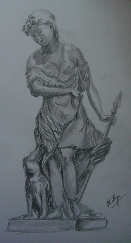 I love looking at sculptures. I enjoyed the sculptures in the Louvre as much as I did the paintings. It is such a terrific art to be able to bring something alive from stone. I have so many favorites at the Louvre, the Hermaphrodite quickly comes to mind. I absolutely love it. Whoa! While I love Indian sculptures for their intricacy and craftsmanship, the western ones have a unique appeal too. Like this one of Diana's companion. What a beautiful figure, I loved the dress, her skirt and the folds in it. Among my extremely limited travel experience in India, my favorite spot for sculptures is the Somanathapura temple near Mysore. I was there last year and it was worth all the trouble of traversing through the pathetic roads. The figures just blew me away! Totally worth a visit.
Diana's Companions
Graphite on paper, 9 * 12 inches
Copyright Nithya Swaminathan
This is my entry for the ongoing challenge at Karin's Different Strokes blog. Its been ages since I painted a sculpture. Long long ago, about 12 years back to be precise, I did a sculpture in graphite, of one of the figures in Halebid. Though I lived in Bangalore for so long, I never got to visit Halebid which is quite close. So after 12 long years, this was my first attempt at doing a sculpture. I have a lot of photos of sculptures, from the Louvre and from Rome. I am inspired to go paint some of them. We'll see.
Karin had requested the figure to be painted as a whole, without cropping. I have flipped the reference image horizontally though. I wanted to do this as a monochrome initially, with various shades of brown. But when I started sketching itself it screamed graphite, hence the choice of medium :) All the entries for this challenge can be seen here. Most of them aremind blowing, absolutely mindblowing. Have a look.
April 24, 2009
April Virtual Sketch Date - Rhododendron bud
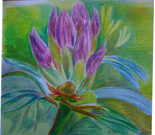 I suck at florals, and would not venture into one even if threatened at gun point! :) Not that I am not inspired by them. When the daffodils were all around everywhere, I was so regretting I am so pathetic with flowers. Maybe some day, I might do some. Currently, I feel my style of using strong contrasts and generally visible hard edges is not quite suited for the softness that's needed to render a flower. I have a long way to go in terms of softening my edges before I can render delicate darlings.
Rhododendron bud
Colored pencil on paper, 9 * 9 inches
Copyright Nithya Swaminathan
However, since the blog events are all about getting out of your comfort zone, I decided to do this one as well. It has such lovely colors, and I have gone in for colored pencil. Thanks to Jeanette for a great image, I had a lot of fun.
This month's entries can be seen here in the Flickr pool, and go here to check the various blog links.
April 23, 2009
Let your hair down
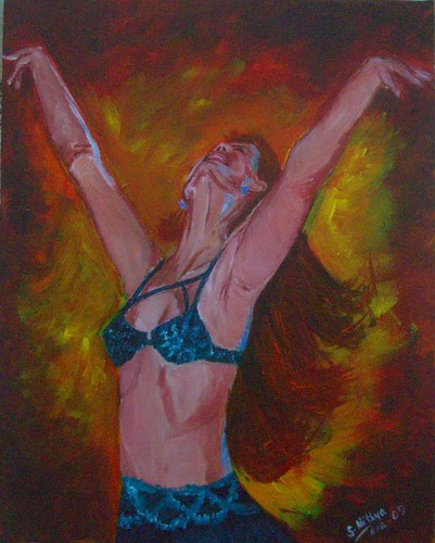 Continuing with my series, this is my 3rd painting of belly dancers. There is one more to go as of now. All these paintings have been done based on the photos of Flickr photographer Adelita Choffi. While I was searching for pictures of dancers, I came across her treasure trove of snaps, all of beautiful belly dancers. She was generous enough to allow me to use them as references for paintings. I have favourited several more of her snaps, and will probably get to them after a while.
I might even extend this kind of a series to paint the various different forms of dance. There are too many exciting possibilities and I need to think before I jump in.
Let your hair down
16 * 20, Acrylics on Gallery wrapped canvas
Copyright Nithya Swaminathan
April 22, 2009
Unleashed
 I love dance as an art form to bits, and not knowing to dance is one of my biggest regrets in life. I did not pursue it despite having had an opportunity to learn. This series of mine essentially aims to celebrate the beauty of the art form, and also the grace of the female form. I wanted the paintings to ooze passion, and that’s the basis for my color choices. I have gone in for a lot of oranges and reds in the background, as I believe it denotes a surge of passion. I aim to capture movement, with emphasis on the body language and not on facial expression. I wanted the whole figure to convey a sense of passion, true to the words “Dance like no one’s watching”.
Unleashed
16 * 20 inches, Acrylics on Gallery wrapped canvas
Copyright Nithya Swaminathan
While I chose blue in her dress mainly because the complementary colors would work well together, I also chose it keeping the peacock in mind. When I was thinking about dancing without a care in the world, or just dancing to your own heartbeat, the peacock was what popped up in my mind first. Hence I have gone in for a lot of Pthalo Turqiose in the dresses.
The style is different from what I normally do, on quite a few counts. This is the first time I have tried to paint focusing on what I “feel”, rather than what I “see”. This could perhaps be a new direction in my work, but I cannot say that for sure now. The style in which the background is done, is totally new. I painted like a woman possessed, dabbing color randomly. I wanted to have fun and yes I did. A lot.
Even with the dancers, I have given all the detailing only to the face and the hair. The hands have not been done as detailed as I’d usually do them. Since I wanted to focus only on the face and hair, I chose to go a little loose with the hands. The dresses also have intricate mirror work and beads in my references. I have omitted all of those and just briefly indicated some designs. I think it works well, but it remains to be seen if I still like it say after a week. I might get back to it and change something if I don’t like it.
April 21, 2009
Dance like no one's watching - a new series
 Whenever I come across very high quality of Art that I greatly admire, it motivates me to work harder at my own art and improve myself. It also happens more often than not, that I get intimidated by awesome artists that I come across. It makes me feel I should strive to be that good, but the realization also dawns that being that good gets tougher with every passing day. I get bogged down that there is a long long way to go, and during every phase of introspection, I invariably feel I have just begun.
A couple of weeks ago, I was in a similar phase of self doubt after I visited an exhibition at a nearby gallery. I was fortunate to see some of the most stunning impressionist landscapes over there, and came back with the feeling that if I had to be even 1% as good, I had to improve by leaps and bounds.
Dance like no one's watching
16 * 20 inches, Acrylics on Gallery wrapped canvas
Copyright Nithya Swaminathan
While I was bogged down by self doubt and a serious loss of confidence, the only way to overcome that was of course to paint something. And for a change I wanted to paint something with reckless abandon, just slap the paint without being bothered about detail. When you lose yourself in the process of painting, the surrounding world hardly matters. And that's the motive behind this new series, a sort of reminder to self, to dance only to your own heartbeat, without a care in the world. There are 4 pieces in all, all of them of beautiful dancers.
I had a tough time getting this face right, due to the different angle. I am very comfortable painting faces that look straight, but these kind of faces give me jitters. And those hands were a nightmare. I thought I had painted them very big, but turned out they were actually much smaller than they should’ve been. I posted WIPs and got some very useful feedback from friends at the Acrylics forum in WetCanvas. One of the artists actually took the time to edit my painting in photoshop to show me how the anatomy wasn’t quite right. And that's why I love WetCanvas. People go out of their way to help and guide others, and you can never really get away with a badly done piece of work :D

