
In the previous painting of pears and grapes, I felt the colors were probably too much on the darker side. I generally keep my colors bold, but I could have probably gone a little softer on the fabric, parts of the fruit etc. My friends at WetCanvas gave some wonderful suggestions, and I tried to incorporate those into this piece. I underplayed the glossiness of the pears, made them look more fleshy than shiny. And instead of going wild with purples on the cloth folds, I opted for softer grays. Your feedback is welcome.
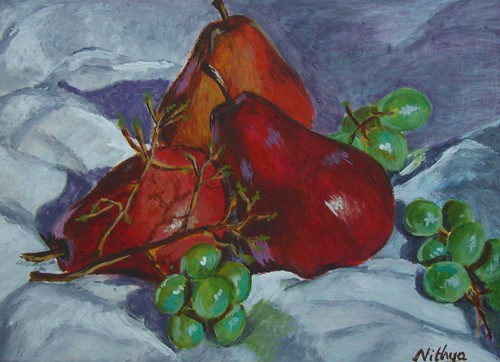 Pears and Grapes #2
Acrylics on Board, 5 * 7 inches
Copyright Nithya Swaminathan
Pears and Grapes #2Acrylics on Board, 5 * 7 inches
Copyright Nithya Swaminathan
0 comments:
Post a Comment