When the dates for the
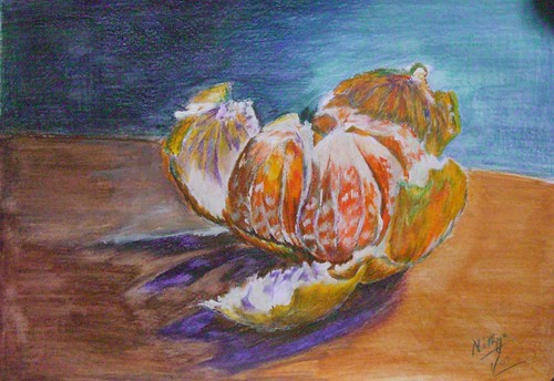
January VSD were put up, it was mentioned that the reference would really stimulate the artists. I was really looking forward to the reference, and I must mention that on first look I wasn't impressed at all. I later realized that a good painting can inspire any artist even if the reference does not! As the various artists started posting their interpretations, I was quite impressed and started with my version in colored pencil. I simply loved the various tones in the orange peel, and the translucence of the fruit.
What are you waiting for?
Colored pencil on paper, 9 * 12 inches
Copyright Nithya Swaminathan
My colored pencil version was taking a lot of time, as I generally work slowly with CPs, building layers meticulously. After a while, I was tired and wanted a break. And guess what I did, decided an ultra-loose version in watercolors, just to unwind myself. Well not watercolors actually, but acrylics painted almost like watercolors. It was a blast. I wanted the painting to ooze color and I think I succeeded reasonably. I don't think it will pass off as a watercolor painting, but it is definitely different from any acrylic painting I have done. While in the colored pencil version, I went in for a lot of complements, in this version I made the colors as intense as possible. The CP version contains a lot of blues and violets, whereas this version does not.
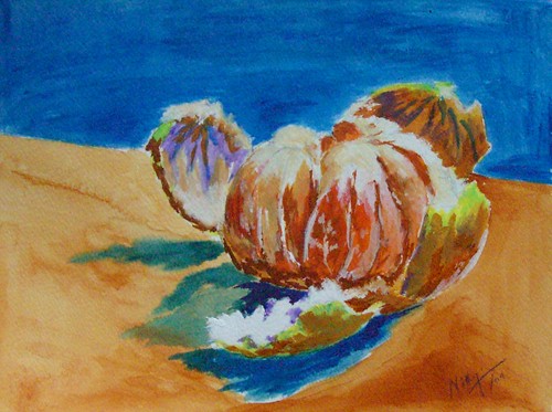 What are you waiting for?Acrylics on watercolor paper, 9 * 12 inches
Copyright Nithya SwaminathanNext I felt I could do one using acrylics as I usually do, and opted for a closer crop this time, and a square canvas. Cropped the right side of the photo and focused more on the fruit. I thought in the CP version, the background almost competes with the fruit, so wanted the acrylic version this way. So this is traditional acrylics, painted loosely, with no underlying sketch. I wanted it to be spontaneous and opted not to sketch, so the fruit looks even more closed and not opened out.
 What are you waiting for?Acrylics on canvas paper, 8 * 8 inches
Copyright Nithya SwaminathanI really like how the colored pencil version turned out, and I like it best in thumbnail. In the larger format, it shows the mess that I have done to the paper, literally pushing it to its limits. So I dont like it much larger. I used watercolor pencils for the background and washed them with a wet brush as well, and the paper reached its limits beyond a point! As far as the work on the peels go, I think the CP one captures the colors correctly than the acrylic paintings.
After painting the image 3 times in a span of 2 days, it was well etched in my mind and I wanted to have a go from memory. Decided to have a go with a different medium, and I chose graphite. This was the last one I did and really like how it turned out. So the graphite drawing is from memory, trying to create the values without the help of the grayscaled version of the photo. I picked up my graphite pencils after quite a long time and had a lot of fun with them.
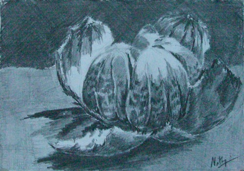 What are you waiting for?
Graphite on paper, 6 * 9 inches
Copyright Nithya SwaminathanI fell in love head over heels with the Orange and had a blast doing each version. My favorite is version #2, because it is totally new for me. It is the most un-acrylic Acrylic painting I have done. I'd love to hear from you, dear reader, as to which version works and which sucks. Or if all of them are terrible, let me know that too.
The great news is that the Virtual Sketch Date has its own
Flickr pool. It is stunning to see all the images together, what gorgeous pieces! You can view all of them here in
Flickr (signin required), or ofcourse in the
Virtual Sketch Date blog on Sunday, 25th January 2009.

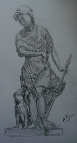 I love looking at sculptures. I enjoyed the sculptures in the Louvre as much as I did the paintings. It is such a terrific art to be able to bring something alive from stone. I have so many favorites at the Louvre, the Hermaphrodite quickly comes to mind. I absolutely love it. Whoa! While I love Indian sculptures for their intricacy and craftsmanship, the western ones have a unique appeal too. Like this one of Diana's companion. What a beautiful figure, I loved the dress, her skirt and the folds in it. Among my extremely limited travel experience in India, my favorite spot for sculptures is the Somanathapura temple near Mysore. I was there last year and it was worth all the trouble of traversing through the pathetic roads. The figures just blew me away! Totally worth a visit.