 |
| Rainbow on my way Oil on board, 18 by 24 cms (7 by 9.5 inches) Buy here |

Showing posts with label Flowers. Show all posts
Showing posts with label Flowers. Show all posts
September 3, 2015
September 30 Paintings in 30 Days - Day 3


August 19, 2014
Waterlily #3 - Original Floral in Oils
I am currently visiting my home in India, and have carried a bit of my paints and boards along with me. I could hardly manage to get time until now, and I am glad I finally got to do a couple of paintings in the last two days. These references are quite old, I took them many years ago at a park. I have painted them before and it is fun to give them a fresh shot. :-)
 |
| Waterlily #3 Oil on Board, 5 by 7 inches Click to bid |
June 16, 2014

May 17, 2014
SOLD - Daffodil #3 - Original Floral in Oils
Flowers are not a subject that I normally paint, they are not a favourite by far. During the spring season here though, when I see beautiful blossoms all around me, it is difficult not to get inspired. So I try to sneak in a couple of florals here and there. Right now what I see all around me are roses and hardly any daffodils. But these references have been lying around too long and I had to get to them :-)
 |
| Daffodil #3 Oil on board, 6 by 6 inches SOLD |
Here's a picture of all the three daffodils together.
 |
| Daffodils Oil on board, 6 by 6 inches each |
May 15, 2014
SOLD - Spring blossom 2 - Original Floral in Oils
Here's the other daffodil that I promised yesterday. I love these white and orange daffodils far more than the yellow ones. These are much more colorful and gorgeous. Oh that orange! They will look great hung together, facing each other. Or even face away from each other :P
 |
| Spring Blossom #2 Oil on Board, 6 by 6 inches SOLD |
And here's a collage of the two daffodils together. Let me know what you think!
 |
| Daffodils Each - Oil on board, 6 by 6 inches |
February 13, 2012
Coneflower #3 - Textured floral palette knife painting
 |
| Coneflower #3 Acrylics on board, 5 by 7 inches Click here to bid. |
March 23, 2011
Welcome Spring! - Textured Oil painting of a daffodil
Is it any secret that I love the German spring? I simply can't get enough of it, and it is definitely my most favorite season of the year. The daffodils have been in bloom for more than a week now and I was waiting for some good sunshine to take pictures. Got some nice references of the flowers today and got to painting them.:) I missed painting the daffodils last year, so did not want to miss them this time around.
 |
| Daffodils #1 Oil on Board, 6 by 6 inches $100 and ships FREE, Click here to Buy |
During spring, more than the flowers, I love the spring green of the leaves. It is so heartwarming to see leaves after the long barren winter. This year, touchwood, the winter in Germany has been rather short and extremely mild. We hardly had any snow after Christmas and the temperatures have been pretty mild.
 |
| Daffodils #1 (framing suggestion) |
I have also provided some framing suggestions, and will be glad to assist you in selecting a frame that will suit your decor. Let me know what you think of the painting.
April 24, 2009
April Virtual Sketch Date - Rhododendron bud
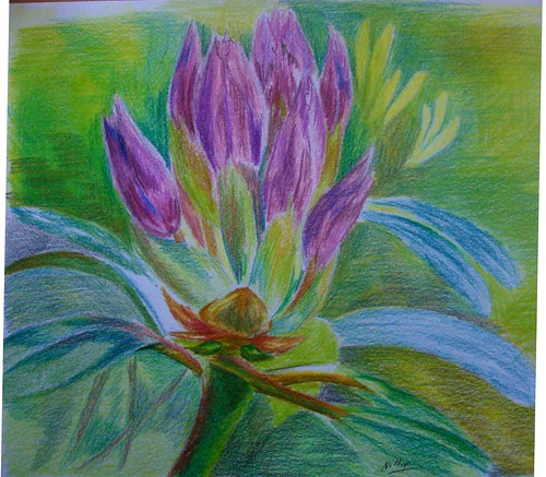 I suck at florals, and would not venture into one even if threatened at gun point! :) Not that I am not inspired by them. When the daffodils were all around everywhere, I was so regretting I am so pathetic with flowers. Maybe some day, I might do some. Currently, I feel my style of using strong contrasts and generally visible hard edges is not quite suited for the softness that's needed to render a flower. I have a long way to go in terms of softening my edges before I can render delicate darlings.
Rhododendron bud
Colored pencil on paper, 9 * 9 inches
Copyright Nithya Swaminathan
However, since the blog events are all about getting out of your comfort zone, I decided to do this one as well. It has such lovely colors, and I have gone in for colored pencil. Thanks to Jeanette for a great image, I had a lot of fun.
This month's entries can be seen here in the Flickr pool, and go here to check the various blog links.
October 25, 2007
Conversation - with WIP
I generally work from reference images, and follow them pretty closely. My painting would be easily identifiable as based on whichever photo I use, coz I do not experiment to change much. I wanted to change this approach, thanks to a brilliant thread at Wetcanvas couple of months ago on 'How to use reference images' (too lazy to hunt the link!) and started this painting primarily as a challenge to myself. I wanted to see for myself how much I am able to differ from a photo and able to stand on my own. I picked up a black and white photo of this little girl that had no big details, no light source, and used that as the base to create this painting.
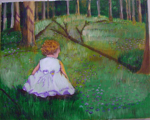 Conversation - stage 1
Nothing here is painted from my imagination, but the whole painting is based on a dozen images, combined in a way that I found appealing. Rather I imagined a scene in my mind, and hunted for pictures that had a lighting to suit, to create a mood etc etc. So its essentially my own composition, and that feels so good!
Initially, my idea was to add a colorful ball to the right side, and something like a butterfly close to the child. It was as if she was playing with the ball but her attention got to the colorful butterfly and the ball was lying unattended to! Well I was thinking about my daughter all along the painting and that is so typical of her. I did add a ball but did not like it and painted over it.
 Conversation - stage 2
I felt kinda lost midway and thought of starting afresh on the canvas, but with a lot of compositional help from the experts at Wetcanvas, I could redeem the painting and make it a tad better. Someone at the acrylics forum suggested about adding a kitten/puppy and I loved that idea. So despite the fact that my bakcground was done completely in green, I added a kitten directly with some paint. That probably explains why that kitten looks kinda distorted.
And then I also felt that the child was looking older than she should. I wanted a girl of 2-3 yrs and she looked about 5 yrs I would say. So I worked on 'rounding' her arms a little more and making her size a little bigger so that she was the focal point. And since I felt there was too much of green all around, I added some flowers to the foreground.
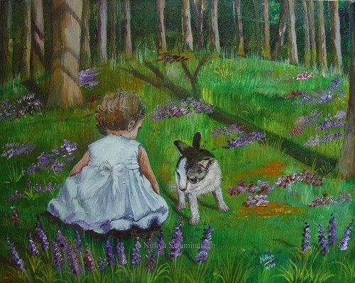 Conversation - completed
Acrylics on Canvas, 16 * 20 inches
Original available
(c)Copyright Nithya Swaminathan
When I just thought I was done and went ahead and signed it, my husband said he did not like the kitten at all. He ofcourse was not able to tell me what the issue was, but worse still I wasnt able to point it out myself! Another artist said that the kitten is too big. Now I am in a fix, whether to make it smaller, or paint over it and put in something else there.. Maybe a butterfly, maybe a puppy or anything else. I have no clue as yet. Any comments and suggestions are welcome, I would love to hear different views on "What could it be thats keeping the girl so engrossed?!"
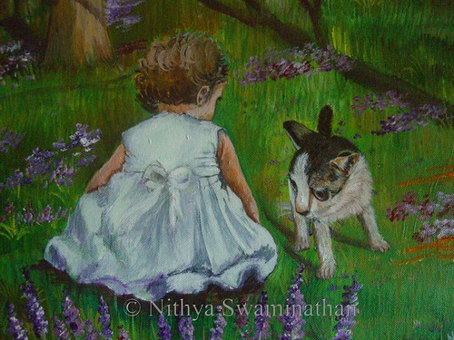 Conversation - detail view
What you see above is a closer look at the child and the kitten, do suggest any changes that you feel would make this a better painting. Thank you!
Conversation - stage 1Nothing here is painted from my imagination, but the whole painting is based on a dozen images, combined in a way that I found appealing. Rather I imagined a scene in my mind, and hunted for pictures that had a lighting to suit, to create a mood etc etc. So its essentially my own composition, and that feels so good!
Initially, my idea was to add a colorful ball to the right side, and something like a butterfly close to the child. It was as if she was playing with the ball but her attention got to the colorful butterfly and the ball was lying unattended to! Well I was thinking about my daughter all along the painting and that is so typical of her. I did add a ball but did not like it and painted over it.
Conversation - stage 2And then I also felt that the child was looking older than she should. I wanted a girl of 2-3 yrs and she looked about 5 yrs I would say. So I worked on 'rounding' her arms a little more and making her size a little bigger so that she was the focal point. And since I felt there was too much of green all around, I added some flowers to the foreground.
Conversation - completedAcrylics on Canvas, 16 * 20 inches
Original available
(c)Copyright Nithya Swaminathan
Conversation - detail view
Subscribe to:
Posts (Atom)