May 31, 2010

Virtual Paint-out May 2010 - Prague

The location for this month's was Prague, which has been on my to-go list for a while now. More so after the virtual travel. I totally loved traversing around the city with google street view. Such beautiful bridges everywhere. Any city with a lot of bridges and water makes me fall in love with it immediately. Amsterdam, Strasbourg all fall in that category. I think that holds good with Prague too, and the husband endorsed it completely. Well he has visited Prague and I almost disowned him for going there without me.:(


With my brushes being used only to sign these days and me working almost exclusively with the knife, I was looking at things differently. As in, searching for a view that would be more knife-friendly to paint. I shortlisted a lot of bridge and river views, but loved this building on first sight. This is a very typical European building with charming windows et al. It was a delight to paint. I like how the red building came out, but do not like the adjacent building. I want to try painting this some other time.


Virtual Paintout Prague The Red Building
Palette Knife on board, 5 by 7 inches
© Nithya Swaminathan
View in Street View


With every month's paint out, I get to marvel more and more at the awesome technology. What would I do without Google, I wonder! :) Let me know what you think of the painting.

May 24, 2010

"Colored Strips" - Original Triptych in Palette Knife

This triptych is of field stretches of Hyacinths, in different colors. Alternating stretches of white, pink and purple hyacinths were such a treat to the eye. Each panel measures 5 by 7 inches.


Colored Strips - Triptych
Palette Knife on board, 7 by 15 inches
© Nithya Swaminathan


Let me know what you think.

May 21, 2010

"Bright and Sunny" - Diptych

After doing a couple of triptychs, I wanted to do one with just the daffodil fields. This was done from a picture of me standing amidst the daffodils, and I just chopped myself off from it :) The daffodils are way more fun than the tulips,  must say. Let me know what you think!


Bright and Sunny Diptych
Palette Knife on board, 7 by 10 inches
© Nithya Swaminathan


$65.00 + $20.00 shipping worldwide


I shall probably do another diptych with just the tulips, let's see. I have enough and more references, but not enough time!

Pink and Yellow - Triptych

When it rains, it pours. And this holds good for good measure in my case. I just did my first triptych earlier this week, and have just done 2 more and 1 diptych as well. They are great fun, I hope you like them too. This one is a different view of the earlier tulip fields triptych, with the daffodils being more dominant.


Pink and Yellow Triptych
Palette Knife on board, 7 by 15 inches
© Nithya Swaminathan


$100.00 + $20.00 shipping worldwide


In other news, I have become a member of the Daily Painters International Art Gallery. This is a group blog, a united effort by 100 artists from all over the world working in a whole range of styles and subjects. I will be posting there too on a daily basis. Do take a look at the blog, it's got some awesome art. You can find the widget on my sidebar.


Do let me know what you think of the painting!

May 19, 2010

Discontinuing prints and other reproductions

I have been a member of Imagekind and Redbubble for a long while now, and used to make paintings regularly available in both stores to be sold as prints. I sold one print long time ago in Imagekind, but that was about it. And it has been ages since I have updated the portfolios at either place. The most recent work there dates to over a year back.  I now feel it is better to offer only originals.  Frankly speaking, I am not an artist whose work is priced so high that I have to make prints available at affordable prices. I am barely emerging and just beginning to sell. I think I must focus on getting my originals out there, instead of any form of reproductions. And the other issue is uploading images in more locations than I can count. It honestly begins to get tiring after a point.


I have already deleted my account at RedBubble. Super easy process, no questions asked. I love that! I think I have already cribbed enough about sites that do not offer an option to quit. Redbubble was a no fuss affair. I have to do the same now with Imagekind. Since my website is undergoing some updates anyway, all this will be updated soon.


The main advantage I see is that this way, my buyers know that the piece of art they own is completely unique, one of its kind. Also, since the focus of my work itself has now shifted towards textures, I believe the beauty of the work can be appreciated fully only in an original. Thus I hope it is a win win situation for everyone!

How prepared are you to handle that FIRST sale?

As I mentioned earlier, I sold my first painting couple of weeks back. It was received by my customer and she wrote back to me saying she LOVED it. Yes, LOVED written in bold. The customer's delight was indeed because of the quality of the painting. But, part of it was also because I shipped it to her promptly with a nice handwritten note of thanks and made sure it reached her by the time she wanted it. This wasn't without hiccups though. As I was packaging and shipping the painting, it struck me how unprepared I was for the whole process of handling the sale. So I just wanted to share some thoughts on the same. Let me repeat again that this is only for artists who are making their work available for sale but have not yet sold any. Are there a few of you who fall into this category? Then, read on.


So, you have put your heart out into a painting and taken great photos of it, presented it nicely on your website and/or your online stores. Everything's great so far. As long as the work itself is good, it is not impossible for a prospective customer to fall in love with a piece and buy it. While that feeling of having sold a painting is great, our job ends only after the customer receives it neatly packaged and likes it as much in person too, as he/she did on seeing the image. It is our responsibility to ensure that the actual painting doesn't underwhelm the client. This customer delight in my opinion is a factor of how neatly the piece is packaged, how timely it is shipped, how intact it arrives, and the X factor which is our personal touch.


Anticipation


The main issue in my case was that I never anticipated a sale in the first place. I had never sold an original so far, and did not expect to. I do make all my work available for sale, but I think you don't believe you can sell until you actually do. Whatever be the reason, the bottom line is that I did not expect a sale. So obviously, I wasn't prepared.


Knowledge about packaging and shipping


Depending on what kind of work you do and sell, are you up to date with how best to package the piece? For instance, do all of us know that bubble wrap is not a good material to pack paintings in, and that foam wrap is better? You definitely do not want a scenario where your precious piece of art is unintentionally damaged by wrong kind of packaging. Not only do we lose the sale in that case, but also have a permanent stigma to our name. A good word of mouth spreads linearly, but a bad one does exponentially. In my case, I was prepared with this basic knowledge and knew how to package it. And though I had not sold work, I had enough experience in packaging and shipping thanks to a lot of art exchanges. There are a lot of articles and helpful tips available from various art bloggers. Read through them and prepare yourself.


Packaging materials


Do you have enough stock of packets, wraps etc? It could be something as simple as missing some tape to seal your package. Is the required inventory readily available?  When you are eager to make a great impression, even something insignificant can make you panic, so it pays to make sure several times that everything is organized and available.


A note/thank you card/business card


If you have business cards with your images on them, are they fairly recent images? Even if not recent, do they relate to your current style? In my own case, the kind of work I am doing right now and what I did a year back are vastly different. And it is not a great idea to attach a card that has an old painting of mine when my style itself has considerably evolved. If you are sending a thank you note, do you have note cards for the same ready? When you are attaching a business card with your images, I don’t think you need a note card with an image too. A simple plain card would do, but it needs to look professional. Not like it was written on some scrap. Each and every little thing together contributes to the impression that we make on the client, don’t we know that too well?


In my store, I specify that shipping will be done within 3 days, giving myself a good buffer to get prepared. But my customer in the US wanted it in a week, which again I did not expect. Though international post from Germany takes about 10 days, the least I could do was ship immediately. I realized that I did not have some other packaging materials, which I did manage to get and ship on time. It was a Saturday and the post works on Saturday here. Now if my sale had happened by Saturday evening, I would have been able to ship the painting only on Monday. Worse still, I’d have waited till Monday to even package it and would’ve been cursing myself for the lack of preparation.


So, go ahead and make yourself prepared as if you have a couple of pending orders to be shipped. So that when it actually happens, you aren't caught off guard!

May 17, 2010

Amidst the narcissists

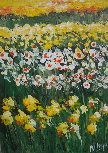
While the tulips are definitely the highlight of the Dutch land, all other flowers (bulbs) are in bloom in good measure and it is quite a sight to die for. As I mentioned earlier, the daffodils ruled the place when we visited and we could spot a stretch of yellow in every direction. This painting is from the same location as the tulip fields, in the village of Voorhout.


Daffodil fields
Amidst the Narcissists
Palette Knife on board, 5 by 7 inches
© Nithya Swaminathan


It was bright and sunny, but quite chill. It was extremely windy, thus successfully curbing any thoughts of working en plein air. The best memory was when the husband lifted me to pose for a snap amidst the daffodils, and I was screaming at him not to drop me on the flowers and crush them. The pathways between the fields are quite narrow and I was so scared not to damage the beauties. He did manage a decent job though, considering I am as heavy as a dinosaur :D


This painting was a super quickie, completed in less than half an hour. Sometimes, it is only the quickest ones that give the best results. Most of the times perhaps. I really like this one, and would love to hear from you!

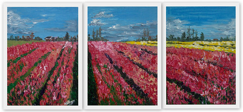
Tulip fields - A triptych

I have always wanted to do a diptych or a triptych, never found the courage to. I do believe they can be done with any subject matter if you know how to compose well and pull it off. This time, I did not take these photos with the idea of doing them on a multi panel, but it just fell in place nicely. with very minor tweaks from my collection of photos, I came up with this idea for a triptych.


Before we went to the tulip gardens, we had verified with the tourism website about where exactly to find the fields and things like that. They had mentioned a couple of places nearby the gardens. While we were driving around the gardens, all we could see were really daffodils. Because the winter was so long and cold this year, the bulbs had not yet bloomed fully and only daffodils were seen. They were gorgeous no doubt, but we wanted to see some tulip fields too. And then we decided to try one last time at a different place. And voila! We found this mouth watering stretch of pink tulips adjacent to bright and sunny daffodils. We ended up spending a good couple of hours there taking so many photos. This painting is for those lovely memories of the Dutch spring this year.


Tulip Fields Triptych
Tulip Fields triptych
Palette Knife on board, 7 by 15 inches
© Nithya Swaminathan


Painting this was great fun I should say. Just placed the three boards next to each other and did it as one single painting. Makes me want to do more multi panels, I think some more of my field references will be good enough for this. Let's see. Let me know what you think of this one!


Btw, I am not making these available as individual panels. It is sold only together. I loved painting it like this and am not interested in splitting them :-)

May 14, 2010

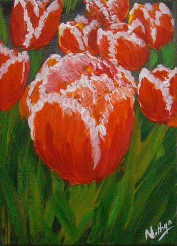
Dutch Damsels #33

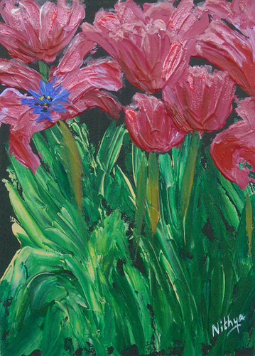
After doing quite a few tulips as groups of flowers, I wanted to one or two of them up close. This is hence a detailed view of bright red and yellow tulips. I think these were called double tiger tulips or something. The next time (if) I visit the Keukenhof gardens, I must remember to photograph the names of the tulips too, so that it makes my life easier. I am kicking myself for missing out on that this time! Let me know what you think of this one.


Dutch Damsels #33
Palette Knife on Canvas, 13 by 18 cms
© Nithya Swaminathan 2010


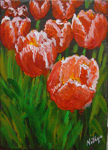
Dutch Damsels #32

Dutch Damsels #32
Palette Knife on Canvas, 13 by 18 cms
© Nithya Swaminathan 2010


Dutch Damsels #31

Dutch Damsels #31
Palette Knife on Canvas, 13 by 18 cms
© Nithya Swaminathan


May 12, 2010

Dutch Damsels #30


Dutch Damsels #30
Palette Knife on Canvas, 13 by 18 cms (5 by 7 inches)
© Nithya Swaminathan


Dutch Damsels #29

Dutch Damsels #29
Dutch Damsels #29
Palette Knife on Canvas, 13 by 18 cms (5 by 7 inches)
© Nithya Swaminathan


May 11, 2010

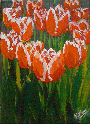
Dutch Damsels #28

Dutch Damsels #28
Dutch Damsels #28
Palette Knife on Canvas, 13 by 18 cms (5 by 7 inches)
© Nithya Swaminathan


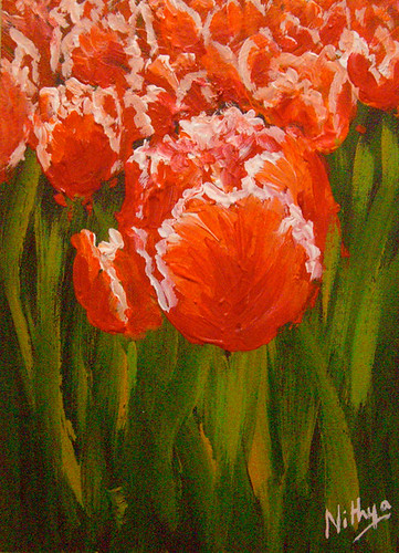
Dutch Damsels #27

When I paint with the palette knife, it takes more time to dry than usual and my boards remain wet for a while even with the fast drying Acrylic paints. So I work in parallel with multiple pieces such that when I finish one layer in say 5 boards, my first one is ready for final tweaks. And at any point in time I have about 5 boards around me, all in precarious state. My biggest challenge obviously is to keep my daughter away from all the chaos and make sure that she doesn't mess around with any of the colors.

But then, she isn't a troublemaker all the time. She loves what I do, and enjoys watching me. After all, I have got her a miniature easel, small boards and even plastic knives so that she shares studio space with me :-D When I completed a bunch of tulip paintings and was clicking photos, the little one was so curious and wanted to touch them. She loves to feel the texture of the knife painted ones, and was asking me slowly pointing to each painting one by one if she could touch them. After all this drama was over, she picked a couple of the paintings and said she loved those.:) It made my day! And very sweetly she also said she will have them in her room, and had planted them amidst her toys and books. It looked so cute there! This painting of red and white tulips is one of the privileged ones to be currently occupying my daughter's shelf. Let me know what you think!

Dutch Damsels #27
Dutch Damsels #27
Palette Knife on Canvas, 13 by 18 cms (5 by 7 inches)
© Nithya Swaminathan


May 10, 2010

Dutch Damsels #26

Since most of the tulip images have multiple tulips, I wanted to do a couple with closeups of flowers as well. Let me know what you think of this one!

Dutch Damsels #26
Dutch Damsels #26
Palette Knife on board, 13 by 18 cms (5 by 7 inches)
© Nithya Swaminathan


Dutch Damsels #25

I have been updating the website with all new work over the last few days, and it seems like a never ending task. I just felt I must integrate Paypal directly with the website and blog, instead of redirecting to stores on Etsy or Zibbet. Even with these stores, the main traffic to them I assume must come from my sites only, so I might as well provide the Paypal right here. The biggest pain with my site and blog design is that both run on different platforms, and I want them to be as seamlessly integrated as possible. Involves a lot of tweaking around with templates etc. I must admit that painting a dozen images is easier than finding a wordpress template that I like. Phew! So look forward to some template and site changes over the next couple of weeks.

Dutch Damsels #25
Dutch Damsels #25
Palette Knife on Canvas, 13 by 18 cms (5 by 7 inches)
© Nithya Swaminathan


May 9, 2010

Dutch Damsels #24

Dutch Damsels #24
Dutch Damsels #24
Palette Knife on board, 13 by 18 cms
© Nithya Swaminathan

Dutch Damsels #23

Dutch Damsels #23
Dutch Damsels #23
Palette Knife on board, 13 by 18 cms
© Nithya Swaminathan

Dutch Damsels #22

Dutch Damsels #22
Dutch Damsels #22
Palette Knife on board, 13 by 18 cms
© Nithya Swaminathan

Dutch Damsels #21

Dutch Damsels #21
Dutch Damsels #21
Palette Knife on board, 13 by 18 cms
© Nithya Swaminathan

My first ever sale!

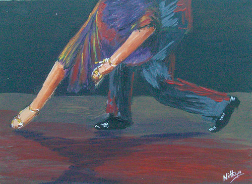
I just sold my first ever original this weekend. My small painting Tango #5 was sold in my Etsy store. It was absolutely awesome, coz I had listed the paintings just the previous night and it was sold within 24 hrs. Prior to this, I have only sold commissioned work, never an original that I had painted on my own. Commissions are great, but this is definitely better, as she loved something that I had done from my muse and not based on a client requirement. I almost fainted when I saw a mail from her saying she loved my work. The happiness on reading that from a stranger is unparalleled, and it is something I am sure I can never get in a regular job.

Tango #5
Dancing Feet #5
Acrylics on board, 5 by 7 inches
© Nithya Swaminathan
SOLD


The painting was packaged and shipped yesterday, and I think it will be a week before it reaches the USA. I am waiting with bated breath to hear back from her after seeing the actual work in person. It is bought as a gift to someone, and I am so hoping that the gift recipient likes it too! A huge thanks to my client for her support. God bless patrons who support artists.

It was a perfect Mothers' day gift for me :) A very happy Mothers' day to all the wonderful moms of the world. I hope you cherish yours and just took a moment today to convey that you do.

May 8, 2010

Dutch Damsels #20

Dutch Damsels #20
Dutch Damsels #20
Palette Knife on board, 13 by 18 cms
© Nithya Swaminathan

Published on Emptyeasel

Dutch Damsels #19
Dutch Damsels #19
Palette Knife on board, 13 by 18 cms
© Nithya Swaminathan


It was a very pleasant surprise to see that my article on adding a Like button to a Blogger blog was published in the hugely popular website for artists, Empty Easel.

I had sent the article last week to Dan, the editor and then saw him mention it in the weekly newsletter. However, I forgot all about it and did not read it until another art blogger had left me a comment. I did note quite a few blogs that have implemented it already, and I am extremely glad if it was helpful. As another commenter had mentioned, the Like button is especially worthwhile if the content being shared is non controversial. Since most art is neutral, liking something rarely will lead to any arguments/controversies. So I think this is a great feature for us artists to market our work to a wider audience.

My article on Emptyeasel if you have missed it - How to add the Facebook like button to your art blog. Also, let me know what you think of the painting.

May 3, 2010

Dutch Damsels #18

Dutch Damsels #18
Dutch Damsels #18
Palette Knife on panel, 13 by 18 cms
© Nithya Swaminathan

May 2, 2010

Dutch Damsels #17

These tulips are painted on a new surface. I love trying out new surfaces and new brands of paint. Gives a great excitement, which I am sure all artists will agree with. This one is a type of wooden panel, called Chirico. I was quite disappointed with the surface, don't like it much. I bought 20 pieces to try out, and am glad I've exhausted them.:) I did not like how the surface grabbed the paint, it was kind of plasticky in nature. Anyway! Hope to get back to my favorite surface, i.e hardboard.

Dutch Damsels #17
Dutch Damsels #17
Palette Knife on panel, 13 by 18 cms
© Nithya Swaminathan


Let me know what you think!

May 1, 2010

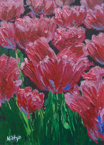
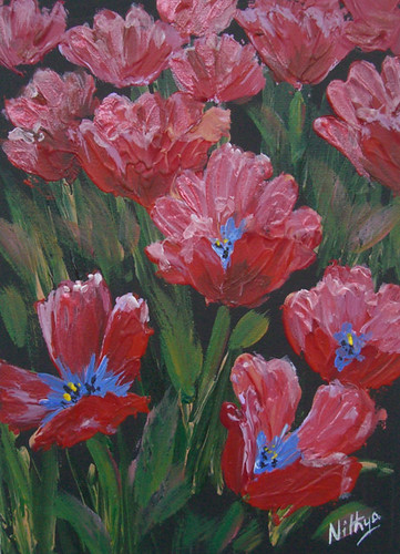
More tulips

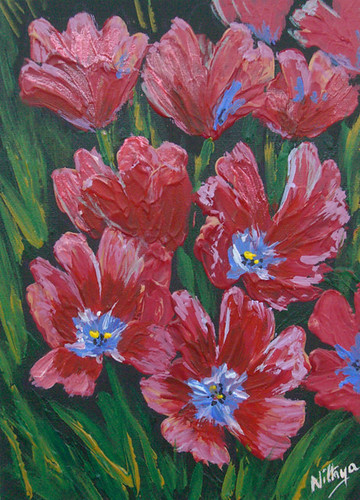
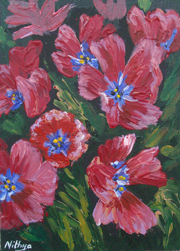
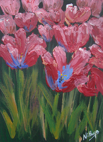
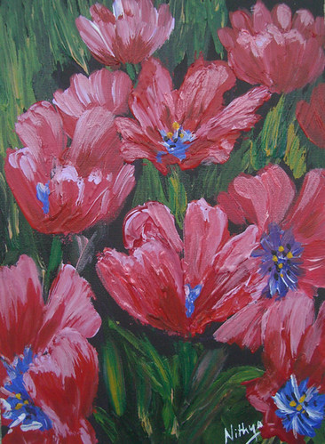
These tulips are a little more "open" than tulips usually do. They do not look like tulips at first sight. These are from the flower arrangements at the Keukenhof gardens. These tulips are a very interesting shade of red, somewhat like tomato pink. I started off with some crimson and flesh tint and that was working quite well. Just then, in between these pieces, I was working on a large abstract, and used some metallic red in that one. Metallic red too is one of the W & N colors I picked up recently, and had not used it so far. I thought it would be a darker value red, but then it was very pinkish. So quickly decided to use a bit of that too for these flowers. The metallic color gives a sheen to the petals, gives them that silky feel and looks nice in person. I don't like them much in the photos. Nothing better than playing around with various colors :-)

Dutch Damsels #16
Dutch Damsels #16
Palette Knife on board, 13 by 18 cms
© Nithya Swaminathan


Your comments are welcome!

Adding the Facebook "like" button to a Blogger blog

After adding the Facebook like button to my blog (which runs wordpress), I also tested the same on my old blog in blogger. And since most of the art blogs I read run on blogger, I thought I could share the method to add the facebook like button at the end of your blog posts in blogger. It is much easier than adding to a self hosted wordpress blog, as there is just a single edit to be done.

  • Goto the Facebook developers page to customize the Like button. The button can be customized to be displayed as "Like" or "Recommend". I went with Like itself, because it is so widely used in all of facebook and helps a reader map it to FB at first sight.

  • In the URL to like, enter "post.url", as this is how the unique permalink of each blog post is represented within the blogger template. By default, this will be set to "http://developer.facebook.com" and must be edited to suit your blog.


    • After customizing the button, click on the Get Code button to get the code to be inserted into the template.


    • Select the code in the top, with the iframe.

    • Goto Layout->Edit HTML in your blogger dashboard. Select the checkbox "Expand widget templates".

    • Take a backup of the existing template before proceeding, by clicking on the link "Download full template".

    • Search for the line "<div class='post-header-line-1'>" in your template.

    • Insert the copied code in between <div class='post-header-line-1'> and </div>.


    Now preview the template before saving the changes, to see if the button looks fine. While customizing the like button in facebook, only the width is specified and not the height. I have set it to be 30px and this looks fine. After previewing the changes, save the template and you're done!

    I have added the feature to my old blog on blogger and it works fine. Go ahead and introduce the Like button in your posts, so that not only friends in your network but also anyone else who visits your blog will be able to share the content to their network.

    If you like it, share it!