Showing posts with label complementary colors. Show all posts

April 18, 2011

Made for each other! - A Complementary Colored arrangement!

This painting was done yesterday for this week's challenge at the Daily Paintworks is the Color ChallengeCarol Marine had asked the participants to choose a color scheme - triadic, complementary or split complementary and then come up with a painting with that color scheme. I opted in for a complementary scheme of Blue and Orange, which is one of my favorite schemes. 

I set up this still life at home and painted it from life. Last time I used the same vase and some oranges for my paintings Blue and Orange and Blue and Orange #2. Both of those were done with the limitation of using one color per stroke, completely out of my comfort zone. So I went it for a set up as simple as possible. This time however, I wanted to have orange as a dominant color, so brought in some orange fabric as well. Been a long time since I painted fabric and boy do I love it!

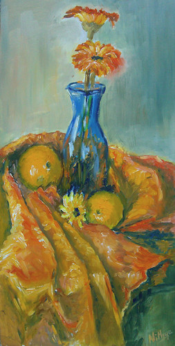
Made for Each Other
Oil on Deep Cradled Panel - 8 by 16 inches
$250 and ships FREE Worldwide
Click here to Buy
Instead of making it completely blue and orange, I thought I would bring in a wee bit of yellow-orange and red-orange, the split complements of Blue in the regular color wheel. Hence that little yellow flower in the middle and some reddish touches in the cloth. 

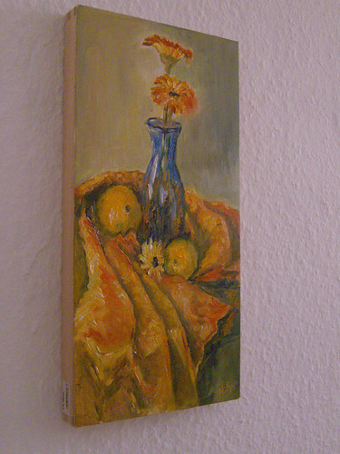
This painting is my first attempt with a deep cradled panel and I must say it is fantastic! There is no worry of warping of the wood and stuff, all I did was one coat of gesso and it could be painted! Awesome! And what more, it can be hung as it is with natural wood colored sides and without a frame. Easy peasy! I even managed a photo hanging it on my wall, though in this photo the colors are not so accurate I must warn you!

Made for Each Other
Oil on Deep cradled panel, 8 by 16 inches
Would you like to see my set up from which this was painted? I have had many people ask me to write more about the process, my tools and stuff. Well I would have never thought an artist's work behind the scenes would interest others, but now I know that it does interest people and indeed makes them curious. So here it is, a juxtaposed image of the set up and my painting in the same frame. :) Enjoy! I took a similar picture after my plein air last week, and then it struck me today, why not when the life session is at home!? So here!

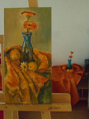
Made for Each Other
The painting and the set up :)
How do you like this one? Write to me with all your feedback and anything else! I love to hear from you. 


October 15, 2008

Primary colors

Yet another attempt at working from life, also with a limited palette. I wanted to try my hand at doing fabric, that too from life. Cannot say I am entirely satisfied with the fabric, I am sure there is a long way to go. Fabric is one of those things that I cannot seem to figure out for the life of me! It is something I really want to master. More so after my visit to the Rijksmuseum and seeing all those pieces by the Dutch Masters with jawdropping fabric.


Primary Colors
Colored pencil on paper, 4 * 5 inches.


I have used only the primary colors, and the complement of each of them. That makes it crimson red, cobalt blue, lemon yellow and Orange, Violet and Viridian green. The finish looks kinda crappy coz my daughter stepped in to the scene when it was going all fine and decided she wanted to eat that apple! Yeah, only THAT apple. So she picked it up and needless to say the other objects also got distrubed. Thankfully the apple was the one I completed first so it was ok. I took a photo of the composition and completed the fabric with the help of the reference. The patterns in the fabric were not exactly the same in the reference but I had to do with it! I hope for better cooperation from my daughter going forward ;-)

September 25, 2008

Sketching from life


I generally work from photographs, using them as references and most of the time sticking to the photos faithfully. Once in a while I change some stuff in photos, go in for some crops etc. Rarely do I have the urge to work from life. My only sketch from life experience is that of doing a lot of portraits, where my friends pose for me for couple of hours, and I have no issues in getting the resemblance right, I have done a pretty good job of it so far. 

Pomegranate and Peppers                                       colored pencil on paper, 4 * 5 inches.                 (c) Nithya Swaminathan

Other than portraits, I have never attempted sketching from life n a big way. The sketchcrawl was the first time I actually worked from life doing people and places while on the move and I loved it. It was very liberating I should say. I have always wanted to try setting up my own still life and trying to work from it. I was hesitant to give it a shot coz of my lack of knowledge of composition. 

Recently, I have been reading a lot of art blogs, articles, forums etc and want to sincerely avoid working from photographs, especially those taken by others. I want to call my work 100% my own from conception to execution. The first step in that direction was to pick up a good book on composition (review coming up soon), and then start working from life. This is formally my first composition from life, and I am happy for taking that step. 

I don’t have a specified studio space for myself, so I don’t have a space to create an elaborate set up with a light source etc. It sucks that the lighting always seems uniform in my house. It then flashed me that there was a reading bulb in my bed, that I could use! And that was it, I set this up on my bed J 

Some quick learnings for myself –

  • Setting up a simple, bare bones still life isn’t rocket science. This is not a learning as such, it is a reassurance. I picked up the 3 objects and tried some combinations, with a reflector, without one etc, and finally settled on this one. It took me less than 5 minutes! I realized I needed to get used to the paradigm shift of working from life by doing more of these studies, then move on to better and bigger set ups.
Grayscaled Version (c) Nithya Swaminathan
Pomegranate and Peppers


  • It tremendously improves my observation – note the red reflection of the pomegranate on the capsicum? I am sure this would not have been captured in a normal point and shoot camera, which is what I use. The reflection isn’t as intense in color as I have depicted, but I could observe that it is there. And it adds a good punch to the painting on the whole.
  • Working with a limited palette helps to get a better understanding of color theory as such. I have used only one green and one red pencil. Value changes have been depicted only with varying pressure and by building up layers using the complements.
  • I still have a long way to go in mapping color to value! Have a look at the grayscale version of the image, and there are only 2-3 values, not a wide range. In real, the shadow of the pomegranate was the darkest, the shadow of the capsicum in the front was mid tone, and that of the capsicum behind was lighter in value. I thought I had achieved it (if you see the color version they look different), but in the grayscale they all look like a mid tone. I hope this improves with practice. 
Next on my agenda is to create a painting, having only my sketch as a reference, without seeing the actual set up. It will then help me evaluate what all I have missed capturing in my sketch. 

If you like it, share it!