Showing posts with label challenge. Show all posts

March 9, 2008

Self portrait - almost completed

I posted the incomplete version of the self portrait in time for the challenge at WetCanvas, and the extremely encouraging folks there said it was looking good already! People said that there was a very good resemblance and some tweaks would finish it up well.

After a week, I got back to the portrait and it is almost completed now. My face is fully done and I just have some little tweaks in the background. So more or less done. The face hasn't undergone any big changes from version 3.0. I had to increase my right cheek, which was not showing my chubby face fully. A slight increase in the cheek made a HUGE difference to the picture overall. And then pushing of some darks around the eyes kinda did it. Here is a look at the whole picture.


A closer look at my image alone -
I am happy with the result. It now looks like me in the mirror too, though it looks like my mouth is skewed at an angle! In the normal view it looks just fine. Let me know your comments, especially if you have met me in person.:-)

Updated: Here is a link to the Self Portrait Challenge 2008 at WetCanvas. This thread contains everyone's portraits with other's comments. Absolutely stunning work by all of them! And this is the gallery with all images alone put together, aptly titled "The Rogues Gallery 2008" :D

March 2, 2008

Some ugly stages of a self portrait

Thanks to a recently announced Self Portrait Challenge at WetCanvas, I got to do my self portrait. After more than a month of shortlisting some photographs, I finally zeroed in on a reference. I was not even sure if I should use a reference or sit in front of the mirror. But since the mirror option is certainly more time consuming, I went with having a reference.

My reference would be familiar to those who are on my network in Orkut, for this pic has been my profile pic forever. The original reference is this -


I opted for a closer crop so that the focus is on my face and not the background. Here is the cropped reference -

To begin with, I did a rough sketch blocking the main regions, for my face, body and the background. And filled it with one layer of colour. I have simply filled flesh tint in the face, without marking the features.


Then, I directly marked the features with a pencil on my face. A very rough marking, which would be refined later as I lay down paint.

I do not have stage by stage WIP images to show the painting process, as I was too involved to pause and click. I completed the face (ver 1.0) only to later realize that the proportion between the size of the face and height of my body wasn't alright. The width was fine, but the picture showed me taller than I actually am. I did not like it, and painted over the face again with flesh tint. I have emptied a tube of flesh tint for this picture alone and need to replenish my stock, btw!

Version 2.0 seemed alright with regards to the proportions overall, but I did not like the eyes. The eyes were perfect in version 1.0, but 2.0 altered this, and therefore the overall resemblance to myself was lesser. When the eyes are perfect, they kinda make up for other goof ups. But if the eyes go wrong even a wee bit, no amount of perfection in the other features will set right the overall painting. Here is a look at ver 2.0.


If I find something wrong, I do not have the patience to "correct" it. I would rather paint over it and start from scratch. Which is why I painted over the eyes alone when I felt they were not okay, and version 3.0 was born! I think the proportions are okay now and the eye also looks fine. A lot of shading is yet to be done though. It was getting too late and I was feeling sleepy, so decided to continue at a later point. Here is the portrait as it is right now -

At every stage, my only verification was with my daughter. If she could recognize me, I thought everyone else can! So I showed it to her and she was happy, which made me sort of relieved. But one thing that is nagging me is that the picture is terrible if seen in the mirror. When I am unsure if I am on the right track, I always use the mirror to judge my painting. And this time, it looks like someone else in the mirror (not that it looks 100% like me in the normal view either!:-) ) I have left it aside for sometime. Will go back to it later and spend some time analysing what needs to be done where, and I hope to complete this soon. Ofcourse, with background and all.

In the meantime, I would like to hear from you folks about what you think of this attempt. And suggest any changes too. Thank you!

November 10, 2007

Art with a timer!

I have always been awestruck with painters who can work fast and convey all they want to with as few brush strokes as possible. Work that is actually impressionistic but looks real. I wanted to give it a shot, after some impetus by plein air painter Larry Seiler at Wetcanvas. Working loose would come naturally to Plein air painters, as they have to capture the moment on canvas before the light changes. It comes with a lot of practice, and gives a lot of life to paintings. In this approach, there is hardly any attention to detail, only the relevant things are highlighted and the painting draws the viewer in.

What I have just completed is my first attempt at working loose. The goal was simple - to paint without spending too much time thinking. Just let myself loose on the canvas. This painting was done in just under an hour, from scratch. It was done using only 1 brush, a 1 inch flat brush. It was weird to actually paint with a timer, as though I was writing an examination!

Generally, my attitude towards an Acrylic or Oil painting is very lethargic. I take my strokes for granted, coz deep inside is the lurking feeling that if things don't work out as I expect, I can always paint over it again. This is an effort to kill that attitude and make every brush stroke count. At every stage, I noted down the time taken for that stage, and everything was painted only once. No redoing at any stage and I am happy for that reason.

Here is a quick look at the painting from start to finish.

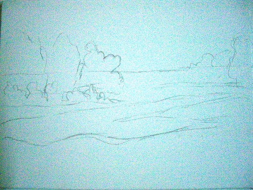
Green Landscape - stage 1
(c) Nithya Swaminathan


Seen above is the initial sketch, as roughly as I could. My sketches for landscapes are generally very vague, I do not follow the picture to the T, but this was more sketchy than I normally do. The sketch was done in under a minute.

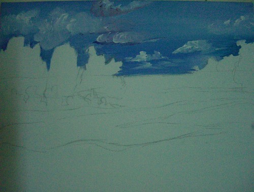
Green Landscape - stage 2
(c) Nithya Swaminathan


Then I start with the skies, and in about 5 minutes, do the sky with some cobalt blue and white. Then randomly do the clouds as I please. A touch of crimson here and there.

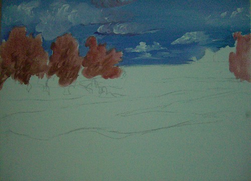
Green Landscape - stage 3
(c) Nithya Swaminathan


I then do an underpainting of the far away trees in tones of red. This is to enhance the effect of the greens which will be done on top of the reds. I have not marked values, just done a plain monotone underpainting. Another 2 mins spent there.

Green Landscape - stage 4
(c) Nithya Swaminathan


And then I started with the greens, did a green wash without much details in the foreground. There is no actual depiction of grass as yet. This was about 15 minutes.


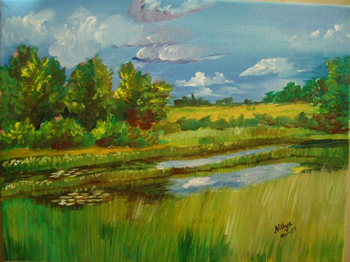
Green Landscape - Acrylics on Canvas, 12 * 16 inches
(c) Nithya Swaminathan
Original available, email me for purchase info.
Prints available here.

And finally I complete the painting with more details on the grass, complete the reflections of the sky etc. Another 25 minutes spent. So start to finish was done in approx one hour. I wanted to finish this Alla prima, in one sitting, but it got spilt over to two sessions. So that defines my next goal - to finish a painting in less than an hour and in one session. I have put this WIP into a slide show, check it out.


It is a lot of fun working like this, it is very liberating since there is no time to think and I just paint. My mind doesnt ponder over what I should do, it is only a spectator. I love the whole thing, though I cannot say for sure if this will be a new direction that I will focus on. Let us see. I would love to hear your views on this. And since my readers already know how much I suck at titles for paintings, I would love to hear some title suggestions as well. I just could not come up with one!

October 12, 2007

Autumn Woods - completed

Did anyone feel that my maples were a bit too yellow last time? Well I felt so, and I had to do something about it. That’s probably not the only reason why they look like gulmohars and not maples, but I wasn’t too happy with the leaves. I added some flesh tint on them to make them brighter, and darkened the crimson on the other side.


Autumn Woods
Acrylics on Canvas, 18 * 36 inches
(c) Nithya Swaminathan
Original Available


In my previous update, since the leaves had a lot of yellow and were surrounded by more of green and yellows last time, they were getting lost in the grayscale. The barks had a good range of values, but the leaves looked quite flat. I have changed that by adding a lot of dark blues surrounding the leaves, to push forward the maple leaves. And then I correspondingly reduced the yellows in the sunlit areas of the birch barks as well.

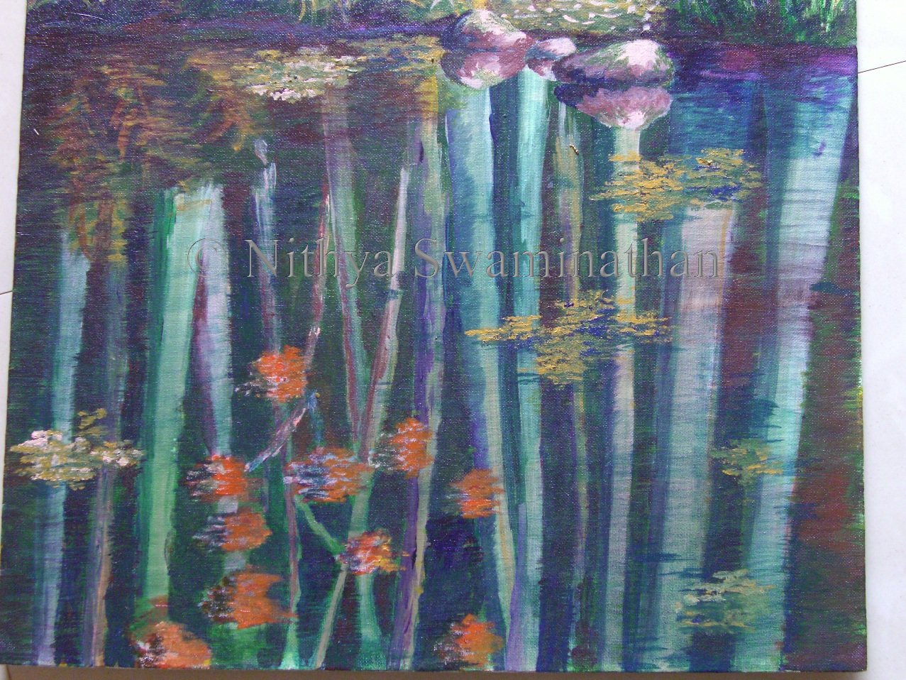
Some closeups of the painting for you guys. First is the closeup of the reflections. The reflections have been done by adding the barks first as bright as possible, and then doing several washes of blues and greens, and some browns here and there. Finally to get a better feel of water, I have added some dried leaves floating here and there. I am pretty happy with the reflections overall except for those of the maple leaves. The orange kinda sticks out. I have already got suggestions to tackle it, will probably be washing it over with some darker hues.


Autumn Woods - close up
(c) Nithya Swaminathan


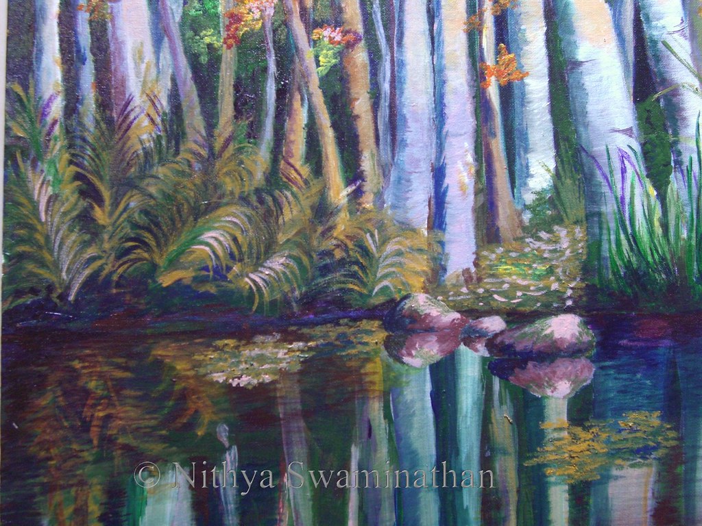
This is a closer look at the middle part of the painting, the ferns and their reflections. This is also my favorite portion of the picture, the part that I am really happy about. I went about randomly doing the ferns but they turned out quite well.I also added some highlights on the ferns. And instead of having the bushes on either side look alike, I made one side have tall grasses. And the middle part is supposed to be a path of some sort, though it may not look like one.


Autumn Woods - close up
(c) Nithya Swaminathan


As I had already mentioned in the previous post, I felt like adding a couple of rocks in the middle. They look really nice, I can tell you. I like the mood that the rocks add, I feel like gingerly stepping on them and walking into those woods, ha!


Autumn Woods - Greyscale
(c) Nithya Swaminathan


Finally, a look at the grey scale, to determine the values in the painting. In this version, I am able to differentiate the background foliage from the maple leaves, which was missing in the previous version. I am fairly happy again with this as well.

While I was checking out slide.com, I just put together the WIP images of this painting and got a slide show done, aint it cool? Shows the flow of the painting from scratch to finish, more importantly shows me my own thought process, how I went off track at several places etc etc. It provides a good learning for me.


Here is a link to this thread at Wetcanvas. Have a look at the amazing results produced by the other artists as well. Such different paintings produced from one image. Awesome fun!

September 28, 2007

Autumn Woods – A challenge

This is my latest painting, that I am doing as part of a challenge in the Acrylics forum at Wetcanvas.

Recently, Celeste had done a small sized landscape of Autumn Woods and in the Acrylics forum, she was challenged to do it in a much larger format. Elaine and Celeste also decided to welcome anyone else who would be willing to join in and have fun. So the idea is to paint from a vague Autumn reference and create a painting that's better than the reference image. And the main challenge is to do in a big canvas. I had a 18 * 36 canvas lying idle for quite some time, and thought this was the best chance to use it. Though there are no deadlines as such, I get the motivation to paint on seeing the WIPs of everyone, and it's a lot of fun.

I made some additions to the original image by adding a water body in the foreground, and added some reflections of the woods. I love fall reflections and leaves, so wanted to paint them here. This was also since my canvas was too tall for just the trees. This is a WIP that I hope to complete during this weekend. My parents are visiting us so I am not sure how much work is going to get done, but there will be an update on Monday for sure.:-)


Autumn Woods - Stage 1

This is technically the second stage in the painting, the first one was my canvas filled with scribbles from my daughter! And I started thereafter and added the trees in white and grey. I also blocked the darkest darks with ultramarine blue and a lot of green. And I got most of the sky done too. This will be my first layer.


Autumn Woods - Stage 2

On top of it, I have started adding some greens and ochre yellow in the background, indicative of some bushes.


Autumn Woods - Stage 3

The next thing that I do is to add more foliage. A lot of glowing yellows and greens in the top for the leaves, and there are going to be a lot of orange maple leaves right in the middle. A good thing to do here would be to actually do the tree barks to completion and then do the leaves. But I am as impatient as my daughter, if not more, and I want to get a 'feel' of how everything would look together, so I have started with the leaves right away.

Autumn Woods - Stage 4

And then I start adding some more detail to the barks, nowhere near complete though. I add some darker greys and browns to the birch tree barks. This is where my painting is right now. I have spent about 2 nights on this one, and there is still a long way to go.


Autumn Woods - Foliage close up

Here is a little close up of my leaves which fall on the top left of the canvas. I promise that they are leaves, though they don't look so. I will define the shapes properly as I progress and make sure they look like leaves and not some patches of color thrown in.


Autumn Woods - Trees close up

Here is another close up of the barks, which are still only about 20% done. A lot more to do there as well. It is mind blowing to see the progress of everyone else, and I am learning a lot in the process. And having a hell a lot of fun. I can't wait to get my hands on the canvas tonight.

Watch this space for more updates.

If you like it, share it!