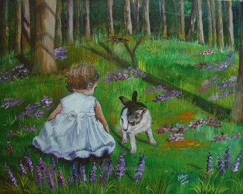
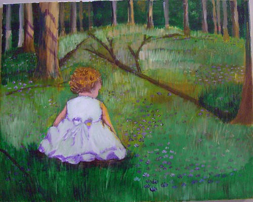
Nothing here is painted from my imagination, but the whole painting is based on a dozen images, combined in a way that I found appealing. Rather I imagined a scene in my mind, and hunted for pictures that had a lighting to suit, to create a mood etc etc. So its essentially my own composition, and that feels so good!
Initially, my idea was to add a colorful ball to the right side, and something like a butterfly close to the child. It was as if she was playing with the ball but her attention got to the colorful butterfly and the ball was lying unattended to! Well I was thinking about my daughter all along the painting and that is so typical of her. I did add a ball but did not like it and painted over it.
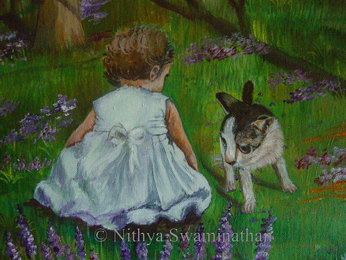
I felt kinda lost midway and thought of starting afresh on the canvas, but with a lot of compositional help from the experts at Wetcanvas, I could redeem the painting and make it a tad better. Someone at the acrylics forum suggested about adding a kitten/puppy and I loved that idea. So despite the fact that my bakcground was done completely in green, I added a kitten directly with some paint. That probably explains why that kitten looks kinda distorted.
And then I also felt that the child was looking older than she should. I wanted a girl of 2-3 yrs and she looked about 5 yrs I would say. So I worked on 'rounding' her arms a little more and making her size a little bigger so that she was the focal point. And since I felt there was too much of green all around, I added some flowers to the foreground.
 Conversation - completed
Acrylics on Canvas, 16 * 20 inches
Original available
(c)Copyright Nithya Swaminathan
What you see above is a closer look at the child and the kitten, do suggest any changes that you feel would make this a better painting. Thank you!


Nithya
ReplyDeleteI like the concept, the girl and the surroundings have come out very well.
The cat looks oversized and hence doesnt feel like it fits in the painting. Maybe you can add a rabbit? Or do away with animals and just play with butterflies, like you had originally imagined?
Good luck and keep us updated
-altoid
wow..excellent, Nithya. I noticed and liked the tree shadows. perfect!
ReplyDeleteand abt the cat, aama, face and eyes esp perusa iruku. can we try rabbit or squirrel?
Fantastic stuff Nits ! I love the bluebonnets thugh they have come as after thought. I think the eyes of the cat is too out of proportion
ReplyDeleteAltoid,
ReplyDeleteRabbit sounds a nice idea, will think about it. I havent touched this in a week now, will post an update soon.
J,
Thanks.. I need to make the cat a little smaller, and if that is fine, will stick to it. If not, I need to see what to do.
Chets,
Thank you. Yeah I too like the bluebonnets, they turned out decent.