Showing posts with label Different Strokes. Show all posts

January 28, 2009

Different Strokes - San Francisco Victorian

Here is my entry for the ongoing challenge at the Different Strokes blog. I had a lot of fun with this one, done entirely in colored pencils. I have tried to bring in more color than in the reference. I initially thought I would do the little trees in acrylics, as I have never handled foliage in CPs. But changed my mind later and went ahead in CPs itself. That's why I love these challenges, they give so much room to experiment. There's another week to go for this one, and I might sneak in another entry, let me see if time permits.
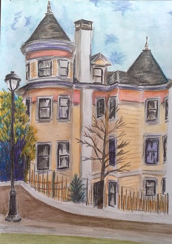
San Francisco Victorian
Colored pencil on paper, 9 * 12 inches
Copyright Nithya Swaminathan
You can view all the interpretations here.

September 28, 2007

Bougainvillea Pots

In the acrylics forum at Wetcanvas, we have a project titled "Different Strokes" running for every month. On the 1st, an image is posted on the forum and everyone paints with the same photo as reference. We do not show our works in progress, but reveal the final image on the 20th. It is great fun and awesome stuff to see how each artist approaches the same subject. I have always wanted to take part in this one, but been lazy. Last month's reference was too good to miss, and I got the better of my laziness! No prizes for guessing that I got lazy again this month.


Bougainvillea Pots
Acrylics on Canvas, 10 * 12 inches.
(c) Nithya Swaminathan

The reference image had a line of flower pots on a terrace of a building, with some coconut trees in the background. I did not like those trees, so I changed the terrace to be more like a balcony at ground level and gave this background of waves. I really liked how this one turned out. I spent about 2 nights on it, and was happy with the results.

I also mustered a little courage to be a little different in chosing my colours. I used bold strokes of purple for my shadows, which I normally wouldn't do. I would do my shadows in diluted black, but tried it this time and liked it. Even though the strokes would stand out in real, it gels on the image as a whole. The whole idea of the project is to experiment and I am glad I found time for it.

If you like it, share it!