Continuing my efforts to come up with my own compositions, I have ventured into this one combining several pictures of
Monet’s gardens at
Giverny, France. The references have been used with the permission of some fabulous photographers at
flickr. Right now the painting is in its formative stages and looks quite tight, but I hope to get an
impressionistic effect going further. I am also not happy with the richness of the color so far, it looks so dull. I need to work on this a lot more, and if I am still not satisfied, I will go in for my oil paints. I have never tried how oil works on top of acrylics, and I am quite excited to try that out.
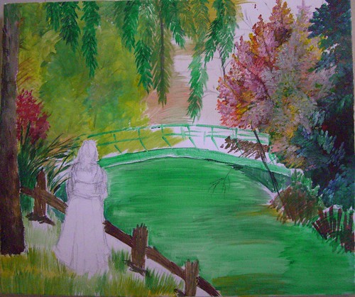 Me time - stage 1
(c) Nithya Swaminathan
I am mostly a waterfall or sea kind of person, I love wild waters. Still waters don’t excite me much, but this is a kind of place that I would like to spend some time with myself. That’s what made me add a figure in the pic. I could just go on staring at the waters and those ripples, doing nothing else! Seen above is the initial stage where I have just outlined the lady.
 Me time - stage 2
(c) Nithya Swaminathan
I have very crudely indicated some waterlilies in the water. I was in a dilemma whether to have a couple of swans or waterlilies, and have gone with the lilies as of now, since they look more like Monet! The water and the bridge are mostly green, and they all look messed up now. I will be making the bridge a lot lighter and differentiating it from the waters.
 Me time - stage 3
(c) Nithya Swaminathan
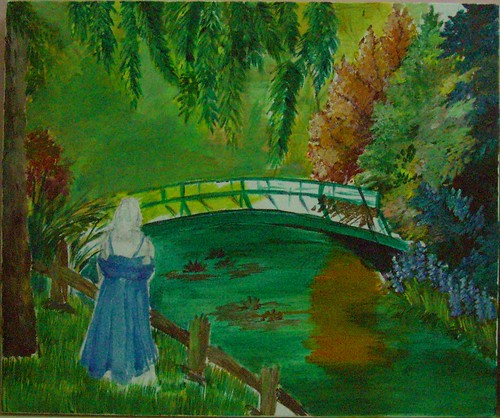
I wanted to give the lady a nice flowing dress, like those of olden times. I felt it would give a old masters kind of look to the image. I have changed that now, have made the dress rather straight forward. I have also tilted her body to be facing the pond, so that she looks more 'in' the scene. I have also reduced the size of the lady, I felt she look huge before! Blue was my first choice for the colour of the dress, since I love blues. But now I don't like what I have done, since the whole painting is so full of cool colours. I am thinking I will make it peach, or even mild yellow. That should make the figure stand out. The background needs a lot more detailing too.
I have not touched this in a week since I have been busy with my cousin’s wedding and other stuff. We have a holiday tomorrow, and I hope to get some work done on this. So you guys can expect an update on Friday.

Wow!
ReplyDeleteY don't you use one of your paintings as background for your blog?
It will make it look colorful, that is how it should be along with title "A Splash of Color"
[Just mute it a bit!]
Think about it, you just need a script after the body tag in ur html.
Script can be found here
You can get back to me in case you need any help :)
GBU
Arti
Thanks for stopping by Arti. And thanks for the suggestion. Not sure if I want to set a painting as a background to the whole blog. To the header, yes, I would love to do it. Will do it one of these days. :-)
ReplyDelete