Showing posts with label water. Show all posts

January 3, 2015

SOLD - 30 Things about me - Day 3

The Splash
Oil on Board, 18 by 24 cms (9.5 by 7 inches)
SOLD
30 Things about me #3 - The waves inspire me and calm my soul
I have a very special relationship with the waves. Not surprising considering I grew up in a coastal city with a beach to die for. I love getting into the water and stand there letting the waves caress my feet. I can also actually sit aside and just keep looking at them for hours together. I find the waves a metaphor for so many things in life. They give me strength, hope and provide endless inspiration while having a calming influence like no other.

I have wanted to make a series of paintings around the theme of waves since a long time and I am glad that I could get to it now. This is painted with the palette knife in an attempt to loosen up and keep things bordering abstract.  Yesterday's painting got tighter than I wanted it to, so today I just stopped at a point and decided not to mess anymore. 

August 19, 2014

Waterlily #3 - Original Floral in Oils

I am currently visiting my home in India, and have carried a bit of my paints and boards along with me. I could hardly manage to get time until now, and I am glad I finally got to do a couple of paintings in the last two days. These references are quite old, I took them many years ago at a park. I have painted them before and it is fun to give them a fresh shot. :-)

Waterlily #3
Oil on Board, 5 by 7 inches
Click to bid

August 18, 2014

Waterlilies #2 - Original Floral in Oils

I tried to consciously work on my edges in this piece, it is one area that I have to improve a LOT. I used the small brush only for parts of the flower, and the largest brush everywhere else. I still have a long way to go, baby steps.

Waterlily #2
Oil on board, 5 by 7 inches
Click to bid

March 4, 2012

Sunshine stroll - Figurative beach painting in Oils

This is one of those references that made me wish I was transported right there. With the gorgeous sun, lapping waters and a stroll all alone with nothing on the mind. Ha! I wish! 

It is also my favorite painting of the week, I am quite pleased with how it turned out.

Sunshine Stroll
Oil on Canvas, 4 by 12 inches
Click here to bid

March 24, 2009

Different Strokes - Having fun

This is my entry for the ongoing challenge at the Different Strokes blog. The reference is a subject Karin paints so well, a beach scene. I love her beach scenes as much as her gallery scenes. It is a new subject to me though, its been a while since I've done beach waters.

Having fun
Acrylics on Paper, 9 * 12 inches
Copyright Nithya Swaminathan

After very detailed painting with my still lifes, I wanted to really loosen up and paint this one. The reference is a very crowded one, with many people vying for attention. The focus would first go to the girl with the surfing board, as if in deep thought. But beyond the figures in the foreground, I was instantly attracted to these little girls having fun in the water. That's what the beach means to me, a place to really let yourself free. So I restricted my focus to these two girls, and had a lot of fun with the water too. Your comments are welcome.

March 6, 2009

Deep woods - WIP

There is a virtual classroom on doing Trees and Foliage happening in the WetCanvas Acrylics forum, and here is my painting that I am doing along with the class. Though I do a lot of landscapes, I always make foliage quite messy, so this was a good opportunity to learn from an experienced painter. I am one confused soul right now as I am unsure how the painting will shape up. But here is a step by step process so far.


I am using two references merged for this painting. One is of a woods scenery in my neighborhood here, and the foreground is from a scene in India.:) The woods are largely with winter trees, with some hint of dried up fall leaves here and there. To begin, I directly sketched the trees on the canvas with a very watery burnt sienna. Have done the sky also quite watery now, with cerulean blue and titanium white. I plan to have some trees in the background, very shallow waters in the foreground with some rocks here and there. I also have a fallen branch in the foreground.

And then I have started adding dark foliage in between the trees. The colors used are olive green, some crimson and burnt sienna. The trees are mainly birch trees, and they are quite fun to paint.

Then I suddenly decided I wanted couple of more bigger trees in the foreground, and have sketched them with some olive green. Thats generally how haphazardly I work :D Since the background foliage is not supposed to be so dark, I have added a layer with titanium white, mauve and olive green. Very loosely mixed on the canvas itself. This is a night photo and it not so good.


Then I realize that the trees all look very evenly spaced, so define them a little more in clusters. Have added another layer of the sky too, as the first layer was too watery.


And then with some yellow ochre, burnt sienna and a hint of orange, I have added some foliage in the background. It is a winter scene with only dried up fall leaves, so no bright colors used really.


With some flesh tint for the brighter side, and pthalo blue + burnt sienna for the darker sides, I have done the trees again. After my daughter's portrait last year where I spent a lot of time getting the flesh tones right, I bought this tube of flesh tint. My daughter's portrait is done with mixed flesh tones, no flesh tint straight off the tube. But ever since I have got this color, I have used it for everything but portraits. I am finding a great use for it in still lifes, and now in landscapes as well. Huh! Here is how it looks right now.

Today I will be working on the trees some more, I hope to pull out my palette knife too. Then I will start working on the water. Look forward to an update in a couple of days.

June 18, 2008

Australian Country side - WIP

When your hands are really itching to get hold of a brush, the fact that you are unable to isn't exactly a very nice feeling. I am in that state of helplessness currently, other than a occasional sketch, I am unable to do any serious painting. So I thought it would be good to post some of my WIP pieces that are waiting for me to take them to completion. These pieces would be completed by end of August.

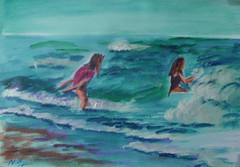
This is a piece I started a long time ago, around 6 months back I guess. I got too distracted with newer paintings and work coming up that this has been lying around. I got to work some more on it about a month back though. Its on gallery wrapped canvas, 16 * 20 inches.

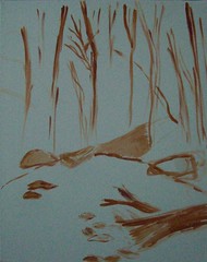
Australian Country side - Acrylics on Canvas

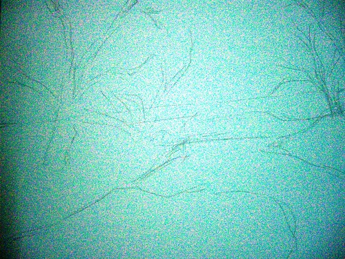
Step 1 - rough initial sketch


Seen above is the initial sketch done freehand and directly on the canvas. This is also an attempt to paint as loose as possible, so I have deliberately avoided giving any details in the sketch.

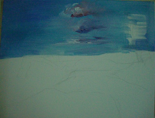
I have then laid down the color for the skies, overlapping the sketch coz the trees will be done over this after drying. I do not find it good to do the trees first and then show some sky in between, it makes it very unreal.

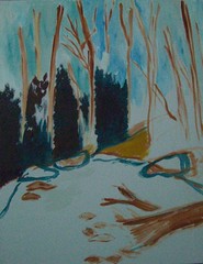
Australian Countryside - Acrylics on Canvas, Stage 2


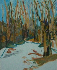
In the next stage, I have marked the darks with burnt sienna. These will be the darkest areas of the tree foliage, with lots of shadow. The picture has really good lighting so shadows have a crucial role to play. The rough marking of the trees looks rather crude, but it is just to guide me where the barks are. I will be painting over this in browns anyway.

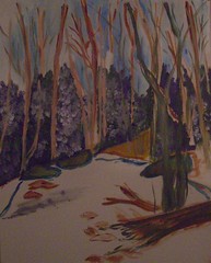
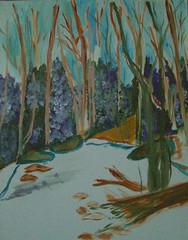
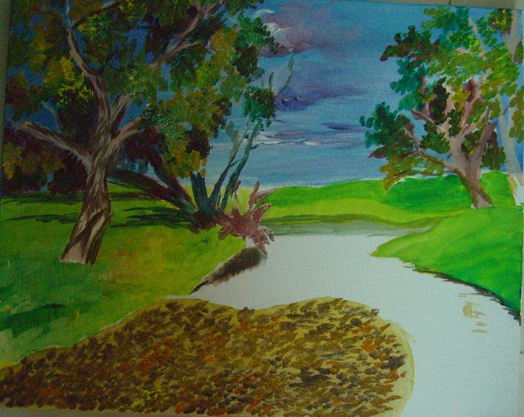
Australian Countryside - Stage 3


I have then started with the leaves, and the grass in the foreground. I have kept the grass really light, as it is much more brighter than this. It is nearly bright yellow. What I have observed from my paintings in general is I don't tend to really push my darks and my highlights. It looks like I tend to stick to more mid tones, which I aim to change. Even here, I should ideally be making the shadows much darker, and the highlights much more brighter. I hope I am able to achieve that by the time the piece is done.


As it stands, this painting will not draw the attention of any viewer methinks. In the meanwhile, I have also started work on the foreground. The foreground is absolutely gorgeous with a lot of dried leaves over shallow waters.

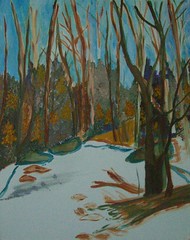
Here is where the painting is as of now. A lot more to go, at least 2 more layers to be done. I need to then refine the skies too, right now the clouds look really haphazard. All that and more by mid-August :-)


I have not prepared a slide show as of yet, will do so after the whole painting is completed. Your comments are most welcome until then.

October 31, 2007

'Me time' - WIP

Continuing my efforts to come up with my own compositions, I have ventured into this one combining several pictures of Monet’s gardens at Giverny, France. The references have been used with the permission of some fabulous photographers at flickr. Right now the painting is in its formative stages and looks quite tight, but I hope to get an impressionistic effect going further. I am also not happy with the richness of the color so far, it looks so dull. I need to work on this a lot more, and if I am still not satisfied, I will go in for my oil paints. I have never tried how oil works on top of acrylics, and I am quite excited to try that out.

Me time - stage 1
(c) Nithya Swaminathan


I am mostly a waterfall or sea kind of person, I love wild waters. Still waters don’t excite me much, but this is a kind of place that I would like to spend some time with myself. That’s what made me add a figure in the pic. I could just go on staring at the waters and those ripples, doing nothing else! Seen above is the initial stage where I have just outlined the lady.

Me time - stage 2
(c) Nithya Swaminathan


I have very crudely indicated some waterlilies in the water. I was in a dilemma whether to have a couple of swans or waterlilies, and have gone with the lilies as of now, since they look more like Monet! The water and the bridge are mostly green, and they all look messed up now. I will be making the bridge a lot lighter and differentiating it from the waters.

Me time - stage 3
(c) Nithya Swaminathan


I wanted to give the lady a nice flowing dress, like those of olden times. I felt it would give a old masters kind of look to the image. I have changed that now, have made the dress rather straight forward. I have also tilted her body to be facing the pond, so that she looks more 'in' the scene. I have also reduced the size of the lady, I felt she look huge before! Blue was my first choice for the colour of the dress, since I love blues. But now I don't like what I have done, since the whole painting is so full of cool colours. I am thinking I will make it peach, or even mild yellow. That should make the figure stand out. The background needs a lot more detailing too.

I have not touched this in a week since I have been busy with my cousin’s wedding and other stuff. We have a holiday tomorrow, and I hope to get some work done on this. So you guys can expect an update on Friday.

May 1, 2007

Remembering Kumarakom - my only 'Indian' ATC


From the backwaters
pvt collection of Rose Herczeg
copyright Nithya Swaminathan

Excuse the poor quality of the scan, I am sure this looks *much* better in person! I had a blast doing that water and those reflections. Coincidentally, most of my cards turned out to have some kind of reflections, and they were all so well received. Talk about a warm group of friends!

If you like it, share it!