Showing posts with label 2009. Show all posts

September 16, 2009

Different Strokes - Return of the muse!

I have not painted for a while, a long while actually. Been more than a month since I did anything worthwhile. Too many things have come in the way and have kept me occupied. And somehow I have not managed to focus on my art. The husband says I should seek solace in art and do it all the more when I am stressed. Though I do agree he has a valid point, more often than not I need to be at peace to be able to focus well. I need to be in a clear mind to pick up a brush and make the first stroke, and then it flows.

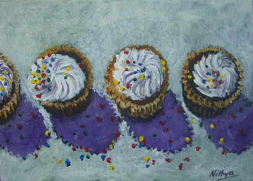
But then came along this utterly compelling reference from Karin, and I just could not let it go. Different Strokes has turned a year old, and this reference is to celebrate the success of the blog. I would like to thank Karin for all the time and effort she puts in to this blog, for the challenges she comes up with. It is a phenomenal effort, and has helped so many artists in very many ways. I have met up with so many different artists through this blog and its been so much fun taking part in it. I have been somewhat regular with my entries and hope to be so. While Karin celebrates the birthday of DSFDF, I thought I would celebrate the return of my muse, finally, after a long absence. Hope it doesn't run away again!

Return of the muse
Acrylics on Board, 5 * 7 inches
Copyright Nithya Swaminathan


Don't forget to check out the hundreds of utterly delicious cupcake paintings. They are simply lip smacking.

In the meanwhile, I finally got a chance to meet up with a group of local artists here, and I even attended a meeting of the group, entirely in Deutsch! How cool is that! My language skills are certainly improving and it was a lot of fun. Regular programming will shortly resume at the other blog as well!

July 19, 2009

Who's hiding behind?

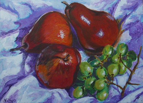
Continuing with the series of Pears and Grapes, here is the next one. I like this one best so far, among the three. I really like how the fabric turned out in this one. My foremost critic, the husband, is not very happy with it though. I am waiting to see what my friends at WetCanvas have to say. It is funny how different things appeal to different people, and it is impossible to please everyone alike. There were quite a few people who liked #1 better than #2, and vice versa :-) It remains to be seen what they have to say about #3 now.

Who's hiding behind?
Acrylics on Board, 5 * 7 inches

Copyright Nithya Swaminathan

The pears have a lot of color, in order to capture the lighting, reflections of the cloth on the surface of the fruit etc. However, I find the grapes are much more challenging and it is fun to paint them. The grapes need to have the translucent effect and I am not there yet. This is the first time I am doing grapes and I am having fun, learning a lot, observing more color. Of course, I have more paintings coming up in this series, and I finally hope to nail the translucence. I hope!

The pears that I have used in these set ups are of the Red Bartlett variety. They are largely red with a mix of ochre in between. My set ups are such that the red side gets prominence. And my renditions seems to be more bright red in color, which is something I have generally done, exaggerating colors a bit from real life. I like it that way, tends to have a more dramatic effect.

July 18, 2009

More pears and grapes

In the previous painting of pears and grapes, I felt the colors were probably too much on the darker side. I generally keep my colors bold, but I could have probably gone a little softer on the fabric, parts of the fruit etc. My friends at WetCanvas gave some wonderful suggestions, and I tried to incorporate those into this piece. I underplayed the glossiness of the pears, made them look more fleshy than shiny. And instead of going wild with purples on the cloth folds, I opted for softer grays. Your feedback is welcome.

Pears and Grapes #2
Acrylics on Board, 5 * 7 inches

Copyright Nithya Swaminathan

July 17, 2009

A new series, a new blog

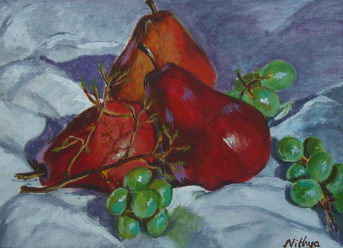
I started a series of still life paintings with pears a few months ago. The paintings underwent a lot of changes and then were lying around incomplete for a long while. I then felt I was not at all satisfied with the compositions and decided to ditch them. I gessoed again over those boards. The references were quite interesting though, with vibrant colors and so I reworked smaller compositions with them. I opted for closer crops which could be painted on a small size. Here is the first one in the new series, of Pears and grapes.

Pears and Grapes
Acrylics on board, 5 * 7 inches

Copyright Nithya Swaminathan

On my birthday, I launched a new blog. It is a new project that I have undertaken, where I plan to complete 300 paintings before my next birthday, when I will turn 30. Check out my new blog 300 to 30.

July 3, 2009

Lane of Pink Blossoms

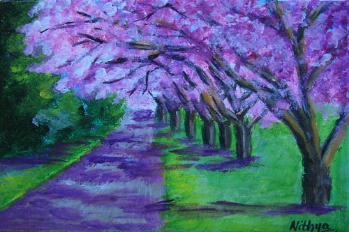
I have a liking to do rows of trees, rather than a single tree. Part of it is because I can skip all the detailing when there are more trees. I still don't think my foliage is any good, but it works well in some cases. I feel totally rusty and lost when I do some close ups of leaves, flowers etc. I have a long long way to go as far as botanical art is concerned!

Lane of Pink Blossoms
Acrylics on Canvas, 4 * 6 inches

Copyright Nithya Swaminathan

July 2, 2009

Jacaranda lane

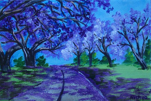
I loved this reference, and was reasonably pleased with how it turned out as well. This was sent to Elizabeth, who took our virtual class on painting trees. I liked this one best amongst those that I painted, and since Elizabeth was largely responsible for that, I sent it to her. She loved it and had such nice words to say, which really made my day.

Jacaranda Lane
Acrylics on Canvas, 4 * 6 inches

Copyright Nithya Swaminathan

It is funny and often frustrating how colors get distorted under a camera or a scanner. The colors in this one for instance, though there is a significant amount of blues, it is not as blue as it appears in the image. It looks much better in real life, and it is unfortunate the photo is the way it is! Sigh!

July 1, 2009

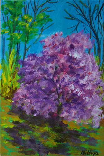
Continuing with the flowering trees

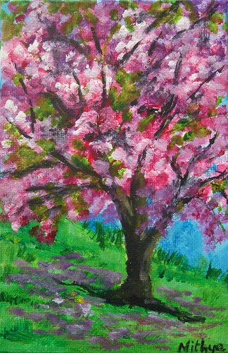
My tree paintings have all reached their new homes, except for two of them. This one has not yet reached, and I hope my friend doesn't peep in here :-) I got some really good feedback for the trees, and I am so so glad!Pink tree
Acrylics on Canvas, 4 * 6 inches
Copyright Nithya Swaminathan

June 30, 2009

Different Strokes - Row, row, row your boat

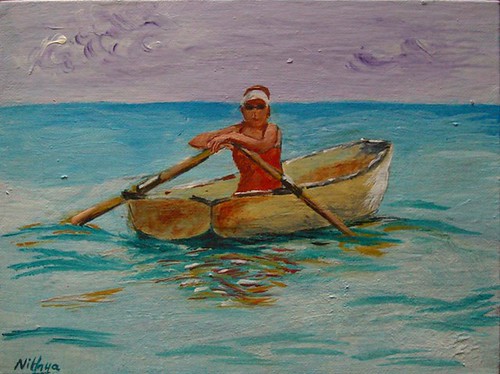
My entry for the ongoing challenge at the Different strokes blog. The image is full of greys, shot on an overcast day. I just felt like adding a little more color to it, and that's what I have done. Just made the waters and the ripples a tad more pronounced than in the reference. Had a tough time painting the ripples! It's been a while since I painted water and was feeling quite rusty!

Row row row your boat
Acrylics on Canvas, 18 * 24 cms

Copyright Nithya Swaminathan

All the entries together can be seen here. Your feedback is welcome.

June 29, 2009

Getting back to some more apples

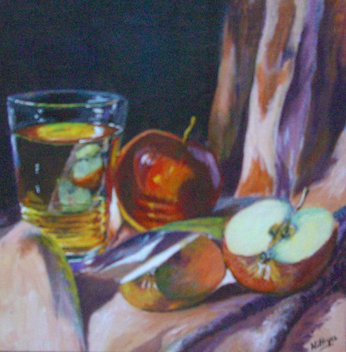
I hope my readers will remember the apples and glass series of paintings that I had done couple of months ago. Well I had some more references of the same, and started them. So here is the ninth painting in the same series.

Apples and Glass #9
Acrylics on Canvas, 8 * 8 inches

Copyright Nithya Swaminathan

I am grown so much in love with painting apples, that I like to think it is the best thing to do when in an extreme phase of self doubt :) It clears all doubts about myself and keeps me going. I did not take any progress shots this time so all I have is the completed image. There are more to come.

June 21, 2009

Twin Pinks

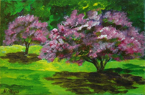
Twin Pinks
Acrylics on Canvas, 4 * 6 inches

Copyright Nithya Swaminathan

I was involved in a lot of ATC exchanges over the last two years, which took up a big chunk of my time. Though I had a great time with most of them, there were a couple of exchanges which I did not enjoy as much. The subjects were stuff that I wasn't very interested in painting. Also, in all my earlier exchanges, I got to know the artists only during the project, after interacting on the discussion thread of the project. However, this time it is a group of artists whom I largely admire in the Acrylics forum. They are experts at making the medium do whatever they want it to, in achieving stunning results with the medium. The chosen subject is also something I want to seriously work at. I don't really like my trees and this was a good chance to correct that. Above everything, this was a great opportunity to own original art from an inspiring set of artists.:) I have got some great pieces, some more are in the mail and I cannot wait!

June 20, 2009

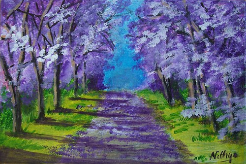
The Road less traveled

The original image for this painting is a reference from Sxc.hu, and it is a fall image. A lovely mix of reds and browns and is a gorgeous reference in itself. I just wanted to try changing the colors and doing this as a flowering forest. I think it turned out okay.

The road less traveled
Acrylics on Canvas, 4 * 6 inches
Copyright Nithya Swaminathan


I started with another slightly bigger painting of this scene with the original colors as well. I am half way through with it and will post it later. It was a reference that's been lying around with me for couple of years and I am glad I finally got to do it twice over.:)

June 19, 2009

Flowering Trees - a postcard exchange

I am addicted to Art exchanges, you know that already don't you? I have mentioned that a million times here and elsewhere. I just love the excitement of receiving such varied Art from all over the world. And it also helps me work better as exchanges generally work within a deadline and I get more stuff done.

For several months now, we have been having virtual classes in WetCanvas covering a wide range of subjects. Few months ago, we had a terrific class on painting trees, by Elizabeth. As a spin off from the awesome class, some of us got together to go a postcard exchange of Flowering trees. So here goes, my attempt at recreating Spring :)

Pink Shadows
Acrylics on Canvas, 4 * 6 inches

Copyright Nithya Swaminathan

Instead of posting them together, I will be making separate posts because it is easier for me that way to keep a count of all paintings done this year. We are working towards 100 this year, just in case you forgot :)

June 17, 2009

Different Strokes - Summer Vegetables

Just managed to sneak in my entry on time for the ongoing challenge at DSFDF. I have been very busy over the last couple of weeks and had no time to get to this one. But I so wanted to do this challenge, and I am glad that I could get it in just in time.

Summer Vegetables
Acrylics on Canvas, 18 * 24 cms
Copyright Nithya Swaminathan


Your comments are welcome. All the entries can be seen together here.

June 2, 2009

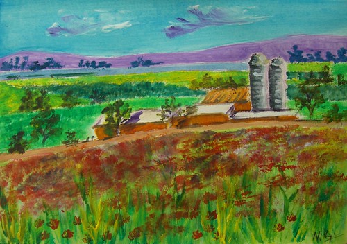
Different Strokes - Pennsylvania Poppies

This is my entry for the ongoing challenge at Karin's blog. It was a fun challenge, to invent color for a black and white image. I have always wanted to paint colored fields, and thought this was a good chance to do so. I attempted to do bring in some poppy fields in the foreground, and I am not entirely happy with how it turned out. This painting actually looks very sketchy, and I might try to do it again for a better result. I liked the image and had fun and would love to give it another shot.

Pennsylvania Poppies
Acrylics on paper, 5 * 8 inches
Copyright Nithya Swaminathan


A big thanks to Karin for a wonderfully unique challenge. She continues to inspire artists and helps them stretch themselves. Have a look at all the paintings here. There are a lot of interesting interpretations.

May 20, 2009

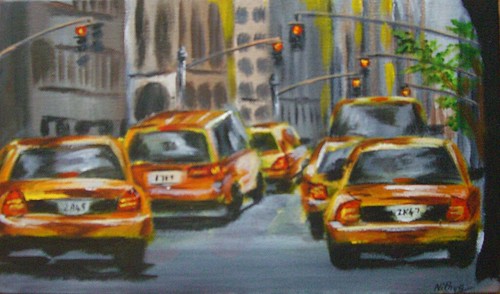
Different Strokes - Red Signal

Here is my entry for the ongoing challenge at Karin's Different Strokes blog. I have never painted a Cityscape before, though I have planned to paint a hundred! I have scores of references, my own references of very nice cityscapes, but I am very very apprehensive to get to them. A crowded scene kind of intimidates me. I get bogged down by thinking where to start and how to go about it. And that is exactly the point Karin makes in her pep talk, to break down a crowded scene and simplify it.

Red Signal
Acrylics on Canvas, 7 * 11 inches

Copyright Nithya Swaminathan


I loved this scene and wanted to do it in full. It is a scene so full of life, and I loved the long format of the image. I also had a 7 * 11 canvas lying around for sometime, so I thought I'd use that one up and do this image in a vertical format. When I got to it however, I changed my mind. I did use the same canvas, but tackled the image in a horizontal format, focussing on my most favorite parts of the reference, viz. the taxis. Such a burst of color, aren't they? As I started the background, the numerous buildings again gave me jitters. Then I squinted and squinted so many times, and all I could see was vertical lines of varying value. Looked much simpler than I thought! I am not sure if I have achieved a good feel of distance, but definitely much better than I expected myself to do.:)

Since I was too busy with my daughter's portrait, I almost missed the deadline for this one. Thankfully I remembered it just on time and got to it. I started working on this only this morning, and due to the lack of time, I was forced to keep it really simple and loose. So instead of nitpicking over too many details, I tried to bring in a feel of the scene and painted as quick as I could to finish it on time. :)

Have a look at all the entries here, they make an awesome collection.

May 19, 2009

Chasing my rainbow - updated

I was so not happy with my kiddo's portrait and I was really looking for someone to rip it apart. And no, that did not quite happen. Apart from a few suggestions from WetCanvas, there wasn't much I got. So I went by my original plan to leave it aside for a few days and then get back to it with a fresh eye. I must say that really helped. Also, till I posted it the last time, I was looking at my reference in the system and painting. This time, I took a print out of it and had it in my hand. That made a world of difference to the whole thing. Looking with the image in hand, side by side with my painting gave me a much better idea of what all I had messed up.

And then, I turned to my ever dependable dad for pointing out the issues in the portrait. Not that I could not do it on my own, but I firmly believe a fresh look helps, more so if its from him. As expected, after I mailed my daughter's portrait version 1.0 to my dad, I got some fabulous suggestions. I got some great suggestions also from my brother, who is a very gifted artist unfortunately with no online presence! My dad pointed out n number of places where I could improve, and finally said that I have to satisfy myself first. I think he nailed it with that one sentence. I wasn't even close to being satisfied with the previous version. A mother's obsession is too strong and I just could not settle with the earlier version. Not that I am greatly satisfied now, I am certainly not. But I feel I am almost there. Here is how the portrait looks now.

Chasing my Rainbow
Acrylics on Canvas, 16 * 20 inches
Copyright Nithya Swaminathan


Some of the things that I have done -
  1. I have added more darks around the corner of her lips to bring in more depth to the smile.
  2. I have softened the area where the neck meets the chest, earlier it was too hard edged and I think it looks better now. So instead of looking like an attachment on the chest, the neck looks like a continuation.
  3. Softened the background a bit. One thing people at WetCanvas and my brother pointed out was that the background was kinda competing with the image. Since it could hinder with the outline of the face I could not do much, but I have greyed it down as much as I could.
  4. I have slightly increased the size of the hand and palm. I am not even sure if it can be seen, but I made the hand a little thicker.
  5. I have redone most of the hair, as I felt it was too artificial looking. It looked like it was pasted on her head, I have tried my best to correct it. I worked a little patiently, strand by strand!
  6. Oh, and most importantly, I have painted over and repainted her left eye (the one closer to the viewer) at least 6 times. The eyebrows looked terrible before, like caterpillars! I tried to soften them as much as possible. And the whole eye was done over and over again. That's why I love and hate Acrylics. While I love it for the flexibility, I sincerely believe I'd take much more care if it were an unforgiving medium. So it is not Acrylics that I hate, it is myself actually. Huh!
My reference for this portrait is a terrible one. It is an image of Teju shot indoors on an overcast afternoon, can it get any worse than that? The lighting is just as pathetic as it can get. If someone gave me such an image to do a commission, I'd just refuse. But as I mentioned, this is a mother's obsession and I just had to paint her in that pose. It was sheer luck that among the dozens of snaps I took, this one had that sparkle in her eye and caught her mood so well. So I just couldn't let it go. I played around as much as I could with the lighting in photoshop, just to get the facial features lit up a little better. I am glad I pulled it off reasonably well.

This painting also has the dubious distinction of being the one that has undergone maximum changes after I signed it. As I mentioned in my previous post, I wanted to schedule this one to be posted on Mothers' Day, before I went on vacation. I therefore finished this up in a hurry and signed it. Even my husband told me it was decent enough to be posted. It was only when I looked at it through the camera that I realized how terrible it was. It was a bad painting, terrible if I were to consider likeness and mood. I just put aside the camera and realized it had a LOT more work to be done. I have worked for about 10 hours on this after signing it. And with great effort it has reached a stage where I like it. I only hope I still continue to like it after a week and don't have to pick up my brush again.

April 23, 2009

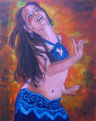
Let your hair down

Continuing with my series, this is my 3rd painting of belly dancers. There is one more to go as of now. All these paintings have been done based on the photos of Flickr photographer Adelita Choffi. While I was searching for pictures of dancers, I came across her treasure trove of snaps, all of beautiful belly dancers. She was generous enough to allow me to use them as references for paintings. I have favourited several more of her snaps, and will probably get to them after a while.

I might even extend this kind of a series to paint the various different forms of dance. There are too many exciting possibilities and I need to think before I jump in.

Let your hair down
16 * 20, Acrylics on Gallery wrapped canvas
Copyright Nithya Swaminathan


I wonder if you have noticed that instead of giving creative titles like dancer 1,2.. n, I have titled them separately. This was a learning when I submitted an entry for the Richeson competition. On my blog the apples were numbered one to eight, and I had a tough time coming up with titles just around the deadline. Huh! I dare not do this 1..n numbering once again. :)

April 22, 2009

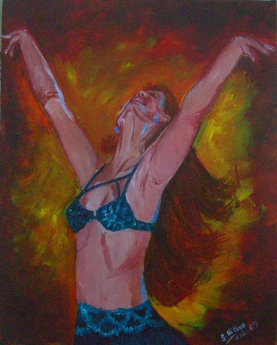
Unleashed

I love dance as an art form to bits, and not knowing to dance is one of my biggest regrets in life. I did not pursue it despite having had an opportunity to learn. This series of mine essentially aims to celebrate the beauty of the art form, and also the grace of the female form. I wanted the paintings to ooze passion, and that’s the basis for my color choices. I have gone in for a lot of oranges and reds in the background, as I believe it denotes a surge of passion. I aim to capture movement, with emphasis on the body language and not on facial expression. I wanted the whole figure to convey a sense of passion, true to the words “Dance like no one’s watching”.

Unleashed
16 * 20 inches, Acrylics on Gallery wrapped canvas
Copyright Nithya Swaminathan


While I chose blue in her dress mainly because the complementary colors would work well together, I also chose it keeping the peacock in mind. When I was thinking about dancing without a care in the world, or just dancing to your own heartbeat, the peacock was what popped up in my mind first. Hence I have gone in for a lot of Pthalo Turqiose in the dresses.

The style is different from what I normally do, on quite a few counts. This is the first time I have tried to paint focusing on what I “feel”, rather than what I “see”. This could perhaps be a new direction in my work, but I cannot say that for sure now. The style in which the background is done, is totally new. I painted like a woman possessed, dabbing color randomly. I wanted to have fun and yes I did. A lot.

Even with the dancers, I have given all the detailing only to the face and the hair. The hands have not been done as detailed as I’d usually do them. Since I wanted to focus only on the face and hair, I chose to go a little loose with the hands. The dresses also have intricate mirror work and beads in my references. I have omitted all of those and just briefly indicated some designs. I think it works well, but it remains to be seen if I still like it say after a week. I might get back to it and change something if I don’t like it.

April 21, 2009

Dance like no one's watching - a new series

Whenever I come across very high quality of Art that I greatly admire, it motivates me to work harder at my own art and improve myself. It also happens more often than not, that I get intimidated by awesome artists that I come across. It makes me feel I should strive to be that good, but the realization also dawns that being that good gets tougher with every passing day. I get bogged down that there is a long long way to go, and during every phase of introspection, I invariably feel I have just begun.

A couple of weeks ago, I was in a similar phase of self doubt after I visited an exhibition at a nearby gallery. I was fortunate to see some of the most stunning impressionist landscapes over there, and came back with the feeling that if I had to be even 1% as good, I had to improve by leaps and bounds.

Dance like no one's watching
16 * 20 inches, Acrylics on Gallery wrapped canvas
Copyright Nithya Swaminathan


While I was bogged down by self doubt and a serious loss of confidence, the only way to overcome that was of course to paint something. And for a change I wanted to paint something with reckless abandon, just slap the paint without being bothered about detail. When you lose yourself in the process of painting, the surrounding world hardly matters. And that's the motive behind this new series, a sort of reminder to self, to dance only to your own heartbeat, without a care in the world. There are 4 pieces in all, all of them of beautiful dancers.

I had a tough time getting this face right, due to the different angle. I am very comfortable painting faces that look straight, but these kind of faces give me jitters. And those hands were a nightmare. I thought I had painted them very big, but turned out they were actually much smaller than they should’ve been. I posted WIPs and got some very useful feedback from friends at the Acrylics forum in WetCanvas. One of the artists actually took the time to edit my painting in photoshop to show me how the anatomy wasn’t quite right. And that's why I love WetCanvas. People go out of their way to help and guide others, and you can never really get away with a badly done piece of work :D

March 24, 2009

Different Strokes - Having fun

This is my entry for the ongoing challenge at the Different Strokes blog. The reference is a subject Karin paints so well, a beach scene. I love her beach scenes as much as her gallery scenes. It is a new subject to me though, its been a while since I've done beach waters.

Having fun
Acrylics on Paper, 9 * 12 inches
Copyright Nithya Swaminathan

After very detailed painting with my still lifes, I wanted to really loosen up and paint this one. The reference is a very crowded one, with many people vying for attention. The focus would first go to the girl with the surfing board, as if in deep thought. But beyond the figures in the foreground, I was instantly attracted to these little girls having fun in the water. That's what the beach means to me, a place to really let yourself free. So I restricted my focus to these two girls, and had a lot of fun with the water too. Your comments are welcome.

If you like it, share it!