Showing posts with label Impressionism. Show all posts

April 28, 2008

Pierre Auguste Renoir - an Old Masters study

Studying Old Masters and their ways of working are generally of immense help to artists. Though I haven’t done a streamlined study of even one master, I can see why it is sure to help artists. It helps us learn by seeing how various compositions work, how some of them work even though they don’t conform to the “rules”, how various masters painted Light, etc. While such a study is going to benefit anyone, I am sure it will be all the more interesting if a group of us do this, and that’s what I have started doing now.

In the Acrylics forum of WetCanvas, a new Old Masters Study project has been initiated, where we would study the works of an old master for a month or two, and then produce our piece of art based on that. It could be a replica of one of his works, or a new painting based on his techniques. The technique and style is more important than the actual content. And the first old master that we have taken up is Pierre Auguste Renoir, one of the famous impressionist painters. I am very happy to take this up because I am a big fan of Impressionism as a movement. I love the distinct brush strokes that characterize impressionist paintings.

Auguste Renoir painted a lot of figures, mostly women. He had women is picturesque surroundings, even his nudes were mostly in idyllic settings. They had very interesting light colored flesh tones that made them very charming. My observation is he did not use too much of darks to bring contrast into his works. They did not have the striking light and dark contrasts as say the Dutch painters’ works have. There is a dominance of cool shades; even the backdrops of his figure paintings feature ochre, greens and blues a lot. The shadows have a lot of violet and blues in them.

When choosing a painting of Renoir to replicate, there were too many good ones to choose from. I went through the entire gallery of paintings and finally zeroed in on 'Woman in a rocking chair'.
Why this interested me is because there is no colored version available. All that is there is only a sketch, and I loved the idea of adding color, and more importantly light to it. It is an outline by Renoir but it will essentially be my original painting. I did not want to be influenced by the existing colors and stick to them, so safely chose a b/w image.

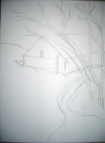
A quick value sketch of Lady on a Rocking Chair

I have just done a rough sketch of the painting, somewhat decided on the background. The painting will be 16 * 24, acrylics on canvas.

Some interesting links that I have come across:
  • A website dedicated to Renoir, full of interesting info and pictures.
  • Pierre Auguste Renoir - A biography
  • A virtual museum of Renoir - link from WetCanvas
  • One of his famous paintings - Umbrellas - the Umbrellas is not entirely an Impressionist work. It is said to span over different styles - part of the painting is impressionistic, and the other half is more realistic. The link provides some really interesting information, have a look. I love how he has used blues so extensively in the painting.
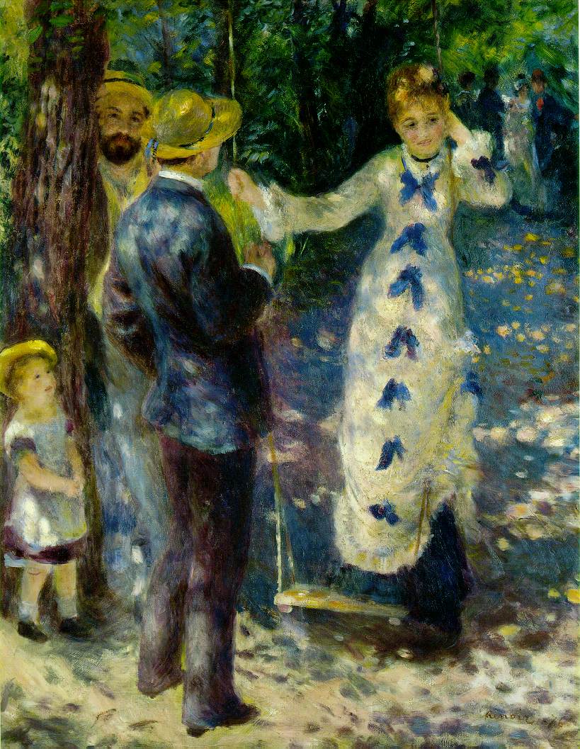
  • My favorite painting of Renoir - The Swing - See the beautiful depiction of light with some dapples of color here and there, in the ground, in her gown etc. I love this painting and hope to do a similar depiction of light in my painting.
  • Woman on a rocking chair -sketch that will be a reference for my painting.
  • Renoir gallery - A lot of paintings listed in alphabetical order.

November 16, 2007

A sunny afternoon - WIP

Since I was fairly satisfied with my previous attempt at working loosely, I started another piece. This time too my goal was to work loose, do not define too many intricate details, but still manage to create an atmosphere with the piece. I felt this one turned out better than the previous one.

The reference image showed an overcast day, which I have kinda converted into a sunny day with some strong shadows. Here is a quick work in progress.

A sunny afternoon - stage 1
(c) Nithya Swaminathan


Firstly a rough sketch under 2 minutes. I heard from another painter that he prefers to directly start painting, no sketch whatsoever. That would give me a nightmare, as I prefer to have a sketch however vague it may be! I would be lost without one.

A sunny afternoon - stage 2
(c) Nithya Swaminathan


Then I do the clouds, just like the previous one. Colours used so far are only cobalt blue and titanium white.
A sunny afternoon - stage 3
(c) Nithya Swaminathan


In the pic above, I have done a red toned underpainting for the distant trees. I have done the foreground directly with some Viridian green and lemon yellow. I have also marked the darkest darks in the barn which will be from the shadows. Till now I had used only my 1 inch flat brush. I started doing the dried tree using the edges of the flat brush and went kinda mad with it. No matter how much I tried, I could not get the finer branches with it. I had to finally resort to my zero brush.

A sunny afternoon - stage 4 (c) Nithya Swaminathan

I have started with the barn, done more details on the foreground. And just started with the canal in the front.
A sunny afternoon - completed
Acrylics on Gallery wrapped canvas, 12 * 16 inches.
(c) Nithya Swaminathan
Original Available, email me for purchase info
Prints available here

Finally, I complete the image with finer details on the grass, and some more details on the water. Also, I have enhanced the depth of the canal where the land meets the water. And deepened the shadows in the barn and in the foreground.

As usual, here is a slideshow. I love slide.com!


This was done in about 2 hours, over 3 sessions. It is done on gallery wrapped canvas with the sides painted so that it can be hung without a frame. Thanks for viewing, and I welcome your comments and suggestions.

November 10, 2007

Art with a timer!

I have always been awestruck with painters who can work fast and convey all they want to with as few brush strokes as possible. Work that is actually impressionistic but looks real. I wanted to give it a shot, after some impetus by plein air painter Larry Seiler at Wetcanvas. Working loose would come naturally to Plein air painters, as they have to capture the moment on canvas before the light changes. It comes with a lot of practice, and gives a lot of life to paintings. In this approach, there is hardly any attention to detail, only the relevant things are highlighted and the painting draws the viewer in.

What I have just completed is my first attempt at working loose. The goal was simple - to paint without spending too much time thinking. Just let myself loose on the canvas. This painting was done in just under an hour, from scratch. It was done using only 1 brush, a 1 inch flat brush. It was weird to actually paint with a timer, as though I was writing an examination!

Generally, my attitude towards an Acrylic or Oil painting is very lethargic. I take my strokes for granted, coz deep inside is the lurking feeling that if things don't work out as I expect, I can always paint over it again. This is an effort to kill that attitude and make every brush stroke count. At every stage, I noted down the time taken for that stage, and everything was painted only once. No redoing at any stage and I am happy for that reason.

Here is a quick look at the painting from start to finish.

Green Landscape - stage 1
(c) Nithya Swaminathan


Seen above is the initial sketch, as roughly as I could. My sketches for landscapes are generally very vague, I do not follow the picture to the T, but this was more sketchy than I normally do. The sketch was done in under a minute.

Green Landscape - stage 2
(c) Nithya Swaminathan


Then I start with the skies, and in about 5 minutes, do the sky with some cobalt blue and white. Then randomly do the clouds as I please. A touch of crimson here and there.

Green Landscape - stage 3
(c) Nithya Swaminathan


I then do an underpainting of the far away trees in tones of red. This is to enhance the effect of the greens which will be done on top of the reds. I have not marked values, just done a plain monotone underpainting. Another 2 mins spent there.

Green Landscape - stage 4
(c) Nithya Swaminathan


And then I started with the greens, did a green wash without much details in the foreground. There is no actual depiction of grass as yet. This was about 15 minutes.


Green Landscape - Acrylics on Canvas, 12 * 16 inches
(c) Nithya Swaminathan
Original available, email me for purchase info.
Prints available here.

And finally I complete the painting with more details on the grass, complete the reflections of the sky etc. Another 25 minutes spent. So start to finish was done in approx one hour. I wanted to finish this Alla prima, in one sitting, but it got spilt over to two sessions. So that defines my next goal - to finish a painting in less than an hour and in one session. I have put this WIP into a slide show, check it out.


It is a lot of fun working like this, it is very liberating since there is no time to think and I just paint. My mind doesnt ponder over what I should do, it is only a spectator. I love the whole thing, though I cannot say for sure if this will be a new direction that I will focus on. Let us see. I would love to hear your views on this. And since my readers already know how much I suck at titles for paintings, I would love to hear some title suggestions as well. I just could not come up with one!

October 31, 2007

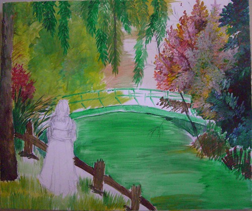
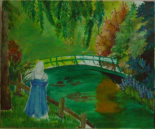
'Me time' - WIP

Continuing my efforts to come up with my own compositions, I have ventured into this one combining several pictures of Monet’s gardens at Giverny, France. The references have been used with the permission of some fabulous photographers at flickr. Right now the painting is in its formative stages and looks quite tight, but I hope to get an impressionistic effect going further. I am also not happy with the richness of the color so far, it looks so dull. I need to work on this a lot more, and if I am still not satisfied, I will go in for my oil paints. I have never tried how oil works on top of acrylics, and I am quite excited to try that out.

Me time - stage 1
(c) Nithya Swaminathan


I am mostly a waterfall or sea kind of person, I love wild waters. Still waters don’t excite me much, but this is a kind of place that I would like to spend some time with myself. That’s what made me add a figure in the pic. I could just go on staring at the waters and those ripples, doing nothing else! Seen above is the initial stage where I have just outlined the lady.

Me time - stage 2
(c) Nithya Swaminathan


I have very crudely indicated some waterlilies in the water. I was in a dilemma whether to have a couple of swans or waterlilies, and have gone with the lilies as of now, since they look more like Monet! The water and the bridge are mostly green, and they all look messed up now. I will be making the bridge a lot lighter and differentiating it from the waters.

Me time - stage 3
(c) Nithya Swaminathan


I wanted to give the lady a nice flowing dress, like those of olden times. I felt it would give a old masters kind of look to the image. I have changed that now, have made the dress rather straight forward. I have also tilted her body to be facing the pond, so that she looks more 'in' the scene. I have also reduced the size of the lady, I felt she look huge before! Blue was my first choice for the colour of the dress, since I love blues. But now I don't like what I have done, since the whole painting is so full of cool colours. I am thinking I will make it peach, or even mild yellow. That should make the figure stand out. The background needs a lot more detailing too.

I have not touched this in a week since I have been busy with my cousin’s wedding and other stuff. We have a holiday tomorrow, and I hope to get some work done on this. So you guys can expect an update on Friday.

If you like it, share it!