Showing posts with label Painting. Show all posts

June 18, 2008

Australian Country side - WIP

When your hands are really itching to get hold of a brush, the fact that you are unable to isn't exactly a very nice feeling. I am in that state of helplessness currently, other than a occasional sketch, I am unable to do any serious painting. So I thought it would be good to post some of my WIP pieces that are waiting for me to take them to completion. These pieces would be completed by end of August.

This is a piece I started a long time ago, around 6 months back I guess. I got too distracted with newer paintings and work coming up that this has been lying around. I got to work some more on it about a month back though. Its on gallery wrapped canvas, 16 * 20 inches.

Australian Country side - Acrylics on Canvas

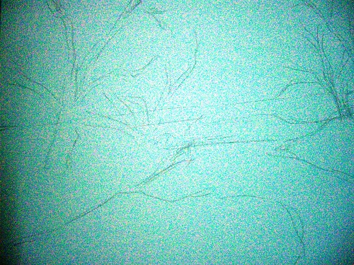
Step 1 - rough initial sketch


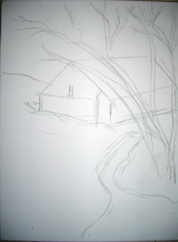
Seen above is the initial sketch done freehand and directly on the canvas. This is also an attempt to paint as loose as possible, so I have deliberately avoided giving any details in the sketch.

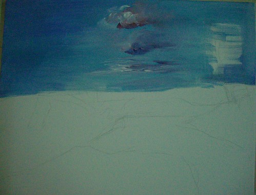
I have then laid down the color for the skies, overlapping the sketch coz the trees will be done over this after drying. I do not find it good to do the trees first and then show some sky in between, it makes it very unreal.

Australian Countryside - Acrylics on Canvas, Stage 2


In the next stage, I have marked the darks with burnt sienna. These will be the darkest areas of the tree foliage, with lots of shadow. The picture has really good lighting so shadows have a crucial role to play. The rough marking of the trees looks rather crude, but it is just to guide me where the barks are. I will be painting over this in browns anyway.

Australian Countryside - Stage 3


I have then started with the leaves, and the grass in the foreground. I have kept the grass really light, as it is much more brighter than this. It is nearly bright yellow. What I have observed from my paintings in general is I don't tend to really push my darks and my highlights. It looks like I tend to stick to more mid tones, which I aim to change. Even here, I should ideally be making the shadows much darker, and the highlights much more brighter. I hope I am able to achieve that by the time the piece is done.
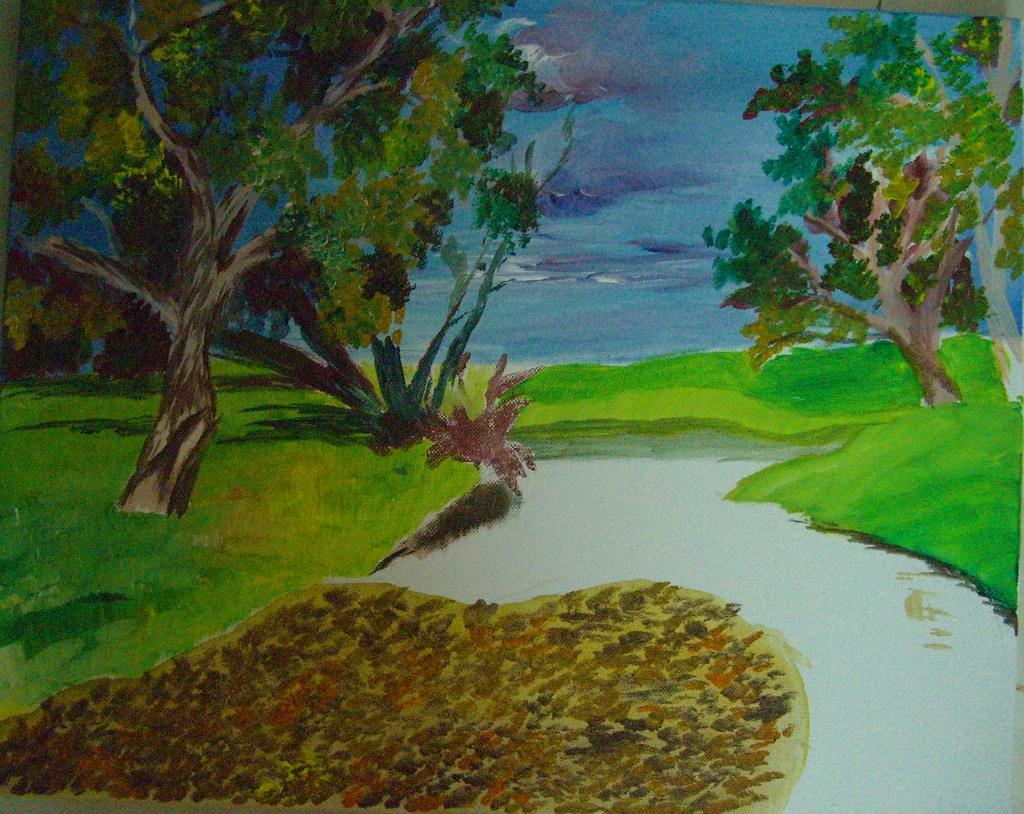


As it stands, this painting will not draw the attention of any viewer methinks. In the meanwhile, I have also started work on the foreground. The foreground is absolutely gorgeous with a lot of dried leaves over shallow waters.

Here is where the painting is as of now. A lot more to go, at least 2 more layers to be done. I need to then refine the skies too, right now the clouds look really haphazard. All that and more by mid-August :-)


I have not prepared a slide show as of yet, will do so after the whole painting is completed. Your comments are most welcome until then.

April 30, 2008

Postcard #2

Continuing with the postcards, here is yet another very colorful bird, done in the same style of a watercolor underpainting followed by colored pencils. I am drawn towards anything blue, and this one was no exception. I am no good at bird watching and do not even know the names of most of these. There is an artist in WetCanvas who gives such jaw dropping bird images for references. Each and every single snap of is a wonder, and all these birds are done from his photos only.

Electric - watercolor pencil underpainting

Electric Blue - colored pencil on paper, 4*6 inches
Private collection.

Among other things, my website is also getting updated with images of these cards. You can locate them under 'Miniatures'. And I guess you would have already noticed the change in my blog layout and color scheme. A reader had suggested long back that I could have a painting as a backdrop, and I felt I could have it only in the header. Finally got around to doing it only now. Let me hear your feedback on the new color scheme, if it is pleasing to the eye.

Postcard #1

I am doing a series of postcards for a Postcard exchange project that I signed up in WetCanvas. A postcard is typically 4*6 in size. Just like the last year's exchange, we are about 25 participants. Each of us will paint 24 postcards and mail it to the others. I have already got about half a dozen postcards and I am a late starter this time.

Postcard #1 - Yellow bird & Cactus plants
Underpainting in Watercolor pencils


I am getting back to colored pencils after a while, and the best way to get back in touch is to work small. Since colored pencil is a medium I was investing so much on even before doing anything worthwhile, I have too many sets of pencils, most of them watercolor pencils. It took me a while to actually realize that people generally don't work with the watercolor pencils to get the pure CP effect. Now I possess a set of pure CPs also, but my watercolor pencils will remain idle if I don't use them, so I use them to do underpaintings. And it works wonders, I should say.
Postcard #1 - Completed
Colored Pencils on paper, 4 * 6 inches

The method is simple - I first do a cross hatching with watercolor pencils which is very rough and the strokes will be haphazard. This is okay, because they will be evened out when I do a wash with a wet brush. It will give a lovely smooth look to the background, especially useful when the background lacks detail and all the focus is on the object in the foreground. After washing with the brush, the color would brighten up a lot too. I then complete the painting with the normal colored pencils on top of the watercolor pencils.

Ideally I should not be posting this in public before my recipient gets the card, but I don't think any of the participants even know about my blog, so it is okay :-)

April 29, 2008

Monet's gardens at Giverny

This is a painting I started and posted as a WIP 6 months ago, but it never took off coz what I had in mind was simply not getting translated onto the canvas. I was getting frustrated to the core! I would touch the painting every now and then, correct something that I felt was not okay, but as a whole it never looked right. The lighting was all screwed up and it lacked any kind of atmosphere.

Now I have got back to the painting, and I gave up on acrylics as my skills were very limited, and decided to proceed with oils. I must say its been more of a relief than anything else. Relief because of two reasons - one is I am able to see some redemption for this painting, which I so dearly loved. I love the image that I have in my mind and I am striving to get it down, and I am relieved that I don't have to ditch it. Secondly, my oil painting abilities are as good as they were and I am absolutely at ease with them even though I am getting back to oils after almost 5 years! Its almost like a love affair, I could just take off where I left. I hope to strike a balance between oil and acrylics henceforth and not totally concentrate on one forgetting the other. I love oils for its flexibility and ease of painting. And I like acrylics for their quickness. And I would like to do a bit of both, going forward.

Untitled as yet.
Mixed media on Canvas, 20 * 24 inches.

So coming back to my painting. Here is how it is now. So what have I done since the last time is I have changed the dress color of the woman, coz I felt it was an overdoze of cool colors. I wanted the woman to stand out in the painting. Most of Monet's paintings of Giverny do not have any human figures in them. They are beautiful depictions of nature and light, but I wanted the human figure here and decided to go ahead with it even though I wasn't sure initially.

My focal point is the lady, coz this painting is very 'personal' in a lot of ways. Monet being one of my all time favorites, this painting is how I would feel if I were at his gardens. It is like cumulative inspiration, one from the gardens themselves, and even more from the art that was generated from the gardens. And what inspires more, Nature or the Art! The woman obviously represents me, though I don't look like that :-) I have got some great suggestions from WetCanvas to take this forward, and I hope to bring this to completion soon.

April 28, 2008

Pierre Auguste Renoir - an Old Masters study

Studying Old Masters and their ways of working are generally of immense help to artists. Though I haven’t done a streamlined study of even one master, I can see why it is sure to help artists. It helps us learn by seeing how various compositions work, how some of them work even though they don’t conform to the “rules”, how various masters painted Light, etc. While such a study is going to benefit anyone, I am sure it will be all the more interesting if a group of us do this, and that’s what I have started doing now.

In the Acrylics forum of WetCanvas, a new Old Masters Study project has been initiated, where we would study the works of an old master for a month or two, and then produce our piece of art based on that. It could be a replica of one of his works, or a new painting based on his techniques. The technique and style is more important than the actual content. And the first old master that we have taken up is Pierre Auguste Renoir, one of the famous impressionist painters. I am very happy to take this up because I am a big fan of Impressionism as a movement. I love the distinct brush strokes that characterize impressionist paintings.

Auguste Renoir painted a lot of figures, mostly women. He had women is picturesque surroundings, even his nudes were mostly in idyllic settings. They had very interesting light colored flesh tones that made them very charming. My observation is he did not use too much of darks to bring contrast into his works. They did not have the striking light and dark contrasts as say the Dutch painters’ works have. There is a dominance of cool shades; even the backdrops of his figure paintings feature ochre, greens and blues a lot. The shadows have a lot of violet and blues in them.

When choosing a painting of Renoir to replicate, there were too many good ones to choose from. I went through the entire gallery of paintings and finally zeroed in on 'Woman in a rocking chair'.
Why this interested me is because there is no colored version available. All that is there is only a sketch, and I loved the idea of adding color, and more importantly light to it. It is an outline by Renoir but it will essentially be my original painting. I did not want to be influenced by the existing colors and stick to them, so safely chose a b/w image.

A quick value sketch of Lady on a Rocking Chair

I have just done a rough sketch of the painting, somewhat decided on the background. The painting will be 16 * 24, acrylics on canvas.

Some interesting links that I have come across:
  • A website dedicated to Renoir, full of interesting info and pictures.
  • Pierre Auguste Renoir - A biography
  • A virtual museum of Renoir - link from WetCanvas
  • One of his famous paintings - Umbrellas - the Umbrellas is not entirely an Impressionist work. It is said to span over different styles - part of the painting is impressionistic, and the other half is more realistic. The link provides some really interesting information, have a look. I love how he has used blues so extensively in the painting.
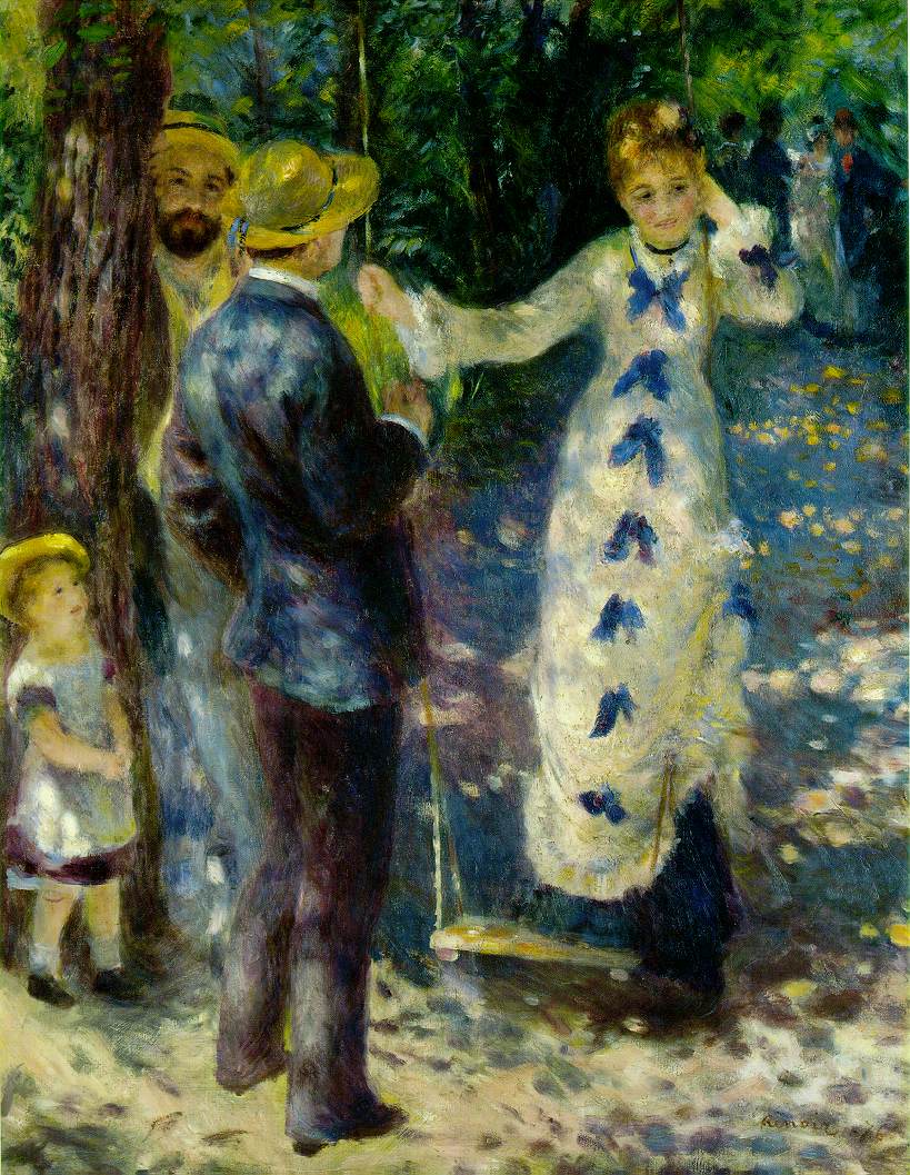
  • My favorite painting of Renoir - The Swing - See the beautiful depiction of light with some dapples of color here and there, in the ground, in her gown etc. I love this painting and hope to do a similar depiction of light in my painting.
  • Woman on a rocking chair -sketch that will be a reference for my painting.
  • Renoir gallery - A lot of paintings listed in alphabetical order.

Bliss!

Not a single human in sight, yeah, not even one. No one to attend to, no one to cook for, no one to question if I ate or not. And no one to really bother about what I did and did not do. That’s exactly my version of bliss and precisely what I did this weekend. So this weekend was essentially no cooking, hardly any eating (I survive on Maggi) and all the time in the world to me only to paint. Till I get tired of it, and I haven’t yet, thankfully. I must agree that I got physically tired though.


Times like these reaffirm to me that this is what I love doing, and this is what I should be doing full time. I love what I do in my job as well, but that’s besides the point. Every time I get to paint extensively, my gut feeling urges me to take it up full time. But then somewhere deep down, there is a little apprehension. If I am forced to do Art and not do it on my own, would it still invoke so much passion from me, I am not sure. And it is too huge a risk to take! Sigh! So many things to ponder!


One great thing that comes out of a weekend like this is ample subject matter to blog about. So even if I did not do a single painting for the next one month, I have stuff to blog every day. Ain’t it cool?! So here we go, before actually looking at any art, a first look at my so called studio. It is amazing when you have no one around that your entire house is your studio to play.

So this is how I exist when I have no one to supervise me. And this is a sneak preview of all the artwork to come in the following days, most of them. I wanted to get some work done on the Postcard exchange project that I started off. I am lagging behind awfully! And also experiment with doing some still lifes, besides getting back in touch with my pencils. Will post some more works over the next couple of days.

November 16, 2007

A sunny afternoon - WIP

Since I was fairly satisfied with my previous attempt at working loosely, I started another piece. This time too my goal was to work loose, do not define too many intricate details, but still manage to create an atmosphere with the piece. I felt this one turned out better than the previous one.

The reference image showed an overcast day, which I have kinda converted into a sunny day with some strong shadows. Here is a quick work in progress.

A sunny afternoon - stage 1
(c) Nithya Swaminathan


Firstly a rough sketch under 2 minutes. I heard from another painter that he prefers to directly start painting, no sketch whatsoever. That would give me a nightmare, as I prefer to have a sketch however vague it may be! I would be lost without one.

A sunny afternoon - stage 2
(c) Nithya Swaminathan


Then I do the clouds, just like the previous one. Colours used so far are only cobalt blue and titanium white.
A sunny afternoon - stage 3
(c) Nithya Swaminathan


In the pic above, I have done a red toned underpainting for the distant trees. I have done the foreground directly with some Viridian green and lemon yellow. I have also marked the darkest darks in the barn which will be from the shadows. Till now I had used only my 1 inch flat brush. I started doing the dried tree using the edges of the flat brush and went kinda mad with it. No matter how much I tried, I could not get the finer branches with it. I had to finally resort to my zero brush.

A sunny afternoon - stage 4 (c) Nithya Swaminathan

I have started with the barn, done more details on the foreground. And just started with the canal in the front.
A sunny afternoon - completed
Acrylics on Gallery wrapped canvas, 12 * 16 inches.
(c) Nithya Swaminathan
Original Available, email me for purchase info
Prints available here

Finally, I complete the image with finer details on the grass, and some more details on the water. Also, I have enhanced the depth of the canal where the land meets the water. And deepened the shadows in the barn and in the foreground.

As usual, here is a slideshow. I love slide.com!


This was done in about 2 hours, over 3 sessions. It is done on gallery wrapped canvas with the sides painted so that it can be hung without a frame. Thanks for viewing, and I welcome your comments and suggestions.

November 10, 2007

Art with a timer!

I have always been awestruck with painters who can work fast and convey all they want to with as few brush strokes as possible. Work that is actually impressionistic but looks real. I wanted to give it a shot, after some impetus by plein air painter Larry Seiler at Wetcanvas. Working loose would come naturally to Plein air painters, as they have to capture the moment on canvas before the light changes. It comes with a lot of practice, and gives a lot of life to paintings. In this approach, there is hardly any attention to detail, only the relevant things are highlighted and the painting draws the viewer in.

What I have just completed is my first attempt at working loose. The goal was simple - to paint without spending too much time thinking. Just let myself loose on the canvas. This painting was done in just under an hour, from scratch. It was done using only 1 brush, a 1 inch flat brush. It was weird to actually paint with a timer, as though I was writing an examination!

Generally, my attitude towards an Acrylic or Oil painting is very lethargic. I take my strokes for granted, coz deep inside is the lurking feeling that if things don't work out as I expect, I can always paint over it again. This is an effort to kill that attitude and make every brush stroke count. At every stage, I noted down the time taken for that stage, and everything was painted only once. No redoing at any stage and I am happy for that reason.

Here is a quick look at the painting from start to finish.

Green Landscape - stage 1
(c) Nithya Swaminathan


Seen above is the initial sketch, as roughly as I could. My sketches for landscapes are generally very vague, I do not follow the picture to the T, but this was more sketchy than I normally do. The sketch was done in under a minute.

Green Landscape - stage 2
(c) Nithya Swaminathan


Then I start with the skies, and in about 5 minutes, do the sky with some cobalt blue and white. Then randomly do the clouds as I please. A touch of crimson here and there.

Green Landscape - stage 3
(c) Nithya Swaminathan


I then do an underpainting of the far away trees in tones of red. This is to enhance the effect of the greens which will be done on top of the reds. I have not marked values, just done a plain monotone underpainting. Another 2 mins spent there.

Green Landscape - stage 4
(c) Nithya Swaminathan


And then I started with the greens, did a green wash without much details in the foreground. There is no actual depiction of grass as yet. This was about 15 minutes.


Green Landscape - Acrylics on Canvas, 12 * 16 inches
(c) Nithya Swaminathan
Original available, email me for purchase info.
Prints available here.

And finally I complete the painting with more details on the grass, complete the reflections of the sky etc. Another 25 minutes spent. So start to finish was done in approx one hour. I wanted to finish this Alla prima, in one sitting, but it got spilt over to two sessions. So that defines my next goal - to finish a painting in less than an hour and in one session. I have put this WIP into a slide show, check it out.


It is a lot of fun working like this, it is very liberating since there is no time to think and I just paint. My mind doesnt ponder over what I should do, it is only a spectator. I love the whole thing, though I cannot say for sure if this will be a new direction that I will focus on. Let us see. I would love to hear your views on this. And since my readers already know how much I suck at titles for paintings, I would love to hear some title suggestions as well. I just could not come up with one!

October 25, 2007

Conversation - with WIP

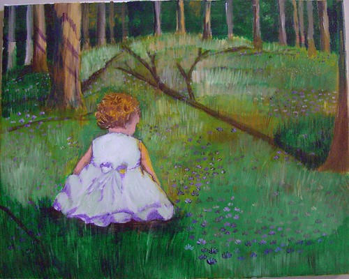
I generally work from reference images, and follow them pretty closely. My painting would be easily identifiable as based on whichever photo I use, coz I do not experiment to change much. I wanted to change this approach, thanks to a brilliant thread at Wetcanvas couple of months ago on 'How to use reference images' (too lazy to hunt the link!) and started this painting primarily as a challenge to myself. I wanted to see for myself how much I am able to differ from a photo and able to stand on my own. I picked up a black and white photo of this little girl that had no big details, no light source, and used that as the base to create this painting.

Conversation - stage 1

Nothing here is painted from my imagination, but the whole painting is based on a dozen images, combined in a way that I found appealing. Rather I imagined a scene in my mind, and hunted for pictures that had a lighting to suit, to create a mood etc etc. So its essentially my own composition, and that feels so good!

Initially, my idea was to add a colorful ball to the right side, and something like a butterfly close to the child. It was as if she was playing with the ball but her attention got to the colorful butterfly and the ball was lying unattended to! Well I was thinking about my daughter all along the painting and that is so typical of her. I did add a ball but did not like it and painted over it.

Conversation - stage 2

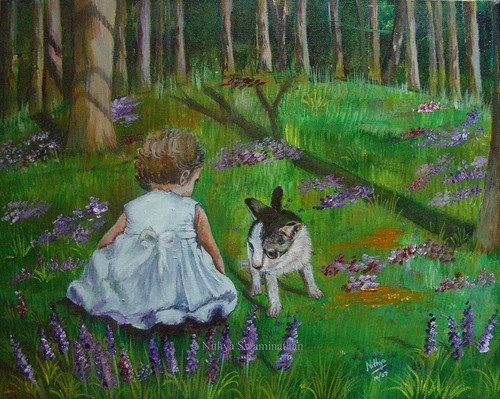
I felt kinda lost midway and thought of starting afresh on the canvas, but with a lot of compositional help from the experts at Wetcanvas, I could redeem the painting and make it a tad better. Someone at the acrylics forum suggested about adding a kitten/puppy and I loved that idea. So despite the fact that my bakcground was done completely in green, I added a kitten directly with some paint. That probably explains why that kitten looks kinda distorted.

And then I also felt that the child was looking older than she should. I wanted a girl of 2-3 yrs and she looked about 5 yrs I would say. So I worked on 'rounding' her arms a little more and making her size a little bigger so that she was the focal point. And since I felt there was too much of green all around, I added some flowers to the foreground.

Conversation - completed
Acrylics on Canvas, 16 * 20 inches
Original available
(c)Copyright Nithya Swaminathan


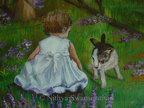
When I just thought I was done and went ahead and signed it, my husband said he did not like the kitten at all. He ofcourse was not able to tell me what the issue was, but worse still I wasnt able to point it out myself! Another artist said that the kitten is too big. Now I am in a fix, whether to make it smaller, or paint over it and put in something else there.. Maybe a butterfly, maybe a puppy or anything else. I have no clue as yet. Any comments and suggestions are welcome, I would love to hear different views on "What could it be thats keeping the girl so engrossed?!"

Conversation - detail view

What you see above is a closer look at the child and the kitten, do suggest any changes that you feel would make this a better painting. Thank you!

October 3, 2007

Autumn Woods - an update

I was absolutely dissatisfied with the leaves that I had begun in this painting. I had only done the initial layer and there was still a long way to go, but the first step itself was not in the right direction I felt. Being the oil painter that I am, I had this urge to pick up my palette knife and paint to my heart's content. And yeah, thats exactly what I did.


Autumn Woods - Stage 5
(c) Nithya Swaminathan

I have no clue if acrylic painters actually use the palette knife, this was the first time I did. I have used it with oil paintings, and I love the textures the knife generates. My leaves now have got that texture too and I am liking it. The end result is satisfying, though they look like gulmohars and not maples, LOL! The reference image has no clear direction of light, which I wanted to change. Hence I introduced some light from the right side and pushed the darks in the shadows with a lot of blue. Also, I introduced some flesh tint and mild yellows in the barks that face the sunlight, to bring in the sunlit effect. Wonder if I have succeeded fully.


Autumn Woods - detail close up
(c) Nithya Swaminathan

What you see above is a little close up of the leaves, how haphazardly they are done without any actual leaf shapes. I love doing that. I simply picked up some scarlett red, orange and lemon yellow in my knife and went about it without a thought. The dark bluish black lines behind are shadows of the leaves and branches on the trees behind. I introduced these sharp shadows also to accentuate the sunlit effect that I was trying for.


Autumn Woods - stage 6
(c) Nithya Swaminathan


I think I would call the top half of the painting done, excepting the ferns in the front. They need some more highlights on them and I am half way with them. I have just begun working on the reflection, have loosely laid in the barks. When I started with the reflections, I felt like adding some wet rocks along the banks. Some rocks with a coating of algae on them. Wonder if it would go along well with the painting or work against it. You will probably get to know that tomorrow.:-)

May 3, 2007

Focussed

I last used Acrylic paints about 10 years back, at least. They were never a medium of choice, since the colors would dry up even before I was done with my shading etc. When I first started using Oils, they instantly became a favorite and I have never gone with acrylics ever after. However, I had to get some work done in very little time, and well, it was acrylics to the rescue!

When I was amidst some shopping, I chanced upon a call for entries poster for a juried exhibition and the deadline was about 10 days from then. Since I had spent 5 days deciding what to paint, there was very little time left. And I jus started dabbling wiht acrylics, not really bothered about the end result. I was more than happy with the painting though. I think its one of my best. Goes to prove that a lazy soul like me does quality work only under pressure. Ah! I need deadlines looming over me forever, be it in IT or Art.


Focussed - Acrylics on Canvas, 16 * 20 inches
copyright Nithya Swaminathan


Not just that, I am a fan of the medium too. I realised that it wasn't an issue with the medium, but my inexperience that produced sub standard works then. I can do a much better job now. I have a couple of unfinished pieces in acrylics, and most of my art cards were done in this medium. 25 cards in 3 weeks, I could not have imagined with Oil. I am one happy soul now, having rediscovered this medium.

May 2, 2007

Stained Glass

Stained glass is a medium that I ventured into not long ago. Actually I got to know of the medium when my art teacher organized a workshop some years back, and I could not go to Madras to attend it. When I was in Madras next, I went and had a look at the lovely panels that the participants had done, and was immediately enamored. I wanted to try it out on my own and did so with some help from materials online.

One thing about stained glass is how less time consuming it is. I can finish a piece from scratch in about an hour. In any other medium, my free-hand sketch alone will take that much time. So when I got my first set of stained glass paints, I did about 4-5 pieces in one shot. The whole thing took less than a week. Aint it cool!? Ofcourse, laying the outline needs a lot of control as even a slight shake in your hands would spoil the painting. Once we get the hang of it, stained glass is a thoroughly enjoyable medium.


Sunflowers, stained glass


Love birds, stained glass


Gossip, stained glass

Peacock, stained glass

In the vineyard, stained glass

If you are wondering at my imaginative titles, I am sorry! I couldn't come up with anything better. All of these are about 9 * 12 inches in size. All the pieces are done on textured glass, as it glows better when hung in the direction of light. Yeah, thats how a stained glass piece is to be enjoyed in all its glory. Hang it on a window where ample light passes through, and the translucent paints will glow.

If you like it, share it!