Showing posts with label colored pencil. Show all posts

April 24, 2009

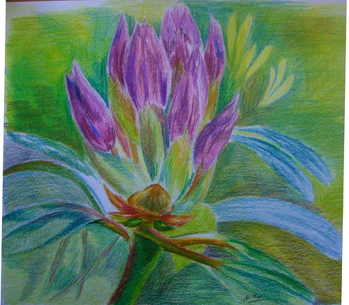
April Virtual Sketch Date - Rhododendron bud

I suck at florals, and would not venture into one even if threatened at gun point! :) Not that I am not inspired by them. When the daffodils were all around everywhere, I was so regretting I am so pathetic with flowers. Maybe some day, I might do some. Currently, I feel my style of using strong contrasts and generally visible hard edges is not quite suited for the softness that's needed to render a flower. I have a long way to go in terms of softening my edges before I can render delicate darlings.

Rhododendron bud
Colored pencil on paper, 9 * 9 inches
Copyright Nithya Swaminathan


However, since the blog events are all about getting out of your comfort zone, I decided to do this one as well. It has such lovely colors, and I have gone in for colored pencil. Thanks to Jeanette for a great image, I had a lot of fun.

This month's entries can be seen here in the Flickr pool, and go here to check the various blog links.

February 22, 2009

A silly portrait - Kevin

As part of the monthly portrait study, this is the portrait for February. It was an extremely fun portrait to do, with so much of color in the reference. I was initially scared about the tongue, as I have never done tongues before. But I was wrong. The tongue was actually quite simple, I had big problems in getting the shape of the face right though. I did one version first, that ended up with a completely distorted face, and I scrapped it. This is ver.2.0, and the face is still not okay. Because of the tongue and the pose, it was difficult for me to judge the length of the face correctly. I have made it a little wider than it should be.

Kevin, colored pencils on paper
8 * 10 inches.


February 3, 2009

More quickies with oranges

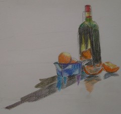
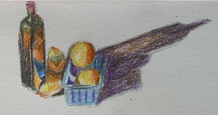
Here is the next installment of the oranges with the same glass bottle. They all look similar, with only slight variations in the angle of light, hence some difference in the shadows. Six sketches in all, and they are getting painted this week in Acrylics.

Your comments are welcome.

February 1, 2009

Some more oranges - start of a series

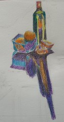
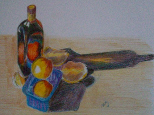
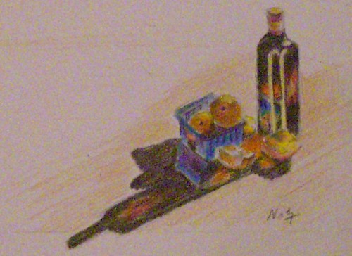
Looks like I am not yet done with my share of the oranges. Picked up some luscious oranges this week, mainly for using them in some still life setups. Also, there was this lovely glass bottle at home, so I was playing around with them. I tried several combinations and liked quite a few, which cover the bottle and fruits in different angles. I like shadows with glass objects, they have so much color in them. So this was a lot of fun as we had some good sunlight too. I always prefer setting up still lifes in direct sunlight and not artificial light. Though the lighting changes very soon, it helps me get sharper images.
Here are a couple of quick sketches, first one from life and the rest from photos.

Shadow play 1
Colored pencils on paper
Copyright Nithya Swaminathan

Shadow play 2
Colored pencils on paper
Copyright Nithya Swaminathan

Shadow play 3
Colored pencils on paper
Copyright Nithya Swaminathan

These studies will be used as bases for paintings in future. I will also sort out some of the other images and do a few more studies.

January 29, 2009

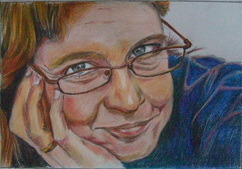
Rose's Portrait - updated

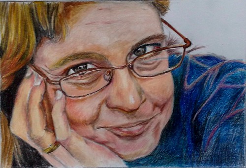
I received some feedback on the portrait and incorporated those. What I have done now is a slight decrease in the size of both eyes, and I have made the glasses a little bigger. Tried to soften some of the edges, since it looked like a hard edged drawing, wonder if it shows. Here is the updated version, and I think I am calling it done.
Rose - completed
Colored pencils on paper, 7 * 10 inches.
Copyright Nithya Swaminathan

January 28, 2009

Different Strokes - San Francisco Victorian

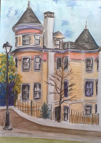
Here is my entry for the ongoing challenge at the Different Strokes blog. I had a lot of fun with this one, done entirely in colored pencils. I have tried to bring in more color than in the reference. I initially thought I would do the little trees in acrylics, as I have never handled foliage in CPs. But changed my mind later and went ahead in CPs itself. That's why I love these challenges, they give so much room to experiment. There's another week to go for this one, and I might sneak in another entry, let me see if time permits.
San Francisco Victorian
Colored pencil on paper, 9 * 12 inches
Copyright Nithya Swaminathan
You can view all the interpretations here.

January 26, 2009

Portrait Study - with WIP

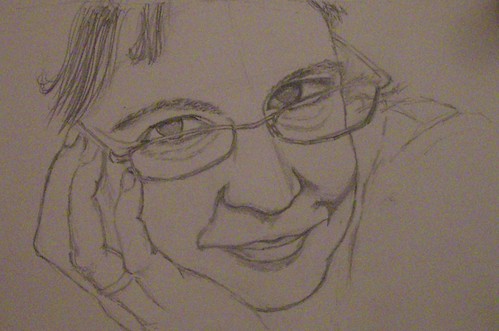
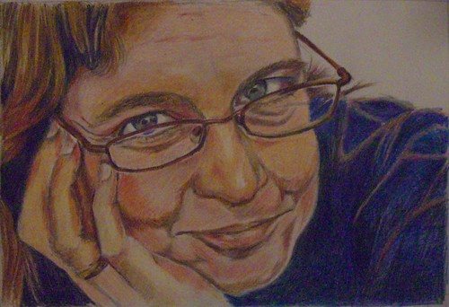
I joined in the portrait study group of Rose and others, and committed to do along with the group one portrait every month. So here goes my attempt for January, a portrait of Rose.
My freehand sketch in graphite, with some shading also started. I wanted to do it in graphite initially and changed my mind later.
After seeing another artist's portrait in CPs though, I too was tempted to do it in CPs. They are a great medium for portrait, especially for rendering hair etc. Seen below is an almost completed stage of the painting.
I knew it had some issues to be fixed but was unable to point out exactly. That's what happens when you look at an image for a long time continuously. My husband had a look and told me that the mouth was not okay, and needed some tweaking. I realized that I had made the lip line flat, and not a little angled. I changed that and I think it looks decent now.
Portrait study - Rose
Colored pencil on paper, 7 * 10 inches.

Since this picture is all I have and I do not know Rose otherwise, it is very difficult to even say if it looks like her or not. If it was a portrait of someone I know well, it would be better for me to judge. I'd just have a look in the mirror and I'd know immediately if something is messed up. Now I leave it to Rose and maybe others who have seen her to judge the closeness of the portrait with the person. It was a fun portrait to do, because it was a very close up look at the face. It was a different pose and new for me. The face is at an angle that isn't as simple as it appears to be. I think even now some fine tuning is needed to get the angle accurate. I think I have captured a decent resemblance though.

It is also great to work in a group because it brings in a sense of commitment to an eternal procrastinator like me. That, for me is the most important advantage, apart from getting honest reviews of the work done. The next month's portrait is sure to be a complete blast, and I look forward to it. All your feedback is welcome, whether or not you know Rose ;-)

January 23, 2009

Going wild with Orange

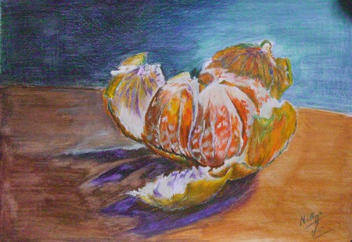
When the dates for the January VSD were put up, it was mentioned that the reference would really stimulate the artists. I was really looking forward to the reference, and I must mention that on first look I wasn't impressed at all. I later realized that a good painting can inspire any artist even if the reference does not! As the various artists started posting their interpretations, I was quite impressed and started with my version in colored pencil. I simply loved the various tones in the orange peel, and the translucence of the fruit.
What are you waiting for?
Colored pencil on paper, 9 * 12 inches
Copyright Nithya Swaminathan
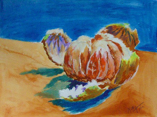
My colored pencil version was taking a lot of time, as I generally work slowly with CPs, building layers meticulously. After a while, I was tired and wanted a break. And guess what I did, decided an ultra-loose version in watercolors, just to unwind myself. Well not watercolors actually, but acrylics painted almost like watercolors. It was a blast. I wanted the painting to ooze color and I think I succeeded reasonably. I don't think it will pass off as a watercolor painting, but it is definitely different from any acrylic painting I have done. While in the colored pencil version, I went in for a lot of complements, in this version I made the colors as intense as possible. The CP version contains a lot of blues and violets, whereas this version does not.
What are you waiting for?
Acrylics on watercolor paper, 9 * 12 inches
Copyright Nithya Swaminathan

Next I felt I could do one using acrylics as I usually do, and opted for a closer crop this time, and a square canvas. Cropped the right side of the photo and focused more on the fruit. I thought in the CP version, the background almost competes with the fruit, so wanted the acrylic version this way. So this is traditional acrylics, painted loosely, with no underlying sketch. I wanted it to be spontaneous and opted not to sketch, so the fruit looks even more closed and not opened out.
What are you waiting for?
Acrylics on canvas paper, 8 * 8 inches
Copyright Nithya Swaminathan

I really like how the colored pencil version turned out, and I like it best in thumbnail. In the larger format, it shows the mess that I have done to the paper, literally pushing it to its limits. So I dont like it much larger. I used watercolor pencils for the background and washed them with a wet brush as well, and the paper reached its limits beyond a point! As far as the work on the peels go, I think the CP one captures the colors correctly than the acrylic paintings. 
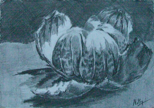
After painting the image 3 times in a span of 2 days, it was well etched in my mind and I wanted to have a go from memory. Decided to have a go with a different medium, and I chose graphite. This was the last one I did and really like how it turned out. So the graphite drawing is from memory, trying to create the values without the help of the grayscaled version of the photo. I picked up my graphite pencils after quite a long time and had a lot of fun with them.
What are you waiting for?
Graphite on paper, 6 * 9 inches
Copyright Nithya Swaminathan

I fell in love head over heels with the Orange and had a blast doing each version. My favorite is version #2, because it is totally new for me. It is the most un-acrylic Acrylic painting I have done. I'd love to hear from you, dear reader, as to which version works and which sucks. Or if all of them are terrible, let me know that too.
The great news is that the Virtual Sketch Date has its own Flickr pool. It is stunning to see all the images together, what gorgeous pieces! You can view all of them here in Flickr (signin required), or ofcourse in the Virtual Sketch Date blog on Sunday, 25th January 2009.

November 14, 2008

Painting upside down - a challenge

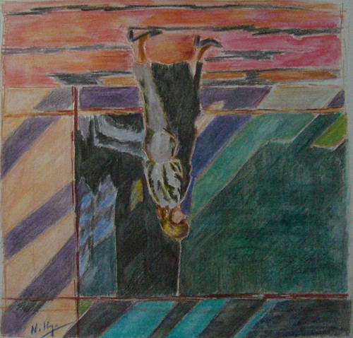
Walking on the ceiling!
Watercolor pencils on paper, 10 * 10 inches
copyright Nithya Swaminathan

This week's challenge at Karin's Different Strokes blog was to paint this walker upside down. In her pep-talk accompanying the reference image, Karin makes a valid point about trying to paint what you know rather than what you see. That would not happen when painting upside dpwn.

With this approach, I followed the reference and the patterns of light in it. Blindly painting what I saw! I did not alter the image in any way, as that would probably mean flipping the image and I wanted to avoid that at all costs. It was super fun I should say. I also went ahead and signed the painting as it was painted, so if viewed in the right direction, my signature would be upside down :-)

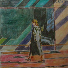
Walking on the ceiling - viewed upside down
Watercolor pencils on watercolor paper, 10 * 10 inches
Copyright Nithya Swaminathan

When painting normally, I have the habit of viewing my canvas in the mirror every now and then. That kind of guides me if I am in the right direction or not. It works like a charm especially for portraits, as mistakes will stick out in the mirror image. This time around, I had to hold my temptation from turning the image :-) That was the most difficult part of the challenge, so to say.

Here is the link to the weekly challenge, have a look at others' interpretations.

Also, watch this space tomorrow for something totally different from me. That is besides the final image of the still life.

October 25, 2008

October Virtual Sketch Date

The virtual sketch date is a blog event happening every month, where a reference image is posted and any blogging artist can give a shot at the image. The artists then post their attempts onto their respective blogs and link to the main blog site. It is a fantastic event, since I always love seeing how various artists tackle the same subject. This has been happening for a few months now, and this is my first entry.

Peared - colored pencil on water color paper
(c) Nithya Swaminathan

I started doing the last month's reference itself but could not complete it before the deadline. This month's reference was so irresistable that I had to give it a shot. I am glad I could complete it on time. I have a blast doing this, as I have never done pears before. They are such fabulous little things, full of character! We do not get these kind of pears here and I haven't been able to do them. I am quite happy with how it turned out and I cannot wait to see what other artists have done.

Today also happens to be the International Sketchcrawl, and though this doesn't qualify at crawling, it counts as sketching at least :-)

October 15, 2008

Primary colors

Yet another attempt at working from life, also with a limited palette. I wanted to try my hand at doing fabric, that too from life. Cannot say I am entirely satisfied with the fabric, I am sure there is a long way to go. Fabric is one of those things that I cannot seem to figure out for the life of me! It is something I really want to master. More so after my visit to the Rijksmuseum and seeing all those pieces by the Dutch Masters with jawdropping fabric.


Primary Colors
Colored pencil on paper, 4 * 5 inches.


I have used only the primary colors, and the complement of each of them. That makes it crimson red, cobalt blue, lemon yellow and Orange, Violet and Viridian green. The finish looks kinda crappy coz my daughter stepped in to the scene when it was going all fine and decided she wanted to eat that apple! Yeah, only THAT apple. So she picked it up and needless to say the other objects also got distrubed. Thankfully the apple was the one I completed first so it was ok. I took a photo of the composition and completed the fabric with the help of the reference. The patterns in the fabric were not exactly the same in the reference but I had to do with it! I hope for better cooperation from my daughter going forward ;-)

September 25, 2008

Sketching from life


I generally work from photographs, using them as references and most of the time sticking to the photos faithfully. Once in a while I change some stuff in photos, go in for some crops etc. Rarely do I have the urge to work from life. My only sketch from life experience is that of doing a lot of portraits, where my friends pose for me for couple of hours, and I have no issues in getting the resemblance right, I have done a pretty good job of it so far. 

Pomegranate and Peppers                                       colored pencil on paper, 4 * 5 inches.                 (c) Nithya Swaminathan

Other than portraits, I have never attempted sketching from life n a big way. The sketchcrawl was the first time I actually worked from life doing people and places while on the move and I loved it. It was very liberating I should say. I have always wanted to try setting up my own still life and trying to work from it. I was hesitant to give it a shot coz of my lack of knowledge of composition. 

Recently, I have been reading a lot of art blogs, articles, forums etc and want to sincerely avoid working from photographs, especially those taken by others. I want to call my work 100% my own from conception to execution. The first step in that direction was to pick up a good book on composition (review coming up soon), and then start working from life. This is formally my first composition from life, and I am happy for taking that step. 

I don’t have a specified studio space for myself, so I don’t have a space to create an elaborate set up with a light source etc. It sucks that the lighting always seems uniform in my house. It then flashed me that there was a reading bulb in my bed, that I could use! And that was it, I set this up on my bed J 

Some quick learnings for myself –

  • Setting up a simple, bare bones still life isn’t rocket science. This is not a learning as such, it is a reassurance. I picked up the 3 objects and tried some combinations, with a reflector, without one etc, and finally settled on this one. It took me less than 5 minutes! I realized I needed to get used to the paradigm shift of working from life by doing more of these studies, then move on to better and bigger set ups.
Grayscaled Version (c) Nithya Swaminathan
Pomegranate and Peppers


  • It tremendously improves my observation – note the red reflection of the pomegranate on the capsicum? I am sure this would not have been captured in a normal point and shoot camera, which is what I use. The reflection isn’t as intense in color as I have depicted, but I could observe that it is there. And it adds a good punch to the painting on the whole.
  • Working with a limited palette helps to get a better understanding of color theory as such. I have used only one green and one red pencil. Value changes have been depicted only with varying pressure and by building up layers using the complements.
  • I still have a long way to go in mapping color to value! Have a look at the grayscale version of the image, and there are only 2-3 values, not a wide range. In real, the shadow of the pomegranate was the darkest, the shadow of the capsicum in the front was mid tone, and that of the capsicum behind was lighter in value. I thought I had achieved it (if you see the color version they look different), but in the grayscale they all look like a mid tone. I hope this improves with practice. 
Next on my agenda is to create a painting, having only my sketch as a reference, without seeing the actual set up. It will then help me evaluate what all I have missed capturing in my sketch. 

September 1, 2008

The Indian woman in my art

While I was digging out some of my old sketches as part of a cleaning mission, I stumbled upon this old portrait of mine, one that I really liked. It is done with only 2-3 pencils on black sanded paper. She is supposedly wearing a black sari with a red border, so I have left the black paper as it is to form the sari. With very less actual work done, this was completed in about half an hour. It is one of my favorites till date, as it was one of the very first colored pencil sketches I did and turned out decently.

An Indian Woman

Colored pencil on paper, 8 * 10 inches

Also, while I was browsing some of my work, it struck me that I have been enamored by the Indian woman in general. I have done at least half a dozen works centered around her. They are direct representations of her like this one, or in other forms like the Indian goddesses. I have a fascination with their traditional jewelry, attires and accessories specific to each state, dusky skin tones etc. These are things I do not use myself, I hate any kind of jewelry on me, but I love to paint them :-) I have a few compositional ideas in my mind/scrap book/sketch book, all of which have an Indian woman as the central figure. I don't know how many of these would get translated into paintings, I hope most of them do.It just struck me that I could almost do a series on these lines, and I am working on that.

July 10, 2008

Some sketching in Venice

I have been roaming around a lot over the past few weekends, visiting several places in Europe. Not to worry, I would not bore you to death with all those chronicles, coz that ain't the point of this post. The beauty about traveling in Europe is that the places offer a great deal to the artist. Every other building has its unique aesthetic appeal and begs to be sketched! As for me, when I am away from my canvasses and I am dying to get hold of some paint, sketching is the least I can do and I do not want to miss an opportunity at any cost. All I need is a pencil and paper, so what is the big deal you wonder? It ain't really THAT simple if you are a parent and have a toddler tagging along with you everywhere.

The problem in traveling with a kid is that she wants everything that I can lay my hands on. If I want to sketch, she will want a pencil, if I want to drink, she will want my glass. You get the idea, don't you? So there is really no question of "diverting" her attention to something more alluring. The minute I pick up a sketchbook, she will proactively shout "Pencil" on top of her voice. One smart child I have! There ends any hope of me doing a sketch. This has been happening in every other place, and I only ended up clicking reference images, but never really got around to doing any sketching/painting.

I did not want to get put off by this routine, and decided to carry my book anyway to Venice. This place is really close to my heart, I just love everything about it. Every inch of Venice is a painting, it almost instantly "connects" with the artist. It was then to great joy I discovered that there was something more interesting to my daughter than my pencils. And that was a pigeon :-) So I managed to send her away for a while to chase and feed the hundreds of pigeons at St. Marks square, while I would spend about 10 minutes sketching the Basilica di San Marco. The St. Marks square is such a lively place, full of people and shops and of course pigeons.


Basilica di San Marco,
St. Marks square, Venice
pencil on paper


What you see above is the little sketch that I could manage in about 5 minutes. Ah! Such joy to even get to it after a long time. It is not complete, but I decided to post it anyway. I was forced to stop not by my daughter, but a waiter at the restaurant where I was happily seated. Without taking any food whatsoever :-) He wouldn't allow me to even complete it, huh!

May 30, 2008

Evening Glow - Postcard #3

In a quick change of events, I landed in Germany couple of weeks ago. I am here for the next 2 months, joining my husband who was already here on an assignment. So that means that I am not going to be actively painting (hardly anything in fact) until then. What I would be doing though, and doing generously is visiting museums and seeing some of the best art this world has ever known. Now that's interesting isn't it?

I will try to sneak in an occasional sketch here and there, but you guys look forward to seeing and reading about Art that is much better and bigger than mine. It is going to be a helluva learning journey for me, and I look forward to blogging about it.

Evening Glow - 6 * 4 inches,
colored pencil on paper

Before I go ahead and blog entirely about the Masters, I thought I would leave you with a couple of my own. Stuff that was done last month in Bangalore. It aches that I have come here leaving behind so many unfinished paintings and I cannot get my hands on them in the near future. This is one of the colored pencil drawings I have done for the postcard exchange, from an awesome reference by Dave Slaughter. I just love his bird pictures, and I know I have said it already. I have tried my best to capture the evening sunlight that's hitting the body of the bird, the lovely shade of orange.

Evening Glow - completed
colored pencil on paper

The method is the same as my previous postcards, a watercolor pencil underpainting followed by a wash with a wet brush. And then finer details added with colored pencils. Your comments are welcome :-)

p.s: Just realized that this post remained in my drafts! Posting it before its too late!

April 30, 2008

Postcard #2

Continuing with the postcards, here is yet another very colorful bird, done in the same style of a watercolor underpainting followed by colored pencils. I am drawn towards anything blue, and this one was no exception. I am no good at bird watching and do not even know the names of most of these. There is an artist in WetCanvas who gives such jaw dropping bird images for references. Each and every single snap of is a wonder, and all these birds are done from his photos only.

Electric - watercolor pencil underpainting

Electric Blue - colored pencil on paper, 4*6 inches
Private collection.

Among other things, my website is also getting updated with images of these cards. You can locate them under 'Miniatures'. And I guess you would have already noticed the change in my blog layout and color scheme. A reader had suggested long back that I could have a painting as a backdrop, and I felt I could have it only in the header. Finally got around to doing it only now. Let me hear your feedback on the new color scheme, if it is pleasing to the eye.

Postcard #1

I am doing a series of postcards for a Postcard exchange project that I signed up in WetCanvas. A postcard is typically 4*6 in size. Just like the last year's exchange, we are about 25 participants. Each of us will paint 24 postcards and mail it to the others. I have already got about half a dozen postcards and I am a late starter this time.

Postcard #1 - Yellow bird & Cactus plants
Underpainting in Watercolor pencils


I am getting back to colored pencils after a while, and the best way to get back in touch is to work small. Since colored pencil is a medium I was investing so much on even before doing anything worthwhile, I have too many sets of pencils, most of them watercolor pencils. It took me a while to actually realize that people generally don't work with the watercolor pencils to get the pure CP effect. Now I possess a set of pure CPs also, but my watercolor pencils will remain idle if I don't use them, so I use them to do underpaintings. And it works wonders, I should say.
Postcard #1 - Completed
Colored Pencils on paper, 4 * 6 inches

The method is simple - I first do a cross hatching with watercolor pencils which is very rough and the strokes will be haphazard. This is okay, because they will be evened out when I do a wash with a wet brush. It will give a lovely smooth look to the background, especially useful when the background lacks detail and all the focus is on the object in the foreground. After washing with the brush, the color would brighten up a lot too. I then complete the painting with the normal colored pencils on top of the watercolor pencils.

Ideally I should not be posting this in public before my recipient gets the card, but I don't think any of the participants even know about my blog, so it is okay :-)

April 28, 2008

Bliss!

Not a single human in sight, yeah, not even one. No one to attend to, no one to cook for, no one to question if I ate or not. And no one to really bother about what I did and did not do. That’s exactly my version of bliss and precisely what I did this weekend. So this weekend was essentially no cooking, hardly any eating (I survive on Maggi) and all the time in the world to me only to paint. Till I get tired of it, and I haven’t yet, thankfully. I must agree that I got physically tired though.


Times like these reaffirm to me that this is what I love doing, and this is what I should be doing full time. I love what I do in my job as well, but that’s besides the point. Every time I get to paint extensively, my gut feeling urges me to take it up full time. But then somewhere deep down, there is a little apprehension. If I am forced to do Art and not do it on my own, would it still invoke so much passion from me, I am not sure. And it is too huge a risk to take! Sigh! So many things to ponder!


One great thing that comes out of a weekend like this is ample subject matter to blog about. So even if I did not do a single painting for the next one month, I have stuff to blog every day. Ain’t it cool?! So here we go, before actually looking at any art, a first look at my so called studio. It is amazing when you have no one around that your entire house is your studio to play.

So this is how I exist when I have no one to supervise me. And this is a sneak preview of all the artwork to come in the following days, most of them. I wanted to get some work done on the Postcard exchange project that I started off. I am lagging behind awfully! And also experiment with doing some still lifes, besides getting back in touch with my pencils. Will post some more works over the next couple of days.

May 3, 2007

Fall all the way

I love fall colors, maybe more so because I have never experienced it being in Madras all my life! Needless to say such vibrant hues make for great painting subjects as well. For the ATC exchange, I did about 14 landscapes in fall colors. Most of them turned out quite well. Have a look at the first set of those.


Autumn reflections, 2.5 * 3.5 inches, pvt. collection of Pat Halverson
Copyright Nithya Swaminathan

The above painting is Chander's favorite among all the cards that I did. I was not very pleased with it initially, I probably tried to do too much in too little space. But it looks quite appealing to me now. I like the scan better than the original!

Across the Bridge - 3.5 * 2.5 inches , Pvt. collection of Mariette Hebert
Copyright Nithya Swaminathan


These have been done with colored pencils, with final touches with acrylic paints. I will probably describe the technique in detail later.


In the woods - 2.5 * 3.5 inches, private collection of Monica Gillis
copyright Nithya Swaminathan


I guess this will do for now. I shall post the rest of the paintings later, and I will also flaunt the little gems that I received. A lot of them deserve to be framed, I am absolutely delighted and honoured to have got them. What a treasure!

May 1, 2007

Remembering Kumarakom - my only 'Indian' ATC


From the backwaters
pvt collection of Rose Herczeg
copyright Nithya Swaminathan

Excuse the poor quality of the scan, I am sure this looks *much* better in person! I had a blast doing that water and those reflections. Coincidentally, most of my cards turned out to have some kind of reflections, and they were all so well received. Talk about a warm group of friends!

If you like it, share it!