May 20, 2009

Different Strokes - Red Signal

Here is my entry for the ongoing challenge at Karin's Different Strokes blog. I have never painted a Cityscape before, though I have planned to paint a hundred! I have scores of references, my own references of very nice cityscapes, but I am very very apprehensive to get to them. A crowded scene kind of intimidates me. I get bogged down by thinking where to start and how to go about it. And that is exactly the point Karin makes in her pep talk, to break down a crowded scene and simplify it.
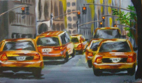
Red Signal
Acrylics on Canvas, 7 * 11 inches

Copyright Nithya Swaminathan


I loved this scene and wanted to do it in full. It is a scene so full of life, and I loved the long format of the image. I also had a 7 * 11 canvas lying around for sometime, so I thought I'd use that one up and do this image in a vertical format. When I got to it however, I changed my mind. I did use the same canvas, but tackled the image in a horizontal format, focussing on my most favorite parts of the reference, viz. the taxis. Such a burst of color, aren't they? As I started the background, the numerous buildings again gave me jitters. Then I squinted and squinted so many times, and all I could see was vertical lines of varying value. Looked much simpler than I thought! I am not sure if I have achieved a good feel of distance, but definitely much better than I expected myself to do.:)

Since I was too busy with my daughter's portrait, I almost missed the deadline for this one. Thankfully I remembered it just on time and got to it. I started working on this only this morning, and due to the lack of time, I was forced to keep it really simple and loose. So instead of nitpicking over too many details, I tried to bring in a feel of the scene and painted as quick as I could to finish it on time. :)

Have a look at all the entries here, they make an awesome collection.

May 19, 2009

Chasing my rainbow - updated

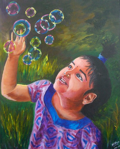
I was so not happy with my kiddo's portrait and I was really looking for someone to rip it apart. And no, that did not quite happen. Apart from a few suggestions from WetCanvas, there wasn't much I got. So I went by my original plan to leave it aside for a few days and then get back to it with a fresh eye. I must say that really helped. Also, till I posted it the last time, I was looking at my reference in the system and painting. This time, I took a print out of it and had it in my hand. That made a world of difference to the whole thing. Looking with the image in hand, side by side with my painting gave me a much better idea of what all I had messed up.

And then, I turned to my ever dependable dad for pointing out the issues in the portrait. Not that I could not do it on my own, but I firmly believe a fresh look helps, more so if its from him. As expected, after I mailed my daughter's portrait version 1.0 to my dad, I got some fabulous suggestions. I got some great suggestions also from my brother, who is a very gifted artist unfortunately with no online presence! My dad pointed out n number of places where I could improve, and finally said that I have to satisfy myself first. I think he nailed it with that one sentence. I wasn't even close to being satisfied with the previous version. A mother's obsession is too strong and I just could not settle with the earlier version. Not that I am greatly satisfied now, I am certainly not. But I feel I am almost there. Here is how the portrait looks now.

Chasing my Rainbow
Acrylics on Canvas, 16 * 20 inches
Copyright Nithya Swaminathan


Some of the things that I have done -
  1. I have added more darks around the corner of her lips to bring in more depth to the smile.
  2. I have softened the area where the neck meets the chest, earlier it was too hard edged and I think it looks better now. So instead of looking like an attachment on the chest, the neck looks like a continuation.
  3. Softened the background a bit. One thing people at WetCanvas and my brother pointed out was that the background was kinda competing with the image. Since it could hinder with the outline of the face I could not do much, but I have greyed it down as much as I could.
  4. I have slightly increased the size of the hand and palm. I am not even sure if it can be seen, but I made the hand a little thicker.
  5. I have redone most of the hair, as I felt it was too artificial looking. It looked like it was pasted on her head, I have tried my best to correct it. I worked a little patiently, strand by strand!
  6. Oh, and most importantly, I have painted over and repainted her left eye (the one closer to the viewer) at least 6 times. The eyebrows looked terrible before, like caterpillars! I tried to soften them as much as possible. And the whole eye was done over and over again. That's why I love and hate Acrylics. While I love it for the flexibility, I sincerely believe I'd take much more care if it were an unforgiving medium. So it is not Acrylics that I hate, it is myself actually. Huh!
My reference for this portrait is a terrible one. It is an image of Teju shot indoors on an overcast afternoon, can it get any worse than that? The lighting is just as pathetic as it can get. If someone gave me such an image to do a commission, I'd just refuse. But as I mentioned, this is a mother's obsession and I just had to paint her in that pose. It was sheer luck that among the dozens of snaps I took, this one had that sparkle in her eye and caught her mood so well. So I just couldn't let it go. I played around as much as I could with the lighting in photoshop, just to get the facial features lit up a little better. I am glad I pulled it off reasonably well.

This painting also has the dubious distinction of being the one that has undergone maximum changes after I signed it. As I mentioned in my previous post, I wanted to schedule this one to be posted on Mothers' Day, before I went on vacation. I therefore finished this up in a hurry and signed it. Even my husband told me it was decent enough to be posted. It was only when I looked at it through the camera that I realized how terrible it was. It was a bad painting, terrible if I were to consider likeness and mood. I just put aside the camera and realized it had a LOT more work to be done. I have worked for about 10 hours on this after signing it. And with great effort it has reached a stage where I like it. I only hope I still continue to like it after a week and don't have to pick up my brush again.

May 14, 2009

Chasing my Rainbow - portrait of a princess

I generally do not take up tags on my blog, obviously since this is an Art blog and I have not yet come across any Art related tag. However, this tag is different. I am first a mother before anything else and so I am willingly taking this up, a lovely tag going around the world to list the 5 best things moms love about motherhood.

I have to say that I am no good at articulating my thoughts as well as some of my friends. Go here, here or here to read some really nicely written tags. :) I will try my best to put across what I love, though it is extremely difficult to limit it to five. I was tagged by the lovely IBH, and here goes my thoughts in no particular order.

1. I have rediscovered myself with motherhood. It is a no brainer that motherhood has made me a stronger person. My daughter has actually made me believe that I can handle two full fledged careers, a happy home, and still find time to pursue my other interests and have time for myself. She has done all this without uttering a word! Before she was born, I had time to roam around every street of Bangalore and equip myself to be a walking Bangalore-restaurant-guide. In short, all that I did was eat and sleep, and crib that I have no time for Art. All that changed miraculously and the more busy I got, the more time I had to do many more things. If not for motherhood, I am sure I'd still be a lazy bum shuttling back and forth between work and home, and nothing else worthwhile to do.

2. I feel I am actually getting younger by the day after becoming a mom. I am rediscovering the simple joys in life, I am more aware of the beauty of nature around me. I stop to notice a butterfly, a ladybug and what not. I go out and dance in the rain, jump around in snow making footprints and have no qualms about doing any of these. I have learned from my daughter to live my life as I want to.

3. Motherhood has made me a believer. In miracles. In unconditional love. It makes me want to be a better person, to make myself worthy of her infinite love. And to give back at least a percent of the love that I get.

4. I have learned to forgive. Or at least ignore if I cannot get myself to forgive. Every time I give my little one a whacking, she showers me with hugs and kisses within minutes. She humbles me with her behavior, that I really want to forgive and not harp about things/people that don't matter.

5. I get to hone up my portraiture skills by painting the most beautiful face in this world. And free of any copyright issues, how cool is that! The gratification I get out of doing her portraits is something I cannot express in enough words. The excitement in her eyes when she sees her face pop out of the canvas is priceless. I get hugs in return, and that is obviously better than any recognition my Art could ever get me. If she is in a great mood, I also get to hear nice things about my work.:) I could of course go on and on, but since the tag says only 5 things, let me stop here.

Chasing my Rainbow
16 * 20 inches, Acrylics on Canvas
Copyright Nithya Swaminathan

I have been planning to do a portrait of my princess for a while now, and Mothers' day seemed a good occasion for it. It is my way of celebrating the blessing that's my daughter, and also the best gift I could give myself this Mothers' day.

I wanted to post this for Mother's day, but I was on vacation. And I wanted to so some last minute tweaks before posting it. Now I would say it is about 90% done, though I have signed it. I don't think I have done justice to her expression, the excitement with which she was chasing these bubbles. The portrait lacks life I would say. I have also posted it on WetCanvas and am waiting for any suggestions to make it better. Else I will have another look after a week, when I hope things will glare at me.

Any moms reading this, please feel free to take up the tag and post your thoughts if you wish. I am not really tagging anyone, take it up if you wish and its fun! Oh and by the way, the first title that crossed my mind when I was doing those bubbles was "Venn diagrams in the air". I was proud of myself for a moment.:)

April 25, 2009

Different Strokes - Diana's companion

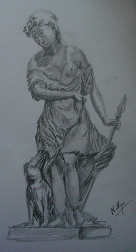
I love looking at sculptures. I enjoyed the sculptures in the Louvre as much as I did the paintings. It is such a terrific art to be able to bring something alive from stone. I have so many favorites at the Louvre, the Hermaphrodite quickly comes to mind. I absolutely love it. Whoa! While I love Indian sculptures for their intricacy and craftsmanship, the western ones have a unique appeal too. Like this one of Diana's companion. What a beautiful figure, I loved the dress, her skirt and the folds in it. Among my extremely limited travel experience in India, my favorite spot for sculptures is the Somanathapura temple near Mysore. I was there last year and it was worth all the trouble of traversing through the pathetic roads. The figures just blew me away! Totally worth a visit.

Diana's Companions
Graphite on paper, 9 * 12 inches
Copyright Nithya Swaminathan


This is my entry for the ongoing challenge at Karin's Different Strokes blog. Its been ages since I painted a sculpture. Long long ago, about 12 years back to be precise, I did a sculpture in graphite, of one of the figures in Halebid. Though I lived in Bangalore for so long, I never got to visit Halebid which is quite close. So after 12 long years, this was my first attempt at doing a sculpture. I have a lot of photos of sculptures, from the Louvre and from Rome. I am inspired to go paint some of them. We'll see.

Karin had requested the figure to be painted as a whole, without cropping. I have flipped the reference image horizontally though. I wanted to do this as a monochrome initially, with various shades of brown. But when I started sketching itself it screamed graphite, hence the choice of medium :) All the entries for this challenge can be seen here. Most of them aremind blowing, absolutely mindblowing. Have a look.

April 24, 2009

April Virtual Sketch Date - Rhododendron bud

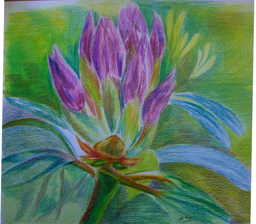
I suck at florals, and would not venture into one even if threatened at gun point! :) Not that I am not inspired by them. When the daffodils were all around everywhere, I was so regretting I am so pathetic with flowers. Maybe some day, I might do some. Currently, I feel my style of using strong contrasts and generally visible hard edges is not quite suited for the softness that's needed to render a flower. I have a long way to go in terms of softening my edges before I can render delicate darlings.

Rhododendron bud
Colored pencil on paper, 9 * 9 inches
Copyright Nithya Swaminathan


However, since the blog events are all about getting out of your comfort zone, I decided to do this one as well. It has such lovely colors, and I have gone in for colored pencil. Thanks to Jeanette for a great image, I had a lot of fun.

This month's entries can be seen here in the Flickr pool, and go here to check the various blog links.

April 23, 2009

Let your hair down

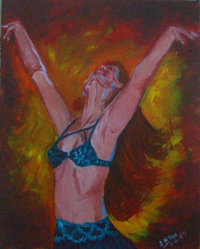
Continuing with my series, this is my 3rd painting of belly dancers. There is one more to go as of now. All these paintings have been done based on the photos of Flickr photographer Adelita Choffi. While I was searching for pictures of dancers, I came across her treasure trove of snaps, all of beautiful belly dancers. She was generous enough to allow me to use them as references for paintings. I have favourited several more of her snaps, and will probably get to them after a while.

I might even extend this kind of a series to paint the various different forms of dance. There are too many exciting possibilities and I need to think before I jump in.

Let your hair down
16 * 20, Acrylics on Gallery wrapped canvas
Copyright Nithya Swaminathan


I wonder if you have noticed that instead of giving creative titles like dancer 1,2.. n, I have titled them separately. This was a learning when I submitted an entry for the Richeson competition. On my blog the apples were numbered one to eight, and I had a tough time coming up with titles just around the deadline. Huh! I dare not do this 1..n numbering once again. :)

April 22, 2009

Unleashed

I love dance as an art form to bits, and not knowing to dance is one of my biggest regrets in life. I did not pursue it despite having had an opportunity to learn. This series of mine essentially aims to celebrate the beauty of the art form, and also the grace of the female form. I wanted the paintings to ooze passion, and that’s the basis for my color choices. I have gone in for a lot of oranges and reds in the background, as I believe it denotes a surge of passion. I aim to capture movement, with emphasis on the body language and not on facial expression. I wanted the whole figure to convey a sense of passion, true to the words “Dance like no one’s watching”.

Unleashed
16 * 20 inches, Acrylics on Gallery wrapped canvas
Copyright Nithya Swaminathan


While I chose blue in her dress mainly because the complementary colors would work well together, I also chose it keeping the peacock in mind. When I was thinking about dancing without a care in the world, or just dancing to your own heartbeat, the peacock was what popped up in my mind first. Hence I have gone in for a lot of Pthalo Turqiose in the dresses.

The style is different from what I normally do, on quite a few counts. This is the first time I have tried to paint focusing on what I “feel”, rather than what I “see”. This could perhaps be a new direction in my work, but I cannot say that for sure now. The style in which the background is done, is totally new. I painted like a woman possessed, dabbing color randomly. I wanted to have fun and yes I did. A lot.

Even with the dancers, I have given all the detailing only to the face and the hair. The hands have not been done as detailed as I’d usually do them. Since I wanted to focus only on the face and hair, I chose to go a little loose with the hands. The dresses also have intricate mirror work and beads in my references. I have omitted all of those and just briefly indicated some designs. I think it works well, but it remains to be seen if I still like it say after a week. I might get back to it and change something if I don’t like it.

April 21, 2009

Dance like no one's watching - a new series

Whenever I come across very high quality of Art that I greatly admire, it motivates me to work harder at my own art and improve myself. It also happens more often than not, that I get intimidated by awesome artists that I come across. It makes me feel I should strive to be that good, but the realization also dawns that being that good gets tougher with every passing day. I get bogged down that there is a long long way to go, and during every phase of introspection, I invariably feel I have just begun.

A couple of weeks ago, I was in a similar phase of self doubt after I visited an exhibition at a nearby gallery. I was fortunate to see some of the most stunning impressionist landscapes over there, and came back with the feeling that if I had to be even 1% as good, I had to improve by leaps and bounds.

Dance like no one's watching
16 * 20 inches, Acrylics on Gallery wrapped canvas
Copyright Nithya Swaminathan


While I was bogged down by self doubt and a serious loss of confidence, the only way to overcome that was of course to paint something. And for a change I wanted to paint something with reckless abandon, just slap the paint without being bothered about detail. When you lose yourself in the process of painting, the surrounding world hardly matters. And that's the motive behind this new series, a sort of reminder to self, to dance only to your own heartbeat, without a care in the world. There are 4 pieces in all, all of them of beautiful dancers.

I had a tough time getting this face right, due to the different angle. I am very comfortable painting faces that look straight, but these kind of faces give me jitters. And those hands were a nightmare. I thought I had painted them very big, but turned out they were actually much smaller than they should’ve been. I posted WIPs and got some very useful feedback from friends at the Acrylics forum in WetCanvas. One of the artists actually took the time to edit my painting in photoshop to show me how the anatomy wasn’t quite right. And that's why I love WetCanvas. People go out of their way to help and guide others, and you can never really get away with a badly done piece of work :D

April 20, 2009

Richeson 75 Juried Show - Accepted!

I am thrilled to let you know that my painting Apples and Glass is accepted into the Richeson 75 Still life & Floral competition, conducted by the Jack Richeson company. My painting will be displayed next month in Kimberly, WI, in a show that will showcase seventy five best still life and floral pieces. The paintings will also be published in a full color catalog along with other finalists and select pieces. I had sent two of my apple paintings for this juried competition, and this one got selected. Yet another apples and glass was not juried into the show, but has been accepted to be published in the book. The finalists will be displayed on their website too, and I will post an update once that is available. 

April 13, 2009

I am still around

I've been working on too many things at once, as I always do. I have so many WIPs, most of which are not even in a showable stage, hence the silence on this blog for a while now. I think I may not be around for the next week too. See you all in a week, and I promise I'll have LOTS to show when I am back. Keep painting until then, Ciao!

March 31, 2009

Couple of works in progress

Some WIP images of a couple of pieces I am working on at present. I am working on a few landscapes, as I had this uncontrollable itch to do some. It was so bad that I had to abruptly stop whatever else I was doing, and plunge into these. Huh! Happened to take some progress shots, so here they are.

Summer fields - work in progress
Copyright Nithya Swaminathan


Finding my way through - WIP
Copyright Nithya Swaminathan

March 30, 2009

A quarterly review of Goals 2009

I have always been an advocate of timely feedback and goal reviews, since it always helps to set things right sooner than later. Last year I was not really acting on the goals, I was doing a lot many other things and I just forgot about them. This year though, things are going good and I'd like to review and revise them now, that we are one quarter into the year.

Summer fields - Work in progress
Copyright Nithya Swaminathan


Here are my goals that I published in December 2008 - they were very very conservative, keeping last year in mind. I tried to play it very safe. I wanted to participate in all the VSDs, but I had to miss the February's. My other goal was to do 10 DSFDF challenges, and I am glad I have already done 4 so far this year. 10 looks rather easy now, so I will change that to 15.

I did not have a goal on a specific number of paintings that I should complete during the year. I have never had such a goal. But, I am extremely happy I have completed around 30 paintings so far (this is including my entries for VSD, DSFDF etc). This is more than the number of paintings I did in the last five years put together! Not to forget the dozen paintings that are in progress, what youe see in this post is also one of them. So I am giving it a shot to complete 100 paintings by end of the year, lets see how it goes. I know that I also had a goal that I should work on one painting at a time and take it to completion. That however has not been possible, and I just left it at that. Some people have a compulsion to multi task and it is best left alone :)

The biggest plus this quarter has been how much I have ventured out of my comfort zone. I always considered myself primarily a landscape artist, who occasionally did other subjects. I never ever thought I'd be doing still lifes for about 75% of my time, but thats what has been happening now. I am having a blast with all these still lifes, since they have been well received and I got some very positive feedback for them. I will be doing more still lifes, and I predict that will constitute a majority this year.

I have done figurative paintings in my winter series, something that I never really bothered to do before. I have also been working consciously on my figure/portrait drawing skills by carrying my sketchbook with me whenever possible. I try to sketch my daughter at home when she is busy with something. I don't post most of these to the blog, but I know I am at it anyway.

As promised, I have also started selling originals now, though not from my blog. I am offering original small paintings from my Etsy store. Most of all, I have been blogging regularly all my paintings and WIPs. It gives me great pleasure to share the WIPs with my readers, more than the completed paintings. And it also keeps me going when I don't feel like it once in a while. Also, though not very important, I have redesigned my blog completely and I like how it looks now. I hope you do too. I am in the process of updating the website, I am moving it to another service provider, and will post the details soon as I should be done anytime now.

I hope the rest of my year is as good as its been so far. We'll do this once again every quarter. How are you doing so far?

March 29, 2009

Some sketches over the weekend

We had gone to this little lake close to where I live, and I managed to do a couple of sketches. My daughter was so excited seeing the ducks over there and wanted to feed them some bread. This is dad and daughter enjoying themselves feeding the birds. My husband is actually a lot thinner, and I couldn't get the proportions exact as they were moving constantly and it wasn't very easy to sketch. The little one looks quite closer to real life.

Feeding the ducks
Copyright Nithya Swaminathan


And then closer to us were a few more gentlemen who had come fishing. There was this elderly gentleman who has set up all his angling equipment and was sitting patiently with a drink in hand. I loved his pose and the entire setting. There were 3 guys in all and I would probably paint them later. Just managed to sketch this one.


Waiting for fish
Copyright Nithya Swaminathan

March 26, 2009

A portrait in graphite after ages

This is a portrait of Jeanette for the monthly portrait study. I have posted it for feedback it the group, and some more tweaks are pending I should say. I am not happy as of now and I hope I am able to fix the issues soon. It was fun doing a graphite portrait after a long long time, more than 5 years if I remember right. The last graphite portrait I did was of my husband, when he was still my boyfriend! And looking back at that portrait now, it looks so childish. This time I used the flatter side of the pencils to block areas quicker and also to get a softer look. I am pretty happy with the shading and the edges, but the resemblance is way off. Your feedback is welcome.

Jeanette Jobson
Graphite on paper,
Copyright Nithya Swaminathan

March 25, 2009

Bringing the pears alive

Now it is time for the pears to rise from the dead, and so finally I get to see some hues other than black and white. I have added one layer of color in the first 2 pieces. I will be adding color layer by layer, so as I mentioned earlier, I will be working on all pieces in parallel.


Let me know what you think of it.

If you like it, share it!