I was so not happy with my kiddo's portrait and I was really looking for someone to rip it apart. And no, that did not quite happen. Apart from a few suggestions from WetCanvas, there wasn't much I got. So I went by my original plan to leave it aside for a few days and then get back to it with a fresh eye. I must say that really helped. Also, till I posted it the last time, I was looking at my reference in the system and painting. This time, I took a print out of it and had it in my hand. That made a world of difference to the whole thing. Looking with the image in hand, side by side with my painting gave me a much better idea of what all I had messed up.
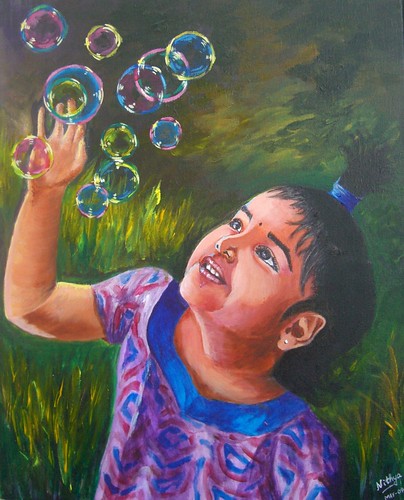
And then, I turned to my ever dependable dad for pointing out the issues in the portrait. Not that I could not do it on my own, but I firmly believe a fresh look helps, more so if its from him. As expected, after I mailed my daughter's portrait version 1.0 to my dad, I got some fabulous suggestions. I got some great suggestions also from my brother, who is a very gifted artist unfortunately with no online presence! My dad pointed out n number of places where I could improve, and finally said that I have to satisfy myself first. I think he nailed it with that one sentence. I wasn't even close to being satisfied with the previous version. A mother's obsession is too strong and I just could not settle with the earlier version. Not that I am greatly satisfied now, I am certainly not. But I feel I am almost there. Here is how the portrait looks now.
 Chasing my Rainbow
Acrylics on Canvas, 16 * 20 inches
Copyright Nithya Swaminathan
Some of the things that I have done -
- I have added more darks around the corner of her lips to bring in more depth to the smile.
- I have softened the area where the neck meets the chest, earlier it was too hard edged and I think it looks better now. So instead of looking like an attachment on the chest, the neck looks like a continuation.
- Softened the background a bit. One thing people at WetCanvas and my brother pointed out was that the background was kinda competing with the image. Since it could hinder with the outline of the face I could not do much, but I have greyed it down as much as I could.
- I have slightly increased the size of the hand and palm. I am not even sure if it can be seen, but I made the hand a little thicker.
- I have redone most of the hair, as I felt it was too artificial looking. It looked like it was pasted on her head, I have tried my best to correct it. I worked a little patiently, strand by strand!
- Oh, and most importantly, I have painted over and repainted her left eye (the one closer to the viewer) at least 6 times. The eyebrows looked terrible before, like caterpillars! I tried to soften them as much as possible. And the whole eye was done over and over again. That's why I love and hate Acrylics. While I love it for the flexibility, I sincerely believe I'd take much more care if it were an unforgiving medium. So it is not Acrylics that I hate, it is myself actually. Huh!
My reference for this portrait is a terrible one. It is an image of Teju shot indoors on an overcast afternoon, can it get any worse than that? The lighting is just as pathetic as it can get. If someone gave me such an image to do a commission, I'd just refuse. But as I mentioned, this is a mother's obsession and I just had to paint her in that pose. It was sheer luck that among the dozens of snaps I took, this one had that sparkle in her eye and caught her mood so well. So I just couldn't let it go. I played around as much as I could with the lighting in photoshop, just to get the facial features lit up a little better. I am glad I pulled it off reasonably well.
This painting also has the dubious distinction of being the one that has undergone maximum changes after I signed it. As I mentioned in my previous post, I wanted to schedule this one to be posted on Mothers' Day, before I went on vacation. I therefore finished this up in a hurry and signed it. Even my husband told me it was decent enough to be posted. It was only when I looked at it through the camera that I realized how terrible it was. It was a bad painting, terrible if I were to consider likeness and mood. I just put aside the camera and realized it had a LOT more work to be done. I have worked for about 10 hours on this after signing it. And with great effort it has reached a stage where I like it. I only hope I still continue to like it after a week and don't have to pick up my brush again.
This painting also has the dubious distinction of being the one that has undergone maximum changes after I signed it. As I mentioned in my previous post, I wanted to schedule this one to be posted on Mothers' Day, before I went on vacation. I therefore finished this up in a hurry and signed it. Even my husband told me it was decent enough to be posted. It was only when I looked at it through the camera that I realized how terrible it was. It was a bad painting, terrible if I were to consider likeness and mood. I just put aside the camera and realized it had a LOT more work to be done. I have worked for about 10 hours on this after signing it. And with great effort it has reached a stage where I like it. I only hope I still continue to like it after a week and don't have to pick up my brush again.