July 10, 2008

Some sketching in Venice

I have been roaming around a lot over the past few weekends, visiting several places in Europe. Not to worry, I would not bore you to death with all those chronicles, coz that ain't the point of this post. The beauty about traveling in Europe is that the places offer a great deal to the artist. Every other building has its unique aesthetic appeal and begs to be sketched! As for me, when I am away from my canvasses and I am dying to get hold of some paint, sketching is the least I can do and I do not want to miss an opportunity at any cost. All I need is a pencil and paper, so what is the big deal you wonder? It ain't really THAT simple if you are a parent and have a toddler tagging along with you everywhere.

The problem in traveling with a kid is that she wants everything that I can lay my hands on. If I want to sketch, she will want a pencil, if I want to drink, she will want my glass. You get the idea, don't you? So there is really no question of "diverting" her attention to something more alluring. The minute I pick up a sketchbook, she will proactively shout "Pencil" on top of her voice. One smart child I have! There ends any hope of me doing a sketch. This has been happening in every other place, and I only ended up clicking reference images, but never really got around to doing any sketching/painting.

I did not want to get put off by this routine, and decided to carry my book anyway to Venice. This place is really close to my heart, I just love everything about it. Every inch of Venice is a painting, it almost instantly "connects" with the artist. It was then to great joy I discovered that there was something more interesting to my daughter than my pencils. And that was a pigeon :-) So I managed to send her away for a while to chase and feed the hundreds of pigeons at St. Marks square, while I would spend about 10 minutes sketching the Basilica di San Marco. The St. Marks square is such a lively place, full of people and shops and of course pigeons.


Basilica di San Marco,
St. Marks square, Venice
pencil on paper


What you see above is the little sketch that I could manage in about 5 minutes. Ah! Such joy to even get to it after a long time. It is not complete, but I decided to post it anyway. I was forced to stop not by my daughter, but a waiter at the restaurant where I was happily seated. Without taking any food whatsoever :-) He wouldn't allow me to even complete it, huh!

June 18, 2008

Australian Country side - WIP

When your hands are really itching to get hold of a brush, the fact that you are unable to isn't exactly a very nice feeling. I am in that state of helplessness currently, other than a occasional sketch, I am unable to do any serious painting. So I thought it would be good to post some of my WIP pieces that are waiting for me to take them to completion. These pieces would be completed by end of August.

This is a piece I started a long time ago, around 6 months back I guess. I got too distracted with newer paintings and work coming up that this has been lying around. I got to work some more on it about a month back though. Its on gallery wrapped canvas, 16 * 20 inches.

Australian Country side - Acrylics on Canvas

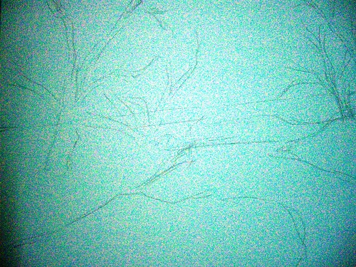
Step 1 - rough initial sketch


Seen above is the initial sketch done freehand and directly on the canvas. This is also an attempt to paint as loose as possible, so I have deliberately avoided giving any details in the sketch.

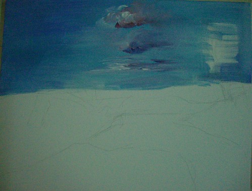
I have then laid down the color for the skies, overlapping the sketch coz the trees will be done over this after drying. I do not find it good to do the trees first and then show some sky in between, it makes it very unreal.

Australian Countryside - Acrylics on Canvas, Stage 2


In the next stage, I have marked the darks with burnt sienna. These will be the darkest areas of the tree foliage, with lots of shadow. The picture has really good lighting so shadows have a crucial role to play. The rough marking of the trees looks rather crude, but it is just to guide me where the barks are. I will be painting over this in browns anyway.

Australian Countryside - Stage 3


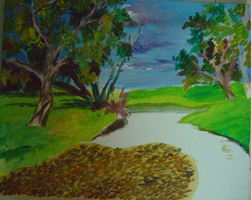
I have then started with the leaves, and the grass in the foreground. I have kept the grass really light, as it is much more brighter than this. It is nearly bright yellow. What I have observed from my paintings in general is I don't tend to really push my darks and my highlights. It looks like I tend to stick to more mid tones, which I aim to change. Even here, I should ideally be making the shadows much darker, and the highlights much more brighter. I hope I am able to achieve that by the time the piece is done.


As it stands, this painting will not draw the attention of any viewer methinks. In the meanwhile, I have also started work on the foreground. The foreground is absolutely gorgeous with a lot of dried leaves over shallow waters.

Here is where the painting is as of now. A lot more to go, at least 2 more layers to be done. I need to then refine the skies too, right now the clouds look really haphazard. All that and more by mid-August :-)


I have not prepared a slide show as of yet, will do so after the whole painting is completed. Your comments are most welcome until then.

June 13, 2008

Face to Face with Rembrandt!

When you study some masters and are greatly inspired by them, actually seeing the paintings for real is an experience quite unmatched. Such was my state of mind when I saw not one, but around 40 Rembrandts in flesh and blood, at the Rijksmuseum, Amsterdam. Rembrandt Van Rijn, obviously the most popular amongst the Dutch masters of the Golden Age, is one artist whom I admire hugely for his masterful usage of darks in order to get dramatic lighting. They say if you want to paint light, paint the darks first. This is true, because only proper darks and shadows with bring out the effect of light. And this is showcased best by Rembrandt.

Blame it on my lack of knowledge, I thought that Rembrandt painted realism painstakingly. But then that wasn't the case. He painted realistically only the focus areas, giving them a lot more detail than the 'out of focus' areas. They were done effortlessly and that kind of increased the effect and completely draws the viewer to the focal point which he aims. It has to be seen to be believed!

One more thing that strikes me is the splendid usage of black in his paintings. This is the case with not only Rembrandt, but a lot of the Dutch masters. They use black extensively, be it in the clothes or in backdrops. My art teacher used to vehemently prohibit us from using black paint as is from the tubes. She always insisted that no shadow or object is absolute black and it is formed by mixing other dark shades instead. I followed it blindly many years ago, and then saw that it was true. The more and more paintings I studied, more real life objects I closely observed, I understood the meaning behind her statement. It is amazing though how these masters have used the color to create the best possible darks and bring in an atmosphere to their paintings.

Rembrandt’s paintings show very clearly his strong brush strokes, and it is believed that he used the bristles and the back of the brushes also to create impressions like fine hair. In his first self portrait seen above, when he was aged just 22, the hair is so masterfully done. After dabbing a lot of dark colored paint, he has scratched on the wet paint using the back of his brush. This creates a great suggestion of hair and looks extremely real too.

My favorite amongst the Rembrandts was the Jewish Bride. The audio guide mentioned that it was Vincent Van Gogh who said that he could spend 10 years of his life sitting there just looking at that painting, and surviving on stale bread. Coming face to face with the masterpiece, it isn’t surprising that he made such a statement. The focus in the painting is on the sleeves of the guy, one that shines in gold. To get the shine, the artist has done an under-painting in burnt sienna, and then followed it up with huge amount of yellow (and some ochre, I think) dabbed with a
palette knife. It gives an unbelievably realistic look to the sleeve, as if it shows every crease possible. But going closer, we would note that it isn’t detailed as a photo realistic painting. The forms are only suggested and terrific values established with the under-painting and the palette knife. Also, photographs will not really capture that 3D effect the painting has.

The genius of Rembrandt can be seen in how he has handles the shadows of the lady’s fingers, and also give glimpses of red on the man’s sleeve, which is nothing but the red reflected from the lady’s dress. One more point which I wouldn’t have noticed if not for the audio was a tiny black outline on the lady’s thumb, which goes to show that she is not resting her hand on his body, but it is away from it. Mind blowing! I just stood there in front of it for a long time, just unable to take my eyes away from it. Though every Rembrandt is a stunner, this one just blew me away, totally! I wouldn’t mind going there again just to see this one.

Another one of my favorites from Rembrandt was the painting of Anna, the Prophetess. This is a profile of an aged woman with diminishing eye sight reading the Bible with the help of her fingers guiding her through the lines. The focus is on the “reading hand” and not the face of the woman. Rembrandt depicts every single wrinkle in that hand, he probably wanted to show in terms of folds all the experience in life she had. Apart from the hand, everything else is shown in less detail. It is not impressionism per se, but it is done in a loose style. The lighting of this painting is also brilliant, the light rays fall on her reading hand. Her face though lacks any detail, and is almost hidden in the shadow.

There is another painting of Anna and Tobit with a lamb, which conveys a great deal of emotion. The story is something like Tobit suspected Anna for stealing the lamb and later regretted it. I do not know the story too well, and it hardly matters anyway. Suffice to say that whatever emotion is conveyed in the story is captured masterfully in the painting.

One more painting that had a religious connotation was Jeremia Mourns. The painting is of the destruction of Jerusalem, and Jeremia, a prophet laments this sitting alone. The story mentions that he had prophesied this event, but he could not prevent it. The emotion that's conveyed in the painting is one of immense pain and grief, and its fantastic. The focus is on the prophet's face and each wrinkle in his face shows the amount of pain. Here again, in doing his bears and hair, Rembrandt employs the back-of-the-brush technique. The ornamental shawl is also exquisitely done.

The photograph here looks as if the top left of the painting is entirely dark with no detail, which is not the case. What is shown there is a lot of troops marching into Jerusalem, a fortress, people attacking each other etc. War and destruction depicted with great lighting but not very intricate detail. This photo obviously doesn't do justice to the painting.

Though Rembrandt was a master of the portrait, his landscapes were no less spectacular. There is only one landscape by him in the museum, called the Stone Bridge. This piece uses the same dramatic lighting that he employed in his portraits. The photo again does not capture the complete detail in the painting. I loved the clouds in this one, very very dramatic. And in the foreground, there is a lot of detail not shown in this photo. There are people walking, one man carrying some load and going, one family going with a cart and so on. It is one of my favorites in the museum.

And then, The Night Watch. This is the most famous painting in the museum, and it occupies an entire wall. It is absolutely gigantic. The painting is a group portrait with terrific light and shade. The scene is that of some militia men marching out of a gate. There is so much of movement in the scene, because the men are not static. They are marching and this effect is achieved in their various postures which are all distinctly different.

The focus is on the lieutenant in the front, and the little girl in the middle who is a mascot. It is interesting to note that both these "objects of interest" are not bang in the center. They are slightly off-center, adding interest to the viewer. So much attention is give to the fabric worn by each person, their collars and the expressions on their faces.

Though the night watch is the most popular painting in the museum, and probably the most popular group portrait, my favorite group portrait is another painting, The Sample Officials. This painting captures more than just faces, it just captures a snapshot of a moment in time, frozen forever. And that is awesome to say the least!

There are 6 men in the picture, and each of them is so unique in posture and expression. They are officials who sample the quality of cloth produced and hence the name for the painting. It is as though the room in which these guys are is slightly raised. As in you open the door, walk up a couple of steps and then these guys would be sitting there. Now, if someone entered opening the door and they all notice this, this is how the moment would be. All of them seem to be looking in one direction, towards the visitor. The cloth is also so wonderfully done. From a distance, it will look like the red cloth is done in intricate detail, which is far from true however. In the focus area where there is light, there is some (not much) detail of golden threads etc. This gives the viewer an impression that the entire cloth is detailed. It is however just red and sienna dabbed randomly with no detail whatsoever. The focus is actually not on the cloth, it is on the faces and they are brilliant.

Some other paintings of Rembrandt that I loved are his other self portrait when he was 55, then some more portraits of other people, specifically one of a young rich woman where he is at his detailed best. Her dress, collars and ornaments everything just oozes detail. I wanted to put in my first thoughts about all the Dutch masters in the museum, but Rembrandt has awed me so much that I am running out of space. So all the other masters, some other day.

All the images in this post are copyright Rembrandt :-)

For further reading -

May 30, 2008

Evening Glow - Postcard #3

In a quick change of events, I landed in Germany couple of weeks ago. I am here for the next 2 months, joining my husband who was already here on an assignment. So that means that I am not going to be actively painting (hardly anything in fact) until then. What I would be doing though, and doing generously is visiting museums and seeing some of the best art this world has ever known. Now that's interesting isn't it?

I will try to sneak in an occasional sketch here and there, but you guys look forward to seeing and reading about Art that is much better and bigger than mine. It is going to be a helluva learning journey for me, and I look forward to blogging about it.

Evening Glow - 6 * 4 inches,
colored pencil on paper

Before I go ahead and blog entirely about the Masters, I thought I would leave you with a couple of my own. Stuff that was done last month in Bangalore. It aches that I have come here leaving behind so many unfinished paintings and I cannot get my hands on them in the near future. This is one of the colored pencil drawings I have done for the postcard exchange, from an awesome reference by Dave Slaughter. I just love his bird pictures, and I know I have said it already. I have tried my best to capture the evening sunlight that's hitting the body of the bird, the lovely shade of orange.

Evening Glow - completed
colored pencil on paper

The method is the same as my previous postcards, a watercolor pencil underpainting followed by a wash with a wet brush. And then finer details added with colored pencils. Your comments are welcome :-)

p.s: Just realized that this post remained in my drafts! Posting it before its too late!

April 30, 2008

Postcard #2

Continuing with the postcards, here is yet another very colorful bird, done in the same style of a watercolor underpainting followed by colored pencils. I am drawn towards anything blue, and this one was no exception. I am no good at bird watching and do not even know the names of most of these. There is an artist in WetCanvas who gives such jaw dropping bird images for references. Each and every single snap of is a wonder, and all these birds are done from his photos only.

Electric - watercolor pencil underpainting

Electric Blue - colored pencil on paper, 4*6 inches
Private collection.

Among other things, my website is also getting updated with images of these cards. You can locate them under 'Miniatures'. And I guess you would have already noticed the change in my blog layout and color scheme. A reader had suggested long back that I could have a painting as a backdrop, and I felt I could have it only in the header. Finally got around to doing it only now. Let me hear your feedback on the new color scheme, if it is pleasing to the eye.

Postcard #1

I am doing a series of postcards for a Postcard exchange project that I signed up in WetCanvas. A postcard is typically 4*6 in size. Just like the last year's exchange, we are about 25 participants. Each of us will paint 24 postcards and mail it to the others. I have already got about half a dozen postcards and I am a late starter this time.

Postcard #1 - Yellow bird & Cactus plants
Underpainting in Watercolor pencils


I am getting back to colored pencils after a while, and the best way to get back in touch is to work small. Since colored pencil is a medium I was investing so much on even before doing anything worthwhile, I have too many sets of pencils, most of them watercolor pencils. It took me a while to actually realize that people generally don't work with the watercolor pencils to get the pure CP effect. Now I possess a set of pure CPs also, but my watercolor pencils will remain idle if I don't use them, so I use them to do underpaintings. And it works wonders, I should say.
Postcard #1 - Completed
Colored Pencils on paper, 4 * 6 inches

The method is simple - I first do a cross hatching with watercolor pencils which is very rough and the strokes will be haphazard. This is okay, because they will be evened out when I do a wash with a wet brush. It will give a lovely smooth look to the background, especially useful when the background lacks detail and all the focus is on the object in the foreground. After washing with the brush, the color would brighten up a lot too. I then complete the painting with the normal colored pencils on top of the watercolor pencils.

Ideally I should not be posting this in public before my recipient gets the card, but I don't think any of the participants even know about my blog, so it is okay :-)

April 29, 2008

Monet's gardens at Giverny

This is a painting I started and posted as a WIP 6 months ago, but it never took off coz what I had in mind was simply not getting translated onto the canvas. I was getting frustrated to the core! I would touch the painting every now and then, correct something that I felt was not okay, but as a whole it never looked right. The lighting was all screwed up and it lacked any kind of atmosphere.

Now I have got back to the painting, and I gave up on acrylics as my skills were very limited, and decided to proceed with oils. I must say its been more of a relief than anything else. Relief because of two reasons - one is I am able to see some redemption for this painting, which I so dearly loved. I love the image that I have in my mind and I am striving to get it down, and I am relieved that I don't have to ditch it. Secondly, my oil painting abilities are as good as they were and I am absolutely at ease with them even though I am getting back to oils after almost 5 years! Its almost like a love affair, I could just take off where I left. I hope to strike a balance between oil and acrylics henceforth and not totally concentrate on one forgetting the other. I love oils for its flexibility and ease of painting. And I like acrylics for their quickness. And I would like to do a bit of both, going forward.

Untitled as yet.
Mixed media on Canvas, 20 * 24 inches.

So coming back to my painting. Here is how it is now. So what have I done since the last time is I have changed the dress color of the woman, coz I felt it was an overdoze of cool colors. I wanted the woman to stand out in the painting. Most of Monet's paintings of Giverny do not have any human figures in them. They are beautiful depictions of nature and light, but I wanted the human figure here and decided to go ahead with it even though I wasn't sure initially.

My focal point is the lady, coz this painting is very 'personal' in a lot of ways. Monet being one of my all time favorites, this painting is how I would feel if I were at his gardens. It is like cumulative inspiration, one from the gardens themselves, and even more from the art that was generated from the gardens. And what inspires more, Nature or the Art! The woman obviously represents me, though I don't look like that :-) I have got some great suggestions from WetCanvas to take this forward, and I hope to bring this to completion soon.

April 28, 2008

Pierre Auguste Renoir - an Old Masters study

Studying Old Masters and their ways of working are generally of immense help to artists. Though I haven’t done a streamlined study of even one master, I can see why it is sure to help artists. It helps us learn by seeing how various compositions work, how some of them work even though they don’t conform to the “rules”, how various masters painted Light, etc. While such a study is going to benefit anyone, I am sure it will be all the more interesting if a group of us do this, and that’s what I have started doing now.

In the Acrylics forum of WetCanvas, a new Old Masters Study project has been initiated, where we would study the works of an old master for a month or two, and then produce our piece of art based on that. It could be a replica of one of his works, or a new painting based on his techniques. The technique and style is more important than the actual content. And the first old master that we have taken up is Pierre Auguste Renoir, one of the famous impressionist painters. I am very happy to take this up because I am a big fan of Impressionism as a movement. I love the distinct brush strokes that characterize impressionist paintings.

Auguste Renoir painted a lot of figures, mostly women. He had women is picturesque surroundings, even his nudes were mostly in idyllic settings. They had very interesting light colored flesh tones that made them very charming. My observation is he did not use too much of darks to bring contrast into his works. They did not have the striking light and dark contrasts as say the Dutch painters’ works have. There is a dominance of cool shades; even the backdrops of his figure paintings feature ochre, greens and blues a lot. The shadows have a lot of violet and blues in them.

When choosing a painting of Renoir to replicate, there were too many good ones to choose from. I went through the entire gallery of paintings and finally zeroed in on 'Woman in a rocking chair'.
Why this interested me is because there is no colored version available. All that is there is only a sketch, and I loved the idea of adding color, and more importantly light to it. It is an outline by Renoir but it will essentially be my original painting. I did not want to be influenced by the existing colors and stick to them, so safely chose a b/w image.

A quick value sketch of Lady on a Rocking Chair

I have just done a rough sketch of the painting, somewhat decided on the background. The painting will be 16 * 24, acrylics on canvas.

Some interesting links that I have come across:
  • A website dedicated to Renoir, full of interesting info and pictures.
  • Pierre Auguste Renoir - A biography
  • A virtual museum of Renoir - link from WetCanvas
  • One of his famous paintings - Umbrellas - the Umbrellas is not entirely an Impressionist work. It is said to span over different styles - part of the painting is impressionistic, and the other half is more realistic. The link provides some really interesting information, have a look. I love how he has used blues so extensively in the painting.
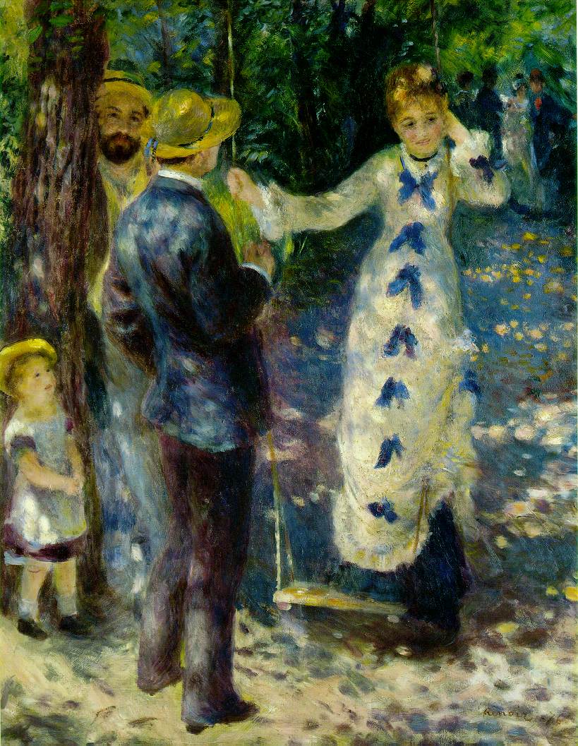
  • My favorite painting of Renoir - The Swing - See the beautiful depiction of light with some dapples of color here and there, in the ground, in her gown etc. I love this painting and hope to do a similar depiction of light in my painting.
  • Woman on a rocking chair -sketch that will be a reference for my painting.
  • Renoir gallery - A lot of paintings listed in alphabetical order.

Bliss!

Not a single human in sight, yeah, not even one. No one to attend to, no one to cook for, no one to question if I ate or not. And no one to really bother about what I did and did not do. That’s exactly my version of bliss and precisely what I did this weekend. So this weekend was essentially no cooking, hardly any eating (I survive on Maggi) and all the time in the world to me only to paint. Till I get tired of it, and I haven’t yet, thankfully. I must agree that I got physically tired though.


Times like these reaffirm to me that this is what I love doing, and this is what I should be doing full time. I love what I do in my job as well, but that’s besides the point. Every time I get to paint extensively, my gut feeling urges me to take it up full time. But then somewhere deep down, there is a little apprehension. If I am forced to do Art and not do it on my own, would it still invoke so much passion from me, I am not sure. And it is too huge a risk to take! Sigh! So many things to ponder!


One great thing that comes out of a weekend like this is ample subject matter to blog about. So even if I did not do a single painting for the next one month, I have stuff to blog every day. Ain’t it cool?! So here we go, before actually looking at any art, a first look at my so called studio. It is amazing when you have no one around that your entire house is your studio to play.

So this is how I exist when I have no one to supervise me. And this is a sneak preview of all the artwork to come in the following days, most of them. I wanted to get some work done on the Postcard exchange project that I started off. I am lagging behind awfully! And also experiment with doing some still lifes, besides getting back in touch with my pencils. Will post some more works over the next couple of days.

April 12, 2008

Some sketches, finally!

Its been two weeks since we went for the Sketchcrawl and I finally found the time to upload the sketches. We were three of us, with me were Rohit and Anand. We started the day at Lal Bagh, and did some sketches of trees and people etc. It was a wonderful experience, as it was very peaceful, lot of place to sit and sketch without any disturbance.

At the entrance of Lal Bagh


Its been a long time since I have worked with my pencils. I love the medium and would love to do more pencil sketches, but I find myself more biased towards color. When the world around us is so full of colors, I don't have the heart to restrict it to just black and white. That's just me! I was feeling absolutely rusty for quite some time, since it was my first sketch from life experience (in public).

A quick sketch of couple engrossed in themselves amidst the rich greenery, and I was almost intruding into their privacy!

It was also the first time I was sitting in a public place, sketching things around me in spite of people staring. Lal Bagh, some people were occasionally staring at us, noticing that we were doing some sketching, and it was fun.

The touring car at Lal Bagh waiting for visitors to get in. This pencil outline doesnt do justice to the myriad hues of green over there, with everything from the car to the shed to the backdrop in some shade of green.

A family sitting in the shade of a tree and chatting among themselves. A quiet family outing on a Sunday.

A very quick, almost 15 seconds sketch of a lady who went by, whose personality I felt was rather interesting.


After a couple of hours at Lal Bagh, we reached City Market at the most inappropriate time. We were there in the scorching heat at around lunch time. There wasn't a place to even stand, let alone sit and sketch! And people who noticed what we were doing gave us such weird looks. Managed to squeeze in couple of sketches though, amidst all the chaos.

A fruit seller selling stuff on his cycle


We then moved to a cafe for a quick grub and then I called it a day from there, coz I realized sketching was far more tiring than I thought it would be and I had no energy to continue! Also, the rains played spoilsport and we had to return.

A vegetable vendor, seen from behind

Another couple in a bench in Lal Bagh. I was sitting in a bench next to them, and they knew I was staring at them and started getting conscious after a while.

Over a lot of sketching, we were discussing a lot of art, favorite art bloggers, favorite media and all things related to Art and art alone! It was awesome. Also gained some intro into Mathematical Art, as Anand does mathematical art and was talking about it. Within seconds he demonstrated some ambigrams, made ambigrams of Rohit's and my names. It was interesting, and all the more fascinating. I strongly recommend checking out Anand's blog and his website.

Most of the sketches here would be converted to paintings, as I have taken some snaps and some notes on the lighting and color. I hope I am able to regularly participate in the sketchcrawls in future, and hope to interact with many more interesting artists around.


March 24, 2008

Sketchcrawl in Bangalore

The 18th International Sketchcrawl is happening this Saturday (29th March), and we have a group of us going to be sketching in Bangalore too! A sketchcrawl is a worldwide event where groups of people get together across the globe and sketch from life the whole day. What a way to spend the day. And then, we share all our sketches online. Thanks to an initiative by a Bangalore based artist at WetCanvas, I got to know about this event and I am thrilled to bits.

Like me, if you too are not aware of the sketchcrawl concept, here is a basic intro -
- Introduction to a sketchcrawl
- Suggested Materials

If you are in Bangalore and interested in sketching, leave a comment with you email, or shoot in a mail to me. You could also sign up in this thread in the sketchcrawl forum. Lets have fun!

March 9, 2008

Self portrait - almost completed

I posted the incomplete version of the self portrait in time for the challenge at WetCanvas, and the extremely encouraging folks there said it was looking good already! People said that there was a very good resemblance and some tweaks would finish it up well.

After a week, I got back to the portrait and it is almost completed now. My face is fully done and I just have some little tweaks in the background. So more or less done. The face hasn't undergone any big changes from version 3.0. I had to increase my right cheek, which was not showing my chubby face fully. A slight increase in the cheek made a HUGE difference to the picture overall. And then pushing of some darks around the eyes kinda did it. Here is a look at the whole picture.


A closer look at my image alone -
I am happy with the result. It now looks like me in the mirror too, though it looks like my mouth is skewed at an angle! In the normal view it looks just fine. Let me know your comments, especially if you have met me in person.:-)

Updated: Here is a link to the Self Portrait Challenge 2008 at WetCanvas. This thread contains everyone's portraits with other's comments. Absolutely stunning work by all of them! And this is the gallery with all images alone put together, aptly titled "The Rogues Gallery 2008" :D

March 2, 2008

Some ugly stages of a self portrait

Thanks to a recently announced Self Portrait Challenge at WetCanvas, I got to do my self portrait. After more than a month of shortlisting some photographs, I finally zeroed in on a reference. I was not even sure if I should use a reference or sit in front of the mirror. But since the mirror option is certainly more time consuming, I went with having a reference.

My reference would be familiar to those who are on my network in Orkut, for this pic has been my profile pic forever. The original reference is this -


I opted for a closer crop so that the focus is on my face and not the background. Here is the cropped reference -

To begin with, I did a rough sketch blocking the main regions, for my face, body and the background. And filled it with one layer of colour. I have simply filled flesh tint in the face, without marking the features.


Then, I directly marked the features with a pencil on my face. A very rough marking, which would be refined later as I lay down paint.

I do not have stage by stage WIP images to show the painting process, as I was too involved to pause and click. I completed the face (ver 1.0) only to later realize that the proportion between the size of the face and height of my body wasn't alright. The width was fine, but the picture showed me taller than I actually am. I did not like it, and painted over the face again with flesh tint. I have emptied a tube of flesh tint for this picture alone and need to replenish my stock, btw!

Version 2.0 seemed alright with regards to the proportions overall, but I did not like the eyes. The eyes were perfect in version 1.0, but 2.0 altered this, and therefore the overall resemblance to myself was lesser. When the eyes are perfect, they kinda make up for other goof ups. But if the eyes go wrong even a wee bit, no amount of perfection in the other features will set right the overall painting. Here is a look at ver 2.0.


If I find something wrong, I do not have the patience to "correct" it. I would rather paint over it and start from scratch. Which is why I painted over the eyes alone when I felt they were not okay, and version 3.0 was born! I think the proportions are okay now and the eye also looks fine. A lot of shading is yet to be done though. It was getting too late and I was feeling sleepy, so decided to continue at a later point. Here is the portrait as it is right now -

At every stage, my only verification was with my daughter. If she could recognize me, I thought everyone else can! So I showed it to her and she was happy, which made me sort of relieved. But one thing that is nagging me is that the picture is terrible if seen in the mirror. When I am unsure if I am on the right track, I always use the mirror to judge my painting. And this time, it looks like someone else in the mirror (not that it looks 100% like me in the normal view either!:-) ) I have left it aside for sometime. Will go back to it later and spend some time analysing what needs to be done where, and I hope to complete this soon. Ofcourse, with background and all.

In the meantime, I would like to hear from you folks about what you think of this attempt. And suggest any changes too. Thank you!

What have I been upto!

Two full months into 2008 and this is my first post of the year! Phew! I have been a little busy with work and I haven’t had the time to even paint, let alone blog. But well, it isn’t that I haven’t painted at all. I did some illustrations for a magazine last month. You can find my illustrations in the Jan 2008 issue of the “Parenting Magazine”. Seeing my stuff in print was super exciting, but I could not continue on that assignment due to tight deadlines. I had a ball doing it for one edition though. Wasn’t 100% satisfied with the output, I felt I could’ve done much better if there was more time, but I guess that’s how the world of print works. It was an entirely new experience for me, both working for a magazine, and doing illustrations in the first place. It was fun!

I have also signed up for a new postcard exchange project this year at WetCanvas. The ATC exchange last year was awesome and I sent out and received some really cool pieces of art. I have about a dozen cards that I will be mailing out soon, and I have already started getting some amazing pieces from others. Boy! People are real quick! I am mostly doing birds this year also, as I love painting birds. I signed up for the project mainly because it helps me keep in touch with colored pencils. I am not yet comfortable working in CP on a large scale, so small pieces like these are the way to familiarize more with the medium which I love so dearly.

If you thought I have forgotten about all those resolutions just after making them, no, that is not quite the case. I am taking them seriously and working on them. Since one of my New Year goals was to work in “series”, I am now working on a series of boats. I have 5 paintings that are underway, all of them 16 * 24. God knows when I will outgrow this habit of having million unfinished pieces and not working on a single piece at a time. As long as it works for me, it is fine I guess.

I have a lot of art that is getting done, but nothing is yet in a post-worthy stage and that’s why I haven’t updated my blog or website.

It was a great coincidence that a new “self portrait” project was announced at WetCanvas and I signed up at the first chance. It was a good motivation, otherwise I wonder when I would’ve got it done. It’s a double challenge actually – I have never done a self portrait, and never done a portrait in acrylics. I have not yet completed the portrait, but it is turning out decently I guess. See my next post for the detailed WIP of the self portrait.

Now that I have got back to the painting mode, I hope to post all my in-process works in quick succession. So stay tuned!

January 3, 2008

Starting afresh in 2008

I wanted to put this post up on New Year’s Eve, but I could not due to some other work. I am not the kind that makes New Year resolutions, since I know I am lazy to keep it up even for the first week of the year. This time around, things are different. I see that a lot of artists work this way, with a set of defined goals, and they work far more efficiently than I do. So I have decided why not give it a shot. I am randomly noting down the things that I want to do during the year, these are not very ‘specific’ goals, but I would refine them in due course of time. This blog post would also get updated accordingly, and we would have an appraisal at the end of the year! So here goes, all that I want to do this year, only on the art front. I have other goals too, but they are outside the scope of this blog.

Learn – I want to pick up a few art books on composition and design. I completely lack any sense of composition, and have miserably failed in several attempts to come up with my own still life arrangements etc. I want to change that, and I want to learn composition.

Sketch – I want to refine my figure drawing skills, which I think are terrible right now. I can do very good portraits and figures with references, but without a reference, I am lost. I cannot draw something that would remotely seem human. I want to change this by practicing a lot of sketching and probably spending some time on the figure drawing forum at WetCanvas.

Do a series – I want to complete at least 2 different series of paintings. A series is a set of 5 or more paintings on the same subject. I want to see how much I can sustain my interest in a subject, in a painting. These would be at least 16 * 20 in size. I already have a lot of subjects in mind for this, let me see.

Study subjects in detail – I would be studying different subjects, and painting a subject each month. I would reveal the subject for each month at the beginning of the month. I have found that my mind is extremely wandering and cannot keep at any particular thing beyond a couple of days. This has often resulted in cases where I begin paintings with great zeal and abandon them midway due to lack of interest. I want to overcome this, and have consciously made this a written goal for the year. It is a very remote possibility that I would study 12 subjects, but I’d be happy even if I do 5. It would be ideal if I can combine this with the previous point and do series as and when I study subjects, but I never know.

Art Business – I am an absolute beginner when it comes to the business side of art, but I want to improve. I want to learn marketing skills and market myself better. That obviously means improving a LOT on the art itself, making more saleable stuff. I hope to improve on both fronts.

Paint for myself – I have two paintings that I have been planning forever - a self portrait and a portrait of my daughter. I am listing this here so that I know I need to make time for it and get them done by the year end.

Maintain my blog and website - I want to maintain my blog regularly, by posting at least thrice a week. My website would be updated every month or so.


I think this is enough for now. I have these written down and I will be sharing with my readers as and when I cross each one out. Wish you all a very happy New Year.

If you like it, share it!