The 18th International Sketchcrawl is happening this Saturday (29th March), and we have a group of us going to be sketching in Bangalore too! A sketchcrawl is a worldwide event where groups of people get together across the globe and sketch from life the whole day. What a way to spend the day. And then, we share all our sketches online. Thanks to an initiative by a Bangalore based artist at WetCanvas, I got to know about this event and I am thrilled to bits.
Like me, if you too are not aware of the sketchcrawl concept, here is a basic intro -
- Introduction to a sketchcrawl
- Suggested Materials
If you are in Bangalore and interested in sketching, leave a comment with you email, or shoot in a mail to me. You could also sign up in this thread in the sketchcrawl forum. Lets have fun!

March 24, 2008


March 9, 2008
Self portrait - almost completed
I posted the incomplete version of the self portrait in time for the challenge at WetCanvas, and the extremely encouraging folks there said it was looking good already! People said that there was a very good resemblance and some tweaks would finish it up well.
After a week, I got back to the portrait and it is almost completed now. My face is fully done and I just have some little tweaks in the background. So more or less done. The face hasn't undergone any big changes from version 3.0. I had to increase my right cheek, which was not showing my chubby face fully. A slight increase in the cheek made a HUGE difference to the picture overall. And then pushing of some darks around the eyes kinda did it. Here is a look at the whole picture.

A closer look at my image alone -
 I am happy with the result. It now looks like me in the mirror too, though it looks like my mouth is skewed at an angle! In the normal view it looks just fine. Let me know your comments, especially if you have met me in person.:-)
Updated: Here is a link to the Self Portrait Challenge 2008 at WetCanvas. This thread contains everyone's portraits with other's comments. Absolutely stunning work by all of them! And this is the gallery with all images alone put together, aptly titled "The Rogues Gallery 2008" :D
After a week, I got back to the portrait and it is almost completed now. My face is fully done and I just have some little tweaks in the background. So more or less done. The face hasn't undergone any big changes from version 3.0. I had to increase my right cheek, which was not showing my chubby face fully. A slight increase in the cheek made a HUGE difference to the picture overall. And then pushing of some darks around the eyes kinda did it. Here is a look at the whole picture.
A closer look at my image alone -
I am happy with the result. It now looks like me in the mirror too, though it looks like my mouth is skewed at an angle! In the normal view it looks just fine. Let me know your comments, especially if you have met me in person.:-)Updated: Here is a link to the Self Portrait Challenge 2008 at WetCanvas. This thread contains everyone's portraits with other's comments. Absolutely stunning work by all of them! And this is the gallery with all images alone put together, aptly titled "The Rogues Gallery 2008" :D
March 2, 2008
Some ugly stages of a self portrait
Thanks to a recently announced Self Portrait Challenge at WetCanvas, I got to do my self portrait. After more than a month of shortlisting some photographs, I finally zeroed in on a reference. I was not even sure if I should use a reference or sit in front of the mirror. But since the mirror option is certainly more time consuming, I went with having a reference.
My reference would be familiar to those who are on my network in Orkut, for this pic has been my profile pic forever. The original reference is this -

I opted for a closer crop so that the focus is on my face and not the background. Here is the cropped reference -
 To begin with, I did a rough sketch blocking the main regions, for my face, body and the background. And filled it with one layer of colour. I have simply filled flesh tint in the face, without marking the features.

Then, I directly marked the features with a pencil on my face. A very rough marking, which would be refined later as I lay down paint.
 I do not have stage by stage WIP images to show the painting process, as I was too involved to pause and click. I completed the face (ver 1.0) only to later realize that the proportion between the size of the face and height of my body wasn't alright. The width was fine, but the picture showed me taller than I actually am. I did not like it, and painted over the face again with flesh tint. I have emptied a tube of flesh tint for this picture alone and need to replenish my stock, btw!
Version 2.0 seemed alright with regards to the proportions overall, but I did not like the eyes. The eyes were perfect in version 1.0, but 2.0 altered this, and therefore the overall resemblance to myself was lesser. When the eyes are perfect, they kinda make up for other goof ups. But if the eyes go wrong even a wee bit, no amount of perfection in the other features will set right the overall painting. Here is a look at ver 2.0.

If I find something wrong, I do not have the patience to "correct" it. I would rather paint over it and start from scratch. Which is why I painted over the eyes alone when I felt they were not okay, and version 3.0 was born! I think the proportions are okay now and the eye also looks fine. A lot of shading is yet to be done though. It was getting too late and I was feeling sleepy, so decided to continue at a later point. Here is the portrait as it is right now -
 At every stage, my only verification was with my daughter. If she could recognize me, I thought everyone else can! So I showed it to her and she was happy, which made me sort of relieved. But one thing that is nagging me is that the picture is terrible if seen in the mirror. When I am unsure if I am on the right track, I always use the mirror to judge my painting. And this time, it looks like someone else in the mirror (not that it looks 100% like me in the normal view either!:-) ) I have left it aside for sometime. Will go back to it later and spend some time analysing what needs to be done where, and I hope to complete this soon. Ofcourse, with background and all.
In the meantime, I would like to hear from you folks about what you think of this attempt. And suggest any changes too. Thank you!
My reference would be familiar to those who are on my network in Orkut, for this pic has been my profile pic forever. The original reference is this -
I opted for a closer crop so that the focus is on my face and not the background. Here is the cropped reference -
To begin with, I did a rough sketch blocking the main regions, for my face, body and the background. And filled it with one layer of colour. I have simply filled flesh tint in the face, without marking the features.Then, I directly marked the features with a pencil on my face. A very rough marking, which would be refined later as I lay down paint.
I do not have stage by stage WIP images to show the painting process, as I was too involved to pause and click. I completed the face (ver 1.0) only to later realize that the proportion between the size of the face and height of my body wasn't alright. The width was fine, but the picture showed me taller than I actually am. I did not like it, and painted over the face again with flesh tint. I have emptied a tube of flesh tint for this picture alone and need to replenish my stock, btw!Version 2.0 seemed alright with regards to the proportions overall, but I did not like the eyes. The eyes were perfect in version 1.0, but 2.0 altered this, and therefore the overall resemblance to myself was lesser. When the eyes are perfect, they kinda make up for other goof ups. But if the eyes go wrong even a wee bit, no amount of perfection in the other features will set right the overall painting. Here is a look at ver 2.0.
If I find something wrong, I do not have the patience to "correct" it. I would rather paint over it and start from scratch. Which is why I painted over the eyes alone when I felt they were not okay, and version 3.0 was born! I think the proportions are okay now and the eye also looks fine. A lot of shading is yet to be done though. It was getting too late and I was feeling sleepy, so decided to continue at a later point. Here is the portrait as it is right now -
 At every stage, my only verification was with my daughter. If she could recognize me, I thought everyone else can! So I showed it to her and she was happy, which made me sort of relieved. But one thing that is nagging me is that the picture is terrible if seen in the mirror. When I am unsure if I am on the right track, I always use the mirror to judge my painting. And this time, it looks like someone else in the mirror (not that it looks 100% like me in the normal view either!:-) ) I have left it aside for sometime. Will go back to it later and spend some time analysing what needs to be done where, and I hope to complete this soon. Ofcourse, with background and all.
In the meantime, I would like to hear from you folks about what you think of this attempt. And suggest any changes too. Thank you!
What have I been upto!
Two full months into 2008 and this is my first post of the year! Phew! I have been a little busy with work and I haven’t had the time to even paint, let alone blog. But well, it isn’t that I haven’t painted at all. I did some illustrations for a magazine last month. You can find my illustrations in the Jan 2008 issue of the “Parenting Magazine”. Seeing my stuff in print was super exciting, but I could not continue on that assignment due to tight deadlines. I had a ball doing it for one edition though. Wasn’t 100% satisfied with the output, I felt I could’ve done much better if there was more time, but I guess that’s how the world of print works. It was an entirely new experience for me, both working for a magazine, and doing illustrations in the first place. It was fun!
I have also signed up for a new postcard exchange project this year at WetCanvas. The ATC exchange last year was awesome and I sent out and received some really cool pieces of art. I have about a dozen cards that I will be mailing out soon, and I have already started getting some amazing pieces from others. Boy! People are real quick! I am mostly doing birds this year also, as I love painting birds. I signed up for the project mainly because it helps me keep in touch with colored pencils. I am not yet comfortable working in CP on a large scale, so small pieces like these are the way to familiarize more with the medium which I love so dearly.
I have a lot of art that is getting done, but nothing is yet in a post-worthy stage and that’s why I haven’t updated my blog or website.
It was a great coincidence that a new “self portrait” project was announced at WetCanvas and I signed up at the first chance. It was a good motivation, otherwise I wonder when I would’ve got it done. It’s a double challenge actually – I have never done a self portrait, and never done a portrait in acrylics. I have not yet completed the portrait, but it is turning out decently I guess. See my next post for the detailed WIP of the self portrait.
January 3, 2008
Starting afresh in 2008
I wanted to put this post up on New Year’s Eve, but I could not due to some other work. I am not the kind that makes New Year resolutions, since I know I am lazy to keep it up even for the first week of the year. This time around, things are different. I see that a lot of artists work this way, with a set of defined goals, and they work far more efficiently than I do. So I have decided why not give it a shot. I am randomly noting down the things that I want to do during the year, these are not very ‘specific’ goals, but I would refine them in due course of time. This blog post would also get updated accordingly, and we would have an appraisal at the end of the year! So here goes, all that I want to do this year, only on the art front. I have other goals too, but they are outside the scope of this blog.
Sketch – I want to refine my figure drawing skills, which I think are terrible right now. I can do very good portraits and figures with references, but without a reference, I am lost. I cannot draw something that would remotely seem human. I want to change this by practicing a lot of sketching and probably spending some time on the figure drawing forum at WetCanvas.
Do a series – I want to complete at least 2 different series of paintings. A series is a set of 5 or more paintings on the same subject. I want to see how much I can sustain my interest in a subject, in a painting. These would be at least 16 * 20 in size. I already have a lot of subjects in mind for this, let me see.
Study subjects in detail – I would be studying different subjects, and painting a subject each month. I would reveal the subject for each month at the beginning of the month. I have found that my mind is extremely wandering and cannot keep at any particular thing beyond a couple of days. This has often resulted in cases where I begin paintings with great zeal and abandon them midway due to lack of interest. I want to overcome this, and have consciously made this a written goal for the year. It is a very remote possibility that I would study 12 subjects, but I’d be happy even if I do 5. It would be ideal if I can combine this with the previous point and do series as and when I study subjects, but I never know.
Art Business – I am an absolute beginner when it comes to the business side of art, but I want to improve. I want to learn marketing skills and market myself better. That obviously means improving a LOT on the art itself, making more saleable stuff. I hope to improve on both fronts.
Paint for myself – I have two paintings that I have been planning forever - a self portrait and a portrait of my daughter. I am listing this here so that I know I need to make time for it and get them done by the year end.
I think this is enough for now. I have these written down and I will be sharing with my readers as and when I cross each one out. Wish you all a very happy New Year.
December 31, 2007
Looking back at 2007
As the year draws to a close, it is time to look back and reflect upon my art and growth as an artist during the year.
The foremost achievement for me this year is the very fact that I have managed to draw/paint very regularly. I wanted to make this a daily habit, which I did during the latter part of the year. Initially I was painting whenever I found the time, and slowly I have learnt to make the time for it. This was my first year of painting with a child, with her taking most of my time. I would say I fared reasonably well.
The next good outcome from this year is I finally started making some money with my art. I started taking up private commissions and it has been a lovely ride so far. The money that I have made is not even worth mentioning, it is a miniscule percentage of what I earn through my job, but it is the one that excites me much more. The feeling that someone is ready to pay for your art is simply priceless, and I got that happiness this year.
And then I took part in my first ever exhibition. Though I did not have much success, I got a chance to interact with other artists and stuff. And it gave me a first hand view of the art market here.
This one is not an achievement by any means, but one that I am happy about - I ventured into doing Art Cards (miniatures) and loved it so much. I will continue to do more of them in 2008.
I updated my website and also blogged my paintings during the year. The website thing was pending forever, and I finally got to do it. I would be improvising it as I go, but I have a decent looking site ready to inform anyone who wants to see what I do. I used to blog my art regularly till 2005, and stopped it last year when I was on long leave. Now I have started again and it has been good so far. I have also interacted more often at WetCanvas and learnt immensely from other artists out there.
And finally, my biggest achievement this year has been the great progress in my time management skills, where I could effectively make time for art amidst everything else. I have gotten over my laziness in a big way, something that I am very proud of! There is still a long way to go, but I have made good progress. So with all these behind me, I am really looking forward to making a fresh start in the new year. Lots of more art to come in the coming days, watch this space.
The foremost achievement for me this year is the very fact that I have managed to draw/paint very regularly. I wanted to make this a daily habit, which I did during the latter part of the year. Initially I was painting whenever I found the time, and slowly I have learnt to make the time for it. This was my first year of painting with a child, with her taking most of my time. I would say I fared reasonably well.
The next good outcome from this year is I finally started making some money with my art. I started taking up private commissions and it has been a lovely ride so far. The money that I have made is not even worth mentioning, it is a miniscule percentage of what I earn through my job, but it is the one that excites me much more. The feeling that someone is ready to pay for your art is simply priceless, and I got that happiness this year.
And then I took part in my first ever exhibition. Though I did not have much success, I got a chance to interact with other artists and stuff. And it gave me a first hand view of the art market here.
This one is not an achievement by any means, but one that I am happy about - I ventured into doing Art Cards (miniatures) and loved it so much. I will continue to do more of them in 2008.
I updated my website and also blogged my paintings during the year. The website thing was pending forever, and I finally got to do it. I would be improvising it as I go, but I have a decent looking site ready to inform anyone who wants to see what I do. I used to blog my art regularly till 2005, and stopped it last year when I was on long leave. Now I have started again and it has been good so far. I have also interacted more often at WetCanvas and learnt immensely from other artists out there.
And finally, my biggest achievement this year has been the great progress in my time management skills, where I could effectively make time for art amidst everything else. I have gotten over my laziness in a big way, something that I am very proud of! There is still a long way to go, but I have made good progress. So with all these behind me, I am really looking forward to making a fresh start in the new year. Lots of more art to come in the coming days, watch this space.
December 9, 2007
My first Art exhibition and more.
I am glad that finally took part in an exhibition. It was a great learning experience meeting a lot of artists, having a look at the kind of work that others do etc etc. My first learning was that I need to work larger, I felt my pieces were miniscule compared to the others. Even a 16*20 seemed so small on the wall, especially when hung without a frame.
I wish more people had turned up, though I do not know anything about how the average turnout would be for events like these. I did not have any enquiries or anything, but got to develop a few contacts. That was the most important goal of the event, to create a platform for art lovers to interact. Two of my friends dropped in and I did not expect either. It was a pleasant surprise to meet Altoid for the first time, and Cheti after almost 3 yrs! Thank you both!:)
The event was great overall, a great initiative by the BYOA guys. They plan to have more events in future to help artists network, let us see. Great job guys!
 Me with both my pieces that were exhibited
Among other things, I got my website up and running finally. I have my domain name booked for well over 6 months now, but never got around to building a decent looking site. This time the motivation was different. I had to market myself at a public event and it was a must that my site was updated. I have gone in with SiteKreator, which is very popular amongst artists for the good image handling capabilities. Have a look at http://www.nithyachander.com and give me your valued opinions.
I wish more people had turned up, though I do not know anything about how the average turnout would be for events like these. I did not have any enquiries or anything, but got to develop a few contacts. That was the most important goal of the event, to create a platform for art lovers to interact. Two of my friends dropped in and I did not expect either. It was a pleasant surprise to meet Altoid for the first time, and Cheti after almost 3 yrs! Thank you both!:)
The event was great overall, a great initiative by the BYOA guys. They plan to have more events in future to help artists network, let us see. Great job guys!
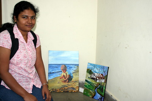 Me with both my pieces that were exhibited
Among other things, I got my website up and running finally. I have my domain name booked for well over 6 months now, but never got around to building a decent looking site. This time the motivation was different. I had to market myself at a public event and it was a must that my site was updated. I have gone in with SiteKreator, which is very popular amongst artists for the good image handling capabilities. Have a look at http://www.nithyachander.com and give me your valued opinions.
December 3, 2007
Bring your own art!
There is going to be an Art festival in Bangalore this weekend, and I am glad to be a part of it. The 'Bring your own art' festival is aimed at providing a platform for several 'unknown artists'. What a unique idea! I read about this unique event in yesterday's edition of the Hindu. I sent in about 6 of my paintings and 2 have been selected to be exhibited. Needless to say, I am hyper excited!
The event is at the Chitrakala Parishad in Bangalore, and is over a period of 3 days - 7th, 8th and 9th of Dec 2007. I am exhibiting on the 8th, when I will be available at the venue all through the day. I hope to come again as a visitor on Sunday too, to have a look at all the undiscovered art.
More than anything else, this event is supposed to be a platform for artists to meet fellow artists and other art lovers. I am hoping to have a lot of fun! If any of you are around, do drop in:-) And spread the word. Thank you.
The event is at the Chitrakala Parishad in Bangalore, and is over a period of 3 days - 7th, 8th and 9th of Dec 2007. I am exhibiting on the 8th, when I will be available at the venue all through the day. I hope to come again as a visitor on Sunday too, to have a look at all the undiscovered art.
More than anything else, this event is supposed to be a platform for artists to meet fellow artists and other art lovers. I am hoping to have a lot of fun! If any of you are around, do drop in:-) And spread the word. Thank you.
November 16, 2007
A sunny afternoon - WIP
Since I was fairly satisfied with my previous attempt at working loosely, I started another piece. This time too my goal was to work loose, do not define too many intricate details, but still manage to create an atmosphere with the piece. I felt this one turned out better than the previous one.
The reference image showed an overcast day, which I have kinda converted into a sunny day with some strong shadows. Here is a quick work in progress.
 A sunny afternoon - stage 1
(c) Nithya Swaminathan
Firstly a rough sketch under 2 minutes. I heard from another painter that he prefers to directly start painting, no sketch whatsoever. That would give me a nightmare, as I prefer to have a sketch however vague it may be! I would be lost without one.
 A sunny afternoon - stage 2
(c) Nithya Swaminathan
Then I do the clouds, just like the previous one. Colours used so far are only cobalt blue and titanium white.
 A sunny afternoon - stage 3
(c) Nithya Swaminathan
I have started with the barn, done more details on the foreground. And just started with the canal in the front.
 A sunny afternoon - completed
Acrylics on Gallery wrapped canvas, 12 * 16 inches.
(c) Nithya Swaminathan
Original Available, email me for purchase info
Prints available here
Finally, I complete the image with finer details on the grass, and some more details on the water. Also, I have enhanced the depth of the canal where the land meets the water. And deepened the shadows in the barn and in the foreground.
As usual, here is a slideshow. I love slide.com!


The reference image showed an overcast day, which I have kinda converted into a sunny day with some strong shadows. Here is a quick work in progress.
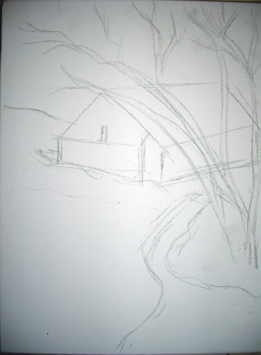 A sunny afternoon - stage 1
(c) Nithya Swaminathan
Firstly a rough sketch under 2 minutes. I heard from another painter that he prefers to directly start painting, no sketch whatsoever. That would give me a nightmare, as I prefer to have a sketch however vague it may be! I would be lost without one.
A sunny afternoon - stage 2(c) Nithya Swaminathan
Then I do the clouds, just like the previous one. Colours used so far are only cobalt blue and titanium white.
A sunny afternoon - stage 3(c) Nithya Swaminathan
In the pic above, I have done a red toned underpainting for the distant trees. I have done the foreground directly with some Viridian green and lemon yellow. I have also marked the darkest darks in the barn which will be from the shadows. Till now I had used only my 1 inch flat brush. I started doing the dried tree using the edges of the flat brush and went kinda mad with it. No matter how much I tried, I could not get the finer branches with it. I had to finally resort to my zero brush.
 A sunny afternoon - stage 4 (c) Nithya Swaminathan
A sunny afternoon - stage 4 (c) Nithya SwaminathanA sunny afternoon - completedAcrylics on Gallery wrapped canvas, 12 * 16 inches.
(c) Nithya Swaminathan
Original Available, email me for purchase info
Prints available here
As usual, here is a slideshow. I love slide.com!
November 10, 2007
Art with a timer!
I have always been awestruck with painters who can work fast and convey all they want to with as few brush strokes as possible. Work that is actually impressionistic but looks real. I wanted to give it a shot, after some impetus by plein air painter Larry Seiler at Wetcanvas. Working loose would come naturally to Plein air painters, as they have to capture the moment on canvas before the light changes. It comes with a lot of practice, and gives a lot of life to paintings. In this approach, there is hardly any attention to detail, only the relevant things are highlighted and the painting draws the viewer in.
What I have just completed is my first attempt at working loose. The goal was simple - to paint without spending too much time thinking. Just let myself loose on the canvas. This painting was done in just under an hour, from scratch. It was done using only 1 brush, a 1 inch flat brush. It was weird to actually paint with a timer, as though I was writing an examination!
Generally, my attitude towards an Acrylic or Oil painting is very lethargic. I take my strokes for granted, coz deep inside is the lurking feeling that if things don't work out as I expect, I can always paint over it again. This is an effort to kill that attitude and make every brush stroke count. At every stage, I noted down the time taken for that stage, and everything was painted only once. No redoing at any stage and I am happy for that reason.
Here is a quick look at the painting from start to finish.
 Green Landscape - stage 1
(c) Nithya Swaminathan

What I have just completed is my first attempt at working loose. The goal was simple - to paint without spending too much time thinking. Just let myself loose on the canvas. This painting was done in just under an hour, from scratch. It was done using only 1 brush, a 1 inch flat brush. It was weird to actually paint with a timer, as though I was writing an examination!
Generally, my attitude towards an Acrylic or Oil painting is very lethargic. I take my strokes for granted, coz deep inside is the lurking feeling that if things don't work out as I expect, I can always paint over it again. This is an effort to kill that attitude and make every brush stroke count. At every stage, I noted down the time taken for that stage, and everything was painted only once. No redoing at any stage and I am happy for that reason.
Here is a quick look at the painting from start to finish.
Green Landscape - stage 1(c) Nithya Swaminathan
Seen above is the initial sketch, as roughly as I could. My sketches for landscapes are generally very vague, I do not follow the picture to the T, but this was more sketchy than I normally do. The sketch was done in under a minute.
 Green Landscape - stage 2
(c) Nithya Swaminathan
Then I start with the skies, and in about 5 minutes, do the sky with some cobalt blue and white. Then randomly do the clouds as I please. A touch of crimson here and there.
 Green Landscape - stage 3
(c) Nithya Swaminathan
I then do an underpainting of the far away trees in tones of red. This is to enhance the effect of the greens which will be done on top of the reds. I have not marked values, just done a plain monotone underpainting. Another 2 mins spent there.
 Green Landscape - stage 4
(c) Nithya Swaminathan
Green Landscape - stage 2(c) Nithya Swaminathan
Green Landscape - stage 3(c) Nithya Swaminathan
I then do an underpainting of the far away trees in tones of red. This is to enhance the effect of the greens which will be done on top of the reds. I have not marked values, just done a plain monotone underpainting. Another 2 mins spent there.
Green Landscape - stage 4(c) Nithya Swaminathan
And then I started with the greens, did a green wash without much details in the foreground. There is no actual depiction of grass as yet. This was about 15 minutes.
Green Landscape - Acrylics on Canvas, 12 * 16 inches
(c) Nithya Swaminathan
Original available, email me for purchase info.
Prints available here.
And finally I complete the painting with more details on the grass, complete the reflections of the sky etc. Another 25 minutes spent. So start to finish was done in approx one hour. I wanted to finish this Alla prima, in one sitting, but it got spilt over to two sessions. So that defines my next goal - to finish a painting in less than an hour and in one session. I have put this WIP into a slide show, check it out.


It is a lot of fun working like this, it is very liberating since there is no time to think and I just paint. My mind doesnt ponder over what I should do, it is only a spectator. I love the whole thing, though I cannot say for sure if this will be a new direction that I will focus on. Let us see. I would love to hear your views on this. And since my readers already know how much I suck at titles for paintings, I would love to hear some title suggestions as well. I just could not come up with one!
(c) Nithya Swaminathan
Original available, email me for purchase info.
Prints available here.
And finally I complete the painting with more details on the grass, complete the reflections of the sky etc. Another 25 minutes spent. So start to finish was done in approx one hour. I wanted to finish this Alla prima, in one sitting, but it got spilt over to two sessions. So that defines my next goal - to finish a painting in less than an hour and in one session. I have put this WIP into a slide show, check it out.
It is a lot of fun working like this, it is very liberating since there is no time to think and I just paint. My mind doesnt ponder over what I should do, it is only a spectator. I love the whole thing, though I cannot say for sure if this will be a new direction that I will focus on. Let us see. I would love to hear your views on this. And since my readers already know how much I suck at titles for paintings, I would love to hear some title suggestions as well. I just could not come up with one!
October 31, 2007
'Me time' - WIP
Continuing my efforts to come up with my own compositions, I have ventured into this one combining several pictures of Monet’s gardens at Giverny, France. The references have been used with the permission of some fabulous photographers at flickr. Right now the painting is in its formative stages and looks quite tight, but I hope to get an impressionistic effect going further. I am also not happy with the richness of the color so far, it looks so dull. I need to work on this a lot more, and if I am still not satisfied, I will go in for my oil paints. I have never tried how oil works on top of acrylics, and I am quite excited to try that out.
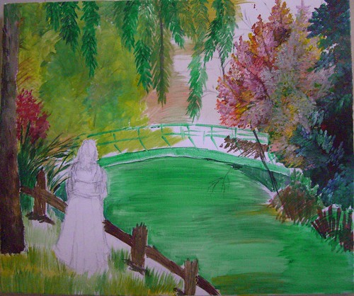 Me time - stage 1
(c) Nithya Swaminathan
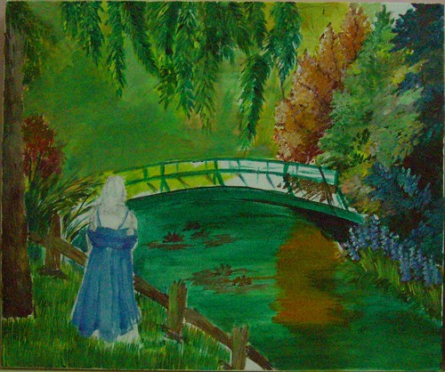 Me time - stage 2
(c) Nithya Swaminathan
I have very crudely indicated some waterlilies in the water. I was in a dilemma whether to have a couple of swans or waterlilies, and have gone with the lilies as of now, since they look more like Monet! The water and the bridge are mostly green, and they all look messed up now. I will be making the bridge a lot lighter and differentiating it from the waters.
 Me time - stage 3
(c) Nithya Swaminathan
October 25, 2007
Conversation - with WIP
I generally work from reference images, and follow them pretty closely. My painting would be easily identifiable as based on whichever photo I use, coz I do not experiment to change much. I wanted to change this approach, thanks to a brilliant thread at Wetcanvas couple of months ago on 'How to use reference images' (too lazy to hunt the link!) and started this painting primarily as a challenge to myself. I wanted to see for myself how much I am able to differ from a photo and able to stand on my own. I picked up a black and white photo of this little girl that had no big details, no light source, and used that as the base to create this painting.
 Conversation - stage 1
Nothing here is painted from my imagination, but the whole painting is based on a dozen images, combined in a way that I found appealing. Rather I imagined a scene in my mind, and hunted for pictures that had a lighting to suit, to create a mood etc etc. So its essentially my own composition, and that feels so good!
Initially, my idea was to add a colorful ball to the right side, and something like a butterfly close to the child. It was as if she was playing with the ball but her attention got to the colorful butterfly and the ball was lying unattended to! Well I was thinking about my daughter all along the painting and that is so typical of her. I did add a ball but did not like it and painted over it.
 Conversation - stage 2
I felt kinda lost midway and thought of starting afresh on the canvas, but with a lot of compositional help from the experts at Wetcanvas, I could redeem the painting and make it a tad better. Someone at the acrylics forum suggested about adding a kitten/puppy and I loved that idea. So despite the fact that my bakcground was done completely in green, I added a kitten directly with some paint. That probably explains why that kitten looks kinda distorted.
And then I also felt that the child was looking older than she should. I wanted a girl of 2-3 yrs and she looked about 5 yrs I would say. So I worked on 'rounding' her arms a little more and making her size a little bigger so that she was the focal point. And since I felt there was too much of green all around, I added some flowers to the foreground.
 Conversation - completed
Acrylics on Canvas, 16 * 20 inches
Original available
(c)Copyright Nithya Swaminathan
When I just thought I was done and went ahead and signed it, my husband said he did not like the kitten at all. He ofcourse was not able to tell me what the issue was, but worse still I wasnt able to point it out myself! Another artist said that the kitten is too big. Now I am in a fix, whether to make it smaller, or paint over it and put in something else there.. Maybe a butterfly, maybe a puppy or anything else. I have no clue as yet. Any comments and suggestions are welcome, I would love to hear different views on "What could it be thats keeping the girl so engrossed?!"
 Conversation - detail view
What you see above is a closer look at the child and the kitten, do suggest any changes that you feel would make this a better painting. Thank you!
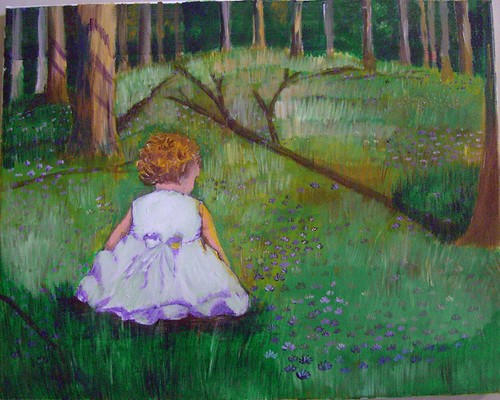 Conversation - stage 1
Nothing here is painted from my imagination, but the whole painting is based on a dozen images, combined in a way that I found appealing. Rather I imagined a scene in my mind, and hunted for pictures that had a lighting to suit, to create a mood etc etc. So its essentially my own composition, and that feels so good!
Initially, my idea was to add a colorful ball to the right side, and something like a butterfly close to the child. It was as if she was playing with the ball but her attention got to the colorful butterfly and the ball was lying unattended to! Well I was thinking about my daughter all along the painting and that is so typical of her. I did add a ball but did not like it and painted over it.
 Conversation - stage 2
And then I also felt that the child was looking older than she should. I wanted a girl of 2-3 yrs and she looked about 5 yrs I would say. So I worked on 'rounding' her arms a little more and making her size a little bigger so that she was the focal point. And since I felt there was too much of green all around, I added some flowers to the foreground.
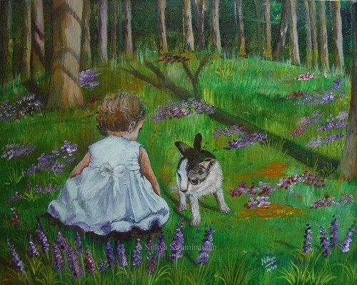 Conversation - completed
Acrylics on Canvas, 16 * 20 inches
Original available
(c)Copyright Nithya Swaminathan
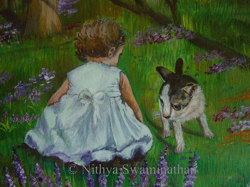 Conversation - detail view
October 12, 2007
Autumn Woods - completed
Did anyone feel that my maples were a bit too yellow last time? Well I felt so, and I had to do something about it. That’s probably not the only reason why they look like gulmohars and not maples, but I wasn’t too happy with the leaves. I added some flesh tint on them to make them brighter, and darkened the crimson on the other side.

Autumn Woods
Acrylics on Canvas, 18 * 36 inches
(c) Nithya Swaminathan
Original Available
Acrylics on Canvas, 18 * 36 inches
(c) Nithya Swaminathan
Original Available
In my previous update, since the leaves had a lot of yellow and were surrounded by more of green and yellows last time, they were getting lost in the grayscale. The barks had a good range of values, but the leaves looked quite flat. I have changed that by adding a lot of dark blues surrounding the leaves, to push forward the maple leaves. And then I correspondingly reduced the yellows in the sunlit areas of the birch barks as well.
Some closeups of the painting for you guys. First is the closeup of the reflections. The reflections have been done by adding the barks first as bright as possible, and then doing several washes of blues and greens, and some browns here and there. Finally to get a better feel of water, I have added some dried leaves floating here and there. I am pretty happy with the reflections overall except for those of the maple leaves. The orange kinda sticks out. I have already got suggestions to tackle it, will probably be washing it over with some darker hues.

Autumn Woods - close up
(c) Nithya Swaminathan
This is a closer look at the middle part of the painting, the ferns and their reflections. This is also my favorite portion of the picture, the part that I am really happy about. I went about randomly doing the ferns but they turned out quite well.I also added some highlights on the ferns. And instead of having the bushes on either side look alike, I made one side have tall grasses. And the middle part is supposed to be a path of some sort, though it may not look like one.(c) Nithya Swaminathan

Autumn Woods - close up
(c) Nithya Swaminathan
(c) Nithya Swaminathan

Autumn Woods - Greyscale
(c) Nithya Swaminathan
Finally, a look at the grey scale, to determine the values in the painting. In this version, I am able to differentiate the background foliage from the maple leaves, which was missing in the previous version. I am fairly happy again with this as well.(c) Nithya Swaminathan
While I was checking out slide.com, I just put together the WIP images of this painting and got a slide show done, aint it cool? Shows the flow of the painting from scratch to finish, more importantly shows me my own thought process, how I went off track at several places etc etc. It provides a good learning for me.


Here is a link to this thread at Wetcanvas. Have a look at the amazing results produced by the other artists as well. Such different paintings produced from one image. Awesome fun!
October 3, 2007
Autumn Woods - an update
I was absolutely dissatisfied with the leaves that I had begun in this painting. I had only done the initial layer and there was still a long way to go, but the first step itself was not in the right direction I felt. Being the oil painter that I am, I had this urge to pick up my palette knife and paint to my heart's content. And yeah, thats exactly what I did.
 Autumn Woods - Stage 5
(c) Nithya Swaminathan
I have no clue if acrylic painters actually use the palette knife, this was the first time I did. I have used it with oil paintings, and I love the textures the knife generates. My leaves now have got that texture too and I am liking it. The end result is satisfying, though they look like gulmohars and not maples, LOL! The reference image has no clear direction of light, which I wanted to change. Hence I introduced some light from the right side and pushed the darks in the shadows with a lot of blue. Also, I introduced some flesh tint and mild yellows in the barks that face the sunlight, to bring in the sunlit effect. Wonder if I have succeeded fully.
 Autumn Woods - detail close up
(c) Nithya Swaminathan
What you see above is a little close up of the leaves, how haphazardly they are done without any actual leaf shapes. I love doing that. I simply picked up some scarlett red, orange and lemon yellow in my knife and went about it without a thought. The dark bluish black lines behind are shadows of the leaves and branches on the trees behind. I introduced these sharp shadows also to accentuate the sunlit effect that I was trying for.
 Autumn Woods - stage 6
(c) Nithya Swaminathan
I think I would call the top half of the painting done, excepting the ferns in the front. They need some more highlights on them and I am half way with them. I have just begun working on the reflection, have loosely laid in the barks. When I started with the reflections, I felt like adding some wet rocks along the banks. Some rocks with a coating of algae on them. Wonder if it would go along well with the painting or work against it. You will probably get to know that tomorrow.:-)
Autumn Woods - Stage 5(c) Nithya Swaminathan
I have no clue if acrylic painters actually use the palette knife, this was the first time I did. I have used it with oil paintings, and I love the textures the knife generates. My leaves now have got that texture too and I am liking it. The end result is satisfying, though they look like gulmohars and not maples, LOL! The reference image has no clear direction of light, which I wanted to change. Hence I introduced some light from the right side and pushed the darks in the shadows with a lot of blue. Also, I introduced some flesh tint and mild yellows in the barks that face the sunlight, to bring in the sunlit effect. Wonder if I have succeeded fully.
Autumn Woods - detail close up (c) Nithya Swaminathan
What you see above is a little close up of the leaves, how haphazardly they are done without any actual leaf shapes. I love doing that. I simply picked up some scarlett red, orange and lemon yellow in my knife and went about it without a thought. The dark bluish black lines behind are shadows of the leaves and branches on the trees behind. I introduced these sharp shadows also to accentuate the sunlit effect that I was trying for.
Autumn Woods - stage 6(c) Nithya Swaminathan
September 28, 2007
Autumn Woods – A challenge
This is my latest painting, that I am doing as part of a challenge in the Acrylics forum at Wetcanvas.
Recently, Celeste had done a small sized landscape of Autumn Woods and in the Acrylics forum, she was challenged to do it in a much larger format. Elaine and Celeste also decided to welcome anyone else who would be willing to join in and have fun. So the idea is to paint from a vague Autumn reference and create a painting that's better than the reference image. And the main challenge is to do in a big canvas. I had a 18 * 36 canvas lying idle for quite some time, and thought this was the best chance to use it. Though there are no deadlines as such, I get the motivation to paint on seeing the WIPs of everyone, and it's a lot of fun.
Recently, Celeste had done a small sized landscape of Autumn Woods and in the Acrylics forum, she was challenged to do it in a much larger format. Elaine and Celeste also decided to welcome anyone else who would be willing to join in and have fun. So the idea is to paint from a vague Autumn reference and create a painting that's better than the reference image. And the main challenge is to do in a big canvas. I had a 18 * 36 canvas lying idle for quite some time, and thought this was the best chance to use it. Though there are no deadlines as such, I get the motivation to paint on seeing the WIPs of everyone, and it's a lot of fun.
I made some additions to the original image by adding a water body in the foreground, and added some reflections of the woods. I love fall reflections and leaves, so wanted to paint them here. This was also since my canvas was too tall for just the trees. This is a WIP that I hope to complete during this weekend. My parents are visiting us so I am not sure how much work is going to get done, but there will be an update on Monday for sure.:-)

Autumn Woods - Stage 1
This is technically the second stage in the painting, the first one was my canvas filled with scribbles from my daughter! And I started thereafter and added the trees in white and grey. I also blocked the darkest darks with ultramarine blue and a lot of green. And I got most of the sky done too. This will be my first layer.

Autumn Woods - Stage 2
On top of it, I have started adding some greens and ochre yellow in the background, indicative of some bushes.

Autumn Woods - Stage 3
The next thing that I do is to add more foliage. A lot of glowing yellows and greens in the top for the leaves, and there are going to be a lot of orange maple leaves right in the middle. A good thing to do here would be to actually do the tree barks to completion and then do the leaves. But I am as impatient as my daughter, if not more, and I want to get a 'feel' of how everything would look together, so I have started with the leaves right away.

Autumn Woods - Stage 4
And then I start adding some more detail to the barks, nowhere near complete though. I add some darker greys and browns to the birch tree barks. This is where my painting is right now. I have spent about 2 nights on this one, and there is still a long way to go.

Autumn Woods - Foliage close up
Here is a little close up of my leaves which fall on the top left of the canvas. I promise that they are leaves, though they don't look so. I will define the shapes properly as I progress and make sure they look like leaves and not some patches of color thrown in.

Autumn Woods - Trees close up
Here is another close up of the barks, which are still only about 20% done. A lot more to do there as well. It is mind blowing to see the progress of everyone else, and I am learning a lot in the process. And having a hell a lot of fun. I can't wait to get my hands on the canvas tonight.
Watch this space for more updates.
Watch this space for more updates.
Subscribe to:
Posts (Atom)