November 14, 2008

Painting upside down - a challenge

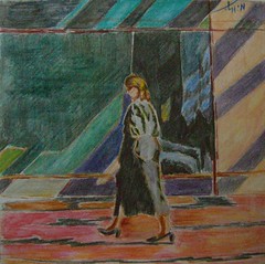
Walking on the ceiling!
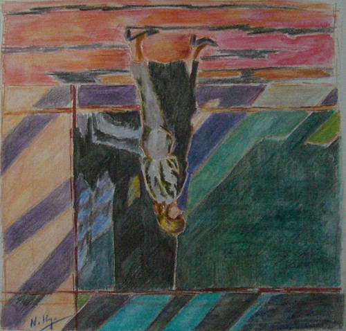
Watercolor pencils on paper, 10 * 10 inches
copyright Nithya Swaminathan

This week's challenge at Karin's Different Strokes blog was to paint this walker upside down. In her pep-talk accompanying the reference image, Karin makes a valid point about trying to paint what you know rather than what you see. That would not happen when painting upside dpwn.

With this approach, I followed the reference and the patterns of light in it. Blindly painting what I saw! I did not alter the image in any way, as that would probably mean flipping the image and I wanted to avoid that at all costs. It was super fun I should say. I also went ahead and signed the painting as it was painted, so if viewed in the right direction, my signature would be upside down :-)

Walking on the ceiling - viewed upside down
Watercolor pencils on watercolor paper, 10 * 10 inches
Copyright Nithya Swaminathan

When painting normally, I have the habit of viewing my canvas in the mirror every now and then. That kind of guides me if I am in the right direction or not. It works like a charm especially for portraits, as mistakes will stick out in the mirror image. This time around, I had to hold my temptation from turning the image :-) That was the most difficult part of the challenge, so to say.

Here is the link to the weekly challenge, have a look at others' interpretations.

Also, watch this space tomorrow for something totally different from me. That is besides the final image of the still life.

November 12, 2008

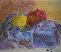
Primary colors - painting from my sketch

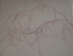
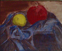
When I did my sketch from life of this still life set up, I did not really plan to paint it later. I wanted to enjoy sketching and thats it. That changed now and I decided to paint it, using only my sketch as reference.

It is fun to paint this way. I get to paint my own set up without the time/light constraints of working from life. And more importantly, I get to evaluate my sketching skills as well.

Primary Colors - reference


Since this is just a beginning in a new direction, I decided to start small. This is done on a gallery wrapped canvas of size 8 * 10 inches.


Primary Colors - preliminary sketch
Acrylics on Canvas, 8 * 10 inches
(c) Nithya Swaminathan


I have always been inspired by Celeste, one of my favorite acrylic artists. She does such gorgeous still lifes, and does them so effortlessly. One of the techniques she uses is a Burnt Sienna underpainting to block the values in the picture. She consistently gets awesome results with the underpainting and I decided to do give it a shot too. This is the first time I am trying this.

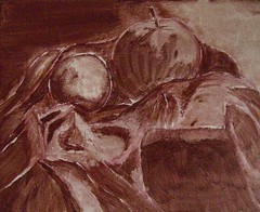
Primary Colors - stage 1
Acrylics on Canvas, 8 * 10 inches
(c) Nithya Swaminathan


The idea is to use only only color, burnt sienna and do all over the painting. The paint is kept a little watery in areas that are lighter in value. For the lightest regions, there is more water than paint in my brush. When the colors are applied over this, getting the values right is much easier and I don't have to break my head over it.

Now onto the colors, here I have done just one layer on top of the underpainting. I deliberately kept the paint a little watery so that my values are still visible beneath.

The painting is quite "flat" now, with only 3 colors - lemon yellow for the sweet lime, crimson on the apple and cobalt blue on the fabric. I have left the background as it is.

Primary Colors - stage 2
Acrylics on Canvas, 8 * 10 inches
(c) Nithya Swaminathan


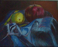
Then I start adding details to the objects and I am almost done now with the background, and both the fruits. The sweet lime now looks like a pear, to my horror! I will fix that in the end. The apple is done I guess. The right side of the background will also be made a little lighter. Have just started on the folds, and they are driving me crazy already.

Primary Colors - stage 3
Acrylics on Canvas, 8 * 10 inches
(c) Nithya Swaminathan


I realized while painting that I have actually done a decent job of sketching. I am able to make out most of the folds. I only wish I had taken a better photo of the set up, as a back up. But who knows, if I had such a back up, I might have never got to this!

So this is my progress so far. There is still a long way to go, and I hope to complete this today. Feel free to give in your critiques. Let me know if the fabric is all crap! Or anything else for that matter.

Testing the waters

Testing the Waters
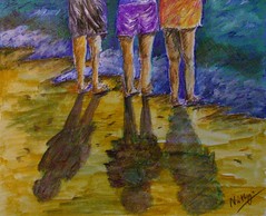
Mixed Media on Canvas, 6 * 9 inches.
copyright Nithya Swaminathan

Karin Jurick, one of my favorite blogging artists runs a blog "Different Strokes from Different Folks" that hosts a challenge every week. She uploads an image and any artist is welcome to submit their interpretation of the image. Any medium is fine.

I love this blog and enjoy seeing the close to hundred different versions of an image every week. While I have wanted to participate in this, I have not quite found the time. Infact I have 2-3 of the previous challenges in a half done state! This time I loved this image and simply could not let it go. I have significantly modified the reference, but the essence is not changed.

The focus is on the shadows and the various colors in them. This one is done with mixed media, a little bit of watercolors, some acrylics and some CPs. It was fun. I did a rough sketch and then closed the reference. I wanted to give it a shot without seeing the colors in the photo. I followed a very loose approach, wanted to try something very different from what I usually do. I will get back to this image after a while and try to evaluate myself, though now I can say it looks decent.

Since the image is a late night image under lights, it does not reflect the true colors as they are in person. I will upload a better image in the morning. And do not forget to check out all the entries, they look awesome!

November 2, 2008

Why I strongly recommend Art Trades

In an art portal like WetCanvas, at any point in time, there would be about half a dozen "Trades" happening. These are nothing but forum projects where artists exchange original art. The media could be anything from photos to bead art.

MidNight Glow
Colored Pencil on Paper
2.5 * 3.5 inches
(c) Nithya Swaminathan

Since the ATCs or Artist Trading Cards have become very popular these days, more and more artists take part in such trades. An art trade is one where a group of N artists take part, and each one prepares N-1 original pieces of art and sends it to the other participants. Whenever I get a chance, I take part in these trades. I love them and I plan to write about my experiences with Art Trades over the next couple of posts.


Striped
Colored Pencil on Paper
2.5 * 3.5 inches
(c) Nithya Swaminathan


The Kiss
Colored Pencil on Paper
2.5 * 3.5 inches
(c) Nithya Swaminathan

In this post, I will write about all that I have gained by taking part in Art Trades, and I wish to reiterate that this is entirely subjective. And then I also plan to write about what it takes to participate in an Art Trade, as it requires a lot of committment from one's side. That will be in a later post.

Experimenting with techniques/media
This is by far my biggest gain by doing such projects - that I am able to stretch my boundaries and try out things I normally wouldn't. And since a trade generally involves doing about 20 cards, by the end of the project it becomes "normal" too!

Golden Twins
Colored Pencil on Paper
2.5 * 3.5 inches
(c) Nithya Swaminathan

Early 2007, when I joined in for my first Art Trade, I picked up a lot of autumn references, fall colors aplenty. I wanted to work in colored pencils and did all my cards using CPs. However, I felt my CP work lacked some punch, and touched up one painting with a little bit of acrylic paints. The result was so good that I did a dozen cards in the same technique – doing it entirely in colored pencils and then with a dry brush, just indicating some leaves etc using acrylics. It became a signature style and was well appreciated.

Turquoise
Colored Pencil on Paper
2.5 * 3.5 inches
(c) Nithya Swaminathan

This year, for another trade, I did a lot of birds. This time I wanted to try an under painting with watercolor pencils. After a wash with watercolor pencils, I painted them over with normal colored pencils, and the results were really good. The colors were more intense. When I normally paint in a larger format, I do not experiment this much with technique. When working large, I prefer to do what suits me best. That would generally be working with Oils/Acrylics.

Underwater Exploration
Colored Pencil on Paper
2.5 * 3.5 inches
(c) Nithya Swaminathan

Talking about trying out different media, all my Art Cards so far have been in colored pencil. My readers would be aware that I love the medium and try to do as much work as possible in CPs, in between my paintings. Since the ATCs are small in size, I always do them in CPs. It helps me to build my confidence to do larger colored pencil pieces. I also plan to do some more cards in Pastels and Watercolors. These are two media that I find really fascinating but have never tried myself. An Art Trade would be the right place to make a start in a new medium for me.

Experimenting with Subjects

Angel Fish
Colored Pencil on Paper
2.5 * 3.5 inches
(c) Nithya Swaminathan

Just as I try to experiment as much as I can with techniques and media, I also try to do a lot of subjects that I normally would not while working large. My body of work majorly consists of landscapes and water scapes.

I have never done a large still life as yet, but I have done couple of dozens of still life Art Cards. Same holds good with birds. My fall landscapes on the other hand were more like studies. I would definitely love to do them large, and wanted to see how they would turn out.

Peeping Tom
Colored Pencil on Paper
2.5 * 3.5 inches
(c) Nithya Swaminathan

My most recent Art Trade was a theme based one – I took part in an exchange titled “Under the Sea” on Drawspace. I have never done any fish before; I never really found them inspiring till date. So took part in the project as a chance to try out a new theme and I had a great time. I still cannot say I would do them on a larger format, but they were ideal for the ATC size. Super fun since I can go wild with the colors!

Fiery Orange
Colored Pencil on Paper
2.5 * 3.5 inches
(c) Nithya Swaminathan

Working in a Series
This is something that I have successfully tried in all the trades I have been part of. Though there is no rule that the cards should be on the same subject, I always make it a point to do all my cards around a single subject. That really helps me explore a subject more, and I enjoy it. I have done exchanges with still life, birds, fall colors, and most recently underwater seascapes/species.

Tiger Fish
Colored Pencil on Paper
2.5 * 3.5 inches
(c) Nithya Swaminathan

I am a person who finds it very difficult to sustain my levels of interest to do a series in a large format. But in the smaller format, I am completely at ease and have always made it a point to work in a series with Trades. This kind of gives an idea to my recipients as to what they could be getting in the mail, though there is always an element of surprise.

Enhancing my knowledge
Until I took part in my first Art Trade, I never knew what was "Encaustic Art". I was fortunate to trade with an artist who did such brilliant encaustics and am now a proud owner of 3 encaustics. It is not something I would myself give a shot at, but it was fascinating to read about a new form of Art and also receive something extraordinary.

Golden Fish
Colored Pencil on Paper
2.5 * 3.5 inches
(c) Nithya Swaminathan


Look at Me!
Colored Pencil on Paper
2.5 * 3.5 inches
(c) Nithya Swaminathan

In my next post, I would continue with some more things that I have gained, most important of which is a trading network of sorts, with all my Art Trade buddies.


All the images in this post have been done for the "Under the Sea" exchange on Drawspace. The trade ended in October and I have all my cards sent out. Waiting with bated breath for the comments from the recipients.

October 25, 2008

October Virtual Sketch Date

The virtual sketch date is a blog event happening every month, where a reference image is posted and any blogging artist can give a shot at the image. The artists then post their attempts onto their respective blogs and link to the main blog site. It is a fantastic event, since I always love seeing how various artists tackle the same subject. This has been happening for a few months now, and this is my first entry.

Peared - colored pencil on water color paper
(c) Nithya Swaminathan

I started doing the last month's reference itself but could not complete it before the deadline. This month's reference was so irresistable that I had to give it a shot. I am glad I could complete it on time. I have a blast doing this, as I have never done pears before. They are such fabulous little things, full of character! We do not get these kind of pears here and I haven't been able to do them. I am quite happy with how it turned out and I cannot wait to see what other artists have done.

Today also happens to be the International Sketchcrawl, and though this doesn't qualify at crawling, it counts as sketching at least :-)

October 15, 2008

Primary colors

Yet another attempt at working from life, also with a limited palette. I wanted to try my hand at doing fabric, that too from life. Cannot say I am entirely satisfied with the fabric, I am sure there is a long way to go. Fabric is one of those things that I cannot seem to figure out for the life of me! It is something I really want to master. More so after my visit to the Rijksmuseum and seeing all those pieces by the Dutch Masters with jawdropping fabric.


Primary Colors
Colored pencil on paper, 4 * 5 inches.


I have used only the primary colors, and the complement of each of them. That makes it crimson red, cobalt blue, lemon yellow and Orange, Violet and Viridian green. The finish looks kinda crappy coz my daughter stepped in to the scene when it was going all fine and decided she wanted to eat that apple! Yeah, only THAT apple. So she picked it up and needless to say the other objects also got distrubed. Thankfully the apple was the one I completed first so it was ok. I took a photo of the composition and completed the fabric with the help of the reference. The patterns in the fabric were not exactly the same in the reference but I had to do with it! I hope for better cooperation from my daughter going forward ;-)

September 26, 2008

Look who is in the news!

My friend Anand Bora, a very talented and gifted Mathematical Artist is in the Economic times today. Hurray to him!
Read the article on Anand here. Have a look at blog and website.
Way to go buddy!

September 25, 2008

Sketching from life


I generally work from photographs, using them as references and most of the time sticking to the photos faithfully. Once in a while I change some stuff in photos, go in for some crops etc. Rarely do I have the urge to work from life. My only sketch from life experience is that of doing a lot of portraits, where my friends pose for me for couple of hours, and I have no issues in getting the resemblance right, I have done a pretty good job of it so far. 

Pomegranate and Peppers                                       colored pencil on paper, 4 * 5 inches.                 (c) Nithya Swaminathan

Other than portraits, I have never attempted sketching from life n a big way. The sketchcrawl was the first time I actually worked from life doing people and places while on the move and I loved it. It was very liberating I should say. I have always wanted to try setting up my own still life and trying to work from it. I was hesitant to give it a shot coz of my lack of knowledge of composition. 

Recently, I have been reading a lot of art blogs, articles, forums etc and want to sincerely avoid working from photographs, especially those taken by others. I want to call my work 100% my own from conception to execution. The first step in that direction was to pick up a good book on composition (review coming up soon), and then start working from life. This is formally my first composition from life, and I am happy for taking that step. 

I don’t have a specified studio space for myself, so I don’t have a space to create an elaborate set up with a light source etc. It sucks that the lighting always seems uniform in my house. It then flashed me that there was a reading bulb in my bed, that I could use! And that was it, I set this up on my bed J 

Some quick learnings for myself –

  • Setting up a simple, bare bones still life isn’t rocket science. This is not a learning as such, it is a reassurance. I picked up the 3 objects and tried some combinations, with a reflector, without one etc, and finally settled on this one. It took me less than 5 minutes! I realized I needed to get used to the paradigm shift of working from life by doing more of these studies, then move on to better and bigger set ups.
Grayscaled Version (c) Nithya Swaminathan
Pomegranate and Peppers


  • It tremendously improves my observation – note the red reflection of the pomegranate on the capsicum? I am sure this would not have been captured in a normal point and shoot camera, which is what I use. The reflection isn’t as intense in color as I have depicted, but I could observe that it is there. And it adds a good punch to the painting on the whole.
  • Working with a limited palette helps to get a better understanding of color theory as such. I have used only one green and one red pencil. Value changes have been depicted only with varying pressure and by building up layers using the complements.
  • I still have a long way to go in mapping color to value! Have a look at the grayscale version of the image, and there are only 2-3 values, not a wide range. In real, the shadow of the pomegranate was the darkest, the shadow of the capsicum in the front was mid tone, and that of the capsicum behind was lighter in value. I thought I had achieved it (if you see the color version they look different), but in the grayscale they all look like a mid tone. I hope this improves with practice. 
Next on my agenda is to create a painting, having only my sketch as a reference, without seeing the actual set up. It will then help me evaluate what all I have missed capturing in my sketch. 

September 10, 2008

A blog award!

The Brilliante Weblog Award’s is given to sites and blogs that are smart and brilliant both in their content and their design. The purpose of the prize is to promote as many blogs as possible in the blogsphere.

My blog was given this blog award by Ano, thanks so much Ano. If not for anything else, it gives me so much pleasure that there is someone who reads my blog after all! Just like any other blogging tag, I am supposed to pass on this on to some of my favorite blogs. 

I am not much into blog hopping and reading these days as I do not have that much free time in my hands. My blog reading is restricted to art blogs, and some food blogs as well, since I am equally passionate about cooking as I am about painting. So here goes, in no particular order, some of my favorite blogs.
  1. Anand Bora - Anand is into mathematical art, something that I do not understand, but find it very intriguing. Having seen him come up with ambigrams for anything and everything (he ambigrammed my name in minutes!), I can say he is amazingly creative. He says he can visualize mathematical functions and the likes, isn't that awesome! His work was recently juried into one of the most prestigious Math-Art exhibitions in Netherlands, and he will soon make it big time. Do check out his blog and his latest ambigram of Google. 
  2. Priyamvada - Hers isn't an art blog, but a favorite nevertheless. I love her posts related to parenting, and I adore her patience/style/whatever in dealing with her sometimes-rebellious-but-mostly-sweet daughter. I hope to have that kind of maturity someday in dealing with people, especially my little one. Most of her parenting posts have been bookmarked by me for future reference :-) 
  3. Ferrari - Even on the days when I am really hard pressed for time and I were to check out only a handful of blogs, his would be on top of my list. Great travelogues with amazing pictures, and general posts with a nice sense of humor make his blog an instant favorite. Its like my morning coffee, hard to miss!
  4. Ano - Ano's blog is another favorite that I love to read, especially the posts about Lil D and the short fictions. I also love her occasional posts about her current favorite ads on TV, which will most of the time match my then favorites too :-)
So that's it! If I start listing all my favorite art blogs, this would turn into a very long post. I strongly recommend to check out the links on my blogroll instead, it would be well worth your time.

September 1, 2008

The Indian woman in my art

While I was digging out some of my old sketches as part of a cleaning mission, I stumbled upon this old portrait of mine, one that I really liked. It is done with only 2-3 pencils on black sanded paper. She is supposedly wearing a black sari with a red border, so I have left the black paper as it is to form the sari. With very less actual work done, this was completed in about half an hour. It is one of my favorites till date, as it was one of the very first colored pencil sketches I did and turned out decently.

An Indian Woman

Colored pencil on paper, 8 * 10 inches

Also, while I was browsing some of my work, it struck me that I have been enamored by the Indian woman in general. I have done at least half a dozen works centered around her. They are direct representations of her like this one, or in other forms like the Indian goddesses. I have a fascination with their traditional jewelry, attires and accessories specific to each state, dusky skin tones etc. These are things I do not use myself, I hate any kind of jewelry on me, but I love to paint them :-) I have a few compositional ideas in my mind/scrap book/sketch book, all of which have an Indian woman as the central figure. I don't know how many of these would get translated into paintings, I hope most of them do.It just struck me that I could almost do a series on these lines, and I am working on that.

August 11, 2008

An "unofficial" sketchcrawl - everyone's welcome!

The world wide sketchcrawl typically happens once in 3 months, and the next one might be sometime in September. The sketching enthusiasts in Bangalore are however trying to make this event a little more frequent. We are having an "unofficial" sketchcrawl in Bangalore on the 24th of August 2008. There is an event created in Facebook for the same, and you can confirm your participation here.

The previous crawl happened in July and was covered well by the Deccan Herald. So I guess the concept is getting popular on this side of the planet too. Hoping to see more artists this time around.

July 10, 2008

Some sketching in Venice

I have been roaming around a lot over the past few weekends, visiting several places in Europe. Not to worry, I would not bore you to death with all those chronicles, coz that ain't the point of this post. The beauty about traveling in Europe is that the places offer a great deal to the artist. Every other building has its unique aesthetic appeal and begs to be sketched! As for me, when I am away from my canvasses and I am dying to get hold of some paint, sketching is the least I can do and I do not want to miss an opportunity at any cost. All I need is a pencil and paper, so what is the big deal you wonder? It ain't really THAT simple if you are a parent and have a toddler tagging along with you everywhere.

The problem in traveling with a kid is that she wants everything that I can lay my hands on. If I want to sketch, she will want a pencil, if I want to drink, she will want my glass. You get the idea, don't you? So there is really no question of "diverting" her attention to something more alluring. The minute I pick up a sketchbook, she will proactively shout "Pencil" on top of her voice. One smart child I have! There ends any hope of me doing a sketch. This has been happening in every other place, and I only ended up clicking reference images, but never really got around to doing any sketching/painting.

I did not want to get put off by this routine, and decided to carry my book anyway to Venice. This place is really close to my heart, I just love everything about it. Every inch of Venice is a painting, it almost instantly "connects" with the artist. It was then to great joy I discovered that there was something more interesting to my daughter than my pencils. And that was a pigeon :-) So I managed to send her away for a while to chase and feed the hundreds of pigeons at St. Marks square, while I would spend about 10 minutes sketching the Basilica di San Marco. The St. Marks square is such a lively place, full of people and shops and of course pigeons.


Basilica di San Marco,
St. Marks square, Venice
pencil on paper


What you see above is the little sketch that I could manage in about 5 minutes. Ah! Such joy to even get to it after a long time. It is not complete, but I decided to post it anyway. I was forced to stop not by my daughter, but a waiter at the restaurant where I was happily seated. Without taking any food whatsoever :-) He wouldn't allow me to even complete it, huh!

June 18, 2008

Australian Country side - WIP

When your hands are really itching to get hold of a brush, the fact that you are unable to isn't exactly a very nice feeling. I am in that state of helplessness currently, other than a occasional sketch, I am unable to do any serious painting. So I thought it would be good to post some of my WIP pieces that are waiting for me to take them to completion. These pieces would be completed by end of August.

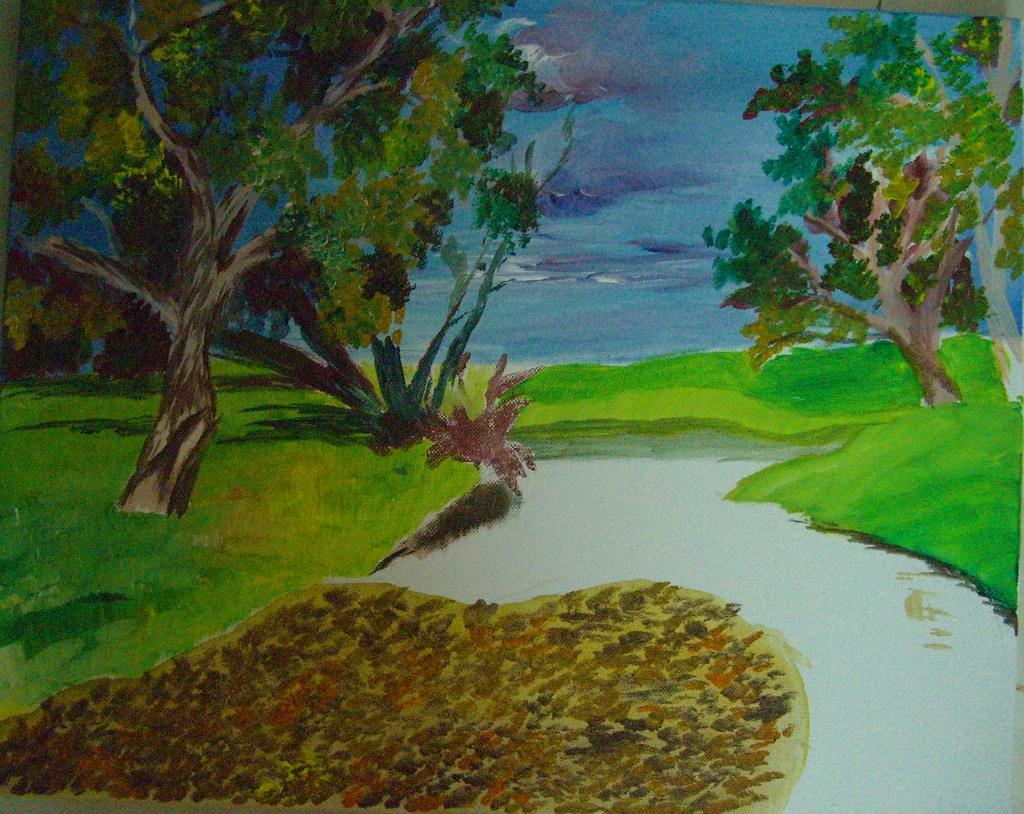
This is a piece I started a long time ago, around 6 months back I guess. I got too distracted with newer paintings and work coming up that this has been lying around. I got to work some more on it about a month back though. Its on gallery wrapped canvas, 16 * 20 inches.

Australian Country side - Acrylics on Canvas

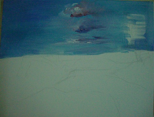
Step 1 - rough initial sketch


Seen above is the initial sketch done freehand and directly on the canvas. This is also an attempt to paint as loose as possible, so I have deliberately avoided giving any details in the sketch.

I have then laid down the color for the skies, overlapping the sketch coz the trees will be done over this after drying. I do not find it good to do the trees first and then show some sky in between, it makes it very unreal.

Australian Countryside - Acrylics on Canvas, Stage 2


In the next stage, I have marked the darks with burnt sienna. These will be the darkest areas of the tree foliage, with lots of shadow. The picture has really good lighting so shadows have a crucial role to play. The rough marking of the trees looks rather crude, but it is just to guide me where the barks are. I will be painting over this in browns anyway.

Australian Countryside - Stage 3


I have then started with the leaves, and the grass in the foreground. I have kept the grass really light, as it is much more brighter than this. It is nearly bright yellow. What I have observed from my paintings in general is I don't tend to really push my darks and my highlights. It looks like I tend to stick to more mid tones, which I aim to change. Even here, I should ideally be making the shadows much darker, and the highlights much more brighter. I hope I am able to achieve that by the time the piece is done.


As it stands, this painting will not draw the attention of any viewer methinks. In the meanwhile, I have also started work on the foreground. The foreground is absolutely gorgeous with a lot of dried leaves over shallow waters.

Here is where the painting is as of now. A lot more to go, at least 2 more layers to be done. I need to then refine the skies too, right now the clouds look really haphazard. All that and more by mid-August :-)


I have not prepared a slide show as of yet, will do so after the whole painting is completed. Your comments are most welcome until then.

June 13, 2008

Face to Face with Rembrandt!

When you study some masters and are greatly inspired by them, actually seeing the paintings for real is an experience quite unmatched. Such was my state of mind when I saw not one, but around 40 Rembrandts in flesh and blood, at the Rijksmuseum, Amsterdam. Rembrandt Van Rijn, obviously the most popular amongst the Dutch masters of the Golden Age, is one artist whom I admire hugely for his masterful usage of darks in order to get dramatic lighting. They say if you want to paint light, paint the darks first. This is true, because only proper darks and shadows with bring out the effect of light. And this is showcased best by Rembrandt.

Blame it on my lack of knowledge, I thought that Rembrandt painted realism painstakingly. But then that wasn't the case. He painted realistically only the focus areas, giving them a lot more detail than the 'out of focus' areas. They were done effortlessly and that kind of increased the effect and completely draws the viewer to the focal point which he aims. It has to be seen to be believed!

One more thing that strikes me is the splendid usage of black in his paintings. This is the case with not only Rembrandt, but a lot of the Dutch masters. They use black extensively, be it in the clothes or in backdrops. My art teacher used to vehemently prohibit us from using black paint as is from the tubes. She always insisted that no shadow or object is absolute black and it is formed by mixing other dark shades instead. I followed it blindly many years ago, and then saw that it was true. The more and more paintings I studied, more real life objects I closely observed, I understood the meaning behind her statement. It is amazing though how these masters have used the color to create the best possible darks and bring in an atmosphere to their paintings.

Rembrandt’s paintings show very clearly his strong brush strokes, and it is believed that he used the bristles and the back of the brushes also to create impressions like fine hair. In his first self portrait seen above, when he was aged just 22, the hair is so masterfully done. After dabbing a lot of dark colored paint, he has scratched on the wet paint using the back of his brush. This creates a great suggestion of hair and looks extremely real too.

My favorite amongst the Rembrandts was the Jewish Bride. The audio guide mentioned that it was Vincent Van Gogh who said that he could spend 10 years of his life sitting there just looking at that painting, and surviving on stale bread. Coming face to face with the masterpiece, it isn’t surprising that he made such a statement. The focus in the painting is on the sleeves of the guy, one that shines in gold. To get the shine, the artist has done an under-painting in burnt sienna, and then followed it up with huge amount of yellow (and some ochre, I think) dabbed with a
palette knife. It gives an unbelievably realistic look to the sleeve, as if it shows every crease possible. But going closer, we would note that it isn’t detailed as a photo realistic painting. The forms are only suggested and terrific values established with the under-painting and the palette knife. Also, photographs will not really capture that 3D effect the painting has.

The genius of Rembrandt can be seen in how he has handles the shadows of the lady’s fingers, and also give glimpses of red on the man’s sleeve, which is nothing but the red reflected from the lady’s dress. One more point which I wouldn’t have noticed if not for the audio was a tiny black outline on the lady’s thumb, which goes to show that she is not resting her hand on his body, but it is away from it. Mind blowing! I just stood there in front of it for a long time, just unable to take my eyes away from it. Though every Rembrandt is a stunner, this one just blew me away, totally! I wouldn’t mind going there again just to see this one.

Another one of my favorites from Rembrandt was the painting of Anna, the Prophetess. This is a profile of an aged woman with diminishing eye sight reading the Bible with the help of her fingers guiding her through the lines. The focus is on the “reading hand” and not the face of the woman. Rembrandt depicts every single wrinkle in that hand, he probably wanted to show in terms of folds all the experience in life she had. Apart from the hand, everything else is shown in less detail. It is not impressionism per se, but it is done in a loose style. The lighting of this painting is also brilliant, the light rays fall on her reading hand. Her face though lacks any detail, and is almost hidden in the shadow.

There is another painting of Anna and Tobit with a lamb, which conveys a great deal of emotion. The story is something like Tobit suspected Anna for stealing the lamb and later regretted it. I do not know the story too well, and it hardly matters anyway. Suffice to say that whatever emotion is conveyed in the story is captured masterfully in the painting.

One more painting that had a religious connotation was Jeremia Mourns. The painting is of the destruction of Jerusalem, and Jeremia, a prophet laments this sitting alone. The story mentions that he had prophesied this event, but he could not prevent it. The emotion that's conveyed in the painting is one of immense pain and grief, and its fantastic. The focus is on the prophet's face and each wrinkle in his face shows the amount of pain. Here again, in doing his bears and hair, Rembrandt employs the back-of-the-brush technique. The ornamental shawl is also exquisitely done.

The photograph here looks as if the top left of the painting is entirely dark with no detail, which is not the case. What is shown there is a lot of troops marching into Jerusalem, a fortress, people attacking each other etc. War and destruction depicted with great lighting but not very intricate detail. This photo obviously doesn't do justice to the painting.

Though Rembrandt was a master of the portrait, his landscapes were no less spectacular. There is only one landscape by him in the museum, called the Stone Bridge. This piece uses the same dramatic lighting that he employed in his portraits. The photo again does not capture the complete detail in the painting. I loved the clouds in this one, very very dramatic. And in the foreground, there is a lot of detail not shown in this photo. There are people walking, one man carrying some load and going, one family going with a cart and so on. It is one of my favorites in the museum.

And then, The Night Watch. This is the most famous painting in the museum, and it occupies an entire wall. It is absolutely gigantic. The painting is a group portrait with terrific light and shade. The scene is that of some militia men marching out of a gate. There is so much of movement in the scene, because the men are not static. They are marching and this effect is achieved in their various postures which are all distinctly different.

The focus is on the lieutenant in the front, and the little girl in the middle who is a mascot. It is interesting to note that both these "objects of interest" are not bang in the center. They are slightly off-center, adding interest to the viewer. So much attention is give to the fabric worn by each person, their collars and the expressions on their faces.

Though the night watch is the most popular painting in the museum, and probably the most popular group portrait, my favorite group portrait is another painting, The Sample Officials. This painting captures more than just faces, it just captures a snapshot of a moment in time, frozen forever. And that is awesome to say the least!

There are 6 men in the picture, and each of them is so unique in posture and expression. They are officials who sample the quality of cloth produced and hence the name for the painting. It is as though the room in which these guys are is slightly raised. As in you open the door, walk up a couple of steps and then these guys would be sitting there. Now, if someone entered opening the door and they all notice this, this is how the moment would be. All of them seem to be looking in one direction, towards the visitor. The cloth is also so wonderfully done. From a distance, it will look like the red cloth is done in intricate detail, which is far from true however. In the focus area where there is light, there is some (not much) detail of golden threads etc. This gives the viewer an impression that the entire cloth is detailed. It is however just red and sienna dabbed randomly with no detail whatsoever. The focus is actually not on the cloth, it is on the faces and they are brilliant.

Some other paintings of Rembrandt that I loved are his other self portrait when he was 55, then some more portraits of other people, specifically one of a young rich woman where he is at his detailed best. Her dress, collars and ornaments everything just oozes detail. I wanted to put in my first thoughts about all the Dutch masters in the museum, but Rembrandt has awed me so much that I am running out of space. So all the other masters, some other day.

All the images in this post are copyright Rembrandt :-)

For further reading -

May 30, 2008

Evening Glow - Postcard #3

In a quick change of events, I landed in Germany couple of weeks ago. I am here for the next 2 months, joining my husband who was already here on an assignment. So that means that I am not going to be actively painting (hardly anything in fact) until then. What I would be doing though, and doing generously is visiting museums and seeing some of the best art this world has ever known. Now that's interesting isn't it?

I will try to sneak in an occasional sketch here and there, but you guys look forward to seeing and reading about Art that is much better and bigger than mine. It is going to be a helluva learning journey for me, and I look forward to blogging about it.

Evening Glow - 6 * 4 inches,
colored pencil on paper

Before I go ahead and blog entirely about the Masters, I thought I would leave you with a couple of my own. Stuff that was done last month in Bangalore. It aches that I have come here leaving behind so many unfinished paintings and I cannot get my hands on them in the near future. This is one of the colored pencil drawings I have done for the postcard exchange, from an awesome reference by Dave Slaughter. I just love his bird pictures, and I know I have said it already. I have tried my best to capture the evening sunlight that's hitting the body of the bird, the lovely shade of orange.

Evening Glow - completed
colored pencil on paper

The method is the same as my previous postcards, a watercolor pencil underpainting followed by a wash with a wet brush. And then finer details added with colored pencils. Your comments are welcome :-)

p.s: Just realized that this post remained in my drafts! Posting it before its too late!

If you like it, share it!